Features:
How We Made “The Melting of Antarctica”
Continuing a 125-year tradition of mapping the continent at the bottom of the world

Detail from the SND award-winning video version of “Melting Antarctica.”
For over 120 years, National Geographic magazine has mapped Antarctica, and continues to visually illustrate the complex processes that occur on this remote continent. The tradition continues with “The Melting of Antarctica,” published in the July 2017 issue, highlighting the effect that climate change is having on the continent.
National Geographic’s interest in Antarctica began in 1892 when it sent a small team of scientists to the southern continent to build on previous work by other explorers: Mendana in 1567, La Roche in 1672, and Cook in 1773. In 1892, four steam whalers set off from Dundee in Scotland—an expedition that would result in National Geographic’s first map of Antarctica, by Dr. James Murray. This beautiful hand-drawn map was the first of many Antarctica maps featured in the magazine. To date, National Geographic has featured over 50 maps of Antarctica and the Arctic—making the poles one of the most heavily mapped geographies on the globe.

1892 map
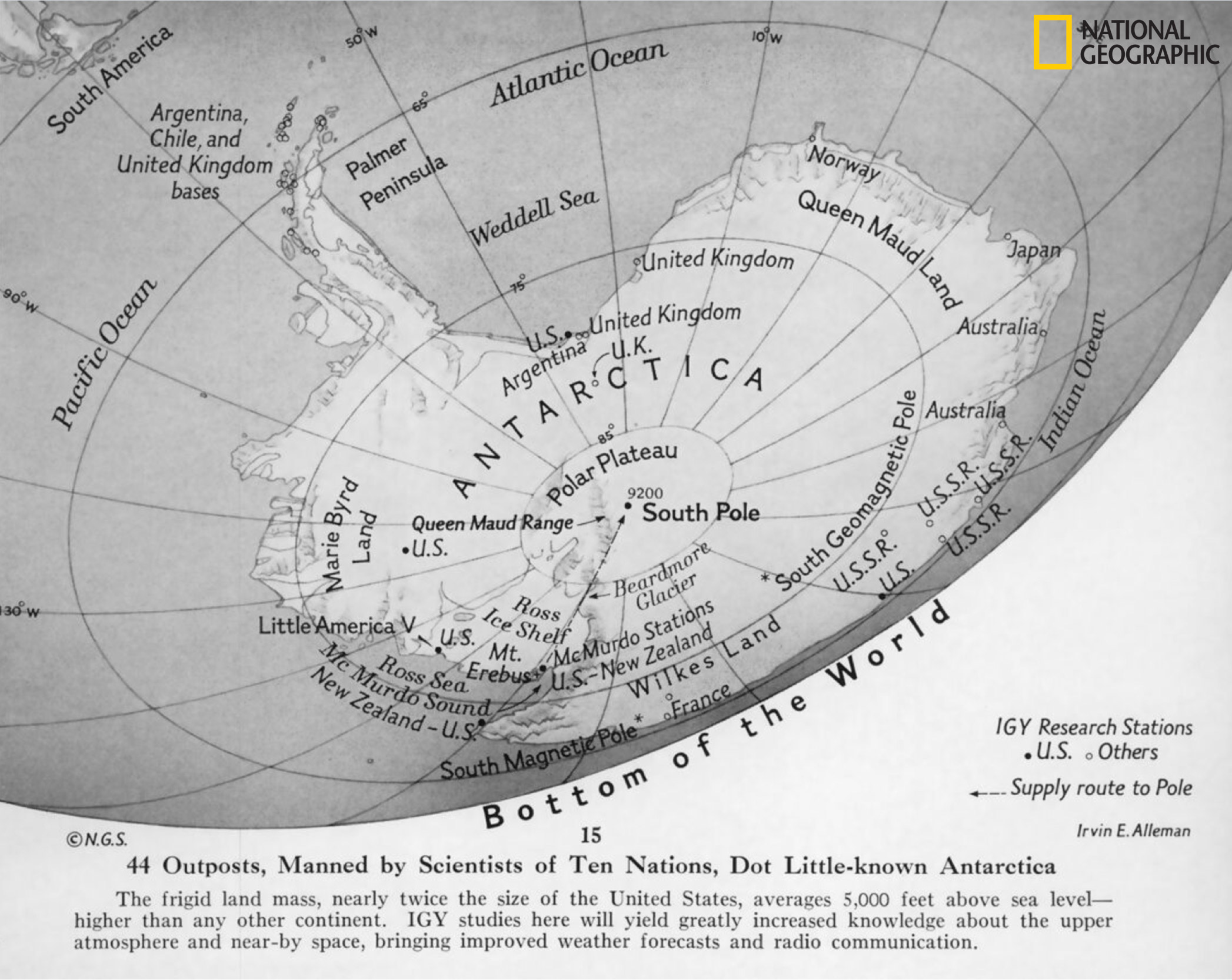
National Geographic’s first supplement map of Antarctica, featured in the October 1932 issue, shows significant progress had been made charting the coastline since Murray’s attempt 38 years prior. State of the art “areal cameras,” as they were known at the time, brought unprecedented images of the great southern continent—allowing a level of mapping that had never been seen before at National Geographic. With this map, National Geographic rounded out its mission to provide its readers with a wall chart of all major divisions of the world.
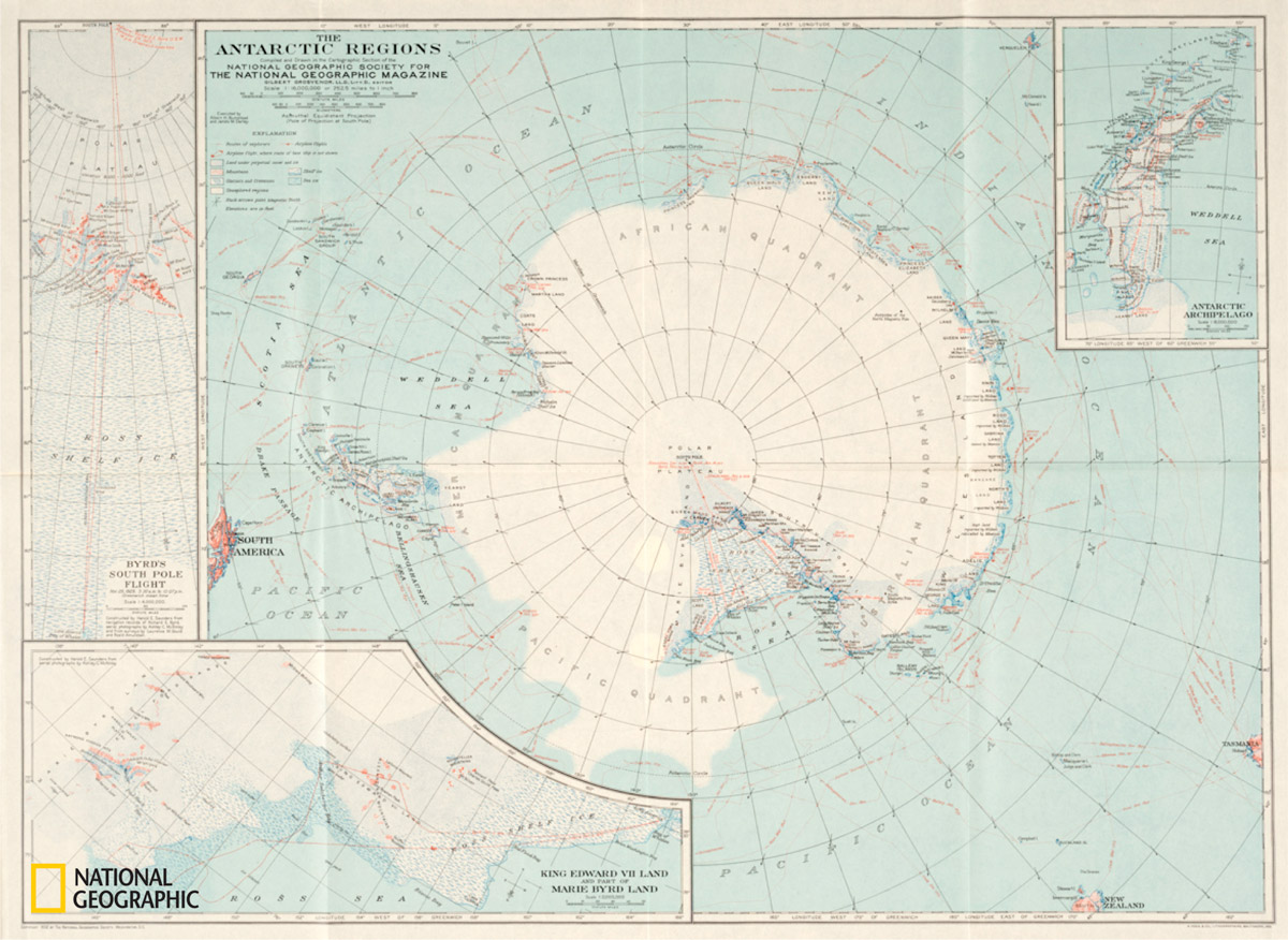
1932 map (view larger)
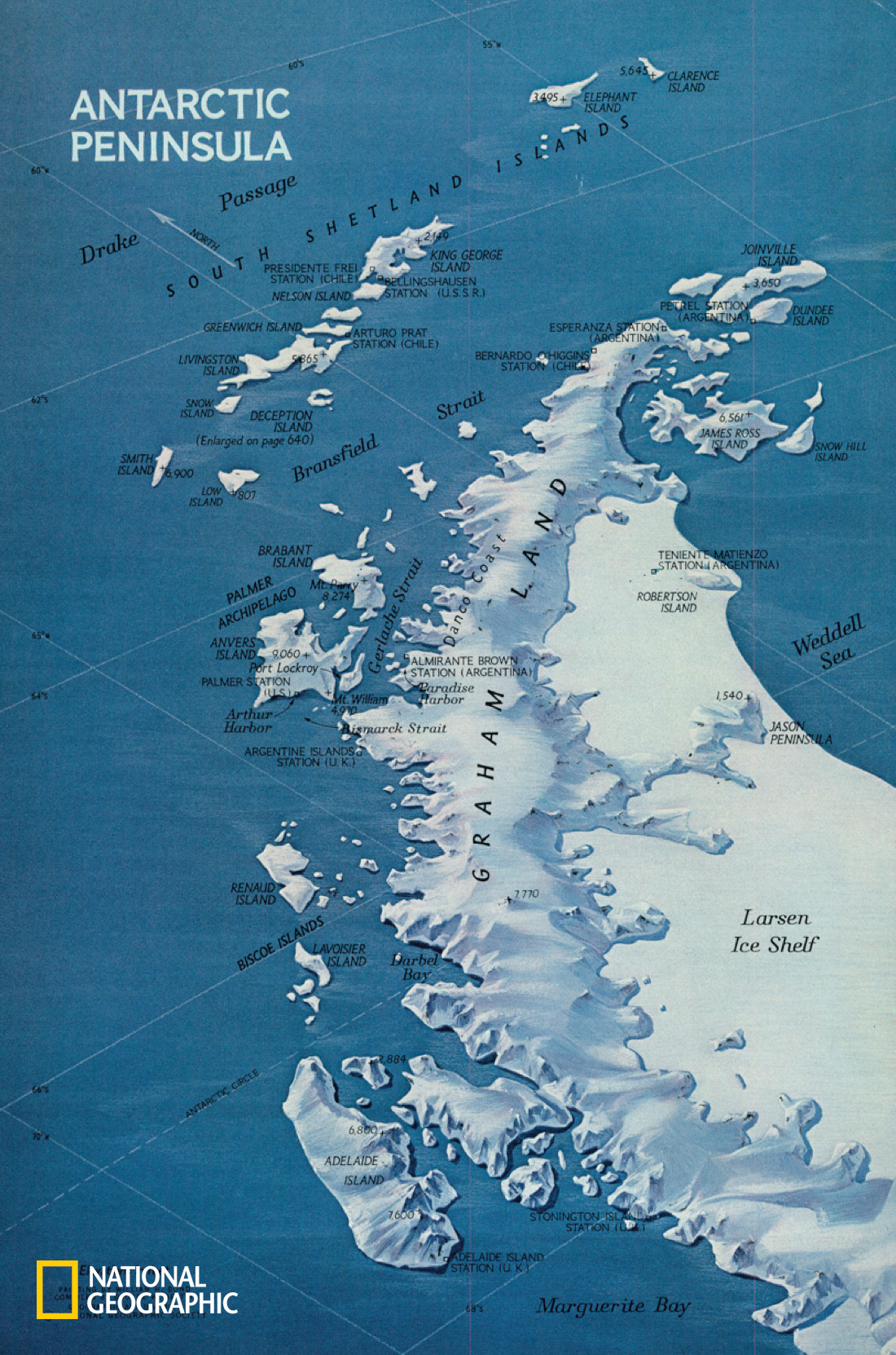
As time passed, so did National Geographic’s love affair with Antarctica and the Antarctic Peninsula. In November 1971 the magazine published a single-page map that exhibited beautiful hand-drawn relief—in perspective, looking down the peninsula to the South Shetland Islands.

1971 map (view larger)
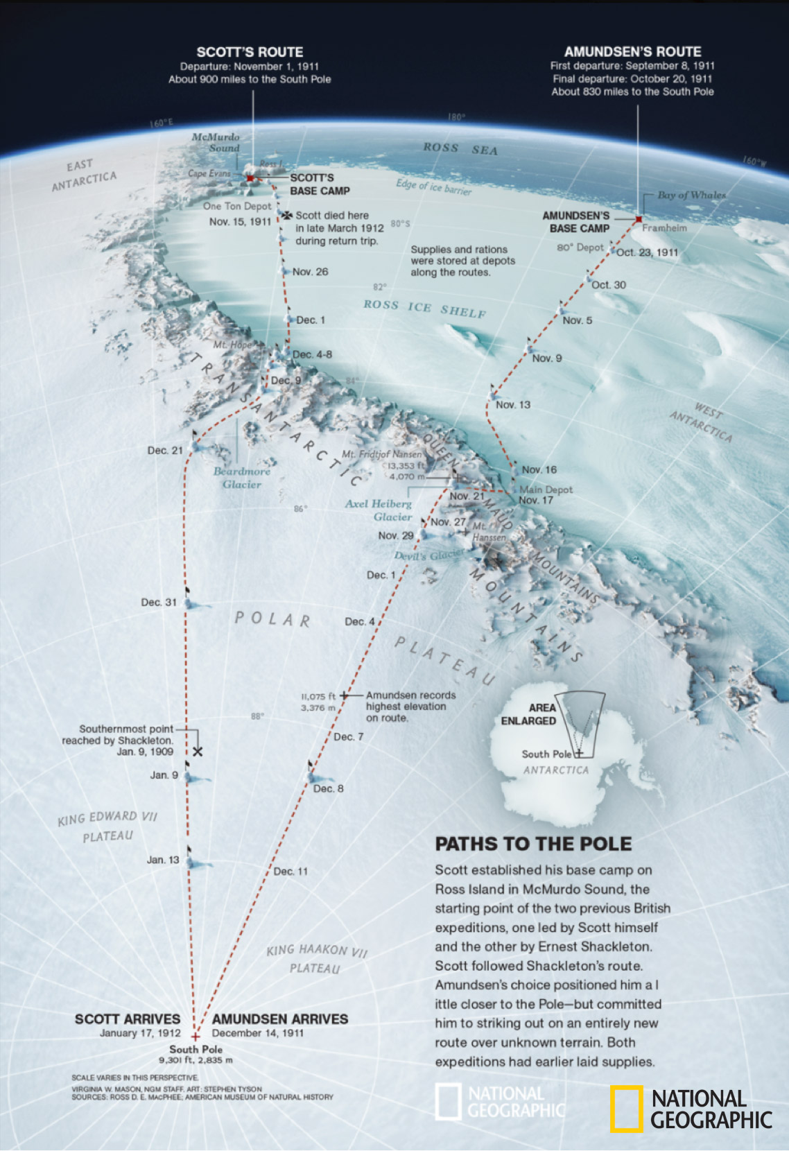
In September 2011, cartographers Ginny Mason and Stephen Tyson mapped Scott and Amundsen’s expeditions to the South Pole from the early 1900s. The colors, texturing, and perspective truly place the reader in the frigid, harsh landscape with the explorers.

2011 map (view larger)
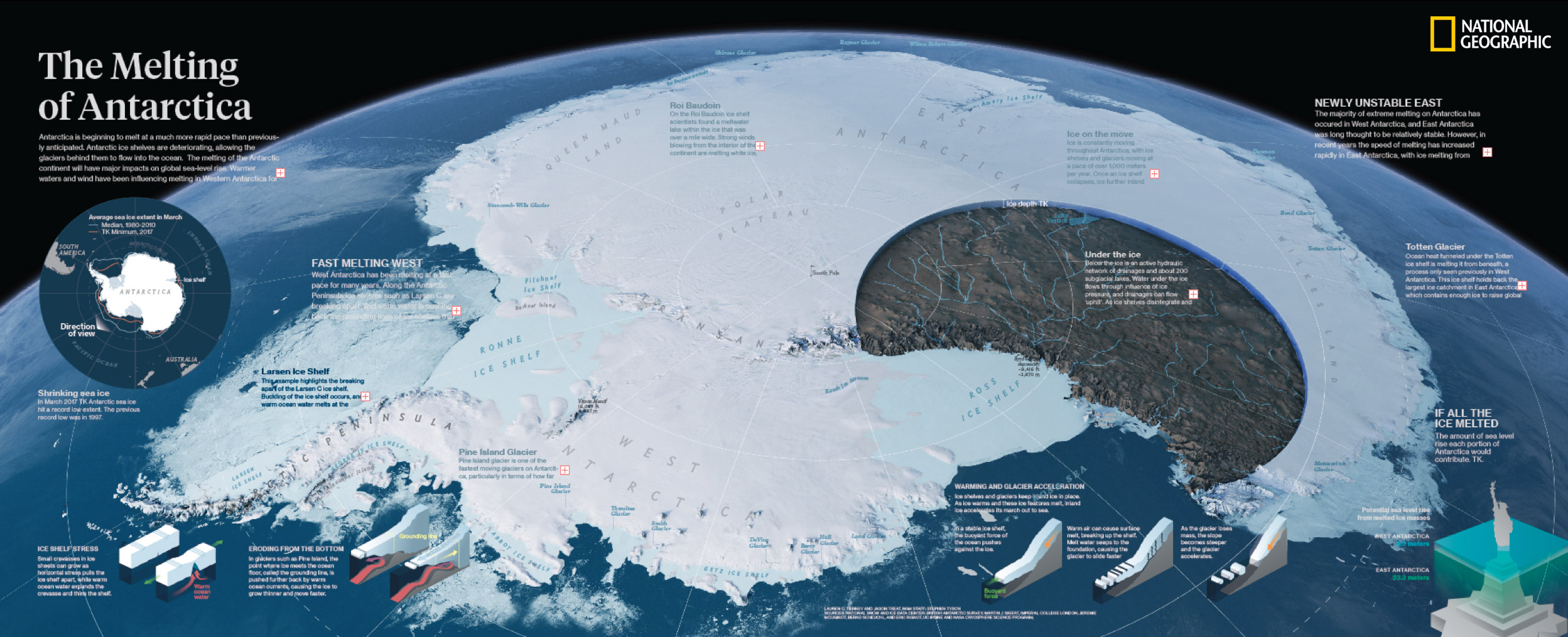
Today, the tradition continues, with National Geographic actively pursuing its ongoing interest in Antarctica, in particular the effect that climate change is having on the continent. In 2017, I, senior graphics editor Jason Treat, and freelancer Stephen Tyson created National Geographic’s latest installment of maps of Antarctica, highlighting the impact of climate change on the continent.

For this map, as with all maps created at National Geographic, the final product was no easy task. The creative process in the NGM maps and graphics department involves an intensive process of multiple critiques, edits, adjustments, and tweaks over the course of weeks or months. And it all starts with a sketch.
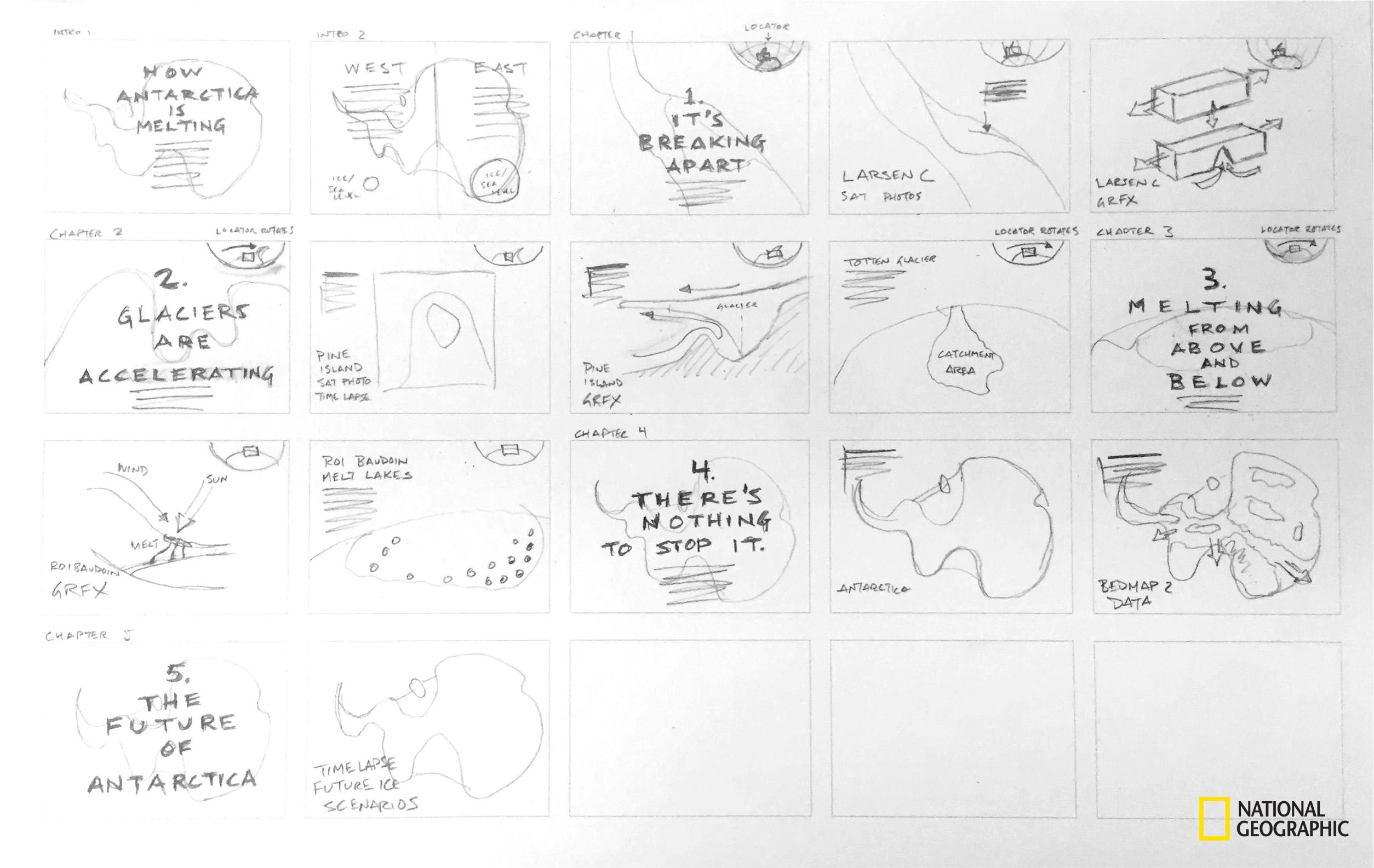
In January 2017 I drew up my first brainstorming sketch for our Antarctica map, to be published in the July issue of that same year. I remember making this during a meeting for another story I was working on (a map of the black-crested macaque’s habitats on the island of Sulawesi in Indonesia…worlds away from Antarctica), with the sketch buried amongst the meeting notes. It’s not the prettiest, but even the roughest sketch is critical to getting into a creative mindset to begin a project before getting locked down in the software.
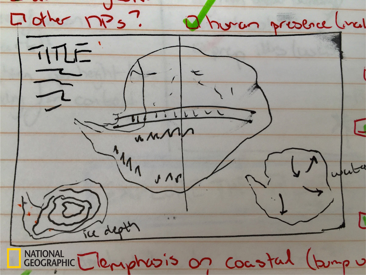
I drafted out a couple ideas, starting with a traditional top-down representation, then breaking apart the continent into two separate maps to experiment with explaining the dynamics of western vs. eastern Antarctica, and then experimenting with this method in perspective view for both sides of the continent.

These early options were drafted to fit a full spread, until we tried our luck drafting up a double-gatefold spread to pitch to our directors (for context, a double-gatefold is about 10 inches high and about 25 inches wide). This is not space that we frequently get for maps and graphics in the magazine. I began pencil-drafting out a full-blown, perspective map of Antarctica that would feature the full continent.


The directors loved the idea, and we got approval to move forward with the double-gatefold spread for the map. Along with our approved layout size we also got our main thematic elements approved.
The thematic elements of the map include four key factors of climate change on the continent:
- It compares the western and eastern sides of the continent, and how one is changing more rapidly than the other.
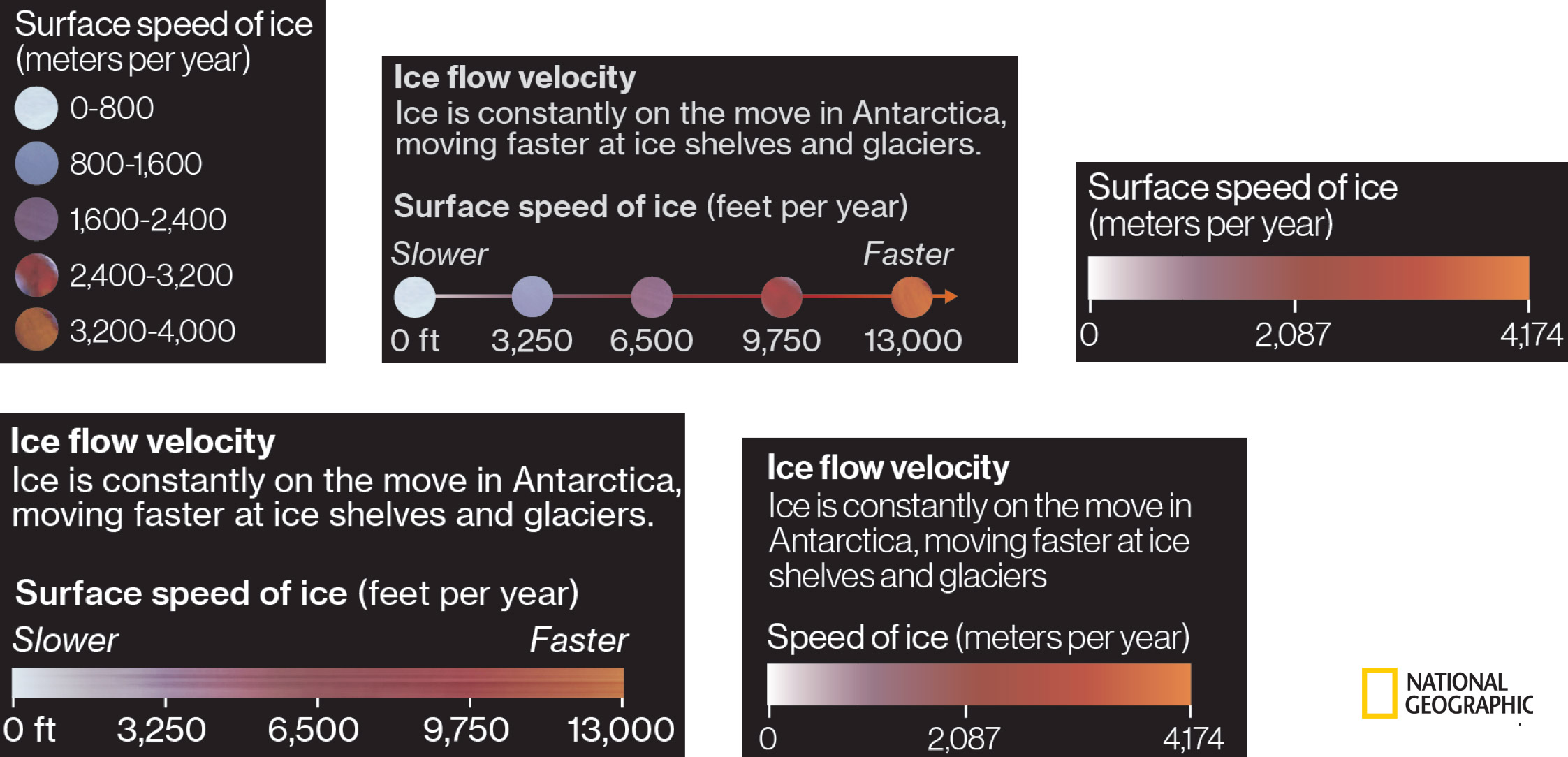
- It demonstrates that ice is constantly on the move (referred to as “ice velocity”) on the continent, and how some places have been speeding up more than others due to climate change.
- It illustrates what’s going on under the ice (subglacial rivers and lakes).
- It highlights how warming waters are changing the dynamics of the ice shelves that hold back the glacial ice on the continent.
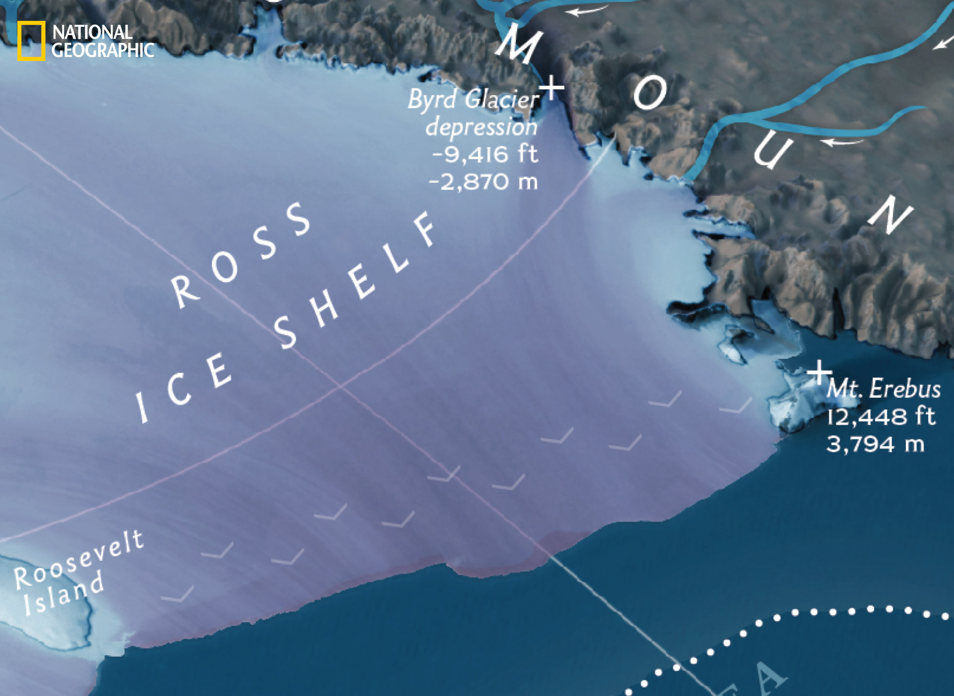
With the layout and proposed thematic elements approved, we jumped into the software. I worked on the main map for the piece with Stephen, who used Maya to render the base map and Adobe Photoshop to design and fine-tune the 3D rendering. Our first step was to figure out which angle would communicate the vastness of the continent, and figure out the appropriate shape for the under-the-ice cutout. The early drafts, which were in greyscale, were commonly referred to by our creative director as “Death Star renderings.”

Once we got the angle of the perspective approved, we began to add color, draft the map notes, add small explainer graphics, and experiment with the locator map. My colleague Jason added small explainer graphics along the bottom of the spread, including a graphic of the Statue of Liberty to illustrate how much sea level would rise if all of the ice on Antarctica were to melt—not that this would ever happen, but the graphic provides context to the amount of ice on the continent. I also began to experiment with how to visualize the ice flow velocity, trying my luck with some colored arrows. (Spoiler alert: it didn’t pan out.)

We experimented with rendering sea ice around the continent, which, while beautifully depicted, made the map very busy and crowded. We also reminded ourselves at this stage that the goal of the map was not to recreate the entire landscape of Antarctica. The goal was to give a window into the dynamics of climate change on the continent, and to do this we needed to stay on the more “graphics” side of the spectrum, rather than the “rendering” side.

We opted for a line and slight tint boundary to give the extent of the sea ice, and expanded the locator map to show the average sea-ice extent and the record low sea-ice extent, clearing out more space on the main map for the map notes and graphic elements and boosting the usefulness of the locator map.
To reach the final product we continued to fine-tune the map labels, graphics, and notes. The title went through about three different versions, and we simplified the Statue of Liberty graphic so as not to conflict with the overall feel of the map. We blended the map labels in with the landscape, adjusted the lighting and shadows to emphasize volume of the ice, and fine-tuned the final purple-red-orange color ramp for the ice flow velocity.

Every little tweak, adjustment, and content change made all the difference in creating the final piece. Some map elements went through many more iterations than others, including the map key and the arrows to emphasize ice flow velocity.
For the key we needed to create an appropriate guide for the reader to interpret what was going on in the map. The key for the ice flow velocity went through many, many iterations (I would estimate that we made 10 different versions). We began initially with a categorical version, and eventually it evolved to a continuous ramp to emphasize the flowing nature of ice on Antarctica. As an extra touch, in the final version we added the same streaking texture that appeared on the map to further drive home the connection between key and map.

To emphasize ice flow velocity, we weren’t fully confident that the streaking texture/effect alone would emphasize the movement of the ice, so we experimented with arrows on the edges of the ice shelves, where ice flows the fastest. Similar to the key, we experimented with many varying versions. The evolution of the ice-velocity-arrow involved blocky arrows, blocky chevron arrows, big chevrons, lots of little chevrons, and a brief period of no arrows, before settling on a delicate, tapered arrow to subtly emphasize the flowing nature of the ice.


For this project we drew a lot of inspiration from historical National Geographic magazine maps of Antarctica and the Arctic. One of my favorite historical touches that made it into our map was the “golf flag” for the South Pole, inspired by an illustrated map of Greenland and encouraged by the Director of Cartography at the time, Damien Saunder. The flag draws from this past style, and also helps emphasize the perspective of the map in a subtle way.

We also drew from the past for examples of cutaways at the poles to explain what lies beneath the ice. This proved pivotal for representing the flow of water below the ice on Antarctica.

Through the process of looking to the past for inspiration we also saw that a lot of our ideas that we believed were original had been done in the past—a humbling process. Our perspective view of Antarctica was far from the first time the whole continent of Antarctica had been featured in perspective in the magazine.

After months of research, proof of concept, drafting, data wrangling, and designing, we sent the final version of the map to the printers, approximately two months before it would arrive at newstands. With the print edition out the door, we turned our focus to the digital representation of “The Melting of Antarctica.”
Our first storyboard sketch for the digital component, drafted by Jason, was created to be flexible as either an interactive digital rollout or a video. After much discussion, we decided to go with a video. We wanted to try something new and different from other projects that had been done in the past, and also build something that would work well in mobile (translating a 25-inch-wide print piece into something for mobile was not in the cards).

For the video Jason and I teamed up with filmmaker Hans Weise and animator Jennifer Smart. We used renderings done by Charles Preppernau for the title and closing scenes.
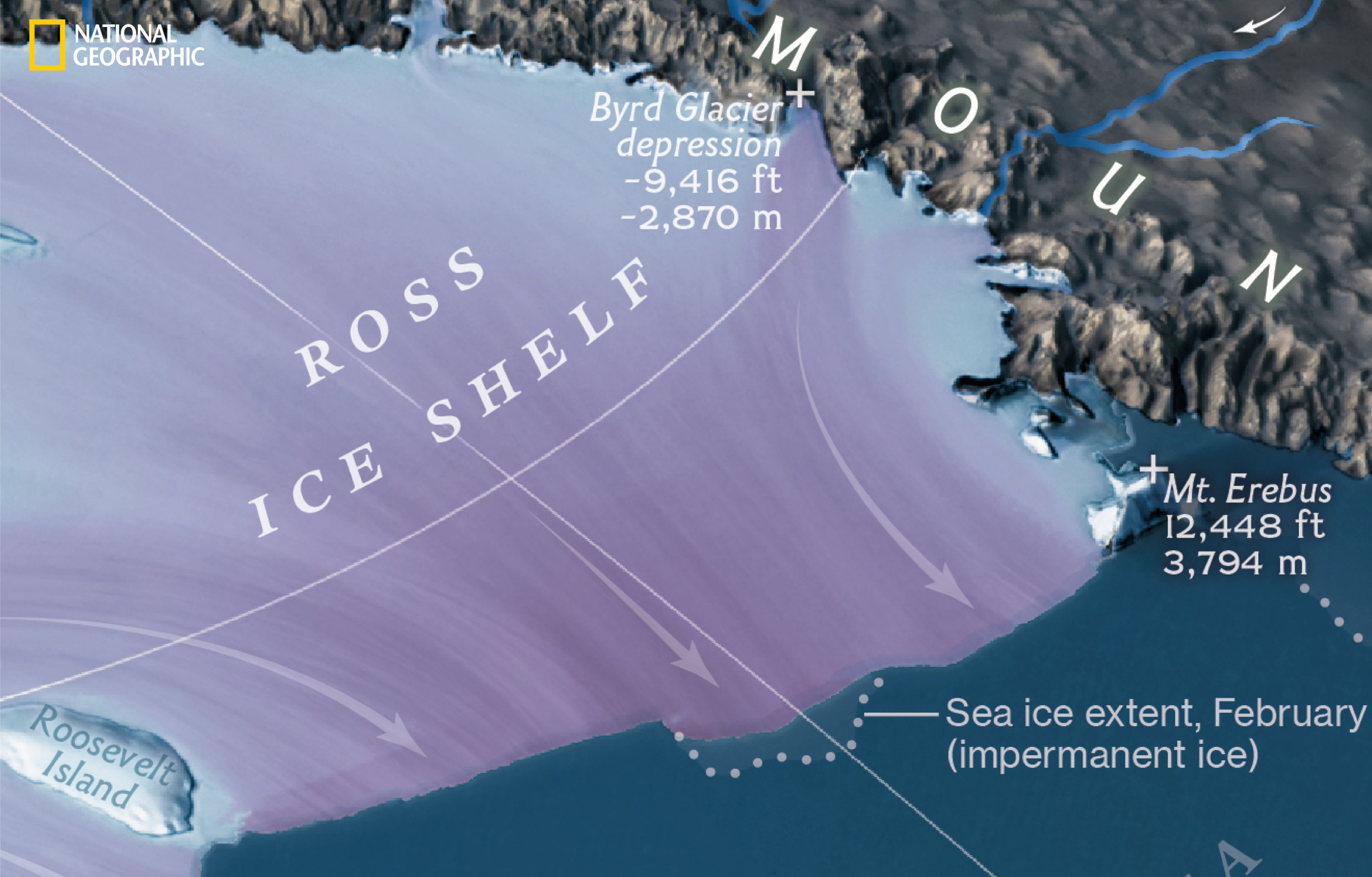
One of the biggest challenges of the digital version was staying true to the look and feel of the original print piece, so that they seemed cohesive. All new maps were created, and I styled them to match Stephen’s texturing and lighting from the print piece. We needed to create all new maps for the video as the original map was created to tell all elements at once, and we needed a map that could be used multiple times to communicate the different thematic elements and place the viewer at particular locations at different times in the video.
To recreate the maps in a style to match the original 3D rendering, I used the same datasets, but used different software to create a similar feel to the maps for a cohesive style. To generate the hillshade for this new map, I used Pyramid Shader, an open source software that I use frequently to create hillshades for different projects. My process was to export out different hillshades with 1.) different levels of generalization and 2.) slightly different angles for the northwest light source so that I could give the ice on the top-down map a greater sense of volume.
I then brought these layers into Photoshop and used some tricks from Tom Patterson’s illuminated shaded relief tutorial to build the relief for the map, overlaying this on top of a satellite image of the continent. With the different layers for shadows I set the layers to multiply and adjusted the transparency for each to get different effects for each of the varying-generalization hillshade layers until I got a final product that matched the feel of the original print version.

From our video. (view larger)
The final design of “The Melting of Antarctica” in both print and digital forms required months of extensive fine-tuning of the map and graphic elements, as well as the incorporation of cartographic elements that draw from historic National Geographic maps of Antarctica, tying the map more closely with its predecessors. From initial concept to final design, it took over six months of planning, research, layout alteration, and cartographic fine-tuning to bring everything together to accurately communicate the effects of climate change at the bottom of the world.
You can also view Lauren’s excellent NACIS 2017 talk on the project. —eds
Credits
-
 Lauren Tierney
Lauren Tierney is a Graphics Reporter at the Washington Post who enjoys telling stories with maps and specializes in mapping environment, climate, wildlife, and adventure topics. Lauren also specializes in terrain representation, using open source visualization tools such as Pyramid Shader and QGIS to work with elevation data in unique ways. She was previously a Graphics Editor at National Geographic Magazine, and has a masters degree in geography from the University of Oregon. Find her at @tierneyl.


