Features:
What I Learned Recreating One Chart Using 24 Tools
Finding the best tool means thinking hard about your goals and needs.
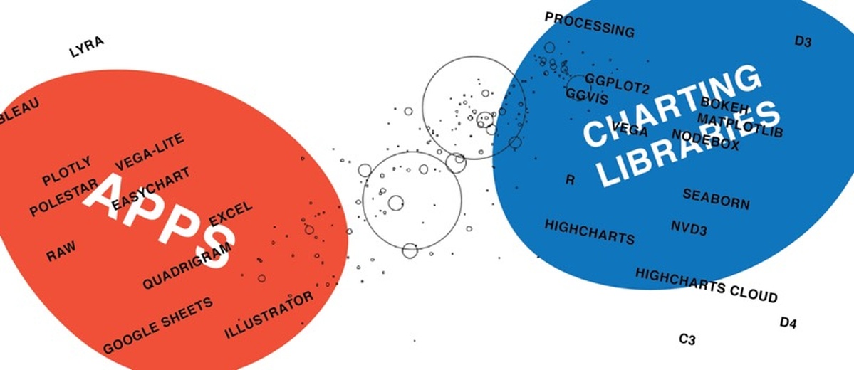
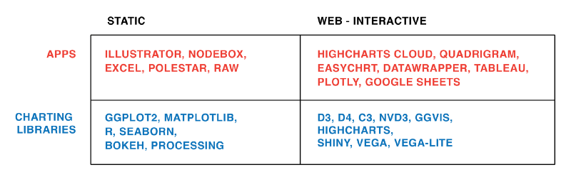
All the apps, all the libraries.
Back in May of this year, I set myself a challenge: I wanted to try as many applications and libraries and programming languages in the field of data visualization as possible. To compare these tools on a level playing field, I recreated the same scatterplot (also called a bubble chart) with all of them. Based on the results, I published two listicles: One for data vis applications and one for data vis libraries and programming languages. An overview of all the tools I tried can be found in this Google Spreadsheet. Now I’ll take a higher-level view and compare these tools with each other; mapping out my learnings.
Full disclosure: My experiment was highly influenced by the tools I already knew before I started trying new ones. Here they are, in order of the hours I’d already spent in front of them: Adobe Illustrator, Google Sheets, Tableau, R & ggplot2, d3.js, Processing, Raw, Lyra.
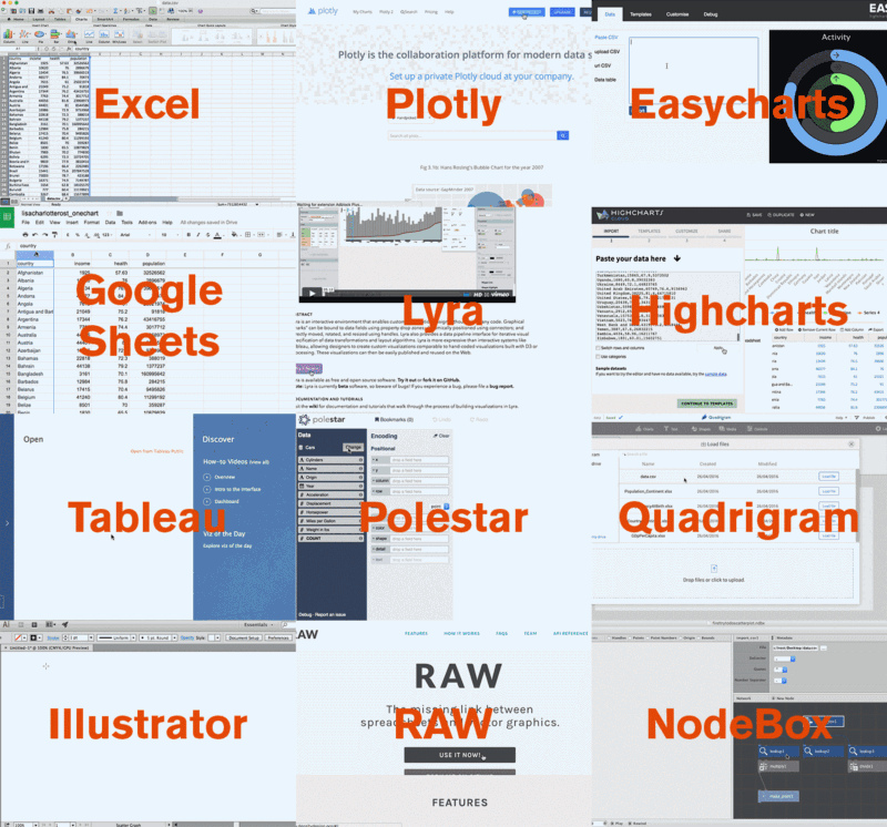
Here’s a GIF of me recreating the same chart with 12 different apps:
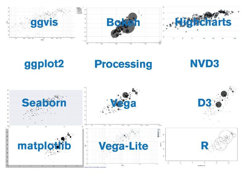
And here’s a picture of all the different outcomes of the charting libraries:
Let’s start! These are the lessons I learned:
There Are No Perfect Tools, Just Good Tools for People with Certain Goals
Data visualization is a communication form used by many subfields, e.g. science, business and of course journalism. All these fields come with different needs—but even in the space of data journalism, data visualization is used for different goals and with different approaches in mind. There can’t be a tool that satisfies them all. Here are some conflicting goals I encountered during my experiment:
Analysis vs. Presentation: Do you want to use your tool to explore the data (R, Python) or do you want to build visualizations for the public (D3.js, Illustrator)? Tools like Tableau, Ggvis, Plotly try to bridge that gap, but I’d love to see more evolved solutions.
Here’s my understanding of the divide:

Data Management: Will you change your data (eg. changing one or all values or adding rows or columns) while creating a data visualization?
In some apps (like Illustrator) you need to start building the graph all over again when changing the data only slightly. This is the least convenient for data management and hinders experimentation. The medium-convenient way is to change the data outside of the tool, then import it (again) and update the visualization with the new data. D3.js is an example for this way. But other apps make it even more convenient than code to deal with data: Once you import your data, you can change it or add new, transformed columns directly in the tool (examples: Plotly and Lyra).
Chart typologies vs. innovative outside-of-the-box charts: Do you just need basic chart types like a bar chart or line chart (Highcharts, Excel); or do you want to create crazy chart magic (D3.js)? Knowing mostly D3.js, I thought that outside-of-the-box charting libraries must come with lengthy code and a steep learning curve. Then I recreated the same chart in Processing–with half of the code (too bad Processing isn’t made for data vis). And then there’s Lyra, an app which lets you manipulate all attributes of a visual element with data and doesn’t require any code at all for innovation.
Interactivity vs. static: Do you need to create interactive graphics for the web (D3.js, Highcharts)? Or are you ok with creating a PDF/SVG/PNG at the end (R, Illustrator)? A few years ago, interactivity was the holy grail—but people currently seem to have moved from “look ma” to asking what actually makes sense.
Still, interactivity can make sense, even for the analysis part. R libraries like Ggvis and Plotly make it easy to let you hover over visual elements and see the underlying data.
There Are No Perfect Tools, Just Good Tools for People with Certain Mindsets
After I published my post, Alberto Cairo recommended that I try Yeeron and InZight; two tools I found very confusing to use. On the other hand, he noted that he found it difficult to use Lyra; a tool that was a revelation to me. Cairo and I come from different backgrounds: He’s a journalist and designer who sees himself as a journalist first. I see myself as a designer first. He likes tools like Quadrigram which see the graphic as part of a story and have well-chosen design defaults. I, on the other hand, like tools which give me complete freedom in styling my graphic.
Humans have different opinions and preferences. So do tool builders. They build tools with certain beliefs in mind about how tools currently work and how tools should work. These beliefs are not necessarily the same ones that you have. Tool builders are influenced by tools they used in the past, by their peers, and by the feedback they get. Tools, therefore, can’t be perfect for everybody. Especially in the data vis and data journalism community, tool builders and tool users have very different backgrounds: journalism, stats, computer science, design, etc. If a tool works for me, I can’t assume that it will work for everybody.
We Still Live in an “Apps Are for the Easy Stuff, Code Is for the Good Stuff” World
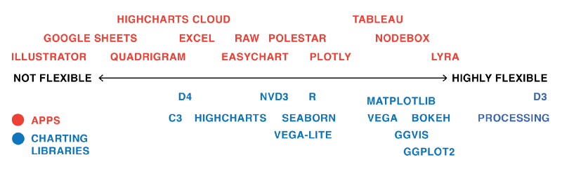
Most apps are easy to learn, but also limited in their features. Most programming languages/charting libraries are harder to learn, but offer more flexibility and options. The following chart is my very subjective idea of the correlation between flexibility and difficulty of learning.
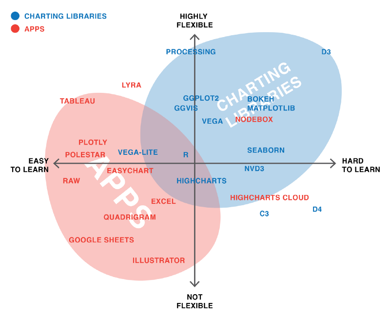
It’s disappointing that this is still the case. Programming knowledge shouldn’t be a prerequisite to feel home in the data journalism world. And let’s face it: Code is still scary for lots of people. We need to work on both sides of the problem. Helping people get into code can make them feel included in the short-term. But we also should work on highly flexible, user-friendly apps which include even more people in the long-term—and in the best case, teach them data visualization rules on the fly.
I welcome new apps like Plotly, Tableau, Lyra, and NodeBox that offer high flexibility with a click-and-drag interface. I’d love to see more of that. Creating user interfaces as powerful as code is “just” a design challenge.
Excel is a good example of that. It’s far from perfect as a tool; it’s missing crucial features like a revision history. But while it’s fairly easy to use for beginners, it also offers a lot of flexibility and power for advanced users.
“Every Tool Forces You Down a Path”
…as my ex-NPR Visuals teammate Brian Boyer says in one of his posts. So what are the available paths and which one do you choose to be forced down?
My own mental map of the paths out there looks like this:
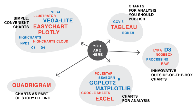
Personally, I feel mostly at home in the “simple, convenient charts” and the “charts for analysis (you should publish)” corners. After doing this experiment, it’s clear that I want to move even deeper into the “charts for analysis”. And I want to walk more on the “innovative outside-of-the-box charts” path. Meaning, I want to prototype more with Lyra and maybe even Processing.
What are the paths you currently choose, and why? Which are paths that are way too underdeveloped? Let me know via email: lisacharlotterost@gmail.com or on Twitter (@lisacrost).
A big thank you to Brian Boyer, Maarten Lambrecht, and Lindsay Muscato for their valuable feedback on this piece; and thanks to Ben Fry, Christopher Groskopf and many other tool builders who helped me make sense of the data visualization tool scene.
Credits
-
 Lisa Charlotte Rost
Lisa loves to design data visualizations, currently as a Knight-Mozilla OpenNews Fellow at National Public Radio in Washington, DC. When she’s not at a conference or helping creating a graphic for the NPR website, she’s posting on her blog or on Twitter about data-viz related things. Back in Berlin she designed for/with OpenDataCity, SPIEGEL & Tagesspiegel, taught data visualization at universities and organized the Data Viz Meetup.