Features:
Behind the Scenes on the NYT Redesign
What it’s made of and why

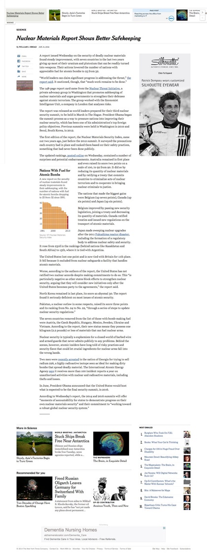
Detail from a new article page
The New York Times just launched the first piece of their sitewide redesign: new article pages, with other tweaks and nudges throughout the site. We spoke with two designers and a developer who worked on the project to learn about the tech choices, design ideas, and strategy behind the new look and feel.
Strategy & Rationale
Renda Morton, product design lead: We are a really big company, that’s trying to be faster. Our website is our largest platform. To redesign the whole thing at once would be a nightmare, so we decided to start with our story page and go from there. What’s launching on the 8th is not a site redesign, but really just a redesign of our story page, and some light re-skinning to our home page, section fronts and some blogs to match the new story page. We started with the story page because, like other sites, that’s where most of our readers spend their time on our site. Most times bypassing our home page completely.
We’re going to tackle the home page and section fronts next, though we may not take the same approach. For the home page we’re going to being iterating from the re-skin, slowly adding features and refinements. Its “redesign” will be a slow evolution.
We’ll still continue work on the story page. We don’t want to just let it sit and rot on the internet, and end up right back that this point again where we had to no choice but to do a major overhaul.
What is your team hoping to achieve with the redesign work?
RM: Most of these are still works in progress, but our goals are:
- Be faster.
- Have a more flexible and adaptive presentation.
- Have consistency across platforms.
- Make the site easier to for the newsroom to produce and maintain.
- Make it easier for our readers to read, navigation, share and explore.
- Maintain and convert subscribers.
- Create a high-quality advertising environment.
What spurred the redesign? Why now?
Allen Tan: It’s partly some much-needed foundation-building. We get to clear out legacy code and design that’s accumulated over 6 years (yeah, it’s been that long), and allows for quicker and easier iteration.
Eitan Konigsburg: Yeah, we had reached a bit of a technical wall in terms of being able to scale the site. A lot of technical debt was holding us back from truly modernizing the website and attempting a redesign (w/o reworking the infrastructure) would’ve been difficult. So the decision to redesign the site was an excellent chance to rebuild the technical foundation as well. These decisions could be seen as going hand-in-hand as it not only furthered the design-develop cycle, but allowed these groups to work even more closely together.
That includes using Github instead of SVN for version control, Vagrant environments, Puppet deployment, using requireJS so five different versions of jQuery don’t get loaded, proper build/test frameworks, command-line tools for generating sprites, the use of LESS with a huge set of mixins, a custom grid framework, etc.
AT: There’s been a range of custom types used for the homepage and for special interactives over the years—but now they’re being used in a systematic and widespread way. They help readers distinguish ‘hard news’ headlines from lighter, feature-y pieces, from opinion pieces. On the old site, you could always scan the top to see what section something was from, but now you can even feel it.
We also worked with Matthew Carter to draw a version of Cheltenham with a higher x-height—to stay readable at small sizes (the proportions are a mix between ITC Cheltenham and Georgia). This helped continue a sense of identity while keeping it easy to read.
The Big Challenges

A complete article page in the new design
What were the biggest challenges you encountered while designing and building out the new site?
RM: The biggest “design” challenge is our own internal process and structure. Our website is where our newsroom’s editorial needs, meet our business goals and requirements, meet our reader’s goals and desires. There’s some overlap, but usually there is a compromise to be made. That’s the challenge. And sometimes you don’t even know if it can be done. Everything else, though hard, is nothing compared to that.
EK: Lots of challenges. While we are really excited about the developments of web browsers, there are still some areas where the designs didn’t mesh well with the technology available. A common example is loading the right image size (for design / page layout purposes in addition to performance) given the user’s viewport size. There are ways of dealing with that using JavaScript, but it’s not native to HTML (yet).
Another example is trying to find a way to ensure that content isn’t too close together. Our pages attempt to evenly disperse text and image content (since we got rid of pagination, there can be some very long web pages), but on narrower screens, it was easy for them to appear too closely together. The web doesn’t have a good way to control those highly-complex layout constraints. The real trick was finding a way to do visual testing. There are a ton of possible layouts/configurations depending on the content of the what’s in a page, and they get calculated dynamically. Making sure every set of possibilities looked good took lots of effort.
AT: The layouts were designed to be flexible—we need to move away from single, fixed templates to configurations that take into account: changing to reflect the contents of articles, the user’s viewport size (and other user settings), and a wide range of ad types. The page has to balance all of those concerns. There are 126 versions, and there will be more as new factors get added.
EK:It’s also a challenge to create an environment where JavaScript widgets could behave and interact with each other as needed, and not fight for control of page-wide resources. We had to come up with a way to make page-level information available to all widgets to prevent them from duplicating the work individually. This lets widgets react to state changes on other widgets, such as adjusting when the comments panel is open or when a news alert appears.
Finally, our Graphics and Interactive teams create some truly amazing (and sometimes award-winning) stories that have to fit into our pages. Not only is it a challenge incorporating an entirely separate application as an embed on a page, but it’s also quite difficult to have them continue to work great given how fast the web (and web browsers) evolve.
Is there anything unusual going on under the hood, technically?
EK: It’s actually what’s not unusual that is noteworthy. Internally, we made changes to almost all aspects of our systems, primarily from proprietary solutions to off-the-shelf ones. Considering the history of the technology behind the website, that is a bit unusual for us. I think that a lot of what was accomplished in this redesign would not have been possible without some of the great technology solutions developed in the last few years.
How much of a consideration were ads as you designed the new article pages?
RM: Advertising is a core part of our website, so yeah ads were considered just as much as everything else was.
Process & Measurement
What does your team look like? How did you work with the paper’s various editors—and other designers—on the redesign project?
RM: There were about 40 people working on this full time. It took over 80 people to get it done. There were designers, developers, representatives from the newsroom and the business side. All four of those groups were fully invested and present in the process. The project took almost two years and the way that we all worked together changed and evolved a lot of the run of the project.
AT: The digital design team is about 25 people, about 10 people worked on the redesign, with at least 4-5 on from start to finish, and some who have rotated in and out. We have a weekly show-and-tell meeting where people can show and talk about work-in-progress. They’re interesting because of the insane variety of things that get worked on—so we borrow heavily from each other excitedly and there’s no formal process needed beyond that.
How will you know if you’ve succeeded with the new design?
RM: If these things are happening, then we’re doing well.
- Be faster.
- Have a more flexible and adaptive presentation.
- Have consistency across platforms.
- Make the site easier to for the newsroom to produce and maintain.
- Make it easier for our readers to read, navigation, share and explore.
- Maintain and convert subscribers.
- Create a high-quality advertising environment.
Ed. note: This Q&A was lightly edited for length and house style, and to add late-breaking information.
Credits
-
 Erin Kissane
Editor, Source, 2012-2018.
-
Eitan Konigsburg
Software Engineer @flatironhealth. Formerly @nytimes
-
Renda Morton
VP design at @nytimes 🍕🍕🍕Tusk is the best Fleetwood Mac album!
-
Allen Tan
Product design lead at ACLU. Formerly: NYTimes. Slytherin!


