Features:
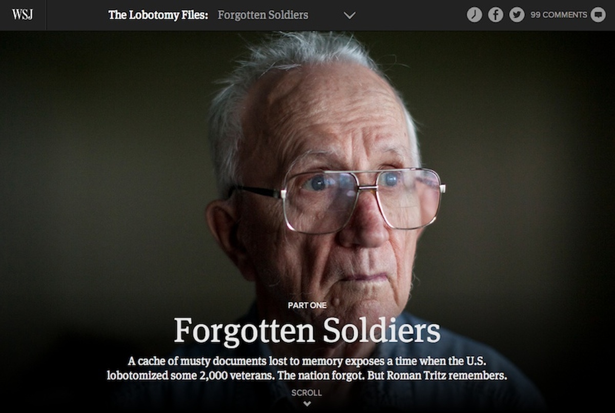
Building “The Lobotomy Files”
How the Wall Street Journal cobbled together a CMS and built the project
The Lobotomy Files project was months in the works, first in the reporting stage, then in designing and building. This is only the second “immersive” story we’ve built (the Trials series being the first), and we’re still finding our legs.
Michael Phillips reported and wrote a great story and gathered a massive trove of documents and photographs in the process. The regular WSJ.com article type wouldn’t have done the content justice, and that’s really what made this it a candidate for custom treatment.
As an interactive graphics team, we’re not used to working with long-form content. It’s a little like asking furniture makers to build a house: we’ll figure it out, but we’ll make it up as we go, and we’ll probably favor the tools we’re familiar with. Which is how we came to use Django as a long-text content manager.
Makeshift CMS
We use Django to manage a lot of our tools and templates because it’s easy and familiar to the reporters and editors who use them. To use Django as a content manager, we added CKEditor—a rich text editor that works as a plugin and wraps text content in HTML markup. Each story had its own entry in a single table with fields for title, subtitle, story id, and body copy.
We had never created a long-text CMS before, so we approached it as a logic problem: how could we store long text in the database and give an editor a simple tool to manage visual elements like photos, slideshows, documents and pull-quotes within the layout?
Rather than build separate tools for each type of element module, we set up a generic form that could work with each. Some fields were common: name, type, column width, source. Others were specific to certain modules: documents needed a thumbnail and a large image (or images), slideshows needed multiple images and captions, and pull-quotes needed a text string. We set up 10 fields that could be used different ways for different modules, and stored them all in a single table, separate from the story data.
To integrate with the body copy in the stories table, we added blocks of text wrapped in div tags within text editor. For example, if I wanted a slideshow to appear at the end of this paragraph or off to the side, I would add the following:
***
<div class="module">WWII Slideshow</div>
***
Why the asterisks? Great question! Because we needed a delimiter. We used PHP to pull the tables from the database and encode them as JSON, then loaded the body copy to the page in an Ajax call. The body copy comes out of the database as a single string, complete with markup. But if we run a split on the string <p>***</p> it breaks the body markup into an array, and we can iterate through it in a loop.
We loaded the element modules as a separate object and indexed them by name. That way the text string within each module tag (“WWII Slideshow” in the example above), could be used as the key to look up the module object. As our JavaScript iterated through the markup array to load content to the page, story markup loaded as it appeared in the database. But module objects were passed to individual functions that wrote additional markup specific to the type of content: slideshow, document viewer, pull-quote etc.
So that was the CMS! It was a little messy, but it did the job.

The Django CMS: it’s what you do with what you got
Responsive Page Layout

The grid we worked from
I had never used the Bootstrap.js framework before but kept coming across those signature “row” and “column” classes when looking to other immersive projects for inspiration. I quickly realized why.
First, Bootstrap has an easy-to-use responsive grid baked into the CSS. Simple column tags allow you to control container width on desktop, tablets and mobile. Of course this thing had to work everywhere, and Bootstrap did the heavy lifting.
Second, Bootstrap has a simple slideshow/carousel component, so I wouldn’t have to write one from scratch. We used Bootsrap’s carousel logic for the slideshows and to build the document viewer.
Best of all, the “row” convention gives you an easy scaffolding on which to hang content. We used a 12-column grid at 1280px wide. In that grid, six columns of text with a four-column image or pull-quote floats pleasingly on the right side, then repositions to flow inline for tablet and mobile. As we iterated through our markup array on page load, we wrote a new div with the “row” class after the each module loaded to the previous “row.” It’s really just a long column of stacked 12-column boxes.
The Modules

The document slideshow

The split screen
The documents were the hardest to figure out. Much of the source material came from the National Archives. Michael Phillips had photographed these 60-year-old memos and letters while doing his research. Some were yellowed and torn, some were hand written … they had character. It didn’t make sense to put them in Document Cloud or Scribd because the text wouldn’t be selectable, and because there were so many of them. The documents needed to be there, but we didn’t want the reader to feel obliged to read a three-page memo between paragraphs in the story. We settled on the split-page convention early on as a way to keep them from breaking up the layout.
A couple of documents stood out though, and we did want the reader to linger on them. The highlighted step-through evolved from a simple slideshow of highlighted pages, to the more elaborate stack of sliding pages you see in the finished version. To achieve the effect, we animate the page positions and fade them in and out with jQuery.
The fading full-screen images and vertical slideshows became the centerpiece of the layout, but we stumbled upon the effect by accident. We knew we wanted to feature a lot of the photography as large we could, but stacking four or five images vertically felt like a lot of real estate to cover between sections. Layering the images gave us a way to condense that to the height of a single image. We toyed with conventional slideshow language like thumbnails and previous/next buttons, but it didn’t feel right. Someone suggested scroll triggers, which is how we came across the Scrollorama.js library.
The Fade Effects
Scrollorama.js combines scroll position triggers with CSS effects and animation. It’s bundled with the Greensock.js tweening library, which makes simple animations easy to control. We pinned the lead images in position for a duration of 70% of the window height. So, let’s say you have a 1000px window height, and you scroll down through a fullscreen image. The image holder gets a fixed position for as long as it takes you to scroll 700px, and a Greensock.js timeline enables you to animate or fade things in or out at any interval along that 700px continuum. That’s how we controlled the subtle vertical caption movement and faded the photos in and out.
Summing Up
As I said at the beginning, this is all pretty new to us. We learned a lot producing Trials and The Lobotomy Files, and plan on doing more in the future. But we’re still a phase of learning, both in terms of how to think about long-form content and what kind of tools we need to solve new problems. Next time out may produce an entirely different set of challenges, and we’ll deal with them as they arise. In other words, we’re still a furniture shop, but we’ve dabbled in building houses.
People
- Chris Canipe
- Jarrard Cole
- Madeline Farbman
- Dov Friedman
- Robert Libetti
- Adele Morgan
- Joe Shoulak
- Araby Williams
Organizations
Credits
-
Chris Canipe
News graphics and data viz @axios. Formerly @wsjgraphics.