Learning:
Choosing the Right Map Projection
Michael Corey’s guide to smashing the earth for fun and profit

The USA four ways
Nearly all maps are an attempt to represent our environment (generally Earth) in a two-dimensional format. The act of systematically transposing a 3D to a 2D object is called projection, and it’s a key concept of cartography, the art and science of making maps.
If you’re already familiar with projections and how they work (and often don’t work), jump down to see my process for choosing and using them in news interactives.
In one sense, making a projection is always a futile effort. Why? Because the Earth is not flat: it’s a spheroid. And it’s impossible to completely accurately flatten a spheroid.
Ever since the first cave-cartographer etched the first mammoth-driving directions to the local watering hole on to the wall of a cave, that impossibility has meant making compromises in accuracy. Done poorly, the result is a bad map: at best an ugly one, and at worst one that dramatically misrepresents your data and its context. But once you know a few of the rules, map projections are your key to prioritizing accuracy, readability, and aesthetics that are appropriate to your unique situation.
Will the Real U.S. Please Stand Up? (Mercator and His Discontents)
Let’s start with a real-world example from my work. Which of the four maps above is the real United States?
Well, none of them is accurate, of course. But which looks right to you?
Chances are, you probably are most comfortable with the map at the top left. This is what we’re all used to seeing, not least because it’s the view of the United States you get in Google Maps. In many of the news applications I build, it’s a perfectly good canvas for overlaying points on a map.
But it’s not always the best choice. At the Center for Investigative Reporting, we wanted to show the value of homeland security grants awarded to state and local law enforcement (and even outlying territories) on one map. The challenge was how to get Hawaii and Alaska on the same map. If we wanted to use one of the standard “slippy map” APIs (Google Maps, Leaflet, OpenLayers, Bing—the kind of map you can drag around)—there are two easy options. The first is to make the default view the lower 48 states, and to not show Alaska and Hawaii unless someone chose to drag the map there. The second option is to show all 50 states at one time, which means every state besides Alaska would be too small for a user to click on or even easily see.

The United States with Alaska and Hawaii in Mercator—a bad map.
Neither of these options were OK with us. Alaska and Hawaii are both states with small populations, true, but they also have a lot of spending per capita, and thus were important to prominently include. So we chose a third approach; we used insets for outlying areas, but there’s still a problem. Which Alaska is the real Alaska?
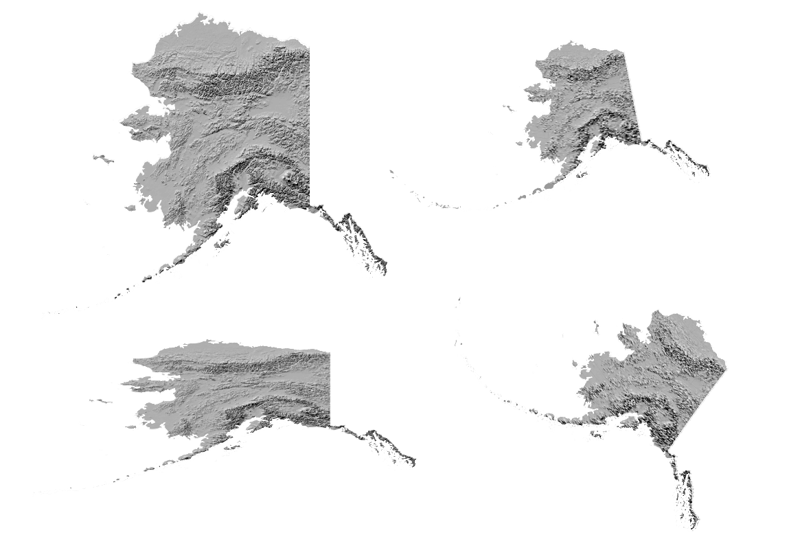
Alaska in several projections
Which is the real Hawaii?

Hawaii in several projections
In both of these examples, the first image is based on the same projection as that upper left corner map in my first example, called a Mercator projection. Frankly, for Hawaii, it’s not a terrible choice. But Alaska is a different story. As any Alaskan will tell you, Mercator makes a mess of it.
Yet that terrible Alaska map is probably the version you’re most familiar with.
But why is Mercator likely to be the projection you’re most familiar with? I’ll give you two choices for who to hold responsible. You can blame Uncle Google (who adopted a modified Mercator projection in the first year of Google Maps in 2005) or you can blame Uncle 16th Century Flemish Cartographer Gerardus Mercator.
Mercator’s projection is by far the best-known by laymen, and it’s the most common world map you’ll generally see. Map zealots are down on poor Uncle Mercator, but I’m here to tell you that Mercator is a perfect example of how a given map projection can be hugely helpful or quite misleading depending on the situation.

Mercator world map
The big beef against Mercator is that it makes Greenlanders feel too good about themselves. It makes areas near to the Earth’s polar regions (Greenland, Alaska and Antarctica, for example) look much larger than they are relative to areas nearer to the equator. This is because Mercator’s balancing act in flattening the globe involved, in effect, stretching the far northern and far southern parts of the world out like silly putty until he had a flat, rectangular map. In the image above, you’ll notice that Greenland appears nearly as large as South America, which is wildly untrue: Greenland has an area of about 836,300 square miles, compared to South America’s 6.9 million square miles. Why did such a crappy map become ubiquitous?
Because the tradeoff for all that distortion in areas where most people don’t want to go (sorry, Greenland) is that it’s a really handy tool for sea navigation by compass—the main reason maps existed for most of the last 500 years.
Think about the maps in the back of the in-flight magazine on an airplane—the ones with all the curvy lines between destinations. This is a good illustration of a phenomenon common to many global projections: a straight-line course between two points on the globe actually appears as a curved line in 2D. And it’s pretty hard to measure distances and angles between curved lines. That’s the brilliance of Mercator’s projection—on a Mercator map, straight courses over the ocean can be accurately drawn as straight lines. Sailors could also easily and accurately calculate the headings they needed by simply measuring the angle between their straight-line courses and Mercator’s straight meridians.
Most of us are not currently navigating on the high seas, however, so shouldn’t we just ditch that dinosaur?
Many cartographers will tell you we should, but when it comes to building interactives for the web, I’m here to argue with them a bit, for two reasons:
You might throw off your users by presenting them with an unfamiliar map of a familiar place, wasting mental energy that should be focused on your data findings.
On a purely practical level, not using Mercator sometimes means you’ll need to use some software that isn’t made for the casual web developer on the street. (Though D3.js does have built-in support for some projections.)
For the times when you genuinely do need to go beyond Mercator, here’s the process I use to make an informed projection choice. Let’s start with the basics.
Pick Your Poison/Choose Your Medicine
The first step in knowing which projection to use is the same as the first step in any visualization: ask yourself what is the most important thing to get across. For example, if you want to show concentric rings of distance around a central point, especially in a limited geographic area (a town or a state), you would use a different projection than if you want to show points across a large nation like the United States. In the first case, you would prioritize a projection that preserved precise angles and directions between objects in a area over a projection that would preserve the areas of similar-sized shapes over a wide geographic area. You can’t really have both.
In most cases, your choice will be significantly informed by the size of the area you care about mapping at any one time.
Mapping Large Areas
When you’re mapping a large area, like the continental United States, the first concern is making sure that the projection you use is going to represent the entire map area reasonably well. Lucky for you, mapping agencies everywhere have often already flagged a good projection for whatever country you’re interested in, so your first stop is to look for that.
Let’s take the United States, for example. Here’s the U.S. National Atlas Equal Area projection:
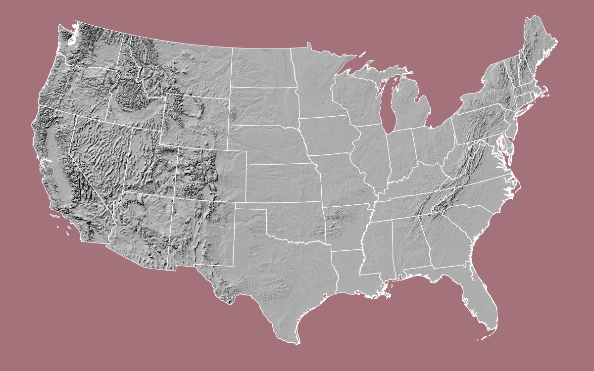
U.S. National Atlas Equal Area Projection
The major difference you’ll probably notice off the bat between this and Mercator is the border with Canada in the western half of the United States: Instead of being a straight horizontal line, it’s curved. By solving the mathmatical problem of how to flatten the globe differently, Albers does a much better job of showing each state in proportion to all the others than something like Mercator.
So problem solved, right? Why don’t we just all use Albers? Because the U.S. National Atlast Equal Area projection is heavily optimized for the characteristics of the United States: wider east to west than north to south. South America, for example, is the opposite and requires different projections.
If you have looked around and still haven’t found a good answer, you can also try out this amazing tool to help choose a projection.
Mapping Small Areas
When you’re mapping a smaller area, like a city, you don’t have to worry as much about distortion as you get farther away from the center. But since you’re much more zoomed in, precision becomes a primary concern.
If you measure the distance between a city in Colorado and a city in California and you’re off by a half mile it’s no big deal. But if you’re giving someone walking directions to a restaurant near her office, being a half mile off is pretty unacceptable.
For a regional map—a few counties, or even many smaller states—a UTM (Universal Transverse Mercator, not the same as a Mercator, confusingly) projection might be a good choice. One of the biggest advantages of a UTM is that measuring distances between two points is a snap. Measuring distances between points in more familiar latitude and longitude degrees requires some pretty complex math, though modern software tools often have distance calculations built in. But in UTM, there are no degrees—the map units are measured in meters. That makes for high accuracy, easy math and easy conversions.
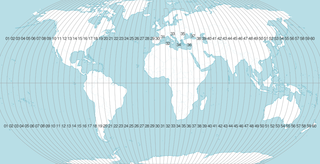
UTM zones
The trade-off is that this trick only works over relatively small areas. UTM keeps distortion down by dividing the earth into 60 zones, each of which is about 300-475 miles wide east-to-west, depending on what latitude you’re at. Inside that zone, and usually into the next zone east or west, measurements are quite accurate. But that accuracy fades the farther away from the origin you get. That means you need to know which zone your map area is in, and it makes UTM a poor choice for national or world maps.
How to Project Your Map
OK, you know which projection you want to use, but how to do you get it into that projection?
There are numerous options, depending on what technology you’re using. The common currency of spatial data is the ESRI shapefile, so we’ll stick to that for this article. (If you’re database-inclined, I’d definitely recommend looking into PostGIS, but that’s another article.)
There are a few steps to getting your map projected correctly:
- Determine what projection the map is currently in
- Tell your software of choice what the new projection will be
- Convert!
- Save your new map with a useful filename so you can tell what you did later
Determine what projection your source map is in
This will vary with what kind of spatial file you’re using, but we’re assuming shapefile.
A shapefile actually is a folder containing several files. There are sometimes more, but shapefiles almost always have a .shp, a .dbf and a .prj file. As you might have guessed, the projection information is in the .prj file.
Here’s a .prj file from a California shapefile:
GEOGCS["GCS_WGS_1984",DATUM["D_WGS_1984",SPHEROID["WGS_1984",6378137,298.257223563]],
PRIMEM["Greenwich",0],UNIT["Degree",0.017453292519943295]]
Well, that’s helpful, right? Thankfully, you’re not on your own. Spatial software like Quantum GIS or ArcGIS will figure it out for you.
In Quantum GIS, for example, in Layer Properties > General > Specify, you can see that the program has identified the projection (using the .prj file) as EPSG 4326. That EPSG code is an example of an SRID (Spatial Reference System Identifier) — a unique, shorthand code that identifies the projection. And once you have an SRID, you’re in business. Nearly every piece of spatial software will project whatever you want into whatever project you want, as long as you know the SRID you have and the SRID you want.

Incidentally, EPSG 4326, also called WGS 84, is a very common spatial reference system, and many of the shapefiles or other spatial data you ever download will be in SRID 4326.
Technically, WGS 84 is not even a projection, and this is an important distinction. SRID 4326/WGS 84 is an example of an un-projected datum. A datum is a mathematical model of the earth as a spheroid, and there are actually quite a few different ones in use. Every projection has a datum under the hood, but a spatial reference system is only “projected” when it has been mathematically translated to a 2D surface. Since SRID 4326 coordinates are still in degrees representing points on a spheroid, they’re not projected. The U.S. Census Bureau uses another un-projected datum, NAD 83, when it releases most (if not all) of its shapefiles.
Unfortunately, in many cases, the spatial data you receive from a government agency or other source will not include projection information. This is annoying—never do this to someone when you become a powerful government GIS official—and it can be a difficult problem to solve.
Do not guess! Even if you find that your data seems pretty close to a known projection, different projections use completely different mathematical models of the earth’s spheroid, which can make your points appear a long distance from their actual locations.
First, check the agency’s website to see if they have a projection that all their spatial data is released in. As long as you got the data directly from them, you’re OK in this case. If you don’t find that clearly stated, contact the agency that created the data, and insist on speaking with a GIS person—no one else will have any idea what you’re talking about.
Find the SRID of your target projection
There are a few ways you might find the SRID of the new projection you want. If you found the projection on a government mapping site, the site might list the EPSG ID of the projection.
If you’re not lucky enough to have an SRID in hand, your next best friend is a search engine and spatialreference.org. For example, if you need to look up the Google Maps Mercator projection, just search “Google maps projection EPSG” in Google or Yahoo. You’ll actually get a number of different answers, but EPSG:3857 comes up the most. Of course we’re not just going to take the search engine’s word for it. Now go to spatialreference.org and search EPSG:3857 to see if that makes sense.
And at http://spatialreference.org/ref/sr-org/7483/, we get this description:
EPSG:3857 — WGS84 Web Mercator (Auxiliary Sphere)
Projection used in many popular web mapping applications (Google/Bing/OpenStreetMap/etc). Sometimes known as EPSG:900913.
Ding! Ding! Ding! We have a winner.
You’ll notice that there are a few numbers here: EPSG:3857, 900913 (hint: it spells “Google,” and isn’t really an official SRID), and SR-ORG:7483. Always go with the EPSG code when available—it’s the most widely used system by far.
If there’s no ID, the agency might list a projection name like “California State Plane system.” The U.S. state plane coordinate system divides regions of each state into zones, which each use their own, slightly different projection. This makes things a bit complicated if your map covers a large area, but the advantage is a high degree of accuracy for local maps (like a city or metro area).
In a case like this, you’ll need to figure out which zone your map covers. Let’s take another California example. Los Angeles county is in Zone 5. So if you’re mapping LA, a good choice would be California State Plane Zone 5. If we search “California State Plane Zone 5 EPSG” in Google, the top result includes a list of projections:
SPCS ID Datum and Grid Name EPSG ID 203 NAD83 / Arizona West 26950 301 NAD83 / Arkansas North 26951 302 NAD83 / Arkansas South 26952 401 NAD83 / California zone 1 26941 402 NAD83 / California zone 2 26942 403 NAD83 / California zone 3 26943 404 NAD83 / California zone 4 26944 405 NAD83 / California zone 5 26945 406 NAD83 / California zone 6 26946 501 NAD83 / Colorado North 26953 502 NAD83 / Colorado Central 26954 503 NAD83 / Colorado South 26955
Looks like EPSG:26945 is our winner. And spatialreference.org agrees.
Convert the shapefile to the new projection
In Quantum GIS, this is as easy as right-clicking the layer you want to project, choose Save As, then choose Browse next to CRS (that stands for coordinate reference system), and search by EPSG.
Save your new map with a useful filename
This seems like a minor point, but I have maybe 10 identical shapefiles of the California state border in different projections. Do yourself a favor and include the SRID in the filename (e.g. california_border_4326.shp).
Insets
Let’s get back to the police grants map we started talking about at the top. As I said earlier, we decided that insets for Alaska and Hawaii were the way to go. But that doesn’t mean we should use the same projection for the insets as we did for the main map—in fact, using the same one in a case where you’re using insets is often a pretty bad choice.
Check out what happens to Hawaii when we put it in EPSG:2163, AKA U.S. National Atlas Equal Area Projection, the projection we used for the main map.

Hawaii tipping over
The point is: find the best projection for each individual inset.
Where to Go from Here
If you can believe it we’ve barely scratched the surface. I’ve left out a lot about the theories and terminologies behind each projection system in the hope that you’ll get your feet wet, get hooked, and come back for more. Start here: Map Projections: From Spherical Earth to Flat Map Projections presentation by Nathaniel Kelso (Apple, formerly Stamen Design) (Slides 47-55) D3 and the Power of Projections
So send your geometry teacher a thank you card, because it’s about to get nerdy as you start practicing the best ways to slice and dice the planet.
Map data sources: Natural Earth, U.S. National Atlas, U.S. Census Bureau, National Geospatial-Intelligence Agency
Credits
-
 Michael Corey
Michael Corey is a senior news applications developer at Reveal. He specializes in mapping, science, front-end Web development and interface design. Keep Reveal weird.