Learning:
How and Why Cross-Disciplinary Collaboration Rocks
Wes Lindamood explains the magic of working together from the start with a UX-driven process
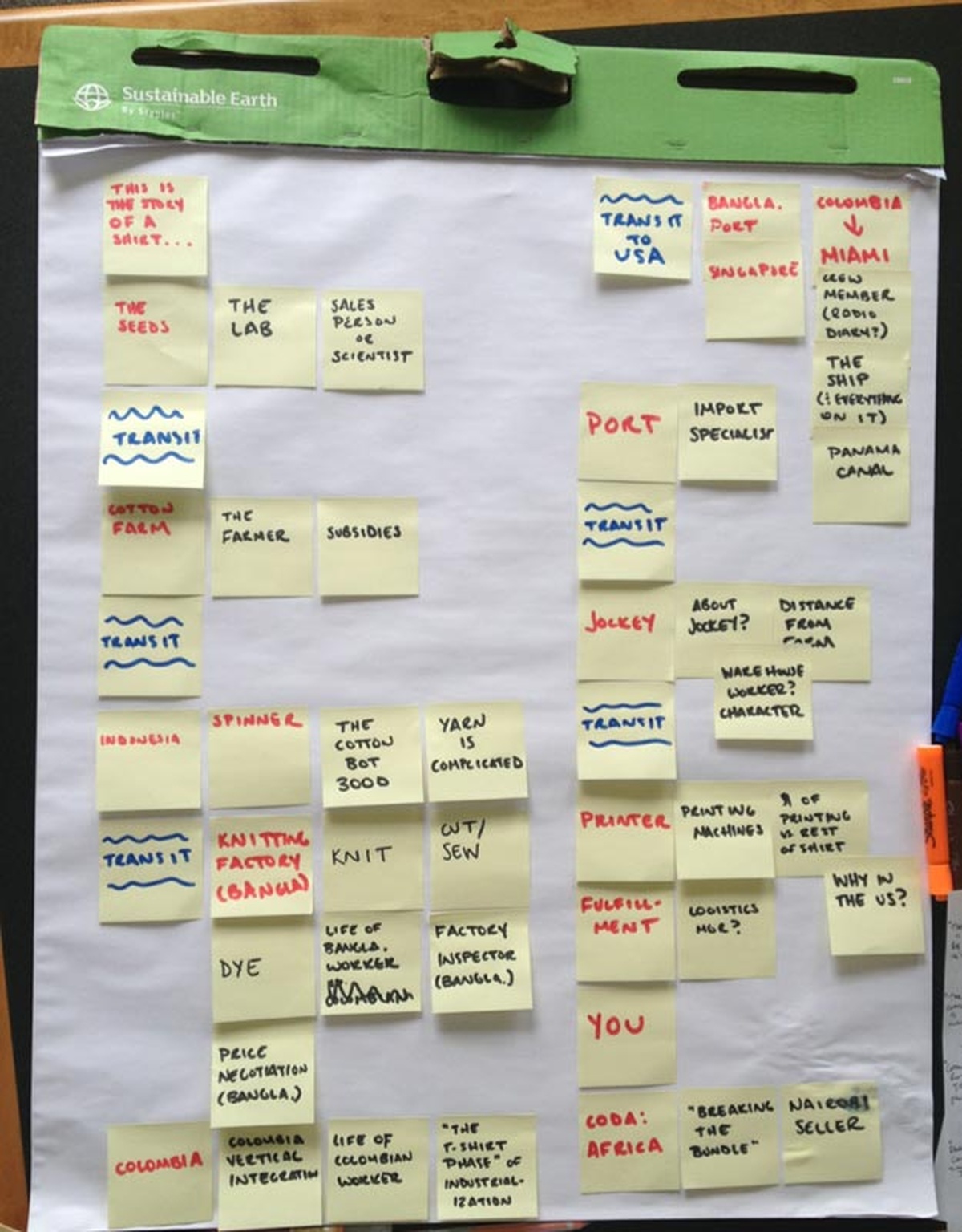
The initial content inventory for the T-shirt story Credit: Brian Boyer/NPR
Editorial note: Back in April of this year, NPR’s Planet Money began a Kickstarter campaign to learn about and report on global supply chains by making a t-shirt and telling the story of its creation from start to finish. The Planet Money team sought $50,000 to fund the project and received nearly $600,000, allowing them to expand the scope of their reporting and presentation. The newly combined News Apps and Multimedia teams at NPR collaborated on the project’s web manifestation.
Here, Wes Lindamood, an interaction designer on the project, explains their collaborative, cross-disciplinary process, the UX design aspects of the project, and how the team integrated UX design thinking into interactive development.
None of us on the design/development side of the project had worked on such a video-heavy project before. We knew we wanted to go beyond simply placing a 20 minute video inside a standard story template. The question facing us was how?
To answer that question our team of eight people from the newly combined News Apps and Multimedia teams and from Planet Money combined our varied backgrounds in reporting, audio production, video editing, agile development, photo editing, and interaction design. We pulled in best practices from all of these disciplines and strove to develop a common visual and storytelling vocabulary that would help us build a cohesive experience for users that felt natural to the web.
Often in editorial settings, the design team is brought in after the story has been reported. I cannot emphasize enough how important it was to this project that the entire team was involved in this process from the beginning. Collective brainstorming sessions were crucial to forming a shared understanding of the story to be told. It allowed reporters to consider content that would lend itself well to a web-native experience while they were in the field, and allowed the design team to begin to consider the presentation of the story, even as we were working on other projects.
Everyone on the team had a shared vision for the story goals, and an understanding of the importance of user-centered design thinking. By user-centered design thinking, I mean considering all story and interface decisions you make in a project from the perspective of the people you hope will experience the story. At its core, user-centered design is about empathy for your audience. We stripped our UX process down to its essentials and folded what we felt were the most important aspects of UX design into a highly collaborative cross-disciplinary project process.
Working in one week iterations, our UX process consisted of a research stage, an ideation and prototyping stage, and a design, testing and iteration stage. What follows is an account of how this UX thinking informed the storytelling process at each stage of the project.
Project Kickoff: a money story, a process story, and a people story
When embarking on a new product or story, the first thing a UX design team will do is collect research and take a first pass at story and interface design approaches that best meet the needs of the target audience. Fortunately, there was no shortage of information to work with for the T-shirt project. The idea for this project had been percolating in the minds of the Planet Money team for over three years. The research and reporting they had already done fueled a kickoff brainstorming meeting with the NPR Visuals team and Planet Money about potential directions the web experience could go in. The brainstorming consisted of listing out key questions the story needed to address. Any and all questions were written down, organized and considered from the perspective of the audience we pictured enjoying this project. To make the idea of the audience more tangible, the team went through an exercise in which we identified our audience(s) for the project, what their needs are and what functionality could be built to satisfy those needs. For example, one group of users were those who contributed to the Kickstarter campaign that paid for this project. Key questions for this audience that the story needed to address were: “what are the lives like of the people who make my shirt?” and “what are the steps involved in making a shirt?” Seems obvious, but listing out questions in this way provides a method for thinking about the story and features in a structured way.
By the end of the brainstorming meeting, the team had condensed these ideas into a detailed content inventory and a brief goals statement that highlighted key aspects of the story we wanted to tell. The distillation of the brainstorming into these artifacts offered guidance to the entire team before reporting began.
In the weeks that followed, the reporting and editing team put together a shot list, discussed the visual tone of the photography and videography, and traversed the globe reporting on the making of a T-shirt. Back at NPR headquarters, the design team prepared for the next stage of the process by forming a hypothesis about how the story might be presented online.

Robert Smith and Jess Jiang interview the Indonesian yarn spinning king, Benny Soetrisno. Credit: David Gilkey/NPR
Ideation and Prototyping
As content from the reporting began to roll in, we knew we had a good story in our hands, and a large task in front of us. With a hundred hours of video, multiple gigabytes of photos, hours of audio, and a vast amount of economic data to sort through, we needed to figure out how to transform all of this great content into an compelling experience that felt native to the web. Building upon research gathered in the brainstorming meeting, the Visuals team met with the project’s executive producer, Alex Blumberg, and video director Josh Davis to assess the reporting from the field. The content inventory we’d put together proved to be durable, and though it wasn’t an exact representation of the final story, it jumpstarted our exploration of how we might build the online experience. As Alex was was working on an outline of key concepts he wanted the story to address, the Visuals team worked on story structure diagrams, paper prototypes and mood boards that would help us come to a shared understanding of a design approach.

From left, NPR Visuals team members Wes Lindamood, Kainaz Amaria, Claire O’Neill, and Alyson Hurt discuss the structure of the T-shirt site. Credit: Brian Boyer/NPR
As a group, we looked for prominent examples of long-form and immersive storytelling to help guide our thinking and ideas. From stories about lions and motorcycles to bushfires and architecture, we cast a wide net and assembled a list of characteristics for many of the projects we admired. To clarify what we found inspiring about these projects we examined the structure, behavior and presentation of each project and organized this research into a series of story structure diagrams and mood boards.

In addition to looking at the behavior and presentation of sites we admired for inspiration, we studied their underlying information architecture. Credit: Wes Lindamood/NPR
Story structure diagrams

The story structure diagrams helped us develop a shared vocabulary for discussing the most important aspect of the T-shirt design, the underlying information architecture. Credit: Wes Lindamood/NPR
The story structure diagrams served as a way to visualize the underlying information architecture of the stories we admired. Beyond serving as a way to study effective storytelling patterns, the story structure diagrams helped us develop a shared vocabulary for discussing the most important aspect of the T-shirt design, the underlying information architecture. This became really important as we started to hone in on a design approach. If the underlying organization of the story was flawed, we knew the behavior and presentation of the experience would be irrelevant.
Mood boards
Having come up with a way of discussing the most abstract aspects of the design, we moved on to exploring approaches to the behavior and presentation of the story. Our goal was to build a quiet interface that got out of the way of the user and invited them to explore the story in a focused way. There are other web-native stories that achieve the goal of creating a focused experience, but unlike more established pattern libraries in user interface design, best practices in web-native storytelling are nascent, and each story is unique.
To give us a framework for discussing what it meant to create a quiet interface, we used mood boards which consisted of screenshots of other projects that we felt embodied a quiet visual experience. In critiquing the screenshots, the notion of a quiet interface became less abstract, and the behavior and presentation we desired for our project began to come into focus.
Paper prototypes and sketches
The story structure diagrams and mood boards provided us with a visual vocabulary for discussing the desired structure, behavior, and presentation of our project. And combined with our content inventory, we now had a shared understanding of what we wanted to build. To condense all our thinking into a tangible guide, we sketched out rough drawings of what we wanted our project to look like. On their own, these low fidelity drawings do not contain enough visual information to express the complexity of what we were trying to build, but paired with the shared understanding we had cultivated with our prior research they provided the right amount of detail allow us to begin development.

Paired with the shared understanding we had cultivated with our prior research low fidelity drawings like this one provided the right amount of detail and allowed us to begin development. Credit: Claire O’Neill/NPR
Design and Iteration
In general, we prefer to minimize the amount of documentation we write that describes how the project should look and behave, and let our code be the documentation of our design decisions. In the T-shirt project, the prototyping gave us enough clarity on a design direction that we could condense our vision for creating a quiet interface into a hypothesis statement:
Tell the stories of the people we meet and the journey of the materials via video and explain the economics behind this complicated journey in text.

The site map we used to discuss the T-shirt site's information architecture. Credit: Claire O’Neill/NPR
Elaborating on this hypothesis, we created several sub-hypotheses about how the interface should work:
- Strike a balance between a video-driven experience and a text-driven experience.
- Present provocative questions in the videos that draw users into the text.
- Be opinionated in the interface about how users should experience the story.
- Provide navigation cues to users that make it easy for them to control how they would like to experience the story.
- If it doesn’t work on mobile, it doesn’t work.
Strike a balance
Striking a balance between a video-driven experience and a text-driven experience was one of the fundamental design challenges of this project. In our exploration of other stories that combined multiple forms of media, the result often felt distracting or disjointed. Text introduced into a video-driven experience runs the risk of disrupting the rhythm of the story. And videos inserted into a text-driven experience often feel like sidebars that are an optional part of the story. To avoid these pitfalls, we created a dual experience that would allow users to watch the process story of how our shirt got made in a layout optimized for viewing video, and explore the economics behind this global journey in a layout optimized for text. It made sense to us that complicated economic concepts were best explained in text and graphs, and the highly-visual process story be told in video. The challenge this introduced for us was figuring out how to make the two ways of experiencing the story feel integrated.
Present provocative questions
One way we hoped to bring the video and text closer together was by presenting provocative questions in the video that would motivate users to want to dig deeper. In addition, we teased to the economic explainer below the video, with a subtle text prompts. Related to both the video and text, the prompt served as a bridge between the two. Because the videos and text were conceived of in-tandem and not a product of separate workflows, our hope was that the bridge between these two modes of experiencing the story would be strong.

By teasing to the economic explainer below the video with a text prompt about the recipe for yarn, we hoped to bring the video experience and text-focused experience closer together. Credit: Wes Lindamood/NPR
Be opinionated about the interface
To strengthen the relationship between the video and text further, we treated the interface as an expression of editorial intention. Within the interface we embedded cues that would help maintain the narrative flow without taking control away from users.
To strike this balance between a directed and interactive experience, we knew that any interactivity we added that directed the user’s experience needed to be subtle. For example, the video-driven content is the emotional heart of the story and we knew we wanted direct users to experience that first. By leading with a full screen, focused video experience and limiting the number of choices available, we placed an emphasis on watching the video first. Five seconds before the end of a video, as the audio begins to fade out, we trigger an event that automatically scrolls the user down the page into the text portion of the experience. This opinionated action sends a signal to users to consider the relationship of the text to each video.

Five seconds before the end of a video, as the audio begins to fade out, we trigger an event that automatically scrolls the user down the page into the text portion of the experience. This screenshot illustrates the result of the auto scroll down the page in the people section of the site. Credit: Wes Lindamood/NPR
Upon reaching the text, we provide contextual navigation to the next chapter to allow users to regain control of the experience and choose whether to continue their journey to the next chapter or dig into the current chapter in greater depth.
Our ultimate interface goal was to remove any friction from the experience that would inhibit users from enjoying the content they were most interested in. By making the text part of scroll below the video, users are not forced to experience video first, although they are guided to do so. Chapter navigation is always available so that users can jump ahead in the experience, if they choose. The contextual navigation to the next chapter merely suggests direction.

A screenshot of the Cotton section of the project as seen on small-screen devices. Credit: Wes Lindamood/NPR
Last but not least, we set out to build a fully responsive multimedia experience. If users wanted to start the story on a mobile device and continue on a tablet or desktop, we wanted that to feel like a seamless and natural experience.
Putting it all together
Having worked through all of these goals, we quickly sketched some visual designs that could serve as a reference point and jumped into a series of 5 one-week cycles to develop the designs. Starting the first cycle with the app template we use as project skeleton for almost all of our work, all interaction design activity happened in code from here to the end of the project. In each successive cycle we added functionality and fidelity to this foundation that would result in the final design. Along the way, we conduced user testing in the newsroom that would challenge and shape our thinking about our editorial and design decisions.
Usability Testing in the Newsroom
We didn’t build formal user testing into our schedule from the beginning like we should have. Given that, it would have been easy to say we just don’t have time for user testing. I’m so glad we didn’t do that. Despite the fact that the testing was done in an ad hoc fashion, we learned that ad hoc testing is better than no testing, and in this particular case it was extremely valuable.
Our testing for the project was comprised of two stages. First, as part of our iteration reviews we regularly gathered feedback from stakeholders that were one step removed from the scrum of daily work. Their distance from the project allowed them to look at the story with fresh eyes and identify issues that were not as visible to those of us who were close to the content.
Our stakeholder feedback and team critiques provided us with a set of key editorial and interface questions that we needed to put in front of users. From the beginning of the project, we knew we were taking a risk to telling a complete story by telling part of the story in video and part of the story in text. When stakeholders echoed this concern after seeing an early version of the project in iteration review, we knew we needed to test if the continuity of the story was suffering based on our approach.
To assemble a group of users to collect feedback from, managing producer Kainaz Amaria recruited colleagues from throughout the NPR. Employees ranging in age from 20 to 65 were recruited from the development, music, ethics, digital media, marketing and news teams to share their feedback on our work in progress.

Test participants recruited from across NPR offer feedback on a rough draft of the T-shirt site. Credit: Wes Lindamood/NPR
We prepared a test script to ensure the feedback we collected was consistent, and videotaped our test participants at their desks as they interacted with our project in as natural a way as possible. It was interesting to see that by treating the interviews with our colleagues as we would have if we had recruited participants in a more traditional way, they evaluated the project from a user-focused perspective, rather than looking at our conversation as a peer review or critique.
Upon completing the usability tests, interface and editorial issues around the continuity of the experience came into sharp relief. We learned that we weren’t appropriately setting expectations around the level of mental investment required on the part of the user to experience the story, and how all the parts of the story fit together. In addition, we learned that we had taken for granted that users would pick up on the global nature of the story.
Voice over narration in the videos that was designed to communicate the global nature of the story and direct users to the text-driven experience was not working. In trying to communicate the global journey, the narration was too subtle and in the case of guiding users to other parts of the experience, it was too direct.

Based on the feedback we received in testing, titling was added to the videos to emphasize the geographic location of the footage. Credit: Wes Lindamood/NPR
In the interface, the explainer prompt that was supposed to pose a provocative question that would pull users into the text-driven experience was doing more harm than good. All users noticed the prompt, and it successfully communicated more content, but more of what and where it would take them was unclear. Moving from video to text was visually abrupt and confusing. Some users thought the text below the video was supplemental to the videos and others thought it was redundant. When users actually read the content it revealed answers to questions they had, but the way it was presented was not drawing users in.

The wording of the prompts was adjusted to make them more generic and better relate to both the video and text. Credit: Wes Lindamood/NPR
To address these issues we made both editorial and interface changes:
- Titling was added to the videos to emphasize the geographic location of the footage.
- “Scroll to read” labeling was added to the explainer prompt that helped communicate that the page was a combined viewing and reading experience.
- The wording of the prompts was adjusted to make them more generic and better relate to both the video and text. For example, in the Cotton section our initial explainer prompt included the name of the cotton farmer, Bowen Flowers, who is featured in our video. This level of specificity was confusing. Users had not yet met Flowers and did not understand his role as a character in the video, or his relationship to the text below the video. This made the prompt distracting and frustrating. By going with a more generic prompt: “Three Reasons U.S. Cotton Is King” we discovered users better understood the role of the prompt as a bridge between the video and text.
- The copy below the videos was adjusted to better relate to the concepts explored in each video. For example, in an earlier iteration of the People section the copy introduced readers to Bangladeshi workers that the Planet Money team had reported on, who were not part of the video in this section. In testing, we learned that users had become emotionally invested in the stories of Jasmine and Doris, the central characters in the video, and introducing them to new characters in the copy diminished the strength of the People section. The copy was rewritten to place the story of Jasmine and Doris into a historical context and build on the video above, which resulted in a much more positive reaction to the People section overall.
- Easily scannable photos and graphs were moved to the top of the text section of the page to smooth out the transition from the video-driven experience to the text-driven experience.

Users saw a stronger relationship between the text and photos in the people section after we placed the story of Jasmine and Doris in a historical context through the use of diptychs, like this one. Credit: Wes Lindamood/NPR
While some of these changes may seem small, the adjustments had a huge impact on how the story was received. In follow up tests that we conducted, the glaring issues we saw the first time around were gone. You never know with certainty how a project will be received, but the testing gave us greater confidence in our approach.
At the launch of the project, the technical approach we ended up with was fairly basic and we certainly didn’t come up with a new storytelling approach, but I do count the collaborative cross-disciplinary approach we took to building the project as a big win. By using a modified UX process, looking at usability testing as a tool to understand the effectiveness of our editorial approach, and treating the interface as an expression of editorial intention, we strengthened the story. We hope to continue to refine our approach to integrating editorial and UX workflows and would love to learn how other teams are approaching the process.
Source has also interviewed team lead Brian Boyer about the project.
Credits
-
Wes Lindamood
Senior interaction designer @nprviz. Music and documentary film obsessed dad.


