Learning:
The Times Regrets the Programmer Error
Jake Harris opens a serious barrel of monkeys about when and how to issue corrections for data journalism
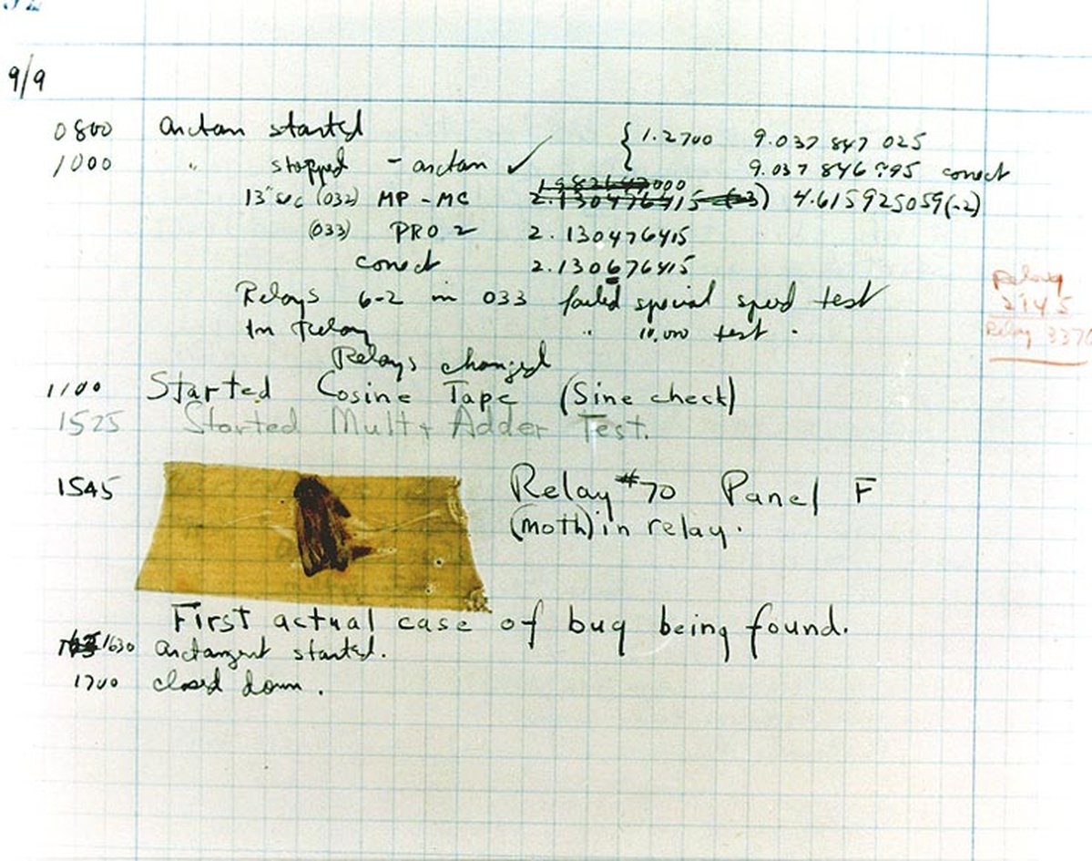
An actual bug in software. (Image: Wikimedia Commons)
It hasn’t happened yet, but there will be a day when the New York Times or another major newspaper will run a correction because of an error in a piece of data journalism. Corrections are an inherent part of journalism and we have standards for issuing them in traditional narrative reporting. It’s part of the process. Because we attempt to report on events as they are happening, we will make mistakes. As long as you have done your best to avoid errors, there is no shame in admitting when they have occurred, and corrections are an honorable and effective means to indicate problems with a story that arise after publication. In their pedantic specificity, corrections can sometimes be comical, but the rules for corrections are pretty clear: if you mess up a fact anywhere in the story, you issue a correction. But what about data?
A typical narrative news story probably contains a few hundred facts or so: names, quotations, locations, factoids, or numbers derived from official government sources. But what about a data journalism piece? Imagine an interactive for a large dataset like school test scores or campaign donations with millions of rows of data? Isn’t each of those records made of many different facts? Now, what if one of those fields is wrong? Do we mark it on the page for that school? Do we issue a correction on the front page? Do we just fix it and say nothing? What if the data has just been distilled into a high-level analysis and a story. The right answer depends on both circumstances and attitudes. In fact, I’m not sure there is a right answer at all. But before we discuss what’s right, let’s look at all the ways things can go wrong.
A Carnival of Errors
Data journalism does not fall perfect from the sky. It’s painstakingly built. As far as I can determine, nobody has formally explicated the process, but in my own experience it generally involves the following steps:
- Acquisition
- Cleaning
- Loading
- Verification
- Analysis
- Cherry-picking
- Presentation
- Maintenance
The fun of data journalism is that each of these steps can introduce errors that can affect the final story. Yes, such fun contemplating all the ways you can go wrong. Let the hilarity commence!
Acquisition, Cleaning, and Verification Errors
First, in order to report the data, you have to collect it. This is often not as straightforward as it sounds. They will try to stop you, although the line between malice and incompetence is hard to determine. I have seen data tables released in PDF to make them harder to work with and I have seen them released in PDF because the provider thought it was actually a useful format. Even friendlier formats like CSV or SQL dumps may be incorrectly generated. Files may be missing or truncated. And there is nothing that government agencies love more than making their own convoluted data formats.
Data often has to be cleaned and verified. Duplicate rows are common. Missing data is much, much harder to identify. Columns you think are fixed categories might actually be freeform text with typos and spelling errors. Typecasting can truncate numbers. Dates and times can be misinterpreted in so many ways. Without context, your computer can only guess “11/1/2013” could be November 1st or January 11th, and times will generally be assumed to be in your own timezone. Even more subtle bugs are possible. The code you write to clean data may introduce new errors into it. Once you have cleaned the data, you must verify it. Is it an accurate model to tell the story you wish to tell? What does it include? What does it leave out? If you are joining it against other data sources, is that combination accurate or does it make assumptions?
Analysis Errors
Scott Klein of ProPublica often describes a good data journalism project as containing both near and a far components. By this, he means that it allows the reader to explore overall trends (e.g., school ratings across the country) and examples specific to them (e.g., how is my local school doing?) Unfortunately, errors can creep into both of these analyses. The near picture can be plagued by missing data, shoddy geocoding, or other simple woes. Crazy outliers and duplicate records can distort many crude statistics like sums or averages in the far picture.
Publication and Update Errors
Publication sometimes has its own issues. Transforming a database into web pages often involves loading data into web frameworks and rendering them out. Errors can occur. Data can be typecast into formats that truncate or distort it. Table columns can run into each other, making new numbers out of two separate values. New programming errors may return wrong results. Maps might place locations in weird places. Sometimes, this is a result of poor geocoding. Sometimes, it’s another manifestation of my own personal bugbear; I hate it when maps geocode an area like "Chicago" or the "United States" by placing a single point in the centroid of the area. Together, we can stop this practice from happening.
And often, when you are done with this process, you will load it again in the future. The most compelling data projects are not static, they are updated with new data, whether it’s the next year’s school test scores or the next minute’s election results. What do you do with the old data? If it supplements the prior data, do you still provide the old values somewhere? If it replaces the old data, do you show where values were changed? What if it fixes noticeable errors in the original data? Do you give people a chance to replay prior revisions even if some of them are wrong?
An Example
Reporting election results can be a remarkably fraught process. Like almost every media organization, the New York Times retrieves election data from the Associated Press which employs a number of stringers to report results from local election officials. Vote counts are updated frequently during the course of a night until unofficial tabulation is concluded (official counts usually come out weeks or months later). Obviously, there are many opportunities for errors to occur, but let me highlight two scenarios from the September 10th primaries in New York City.
For this election, we were also provided with precinct-level reporting which makes for some pretty awesome maps, but it also led to transient reporting errors. For instance, for six or so hours, the data reported a surprisingly large victory of a 1,000 votes for longshot candidate Neil Grimaldi

Grimaldi wins!

No he doesn’t!
This was obviously a data entry error, since most precincts averaged approximately 128 votes and those 1,000 votes did not appear in Grimaldi’s citywide vote tally. Eventually the AP feed corrected the problem and our results map updated with a more accurate tally. Some readers did notice it, but it was enough to replace the data without issuing a correction because it’s accepted that early returns are likely to be corrected. In contrast, the AP data also erroneously reported the name of a city council candidate as Paul Garland (his middle name) instead of David Garland. Unlike the aberrant votes, this error did result in correction text being appended to the results.
A Corrections Policy for Data?
In both of these examples, errors appeared in the election data and were corrected in the interactive. But one of them merited a text correction and one of them didn’t. I think this makes sense in both circumstances, but it strikes me how difficult it was to find a data corrections policy enumerated anywhere publicly. Indeed, some fitful Googling revealed only this corrections policy from ProPublica:
News apps and graphics should follow your newsroom’s standard corrections policy. Observe the following additions: When data is incorrect, place the correction language on every page that once showed the incorrect data point. That may mean that a correction will appear on thousands of pages. When an app’s data is refreshed and the corrected data has been removed or superceded, remove the correction language to avoid confusion.
This is an admirable policy to follow, but it works best for only specific types of interactives that are published once using verified data and infrequently updated. For instance, in an election we are updating pages every few minutes, meaning a correction would quickly vanish. Should it? Or should we accumulate more and more corrections as the night progresses and transient reports are clarified? And if we computed citywide totals by summing up precinct votes, that erroneous precinct would lead to some distortion in the unofficial numbers. Should we report a correction for those derived figures too? I’m not criticizing the ProPublica policy here. The point is that thinking through ProPublica’s policy highlights the fact that that the world of data interactives is varied enough that it’s hard to find one policy that fits all.
What’s Next?
Maybe a unified policy is too much to expect. We could consider several different factors in specifying a correction policy for any specific interactive:
- Is the data updated rapidly or infrequently/never?
- Is the data official or provisional?
- Has the data been processed or is it direct from the source?
- Are derived measures like totals or averages included in the data or computed afterwards?
- Does the data include geocoded values or were those derived later?
- Does the interactive imply a specific level of accuracy that may be misleading?
And so on. What I’m suggesting here is that there is one optimal correction policy for the single-page static graphic, another possibly different one for a browsable site of school ratings, another different still for election or Olympics results where the upstream provider only promises the data will be eventually correct, not that errors will never occur.
It might be possible for an individual news organization to codify a data correction policy as a decision tree, although that might be a more arduous process than it sounds. We could then imagine data corrections being automatically applied in some cases, although we’d likely need to aggregate error reports to prevent the reader from being drowned in very specific corrections for each data point.
It would be a hard-fought achievement to merely catalogue all the types of errors that might occur in these steps of data journalism (I imagine them organized like HTTP status codes but far more numerous and with developer errors included).
I also wonder if we should always try reporting our data in such a way that replay is possible. One can imagine something like a single data table being committed into a source repository like Github to see the possibilities and pitfalls of this. The problem is, most interactives are not single tables. They often comprise entire databases. It might be difficult to let users replay the night. There may be reasons why the raw data can’t be shared. And many changes might simply be the result of new data coming in rather than errors in the original table (it would be nice to be able to annotate specific errors with corrections later). Still, the idea might be interesting to explore as a proof of concept on how to track changes to data in a similar way that NewsDiffs does for text. Similarly, would a machine-readable format make sense for presenting data corrections? How might that look?
Another approach is to get even more granular. What if we could easily generate an audit trail for changes to every bit of data in an interactive. A large number of errors can occur at the data-cleaning stage and an automated system that complements all data overwrites with an audit trail might be useful for verifying that no mistakes were made along the way. This seems pretty cumbersome for any of us to support, especially on deadline, so all most of us do is make backups and do our best. Is there a way to store data that would track all changes nondestructively and produce its own audit trail? Would this approach be useful for identifying errors or would it make us unable to see the forest for the trees?
No matter how we approach the problem, it’s clear our glorious data journalism future will be riddled with errors. But I’m not mistaken in hoping that we can figure out better ways to handle those errors when they arise.
Correct me if I’m wrong?
Credits
-
Jacob Harris
Jacob Harris is a Senior Software Architect who works with a kickass team of fellow newsroom developers at the New York Times.


