Features:
Elephants Count: Designing the Elephant Atlas
How we visualized and shared the many stories of Africa’s elephant population
The Elephant in the Room
In 2013, The Great Elephant Census embarked on a journey to understand the alarming decline of elephant populations across Africa. Coordinating with national parks and wildlife staff in 18 countries, the GEC undertook the first pan-African elephant survey in 40 years, creating an enormous wealth of standardized, cleaned, and checked African elephant population data. In 2016, The GEC and Vulcan partnered with us—The Office for Creative Research—to build the Elephant Atlas, which would tell the stories within this data and spur the public to action.
Although the the final number of elephants counted (352,000, down 30% in the last 7 years alone) told one macro thread of the story, there were many micro-stories hidden in the data: differences in population decline/growth across countries, the intertwining of outside factors like war and climate change, method changes across individual scientific studies, and so on. The challenge would be telling all of these stories in an accessible but accurate way that everyone from scientists to policy-makers to the general public could all learn from.
This was a challenge that appealed to us as a studio tremendously. We have a very diverse list of projects (from websites to interactive physical installations to live performances), but the unifying goal in all of them is to improve the public’s data literacy. We build tools and platforms that help people understand complex systems, act based on the learnings of a given dataset, and ask their own questions of the data themselves. With this incredible dataset, there was tremendous opportunity to build the platform such that we not only told the narrative of elephant population decline, but supported the open-ended user exploration and questioning that is at the heart of data literacy, curiosity, and engagement.
That gave us two main project goals:
To build a web-based visualization platform for The GEC and other elephant data, allowing for a thorough but clear narrative of the factors involved in elephant conservation.
To design an API that would be targeted to a wider range of users than just developers: one from which which the general public, policymakers, etc. could explore and generate their own visualizations.
The Process
We began with iteration and prototyping: the creation and continuous refinement of many small interactive experiments. This is a process most designers are familiar with, and for us, it allows us to discover what’s most interesting and compelling about the data, as well as the most clear and honest way to communicate it. Those insights snowball into new ideas for interactions and prototypes, which we iterate on until we come up with a concept for a final product.
Since there were so many facets of the story to tell, and so many potential subsections of the data to draw upon, we created a ton of prototypes—partially in service of the final platform, but also to help us understand the meaning of the data in the first place.
Prototype Ideas

For example, the dataset contained information on the hundreds of surveys that made up the final number. Each aerial survey was done by flying a particular route at a particular height and speed, with two participants in the back of the plane spotting elephants within a particular stripe of land. It’s all too easy to assume that data just appears out of the air, so we were keen to convey the scale of the human effort that went into the survey.

Also critical to convey: the sheer scale of the population drop. Our stakeholders referenced the “shifting baseline” that they saw occurring, where fluctuations in the current baseline were viewed as no big deal, even though elephant populations had dropped dramatically from a high in 1979.

The story also wasn’t the same in every country: although most countries showed a decrease in elephant populations, others have put policies in place that have had a significant impact on elephant recovery. We wanted to make sure these differences were called out, as the positive cases could serve as potential models for others to follow.
User flow
We also had to decide how users would move through the information. We wanted to support multiple levels of expertise, as well as multiple use cases (from the scientist digging for deeper information, to the curious member of the general public looking for the bottom line), all while retaining a coherent narrative. We played with flows that were totally user-driven, flows that were highly narrative, and flows that used physical space as the main exploratory conceit.


Different user flows, from bricolage to narrative to a Powers of 10-style approach.
In thinking about the API, we envisioned different interfaces that would allow users to access the data in different ways, and produce different kinds of data-driven outputs.

A sketch of how the API interface might look.
For example, we knew we wanted our API to help power academic papers and scientific research, as well as to support executive-summary-style takeaways that a policymaker could take with them to a meeting.
The Site
The best way to explore is on the Elephant Atlas site itself. Read on to see the reasoning behind each section.

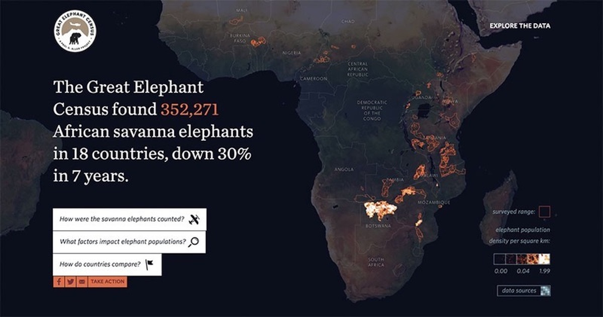
The homepage.
The homepage text is just a sentence long. We wanted to convey, to the average user, the overall takeaway from the elephant census as quickly as possible.
Edward Tufte has talked about how qualitative reasoning, at heart, orbits around: how much? and compared to what? The intro text and visualization give us the final number (how much?) and the percentage drop (compared to what?). From this point, a time-pressed user can quickly and easily share this info, or skip right to the Take Action area.
For the bulk of the site content, we decided to frame the narrative not by topic, but by the questions we had found ourselves asking about the data, and which we anticipated our users having as well:
How did they do the census?
What’s causing these population changes?
How does it differ from country to country?
Each question leads to a different narrative and a different way of understanding the census and the elephant populations involved.

Exploring the census techniques and methodologies.
We seamlessly zoom back in to explore the techniques used to conduct the census and do the actual counting. This seamlessness was important to us in order to keep the sense of scale and the relationship between the macro (overall number) and the micro (human effort).

harting relative change of different factors (here, ivory prices versus elephant decline).
In the context section, we can explore the many interrelated factors that may have effects on elephant populations. Our example stories are based around ivory and the economy; habitat loss and fragmentation; human conflict; and climate change. The goal isn’t to prove causation: rather, it’s to show how different factors may impact elephant populations, and to get people curious and making their own hypotheses.
The challenge here was to figure out how to graph factors with wildly different units and scales in a way that was readable. After all, we would be comparing GDP against total elephant counts versus square meters of elephant range. We decided to deal in percent change since a baseline date (either 1979 or 1995, whichever we had data on all the factors for): that allowed us to normalize the numbers and see how things scale in proportion to each other.
We also added vertical lines that marked important events, like ivory bans and other relevant international policies.

Exploring region data over time.
In the country section, users can deep-dive into a particular country and look at the shift in its elephant population over time. We provide a brief summary of important findings about that country, as well as a timeline that plots historical region data against important events in that area. Users can scroll backwards through time and see how populations and ranges have changed.
It was important for us to allow people to explore this more granular data. It allows conservation delegates from Africa, and residents of the survey countries, to get an overview of the situation in their country. It also allows us to differentiate countries that have a severe elephant population crisis from those that are successfully holding their populations steady, or beginning to increase them.
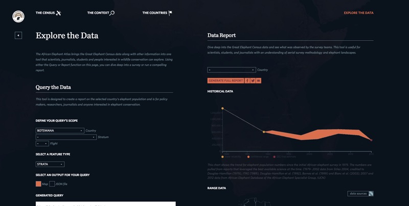
The main API interface page.
The exploration section is designed to help users of every skill level to explore, visualize, and take ownership of the GEC data in their own way.
On the left, we have an interface that allows users to generate your own visualizations of different features of the GEC. They can target from the continent level down to the individual flight, and explore different facets of the GEC database. Users can access the API endpoint or generate a map of that feature. For example, if the user chooses Botswana and decides they want to see all the strata surveyed there, they can select those two things from the dropdown (as above) and instantly get the following map:

A map generated from the dropdown query format on the previous page.
On the right, we have an interface that allows users to generate an executive summary for a given country, complete with region data, range maps, and historical data. This gives delegates and other policymakers something lightweight that they can download, take with them, print out, and quickly reference.

A report generated from the dropdown query format of the previous page.

Ways to take action.
There are many facets to elephant conservation, which means there are many ways to get involved. We wanted to provide a variety of options, for people who live both in and out of the survey countries, to push for better conservation policies and contribute to the cause. These options include donating money, lobbying, contacting representatives, and more. Providing a route for action allows us to turn a dire story into a hopeful one.
Now: time to explore!
The results of our work were unveiled with Vulcan and the Great Elephant Census at the World Conservation Congress in Hawaii in late summer 2016. We were thrilled to have been part of this multinational effort! Feel free to explore the data on the Elephant Atlas website.
Credits
-
 Jane Friedhoff
Jane Friedhoff is a game designer, creative researcher, and experimental programmer whose work focuses on pushing the affordances of a given medium to create new, unusual, and playful relationships between people. She currently works at the Office For Creative Research, and before that was a creative technologist at the New York Times’ R&D Lab, where she developed journalism-oriented experiments like Madison and Membrane.


