Features:
How Usability Testing Can Improve News Stories
From quick turnarounds to big productions, a little advance testing goes a long way
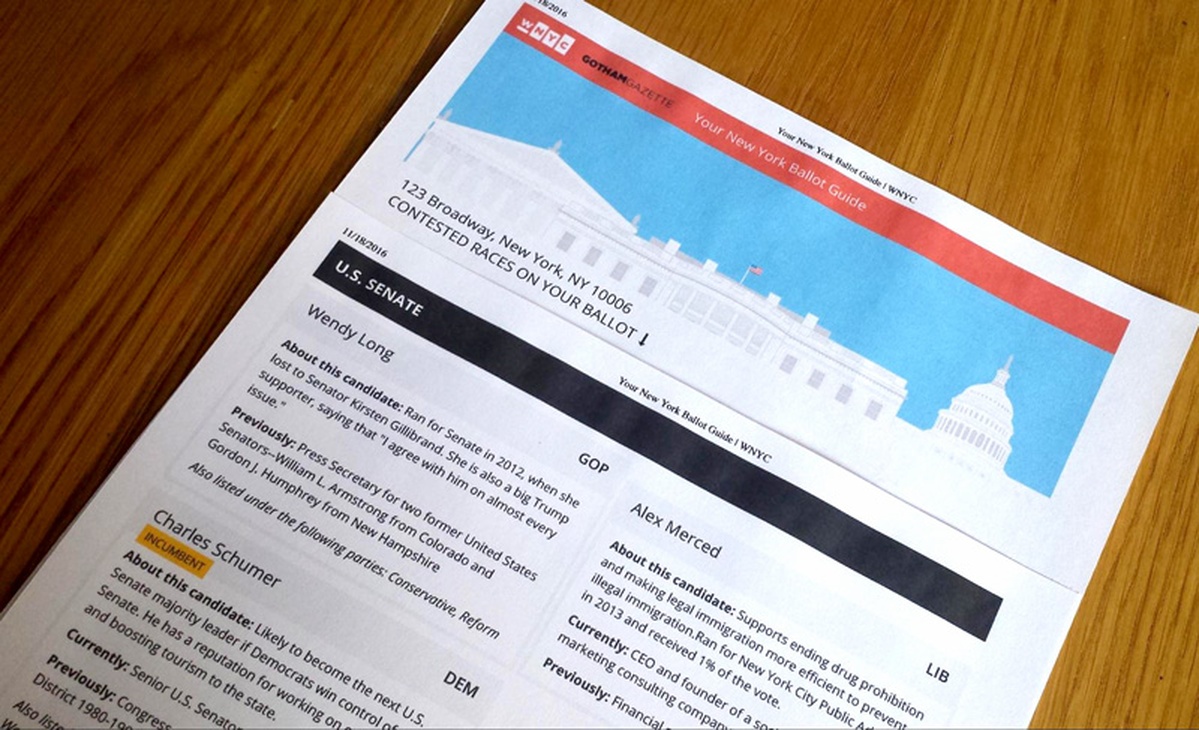
Our printed ballot guide for voters to take to the polls—a product of the testing described in this article
Working in the news cycle often leaves little time to design different iterations of story ideas, and even less time to test them with an audience. But as an author or designer—and as a media outlet which provides a public service, like WNYC at New York Public Radio—we have a responsibility to know how the public might understand and engage with our stories. The reason to make time for some kind of usability testing is because it makes our work better and increases its impact on the audience we serve.
So what kinds of usability testing can be used, and for what kinds of stories? Some stories happen in a day or two, while more in-depth stories might have weeks or months for production. The WNYC Data News team recently began using two scales of testing, which I’ll walk through using two examples. The first example will show the process of creating an infographic (with minimal testing) and the second will look at the process of creating our election guide, a longer interactive project with more involved usability testing. In both cases, we were focusing on a story’s visuals, but through testing, we discovered non-visual editorial problems, too, like confusing headlines or jargon.
Basic Usability Testing for Stories Being Published Within 48 Hours
Have a Clear Story
The first thing in making a story or visual is understanding its purpose. In the designer’s case, start with an objective of what the visual is trying to convey in a story. What are the one or two points the visual needs to get across? From there the form can take any shape, but the clarity of the content is the driver for revising and fine-tuning.
Talk to Non-Journalists (and Non-Designers)
Test the first iteration with two or three people outside of the newsroom and design departments. The key here is to find people who have no idea what the story could be about. This can just mean walking over to Human Resources, Financial Services, or other departments not tied directly to the newsmaking process. In basic usability testing, we just want to know if our story or visual at the article scale is communicating clearly. While hesitant at first to randomly walk up to people working at their desks, we’ve found that people across departments are genuinely happy to see what we’re making and like to be included in the process.
Listen and Observe; Ask Why
When conducting the usability test, it is key not to give away too much about a design but to get the participant’s impressions of what it is. The more they talk the better.
Start with showing the visual or story—it’s ok to give a little context of what the story might be about if the visual is complementary to the story. Set the scenario up: “Pretend you are on our website, and you see this…” Then ask what they see first.
Tell them that there are no right or wrong answers—they should just describe their impression. Similar to interviewing someone for a story, remain objective and try to understand why they think and do certain things, and what would make it a better experience.
Revise Design
After two or three people, a pattern of similar feedback may emerge, pointing out flaws in the design. We’ve found in our testing that this can lead to small changes that make a big difference. Things like font size, color, and visual hierarchy of information can be adjusted to make the visual and story more clear. It doesn’t take too much time to ask two or three people for feedback, and the benefits of improving our work make it worth it.
Quality Check
After the first test, make adjustments to the design based on feedback. Then test again with two-three more people to make sure that the changes made have indeed improved the clarity of the design.
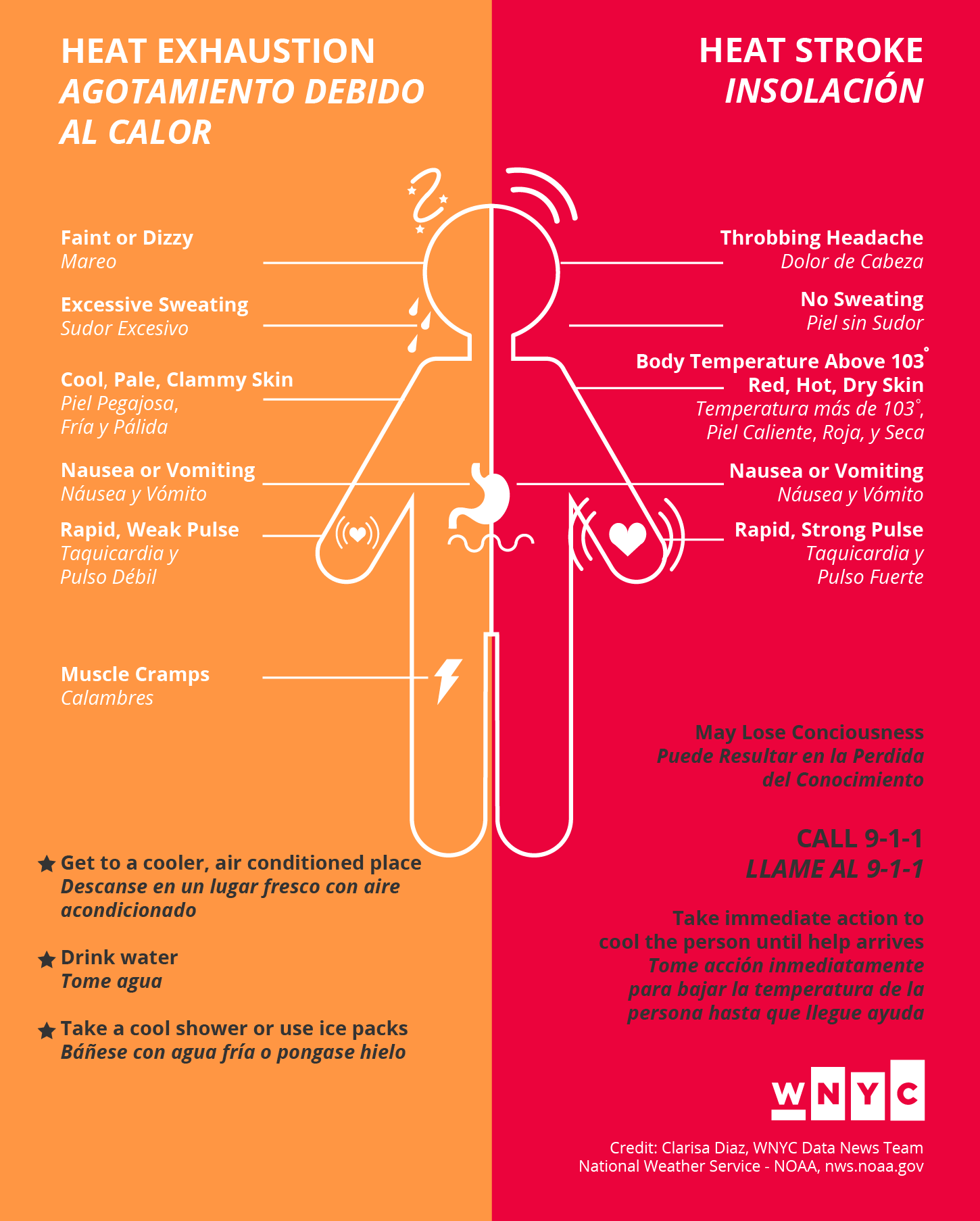
An example of a daily story we did testing for was an infographic about the warning signs of heat illness. The infographic was printed as posters for residents in overheated housing, reported during our Harlem Heat Project. The National Weather Service has public domain material for the symptoms of heat illness that we used to make the infographic. The objective: To inform people about the symptoms of heat exhaustion and heat stroke, and what to do if it happens.
Iteration #1: Tested with three people outside of the newsroom
Participant #1 Feedback:
- Understood graphic talking about symptoms of heat illness, what to do is not as clear on both sides because of stars
- CALL 9–1–1 is important as first step on heat stroke side. May Lose Consciousness is more of a symptom
- Illustration is clear
Participant #2 Feedback:
- Spanish is good, but the italics makes it look secondary, a little hard to read
- Nice aesthetics, colors
Participant #3 Feedback:
- Most important thing to do is call 9–1–1 when having a heat stroke, so that should be first
- Overall clear
After this first iteration it was clear that we had overlooked something so seemingly obvious, CALL 9-1-1 was the most important information in an emergency. For the second iteration, the font size of the line was enlarged and given more visual hierarchy, italics were changed to a lighter font weight for more legibility, the title enlarged and the stars removed. Then we tested again with two more people.

Iteration #2 Revised Design: Tested with two people outside of the newsroom
Participant #4 Feedback:
- First impression is to be aware of heat illness, notices call to action to either stay cool or call 9–1–1
- Self-explanatory, pretty clear graphic
Participant #5 Feedback:
- First sees body graphic, likes the round softness of it, not overly serious
- Understood symptoms and graphics from both sides
- Looks advisory
With some pretty quick testing and minimal changes because of it, we ended up with a better graphic to publish with our story—and the time it took was manageable in a day of work.
Now for a look at a longer project, our election guide. This is an example of a project that we were able to iterate on during a series of elections, the Congressional Primary, the State Senate/Assembly and Judicial Primary, and the General Election. We started with sketching what would be a straightforward, easy-to-use tool to help someone going to the polls get a quick overview of which candidates they would see on the ballot for their voting district.
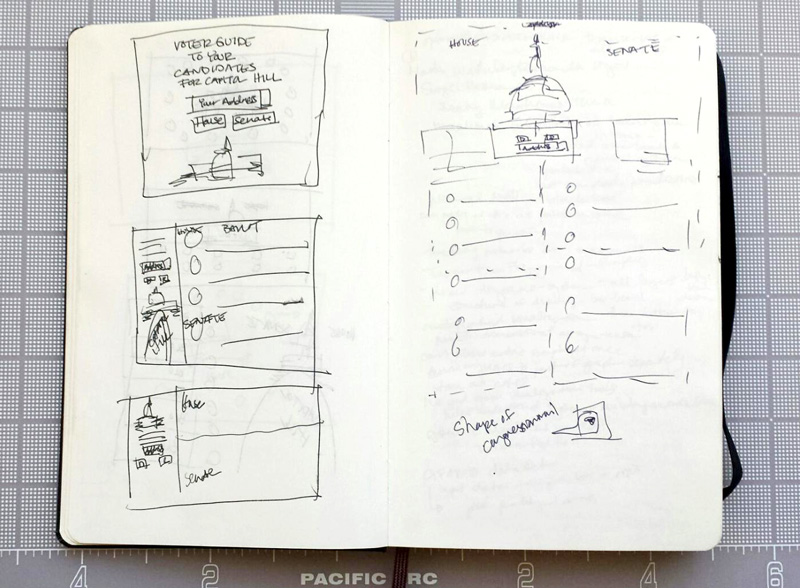
Preliminary sketches of the WNYC Election Guide
Sketching led to the prototype of our first guide for the Congressional Primary. The tool is a search box illustrated by the theme of the election, in this case Capitol Hill for congressional candidates. Input of a person’s address and selection of a political party shows same-page results of which district the person will be voting in and the candidates they will have to choose from on their ballot.

Prototype of the WNYC Congressional Election Guide (desktop and mobile)
In testing, we found there needed to be improvement to the search box, giving people a reason to input their address to find candidates in their district. Finding candidates based on a form, by selecting a party, was also not the most effective. People wanted to switch and see who else was running in their district. In the next iteration, we changed the form to filters: Democratic, GOP, or Races to Watch. We also needed to add language to the types of races to be clear that they were races. People weren’t familiar enough with elections to know what a title like “State Assembly District 66” was. For the New York Primary election guide, we also chose to show candidates in the order that was less familiar, starting with candidates for judicial delegates in which very little information about them is known, then progressing to more general races in the State Assembly and State Senate.

Prototype of the WNYC New York Primary Election Guide (desktop and mobile)
On the day of the primary, the tool reached its maximum number of requests for finding a person’s address. We became aware of the issue when readers used the comments section of the page to inform us that the tool was breaking, allowing us to quickly troubleshoot and fix the problem. With this many people using a tool, the importance of usability testing became clear. For the General Election guide, we set up a more in-depth usability test, where we recruited listeners to come into the station and give us feedback.
Basic Usability Testing for a Story When There’s Time
Make an Outline of Testing Objectives and the Project Timeline
Write out a guide outlining the general reason for testing, the objective of what the audience should get out of the story—and its design. Outline the timeline for the project, including time for recruiting participants, conducting tests, and the launch date.
Script an Interview Guide
Write out questions to ask the participant about the overall design and key elements in the design. Don’t reveal what the product or design elements are to the participant. Instead let them inform you what they think the elements are.
Don’t tell the participant what to do or give instruction about the story or design, instead ask prompts such as, “When you see this, what do you think it is?” or, “What is your first impression of this?” and let them speak their thoughts out loud. Move from the general to more specific elements of the design in the way that the participant interacts with the design. Questions may be asked with particular tasks in mind in order to achieve the objective of the design, but it is important to keep questions centered on the participant’s experience. Try questions like, “What would you do next?” or “How do you think you would find that information?” and then watch them do it. You will gain more insight into the effectiveness of the design.
Select & Confirm Participants
Testing with five people is enough to get a sense of how to improve on the design. Depending on time, there may be multiple tests for multiple iterations of the project. When selecting, try to get a group that is as diverse as possible, all ages and various levels of experience interacting with the type of product being designed. Participants can be screened through filling out a form answering a set of questions that pertain to their age group and experience. Contact those participants and confirm their availability.
Conduct the Usability Test
Prior to testing, arrange for someone else to also take notes during the testing session while you conduct the interview. Later you can compare feedback with each other. This tactic also allows you to concentrate fully on the conversation with the participant. Set up equipment needed either on a laptop and/or phone, with a microphone and recording software.
Begin by making the participant feel comfortable in the testing space. Offer them something to drink, and introduce yourself as a researcher studying how people interact with online tools. Try to make your introduction as objective as possible, so that the participant does not feel you are personally invested in the project and therefore may alter their answers to make you feel good.
Explain that there are no right or wrong answers during the test, and that the participant should feel free to speak out loud and be honest about what they think.
Ask for permission to record the test—this can either be an audio recording or a screen recording for review purposes, in case something is missed in the note taking. If the participant does not want to be recorded, conduct the test without recording.
Follow your Interview Guide and walk the participant through the design, starting with overall impressions about what the participant would do next to interact with the design. Always ask the participant why they did a certain action, and let them take you through their thought process.
Conclude the test by asking followup questions, for example: What did they think about the overall experience? What things were confusing and why? What was the best and worst experience of the design? On a scale of 1 to 10, how likely are they to use the tool and why?
Thank the participant for conducting the test. A gift or souvenir may be given, but should not be used as an incentive for participation prior to testing. The participant’s motive for conducting the test should be based on interest in the product produced. Any thanks is not a prize but a genuine gesture.
Summarize Findings and Next Steps
After completing the test with all participants, compare notes and look for patterns in problems encountered and issues that were brought up that might be important to improve the design. Come to a consensus on what elements of the design need to be changed and list the tasks that must be completed for the next iteration.

Testing setup for the WNYC General Election Guide 2016

Prototype of the WNYC New York General Election Guide (desktop and mobile)
After conducting our usability test with listeners that we invited to the studio, we found some of the following issues came up:
- The phrasing “(e.g. street, zip)” was not clear enough to enter a correct address. This was improved by instead showing an example of an address in the input field.
- On smaller screens, the header was too tall, minimizing the number of results seen on the same page. This was improved by tightening the height of the header.
- The curation of Races to Watch was not clear, and some participants thought the races were ones most popular in media coverage, while others thought they were WNYC’s picks. In fact all Races to Watch were all NYC-area races in which incumbents faced strong challengers or the seat was unoccupied. To improve this we added space for a description of Races to Watch under the header.
- Participants wanted the map to give them information about their polling place. To improve this, and because of time constraints, we included links with the map for people to look up their polling places.
- Participants might have also wanted the option to print out their results to take to the polls on Election Day. For this we added a print feature with a customized stylesheet.
For first impressions, all participants understood that the tool was about the election. Most participants appreciated that the guide was very visual and colorful, allowing for a better experience in learning about candidates on their ballot. In terms of basic usability, all participants understood the flow of the design, entering their address first and looking through the list of results. While the design was effective, we would not have known some of the issues had we not done the testing. Most of the issues that came up were minor—but addressing them greatly improved the project, making the time well spent. It was also pretty fun to meet listeners, converse with them, and get feedback on our work.
On the WNYC Data News team, we’ve also discussed what usability testing could do for the radio, in terms of what people retain from hearing our stories. Language and timing of information in script writing could also be tested to improve the way information is heard. The applicability of usability testing to make better listener and reader experiences before publishing seems worth exploring.
Credits
-
 Clarisa Diaz
Clarisa Diaz is the interaction and graphic designer for the WNYC Data News and Journalism team. She is a former Fulbright Scholar in Architecture and practices interdisciplinary ways of designing tools for services, including work with the Queens Museum, NYPL Labs, and various nonprofit organizations. Twitter: @Clarii_D.


