Learning:
Men’s NCAA Interactive: Redesigning Bracket Slightly Easier than Winning It
Sean McDade reinvents the wheel with the Associated Press Final Four Interactive

The Associated Press interactive for the 2013 Men’s NCAA tournament
I once heard a sports announcer laud a batter’s form by saying “he consistently uses the same approach every time,” the comic redundancy of the phrase lodged it in my skull. His point, the virtue of consistency, is celebrated throughout sport; from pre-game rituals to post-game treatment. Same too, for information design. Generally, it should be familiar, allowing immediate viewer comprehension. Anyone applying their powers of creativity to an exit sign will likely get pointed to the one we see everywhere.
So why might a combination of sports and information design benefit from the occasional shake-up? Because when every major news outlet covers the same sports events year after year, the designs have a stultifying sameness. If you’re not offering anything unique, what incentive do users have to use your interactive over others? Why even bother, if what you’re making already exists?
Unlike “hard news” coverage, sports coverage allows for a little playfulness, even irreverence. So, when the Associated Press’s Interactive department was asked to make an interactive on the Men’s NCAA basketball tournament, I thought it was the perfect candidate for a convention-flouting makeover.
I worked through iterations of the project with content, design and coding each informing the other. Each iteration demonstrated a strength to be embraced or a shortcoming to be avoided.
I imagine the process is similar to a complete rebuild of any aspect of your game, be it a free throw or golf swing: it’s going to take longer than you’d like, quite ugly in between, but hopefully worth it in the end.

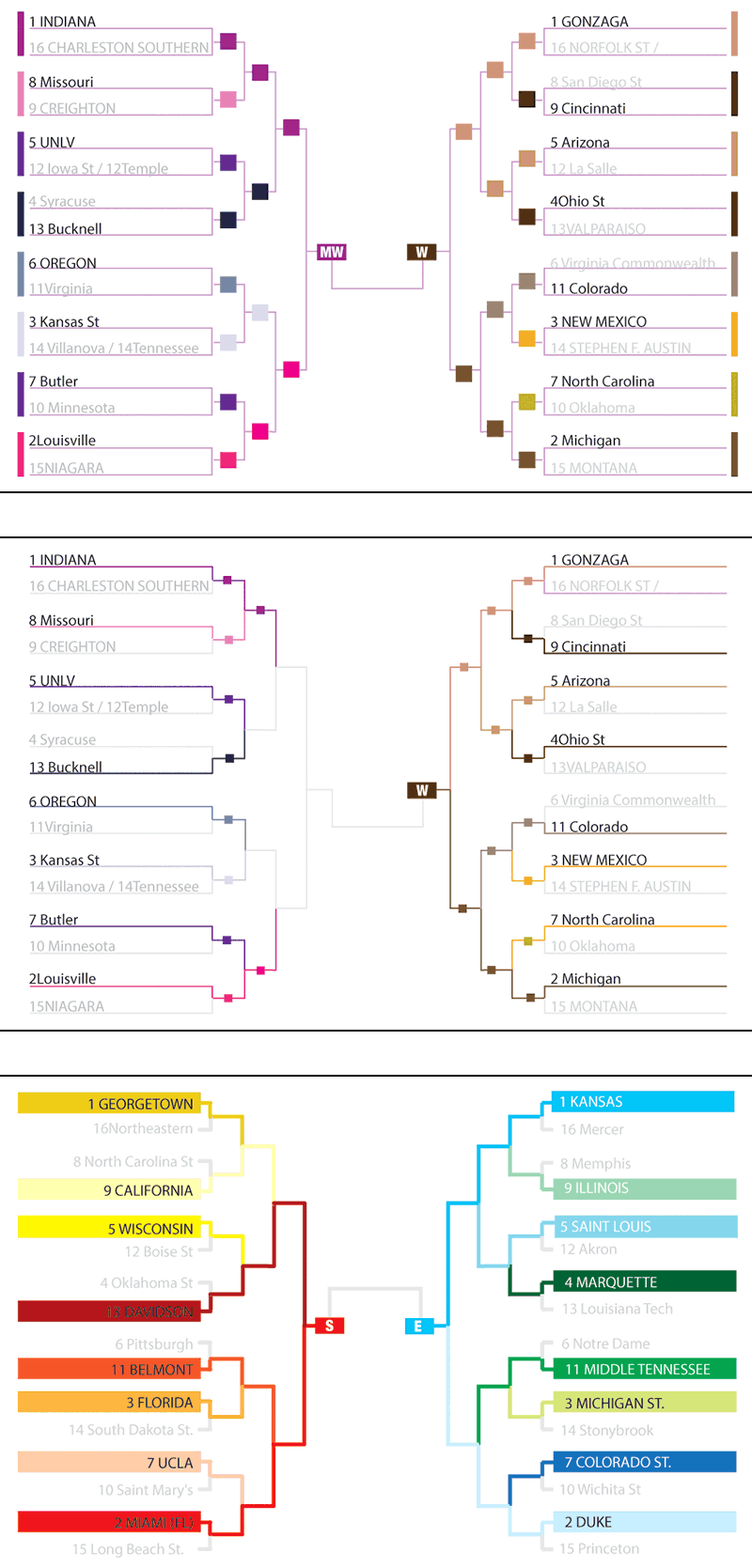
Traditional bracket design
Determining Content
We first had to define what would be shown. Early planning sessions determined we would show the matchups and results of each game, with match-up information for each game nested at a deeper level. Then we had to see the available data we’d be working with. We relied on STATS, LLC for data. They provided us with a list of files to expect, samples of them and docs describing the xml structures and conventions. They also indicated the frequency at which files would be refreshed to reflect the latest results.
After poking through the data there were three sets of data available from STATS that I was interested in:
- Regular-season statistics—a 66k file for each team, documenting each game they played this season. From these I chose metrics I thought would be most informative, sometimes combining 2 stats, one for the chosen team and one for their opponent to calculate a differential.
- All-teams summary—a 1.6mb file that had statistical summaries for every team in the NCAA Division I. I wrote a Ruby script to generate a file with only the desired statistics, for only those teams in the bracket, resulting in a 16kb file.
- A file dedicated solely to the bracket, tracking the results of each slot.
Initial Brainstorming
Once I had a solid idea of what to show I set about sketching design options.

Initial sketch of a target bracket
In this pie-like visualization each team represents a pie slice. Ranking by statistical categories could be overlaid as dots. The farther the dot from the center, the higher that team’s ranking. Selecting a different statistical category from a drop down would trigger a rearranging of dots.
Sketching with JavaScript
Using amCharts.js I was able to quickly create a polar chart that approximated the initial pencil sketch. The beige and blue guides are added to make the four regions distinct. Here teams are associated with radial lines.

I like that the teams point toward the center, creating a sense of vying or competition toward a central goal. There’s an immediate readability issue though: statistics are difficult to read and compare. And there’s a design question: how are later rounds indicated? A slider could be used to animate through the rounds, with the number of pie slices increasing or decreasing (below). This might look nifty, but viewers lose the ability to view more than a round at a time.

Slider sketch
Playing with this design, I found that the dot placement for blocked shots/steals creates an unexpected spiral when teams ranks correspond to their position on circle (below).

Polar chart with spiral result
One Pie into Four Pies
To make statistical comparisons easier, each region was given its own pie holding 16 teams. This not only makes statistical comparisons easier but more relevant, as only teams playing in the same region are compared.

Top: radial design; Bottom: radial pie
In the first version, teams are associated with a radial, creating a starburst effect. The inner ring indicates the median ranking. The statistics are easy to compare, but matchups are not.
In the second image, color is added to establish matchups. The shapes make the grey lines superfluous, an opportunity to simplify the design. The less visual information to process, the easier the to grasp what’s essential. I added rollover behavior to show head-to-head statistical comparisons. The final version of the pop-up statistics avoids this cacophony of color, using a palette of grey and red. It’s easier on the eyes, allowing the information to be more easily absorbed.

Radial design with 4 brackets
Above is a quick stab at bringing them together, using the earlier region design. The more I worked with this design the less it seemed viable. It may be adequate in comparing statistics. It’s weak, however, in its principal functionality: to display team advancement and subsequent rounds. Again, this could be remedied using animation and a scroller or perhaps another solution, but the user is then limited to viewing the brackets one round at a time, unable to view it as a whole.
Back to Tradition
So I returned to the traditional bracket design, attempting incremental improvements by emphasizing graphics and color over text.
Three iterations of adding color to the traditional bracket structure
(see all larger)
At the Associated Press we design our interactives for placement on member sites, not knowing the final display dimensions. Even though our designs are responsive, it’s often a good idea to visualize an interactive at a smaller view and build it out for larger displays, rather than starting with an expansive vision, and coming up with ways to make it smaller. In that spirit I began with the idea of showing the team names only once, and guiding the reader using color. I worked these up in an afternoon using illustrator. The design below saves horizontal space by replacing winners’ names with color.
The second version shows the same idea, refined; colored lines, smaller blocks. Cleaner, but the fine lines and small boxes lack visual punch. The third iteration dispenses with the little boxes, relying instead on thicker lines and a solid block of color behind the team names.
By the third exercise, the role of color grew from modifying attribute to a dominant design element. These pushes from a text-centric design toward graphic abstraction yielded solid, if moderate, improvements. They also triggered new thoughts about the earlier pie designs.
More Pie
What if the radial lines in the earlier pie were color-coded similarly? And what if these lines merged as they progressed toward the center? The noodlings below show subsequent rounds as concentric circles.

Returning to pie design
Getting a Positive out of a Negative
Playing with these designs, I had a fun final thought: what if the teams were represented by the negative space between the lines? The tournament rounds could be depicted as concentric rings with the outer-most first round and the single winner in the center.

It’s stronger visually and provides user-friendly hit areas for each team, as they progress through the tournament.
I hooked up to some dummy data and gave it nominal functionality for a proof-of-concept. I presented both this and the more traditional, albeit colorized, bracket to my art director, Paul Cheung to see what he thought. Happily we agreed the bold graphic treatment would be a fun experience for users. The unfamiliar, abstracted design is, in this rare instance, a strength given the ubiquity of the brackets during the tournament. The ability to stand out, to pique a user’s curiosity is a small victory. The design will work so long as the user receives immediate cues and feedback to nominal interaction; users enjoy making connections. This same pleasure principle is at work in the “getting” of a joke.
The interactivity of the final design works like this. At the tournament’s outset, only the outermost rings are colored. The higher a team’s ranking, the darker their color. Interior rings are grey with no interactive behavior. Rolling over a single team, say, Kansas at 12:00, changes the color of both Kansas and their first opponent, Western Kentucky. It also triggers a tooltip showing statistics for each team. Once the game’s completed, the slot to the immediate interior is color-coded to correspond to the winner. Rolling over this slot gives both the result of the Kansas/Western Kentucky game and statistics for the winner. If the winner of the matchup to the immediate right, North Carolina and Villanova, has been determined, that game winner’s statistics are displayed as well. As the tournament progresses, the colors fill in. The gradient/ranking color system allows users to view at a glance which teams did poorer than expected (dark colors that disappear after a round or two) and which exceeded expectations (light colors that progress closer to the center).
Nuts and Bolts
Sketching with JavaScript
I used a couple of JavaScript libraries to generate the early iterations. AmCharts
While amCharts is handy for simple “off-the-rack” charts, for something custom, like the set of four pies with the animated radial dots, I choose Raphael.js.over D3 or other cool libraries. Interactive content from the Associated Press needs to support older browsers, back to MS IE 8. Raphael renders in SVG with a VML fallback, so we’re covered there.
Coding the final design
A challenge to Associated Press producers is not knowing the display size of our work on members’ sites. As such, we use a combination of CSS media queries and JavaScript to design each piece to work at sizes ranging from 320 x 480 to very, very big. I used jQuery’s $(window).width to inform the layout and the size of the overall shape.
Individual shapes are instantiated based on data in the tournament xml file. It has a “slot” for every game, each slot has an “upper-team” and “lower-team.” While the actual team might not be determined, there’s an empty field waiting for it. A shape (representing one team in a slot) is rendered grey until the team is determined.
The shapes are generated one round at a time, creating the concentric rings. The inner and outer radii of each shape are determined by the outermost radius, the number of rounds and a set amount of space we want between each shape.
Creating the shapes with Raphael
Paths can be defined by a simple string indicating a starting point, each subsequent point and an endpoint: var c = paper.path("M10 10L90 90");
Shapes, like the team shapes, can also defined as an array. Brief descriptions are at the end of each element below.
var path = [
    ["M", outerX1, outerY1], //move to the start point
    ["A", outerR, outerR, 0, largeArc, 1, outerX2, outerY2], //draw the outer edge of the arc
    ["L", innerX1, innerY1], //draw a line inwards to the start of the inner edge of the arc
    ["A", innerR, innerR, 0, largeArc, 0, innerX2, innerY2], //draw the inner arc
    ["z"] //close the path
];
Most of the array items are straightforward, except for the elliptical arcs. They require a couple of parameters, one indicating whether it arcs downward or upward, the other indicating whether it takes the short way around the ellipse or the long way.
- This is the best explanation of an elliptical arcs components I’ve seen.
- Another run down on elliptical arc commands.
- And a decent guide to working with arcs in SVG.
Once the shape’s created, line weights, fills, transforms, etc can be applied through attributes:
var slotShape = bracketPaper.path().attr(params)
Attaching data to the shapes
The tournament file is structured by game, or ‘tournament slot’. Here’s an abbreviated node:
<tournament-slot>
<slot slot="0"/>
<round round="1"/>
<gamecode code="201303190538" global-id="1318035"/>
<advance-slot gamecode="1318006" slot="5"/>
<tba tba="true"/>
<gamestate status-id="1" status="Pre-Game" half="0" minutes="" seconds=""/>
<upper-team-score score="0"/>
<lower-team-score score="0"/>
<upper-team alignment="away">
	  <team-code id="359" global-id="1500"/>
 	 <team-name name="Blue Raiders" alias="MiddTn"/>
 	 <team-city city="Middle Tennessee"/>
 	 <seed seed="11"/>
	  <region number="3" name="Midwest"/>
</upper-team>
<lower-team alignment="home">
	  <team-code id="538" global-id="1622"/>
  	<team-name name="Gaels" alias="StMry"/>
	  <team-city city="Saint Mary's"/>
	  <seed seed="11"/>
	  <region number="3" name="Midwest"/>
</lower-team>
</tournament-slot>
Sparklines.js. is used to show the performances over time in the tool tips. The graphics had to be minimal and concise as this amount of data could become a visual overload quickly. Edward Tufte’s “sparklines” concept works nicely here, allowing the reader to appreciate trends at a glance.
The tooltip also has data for the previous matchup it won. Keeping track of this is tricky, as each tournament-slot node contains data regarding the current game and reference to the future game (‘advance-slot’) the winner will advance to. It has no reference, however, to the previous game the team won to advance to this point. This required an early run through the data to make an array of key:object pairings, with the key being the advance-slot gamecode, and the value being an object containing data from this node we want to access when rolling over the shape representing a team in that future game.
I used jQuery’s .data to attach to each shape:
$(slotShape).data( {
           "round": round,
        'thisSlot': currentSlot
});
Final Touches
Color ramps with 16 values were needed for each region (eek!). I started with a stack of green, yellow, red, and purple squares of roughly the same darkness and saturation. I then made 15 copies of the stack, offset horizontally from the original for easy color comparison. New tints were set one stack at a time, rather than one color at a time for subtle consistency.

Color ramps
The initial thinking was to maximize contrast between teams with similar rankings; A 1-seed would be notably different from a 2-seed, in anticipation of the higher seeds advancing and facing each other. The concept of going dark to light with seeds high to low won the day, however, once we realized the story that could be told graphically. While generally successful, I would like to revisit color-stepping process to find a more programmatic approach than my eyeballing using hue and saturation in Photoshop.
To add a spirit of play, final scores descriptions were randomly selected from arrays. For instance, the results of a team winning by a margin less than three would be described by one of the following: [‘squeaked by’, ‘edged’, ‘narrowly beat’]
Once full functionality and design were established, it went through the traditional rounds of edits and browser testing but its essence—the content, design and interactivity—were established.
The interactive was well received and popular during the tournament. It was informative watching folks interact with the piece. I think the big visual payoff is simply watching the grey shapes fill in, round after round. I’m looking forward to working on next year’s version, armed with what I’ve learned. It shouldn’t require a complete rebuild though, just a few tweaks.
Credits
-
Sean McDade
Sean McDade is Visual Editor for Business and Technology at the Wall Street Journal. He enjoys telling stories with code or crayons.


