Learning:
Pushing Hot Buttons with Census.gov
Ronald Campbell on using census data to find facts in a world of speculation

(James Cridland via Flickr)
Published in partnership with
Journalists are often accused of bias. Well, I freely confess to one form of bias: Given a choice between writing about something bland and something heated, I will choose the hot story every time. I think most journalists share my bias, and this explains the common refrain that newspapers, TV stations, and news sites “only report bad news.”
There is no better place to pursue hot button issues than the Census Bureau website. Here you will find a refuge from overheated rhetoric. Here you will find hard, well-documented facts and data on almost every subject imaginable from traffic to health insurance to race relations. Why write stories amplifying the blather when you can report real facts? I’m going to show you how to walk into a minefield, the immigration debate, and emerge with your journalistic credibility not merely intact but enhanced.
Immigration has been controversial for a very, very long time. Anti-immigrant riots convulsed Philadelphia and New York in the 1840s. This was the popular climate when the Census began collecting information on immigrants in 1850. (See this Census Bureau table for statistics from 1850 through 1990; I’ve updated the data through 2010 in this chart.)

Once a decade the Census attempts to count every household in America. But it gets most of its information from smaller surveys. “Smaller,” in Census terms, is relative. The American Community Survey, its most comprehensive program, reaches 3.5 million households a year. A typical nationwide opinion survey targets just 1,500 to 2,000 people. The ACS sample is large enough to produce statistically accurate estimates each year for a city of 65,000 and on a rolling 5-year basis for a neighborhood.
As a result, census data has some unique strengths—but also some important weaknesses.
Strengths:
- Carefully documented methodology. The Census explains in exhaustive detail how many people it interviews, how it selects them, how it handles non-responders, and how it selects the topics for the survey.
- Comparable data from year to year and from place to place; Census statisticians try to avoid changing survey questions from one year to the next.
- Richly detailed tables. For example, if you want information on the foreign-born population from the 2012 ACS, the latest available, you can choose among 231 tables.
Weaknesses:
- Timeliness: The 2013 ACS is scheduled for release in fall 2014. The lag is typical for Census data.
- Jargon: It’s “foreign-born” not “immigrant,” “educational attainment” not “education,” “tenure” not “home ownership.” If you don’t use Census-speak, you won’t find what you’re looking for.
- Weak search engine: The Census Bureau’s advanced search engine at American FactFinder is clunky—though a vast improvement on the first version that the bureau rolled out just prior to the first data release for the 2010 census. If you’re just a casual Census customer you are better off using CensusReporter. If you need to take a deep dive, download my tip sheet on using FactFinder.
Now, back to immigration.
How Many Immigrants Live Right Here?
If you listen to talk radio or read comments on an immigration story, you’ll encounter plenty of guesses. The Census Bureau’s answer is contained in Table B05012: Nativity in the United States—40.8 million people, give or take 111,000 (due to the margin of error), 13 percent of the nation’s population. Here is what the table looks like in FactFinder:
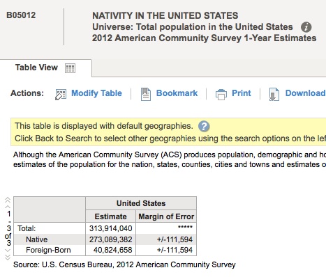
Here are a few things to keep in mind: First the table, B05012, is a shell; you can get the same table—with different numbers obviously—for any state, county, city, or census tract, though you would need to use 3- or 5-year ACS data for smaller cities and counties and all census tracts. Second, notice the word “Universe” below the title of the table; that tells you what is being surveyed. Sometimes the universe is every person in a given geographic area; sometimes it is every household; sometimes it is a bit different, like everyone aged 25 and older or every foreign-born resident. Third, in the table itself notice the terms “estimate” and “margin of error.” This table comes from a survey; the Census did not count every person in the U.S., so it can only make estimates, and those estimates have a statistical margin of error, which is stated. Here’s a rule of thumb: The smaller the estimate, the bigger the margin of error.
Immigrants are highly concentrated: Nearly two-thirds of them live in just six states—California, New York, Texas, Florida, New Jersey, and Illinois.
TIP: By using the geography filters built into American FactFinder or CensusReporter you can get authoritative numbers in your community for immigrants—including counts for naturalized citizens and non-citizens.
So now that we know how many immigrants are here, let’s push a few more hot buttons.
When Did the Immigrants Get Here?
The answer is in Table B05005: Year of Entry by Nativity and Citizenship Status in the United States. Notice that the universe has changed from the previous table: Instead of “Total population of the United States” it’s “Population born outside the United States.” And that brings a caution—not all persons born outside the U.S. are immigrants; this table includes 4 million people born outside the U.S. who nonetheless are considered natives because they were born in Puerto Rico or U.S. island areas, or born abroad to American parents. So ignore the “Total” line.

It turns out that 72 percent of immigrants currently living in the U.S. arrived here before the year 2000. Most of those who got here before 1990 are naturalized citizens; nearly half of those who got here in the ‘90s have become naturalized. Since then, the vast majority of immigrants have remained non-citizens.
Note: The Census asks about citizenship but does not ask about legal status. For estimates of the undocumented population you’ll have to turn elsewhere, to the Department of Homeland Security and the Pew Hispanic Center. Their national estimates of the undocumented population are similar, between 11.4 million and 11.7 million respectively in 2012.

Where Have the Immigrants Come From?
If you’re familiar with U.S. history—or even if your knowledge of immigration history begins and ends with what you saw in the chart near the top of this story—you know there was a huge wave of immigration from the 1880s until World War I. Most of those immigrants came from Southern and Eastern Europe. Today’s immigrants come mostly from Latin America and Asia.
Look at Table B05006: Place of Birth for the Foreign-Born Population in the United States. This is a long table, 160 lines, so I won’t copy it here. But if you hail from the West or the Southwest, the top country of birth won’t surprise you; it’s Mexico, birthplace for five times more immigrants than the second largest source, China. The third biggest is India followed by a one-time American colony, the Philippines.
If you know some of the fraught history of immigration, the numbers become even more fascinating. A 1952 immigration law forbade anyone from harboring illegal immigrants. But the law tacitly winked at farmers who employed Mexican farm workers under a section (“the Texas Proviso”) that said hiring an illegal immigrant did not amount to harboring. Chinese immigrants were barred from the U.S. under the Chinese Exclusion Act of 1882, a law that was not repealed until 1943 when the U.S. and China were wartime allies against Japan.
The Census identifies immigrants from more than 150 nations; you can use geographic filters on the census website to identify the largest immigrant groups in your community. But beware the margin of error. If you go looking for immigrants from, say, Cameroon, you may well find that the margin of error exceeds the estimate.
My personal rule of thumb: Avoid estimates where the margin of error exceeds 10 percent of the estimate. I claim no scientific basis whatsoever for this custom. But life is too short to waste it defending sketchy data. Above all, avoid using exact numbers; the word “about” is very useful in census stories.
Are These Immigrants a Burden on Society?
Immigration is changing—some say tearing apart—the nation’s social fabric. As millions arrive, critics argue that immigrants are driving down wages while piling up bills for education, health care, and law enforcement that the newcomers’ taxes will never repay.
That’s a big critique, and no one has proved or disproved it. But one way to address it is by asking a simpler question: How well-educated are immigrants? The linkage between education and financial success is far from perfect—too many recent college graduates are struggling. But one glance at Table B20004: Median Earnings in the Past 12 Months By Sex by Educational Attainment should convince you that you made the right choice going to college instead of slinging fries at Mickey D’s after high school.

So let’s return to immigrants. How well educated are they compared to natives? The best place to look for answers is Table S0501: Selected Characteristics of the Native and Foreign-Born Populations. This is a catchall table that compares natives and immigrants in several categories; it should be your go-to resource when you can’t find a specific table. Here you will find that 30.8 percent of immigrants have not graduated from high school—three times the rate for natives (10.2 percent). On the other end of the scale, immigrants are more likely than natives to have a graduate or professional degree (11.6 percent vs. 10.8 percent).
Some immigrants are probably going to do very well while others will struggle all their working lives in low-wage jobs—jobs like landscaping and construction that, a generation ago, were performed for comparatively better pay by native-born Americans. Whether that makes them a burden or a vital workforce is a question even the census cannot answer.

How Well Are Immigrants Assimilating into Society?
Again, there are a lot of ways to answer this question, and we can find several possible answers by returning to Table S0501. On average immigrants are more likely to hold jobs than natives but earn less money from those jobs. They are more likely to work in blue-collar trades like construction but less likely to be in management. They earn less money, are more likely to be poor, are less likely to own their homes, and are more likely to live in crowded housing.
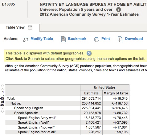
But perhaps nothing spells assimilation in our polarized land like language. Several states have adopted English as their official language. How comfortable, then, are immigrants in the dominant American tongue? The answer is in Table B16005: Nativity by Language Spoken at Home by Ability to Speak English for the Population 5 Years and Older. About 1.6 million native-born Americans grew up speaking Spanish or other languages and cannot speak English well or at all. But most of the 13 million people in the table who speak English “not well” or “not at all” are immigrants.
Using the Census on Your Beat
I’ve showed you how to push hot buttons on immigration without getting burned, using authoritative census data. But the Census website contains vast seas of information on other topics. It’s worth spending a little time exploring the site to see what it has to offer on other beats, including yours.
I’ve referred earlier to my tip sheet on American FactFinder. Without going into detail, let’s take a nickel tour, going just far enough to show you how to explore on your own.
Here is the home page of FactFinder. If you cover a city or county, you need go no farther than the ultra-simple search at Community Facts. Type a place name into the search bar, hit “Go,” then click the menu options on the left to explore. (In the example, I’m using my home, Orange County, Calif.)

Community Facts will display a similar page for thousands of cities and counties across America. Just enter your town and spend 10 minutes or so exploring the data; I’d be surprised if you fail to find something noteworthy.
But what if your beat is not a place but a thing? The Census still has plenty to offer. However, you need to turn to the Advanced Search page. This is how it appears at first:

If you’re a Census Wizard®, you can type a table name (for example B20004) in the box labeled “topic or table name” below the Advanced Search button. If you’re human, you’ll work with the Topics and Geographies boxes on the left. If you’re like me, you’ll spend most of your time in the Topics box and, especially, in the People portion.

Here is where you will most likely find information about your beat. Spend time exploring these categories: They’re like nesting Russian dolls, each with topics buried inside topics. No matter what your beat, there’s a fair chance the Census has something for you. My favorite recent discovery is Table B12505: Number of Times Married by Sex by Marital Status for the Population 15 Years and Over. You’ll find it under Marital & Fertility Status - Marital History. Turns out the states with the largest proportion of people married three-plus times are in the Bible Belt.
Suppose you want, to borrow every editor’s favorite word, to “localize” this? Easy. Click on the Geographies tab. This will open a new box, labeled “Select Geographies” with four tabs at the top. You can pick states at bottom right or you can click on the “Name” tab and type a name of a state, county, or city.

Click “Go” to add it to your geography results, then click on the name in the results to add it to “Your Selections.” Close the geographies pane. Select a table, and FactFinder will narrow down the table from the nation to the geography you choose.
One hot button, made to order.
Organizations
Credits
-
Ronald Campbell
Ronald Campbell is a veteran data journalist. He has reported on the census, immigration, white-collar crime and the trade in human body parts. Married with two children, he lives in Orange County, Calif. When he is not working, struggling to learn software or humbly serving his cat, Campbell hikes and rock climbs.


 By what metric?