Learning:
When and How to Use Census Microdata
Robert Gebeloff’s primer on working microdata magic

Published in partnership with
The first thing you probably notice about Census data is that there’s lots of it. The American Community Survey, for example, weighs in at 35,000 data line items spread across 1,500 subject tables covering more than 13,000 geographies.
With this much information, you would think you could find the answer to any possible demographic question.
But as you grow more experienced working with the published Census tables, you soon discover that the nuances of demography are even greater than the size of the Census code book.
Sometimes the table you were hoping for doesn’t actually exist. Sometimes it exists, but isn’t broken down by age or race or gender the way you’d like to see it. And sometimes, the table you want does exist in exactly the format you want—but there isn’t a comparable table for past years that you can use in a time series.
Thankfully, the Census Bureau has you covered through a data set called PUMS—the Public Use Microdata Sample. And thankfully again, the Minnesota Population Center has created free tools that make it much easier to work with PUMS data, either as a downloaded data file or via an online interface.
This article will show you how to get the most out of this valuable resource. I’ll introduce you to IPUMS, the fabulous and free toolset for working with microdata, walk you through a simple do-it-yourself example using the IPUMS online interface, illustrate some of the pitfalls, and then close with an example of a more complicated analysis that required me to download the data and work it with my own software.
Power and Responsibility
Microdata empowers you to customize the ACS, creating your own tables out of any variables in the data set. That’s because microdata is a person-level sample of the actual Census returns—each row is an individual observation, populated by column after column of responses for that person to Census questions. So if the published Census table you’re looking at has a universe of adults aged 18-64, but you want to see what it looks like for Hispanic females aged 35-54, you now have everything you need to recreate that table but with your own specs.
With these new powers comes additional journalistic responsibilities, beyond the additional skills required.
Simply put, the microdata comes without a governor. Just because you can technically cross any and all variables doesn’t mean such a query makes analytical sense. For example, the microdata allows you to crosstab any variable by a single year of age—but doing so is usually not advisable because the smaller you slice the data, the larger your margin of error.
By contrast, each published table in the ACS comes with its own handy calculated confidence interval that tells you upfront—this estimate is pretty good, but that one, well, caveat emptor. With microdata, you’re on your own. You make the table, you bear the responsibility for avoiding misleading conclusions based on small sample sizes.
I advocate marrying data work with traditional reporting in almost all cases, but it’s especially important when you’re working with a sample survey like Census microdata. A small margin of error provides some comfort, but gaining confirmation through interviews with experts and people in the situation you’re analyzing, that’s the best backstop out there.
Under the Hood
Ok, I promise this is going to be relatively easy, but first bear with some of the explanatory details. The American Community Survey is a sample survey—those published tables you get are based on a random sample of the population. With the PUMS file, you are getting the raw results of the survey in anonymized form to protect the privacy of respondents.
Each record, as I said above, represents the responses to the Census questionnaire for a single person. That means the first part of the record contains information about that person’s household, which is repeated for all members of the household, and the second part contains responses pertaining to that person specifically. So people are rows, Census variables are columns. If there are four people living in an owner-occupied house with an estimated value of $250,000, all four will have these household-level values repeated on their row, but will have individualized values for their person-level variables.
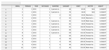
In the raw, it looks like this, but even if you’re going to work with the raw files, IPUMS provides tools for generating a clean import with labels attached to the values.
The 2012 single-year PUMS file contains 1,340,387 housing unit records, 2,992,629 person records from households, and 153,458 person records from group quarters. Each row contains a sample “weight”—when you run a query, multiply your counts by either the household weight for household variables or person weight for person variables, and voilà, you will create estimates that are representative of the U.S. population. You can also get larger PUMS files that match the ACS multi-year samples, and as a bonus, IPUMS also provides the microdata for the March supplement of the Current Population Survey, if you ever need to work with that dataset.
This is probably best explained with an example, and in so doing, I’ll also introduce you to the IPUMS online query tool, which is by far the easiest way to work with the microdata.
Working with IPUMS Online
Let me tell you two things about my Uncle Franco. He gave me my first haircut, but also inspired one of my first microdata stories.
Franco is an Italian immigrant barber, and when I was growing up in New Jersey in the 1970s, it seemed like there were Franco’s everywhere—every little nook and cranny of New Jersey seemed to have a small barbershop with an Italian barber. So when I was working for The Star-Ledger in the early 2000s, and the paper was hungry for stories that touched on the life and culture of New Jersey, I thought of Franco and came up with an idea: What if we could actually measure the prevalence of people like Franco over time?

The author’s Uncle Franco (Credit: Marissa Rozenfeld)
In the published Census tables, you can get a count of how many people said they were barbers. And you can find out how many people said they were born in Italy. But you can’t find a crosstab showing barbers born in Italy, and you certainly can’t create a time series showing Italian barbers over time. With microdata and IPUMS, you can.
Let’s get to know IPUMS so we can better answer the question. Before we begin, you’ll need to create a free users account. You’ll need to answer a few questions and promise to “Use it for good, never for evil.”
TIP: I also usually use Firefox at this point, mainly because I’m fond of the Table2Clipboard plugin which is the easiest tool I’ve found for copying and pasting HTML tables into a spreadsheet, which is the way I roll with IPUMS. (You don’t need to do so for this exercise, but keep this in mind for future use, and yes, Chrome has something similar called “Tablecapture”).
Let’s start with the sample selection page. This is where you can tell IPUMS what years you want to cover. In my case, I want to cover all available years, but as you’ll see in a minute, you can always use filtering to get the years you want. So I’m going to pick “United States, 1850-2012”.
In another tab, I’m going to open up the IPUMS data dictionary. If you peruse this, you’ll notice that it’s organized along the lines of the regular ACS data dictionary, with household and person variable categories, and then specific variables within those categories. For example, if you click on Person/Education, you’ll get a handy table of available variables, including the years for which they’re available. If you click on a specific variable such as educ, you’ll get a full dictionary for that variable.
Back to Franco, Italian barbers, and the IPUMS query tool. Whenever I write a query in any language, I work backwards—I think of what I want my results table to look like, and then I design my query parameters from there. In this case, I’m going to want to select all barbers from the data set, make my rows the country of birth, and make my columns the Census years.
To find the proper variable names, you could either browse through the data dictionary as discussed above, or on the query page, use the alphabetical version of the codebook. Country of birth is included in the variable BPL—so type BPL into the form field for row. And Census year is just year, so type year into the form field for year.

IPUMS query window, bpl and year.
We only want barbers, so we need to “filter” our query to select only people who said they had that occupation. This is where IPUMS really helps.
If you’ve ever tried to do work with Census occupation data across years, you’ll quickly notice that the occupation categories change frequently, and it makes building a time series out of published tables pretty frustrating.
For this problem, the IPUMS folks created a solution in the form of occupation codes that are standard across the years. They’re not perfect, largely because the occupations people work at are constantly changing—been to a blacksmith lately? But in this case, we’re interested in barbers, and that hasn’t changed too much over time.
In our codebook, look under work and click on the IPUMS-created variable OCC1950.
There’s another called OCC1990 that’s better to use if you’re only going back a few decades. OCC1950 definitions are best for going further back. So in the OCC1950 codes, barbers are a 740. Of course, if you’re not doing a time series, you don’t need to standardize the jobs, and the OCC variable is best, because it reflects the occupational schema that was current for that specific year. (IPUMS provides all of the codes sheets for each year in the docs.)
We’re also going to simplify our results by specifying years—since the middle of last decade, the ACS has come out annually, but our historical info is based on the decennial Census. So to keep our time intervals consistent, let’s specify our decades.
In our “selection filter”, we’re going to add: occ1950(740) year(1950,1960,1970,1980,1990,2000,2010)
Almost there—but we want to make some adjustments to the control switches in our query window. Because the microdata is a sample survey, each person in the sample is given a weight that tells you how many people they are representing. The weights are designed to “true up” the sample so that even if it includes slightly fewer elderly Hispanics, say, those that are included can get a higher weight so the elderly Hispanic population is more fully represented.
For convenience, we want to turn on “column percentaging,” which will do the math for us by dividing our results into shares of the total. And also for even more convenience, we want IPUMS to tell us the 95-percent confidence interval of our estimates. This feature alone is worth the price of admission—doing the calculations manually is difficult and tedious. And as previously mentioned, it’s crucial to keep an eye on the confidence estimates as you do data work to make sure you’re not abusing your powers.
We also want to make sure the weighted number of cases is displayed in our results, so we check that box as well.

IPUMS query window, very detailed.
Now, time to run the query and create the table!

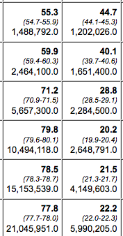
Italian barber, query results.
I’ve copied the results from the HTML into a spreadsheet so I can point out the important figures. The results—which with sample data, we call an estimate—show that in 1950, around the time Franco came to this country, about 6 percent of all barbers were Italian immigrants. Thanks to the built-in confidence interval calculator, we also know that this estimate is pretty reliable—the confidence interval means we’re 95 percent certain that the truth is somewhere between 5.4 and 6.9 percent, but 6.1 percent is our best estimate. The estimate for 2010: between 0.3 and 0.5 percent.
Notice something else—in the descriptive material listed on top of the output (not pictured here), we get the full definition of what we measured. Here we are reminded that occupation 740 includes “Barbers, beauticians, and manicurists.” You can see why those occupations would be grouped together in a hierarchy of occupations, but for the purposes of this exercise, we’re really only thinking about “barbers”—who are mostly male.
So let’s rerun our query and this time break the results down by gender—we’ll use the “control” input and enter the variable name of sex into that field and resubmit the form.

Italian barber, male only.
When we look at just males, two things jump out—the Italian percentage is higher, but notice also, our confidence interval (CI) is a bit wider, between 10.4 and 13.1. This is the classic tradeoff you make when working with microdata—the more precise you get with your parameters, the smaller your sample size, and the wider your margin of error.
One final note on this example: By going this extra step, of drilling down from all barbers to male barbers, I mean to demonstrate that working with microdata really challenges you to think about what you’re doing with a creative and open mind. My approach is often to think about the questions I want to answer first, to assume that the variables I need will be there and that I’ll be able to figure out the best variables to use. There is nothing inherent in this data that says, “Oh, we’re looking at occupations, better cross it with gender too”—these types of subjective decisions are all driven by your own curiosity.
IPUMS Tricks
Now let’s consider a more serious example. Let’s say we are interested in exploring educational attainment. We go to censusreporter.org and pull the base table for the United States in 2012. What we decide we want to know is how this breaks down for different demographic groups. If we peruse censusreporter.org a little more, we find about 15 different tables that would provide various breakdowns of educational attainment by gender, race, etc. Let’s say we’re most interested in the intersection of education and employment status.
Playing around with that table, one of the more interesting things to note is near the bottom, the number of adults with college education who are either unemployed or not in the labor force.
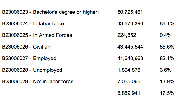
Your education/employment table.
We might wonder, how does this breakdown play out by gender? Or by race? Or by some other demographic factor? How does this figure compare with previous years? We can find some of this information in other published Census tables, but if we switch over to the microdata, we can answer ALL of these questions, and in a relatively quick, systematic fashion.
First, let’s create this example table using the IPUMS query tool and some smart filtering. This is a very good practice for PUMS-work—make sure you can match published estimates before you begin to produce your own customized breakdowns. We know the base table has a universe of adults aged 25 to 64, and we know we only want to look at adults with a bachelor’s degree or higher, and we know we want the rows to report labor force status.
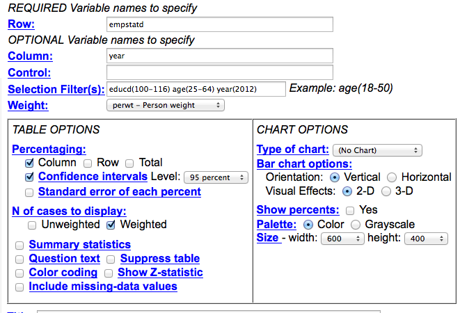
IPUMS query, empstat vs year, year 2012.
To make sure our params are in sync with our base table, I’ve picked the nearest possible PUMS variable—in this case, it’s the detailed employment status variable, or empstatd—and made it my row. I’ve made the year the column, because we’re going to want to compare over time. But because this first query is a test, I’ve filtered for year (2012). I’ve also gone into the detailed educational attainment variable, educd. When we click on it in the data dictionary, we find that to get bachelor’s degree/4-years-college and higher, we need codes 100 through 116. I’ve filtered age to include only adults (25-64) I’ve also told the program to select column percentages.
If we run the query, we get different row labels than the published table, but they can easily be translated and compared—and you’ll see that our PUMS estimate is extremely close to published.
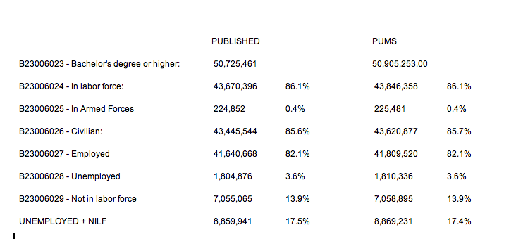
Table vs. IPUMS results comparison.
This is most importantly true for our metric of interest—the percentage either unemployed or not in the labor force, where we’re only off by a small rounding error. Now we’re ready to take this to the next level—let’s compare this over time. To make our life easier, let’s collapse our rows into just two categories—Employed vs. Unemployed/NILF.
Here’s what I’ve changed. Because we’re going to collapse our employment into two categories and look at the data over many years, I’ve made the row variable “year”, and I’ve modified the empstatd variable with some collapse syntax: (r:10-15;20-34) which is going to combine all of the employeds and armed forces into a single batch, while putting our unemployed and NILFs into a second batch. (Click here to read more about recoding and collapsing). I’ve also turned on the confidence interval switch to get a sense of how valid our changes are going to be over time. And finally, I’ve gone ahead and specified the years for which I want data—again, when I’m looking at long-term trends, I usually only pick the most recent ACS year, then go by decade from 2000 on backwards.
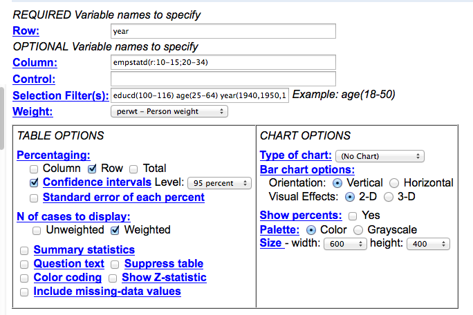
IPUMS query, emstat vs year (1940-on).
The results:
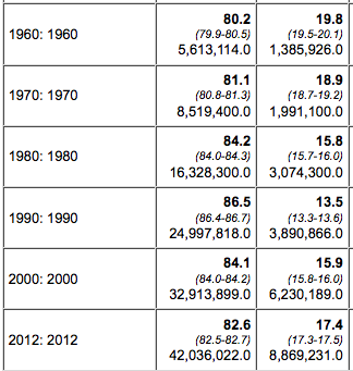
1960-2012 query results.
So here’s a surprise. In 1960, nearly 20 percent of college grads were either unemployed or not in the labor force. The trend-line changed steadily until 1990, but then started to creep up again. What’s going on?
We can start to get at these questions with more queries, so we go back to the query window and this time put the variable name “sex” into the control form field. This will rerun the query with results broken down by gender. This is what it looks like:
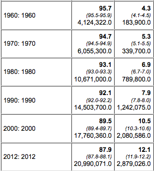
Query results for males (left) and females (right).
Notice the difference? The story is totally different for men and women, from the number of people with college degrees to the trend-line in labor force participation.
And this is just the beginning. What other variables might we want to throw into this mix? And what kind of people might we want to speak with about your findings? Usually as I start interviewing experts about your findings, they’ll make suggestions for other queries I might want to try. And because of the SDA interface used on the IPUMS site, the cost of experimentation is minimal.
Rolling Your Own
Lastly, there is the situation in which you need to roll your own PUMS analysis. The IPUMS online interface is tremendous, particularly because it puts all of the variables and years at your fingertips and calculates your confidence intervals for you. But sometimes there is data work to do and the online interface doesn’t cut it.
For example, when the Affordable Care Act launched (and shortly before the Web site disaster became the focus of coverage), a big concern was states opting out of the provision that expands Medicaid to serve the poor. The New York Times wanted to measure who would be impacted in these states. While the ACS has some published tables on health insurance coverage, it wasn’t nearly detailed enough to truly profile the poor and uninsured. Because we knew it was in the ACS, we knew it would also be in the microdata, so to the microdata we turned, with an eye towards crosstabbing poverty status with health insurance coverage.
But to really nail the estimates, we had to make some adjustments to the data, adjustments I learned about by trying to match some published tables of summary data put up by experts. As mentioned, this is always a good practice with your microdata work—you can usually find a published table with a broad view of what you want, and checking to see how your figures match up with those published tables often gives you guidance on how to proceed with your own customized work.
To start with, I learned that healthcare researchers do not work with Census definitions of households. The Census defines households—and the poverty rate—based on the number of people who live in the housing unit and how much they earn combined. Healthcare researchers prefer to adjust the household along insurance lines. In Census-think, three young adults living together as roommates are a household; in healthcare-think, they are three separate health insurance housing units, because each person would be responsible for their own coverage. Or, for example, in a multi-generational family:
Traditional household (left) and healthcare household (right).
IPUMS fortunately had me covered for this, but it required me to to create my own data extract and download the data to query in my own software. The interface for doing this is a little clunky but you get the hang of it after a while, and the good news is they support all of the main commercial stat packages (SAS, SPSS and R) but also provide ASCII if you want it with a codebook that can be turned into an import script.
Here’s how it works. From the IPUMS home page, click “select data”, then select samples to pick the years you want. Once you have that, then go through and pick the variables you want—key variables such as the weights will automatically be added to your extract. For our story, we grabbed all of the “health insurance unit” variables that IPUMS provides—these variables enabled us count health insurance housing units and determine how many were in poverty, which we were able to benchmark against published tables by other researchers.
Once you have all of the variables you want, I recommend grabbing anything you THINK you’ll need at this point, because while you can always revise your extract, download it again, and re-run your code, I find it breaks my creative momentum if I have to keep pausing to resubmit a download request.
The data.
Once you have the data in hand, you write queries like any other data set. Except do make sure you’re always multiplying your variables by the person weight. If you’re doing true household measures, such as home ownership or household income, make sure you’re using the household weight, and make sure you’re only including household heads (relate=1). This is because for household level variables, all of the information is repeated for each person in the household. If you want to calculate the 95-percent confidence interval for your estimates, consult with the instructions within the “accuracy of the data” docs.
This was our story: “Millions of Poor Are Left Uncovered by Health Law.”
Mapping with Microdata
One more thing to note—for the ACA story, we made a map. But a map of what? Microdata geography has a strange twist to it. There is the nation. There are states. There are metro areas. And then there are “public use microdata areas” or PUMAs. PUMAs are geographically contiguous areas of roughly 100,000 people each. A place like Manhattan will have many PUMAs. But in rural areas, a PUMA might cover numerous counties. The PUMA boundaries change every 10 years based on the Census results, but IPUMS has a nifty variable called CONSPUMA that breaks the nation down into 543 pieces that are fully comparable back to 1980. It’s not as good as, say, counties, but that’s not possible with the microdata sample size, and especially if you’re just trying to visualize your results with a map, PUMAs are the way to go.
Error Avoidance
I am often asked—so what is the rule for knowing when your margin of error is too big to be useful? While I’d like to be able to provide a hard and fast set of rules, the truth is more complicated, and overall, journalism standards are more informal than that of academic researchers.
Generally speaking, you want to avoid having overlap in your confidence ranges. For example, the table of male barbers born in Italy showed a decline from 1.8 percent in 2000 to 1.4 percent in 2010, according to our estimates—but the upper bound of your 2000 CI crosses the lower bound of your 2010 CI—which suggests the difference between the two years is not significant. But in the end, it’s your reporting that will ultimately tell you whether you’re onto the truth or whether you’ve discovered statistical fool’s gold.
I’d also like to raise here another significant point, one that sometimes gets lost in these heady days of data journalism’s popularity. In best practice, we are writing these queries not to generate stories, but to generate evidence that can be used to tell stories. In other words, your query results are not THE story, but are an important piece of a potential story that can only be fully realized with additional reporting—observations, interviews, literature reviews, the stuff of traditional journalism. Just as we’re trying to avoid putting stories out there based on anecdotal evidence with no analysis, we’d like to also avoid publishing stories based on analysis in a vacuum.
I’ll close with one more quick, hopefully microdata-inspirational example. I’ve always been interested in migration—the movement of immigrants into the U.S., as well as the movement of Americans from state to state. So when the folks at The Upshot, our data-intensive news blog, asked me if I had anything to contribute, I sent them some microdata analysis. I created an extract going back to 1900, and wrote a relatively simple crosstab, where people live vs. where they were born. Greatly aided by some brilliant visualizing by colleagues Gregor Aisch and Kevin Quealy, the project went viral and became one of the most popular features of the year on all of nytimes.com.
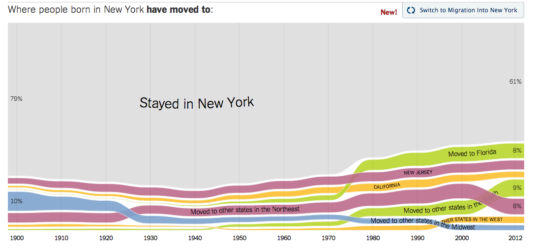
Screenshot of New York Times interactive.
I hope this quick intro has been useful for you. If you have any other questions, don’t hesitate to drop me a line.
Credits
-
Robert Gebeloff
Robert Gebeloff is a data journalism specialist for The New York Times and has worked with Census data since the early 1990s. Other recent projects have examined speciality financial markets, government entitlements, and education. Before joining the Times in 2008, he was a database editor for newspapers in New Jersey.


