Features:
Automating XKCD-Style Narrative Charts
How we did it—twice—and how we might do it differently next time
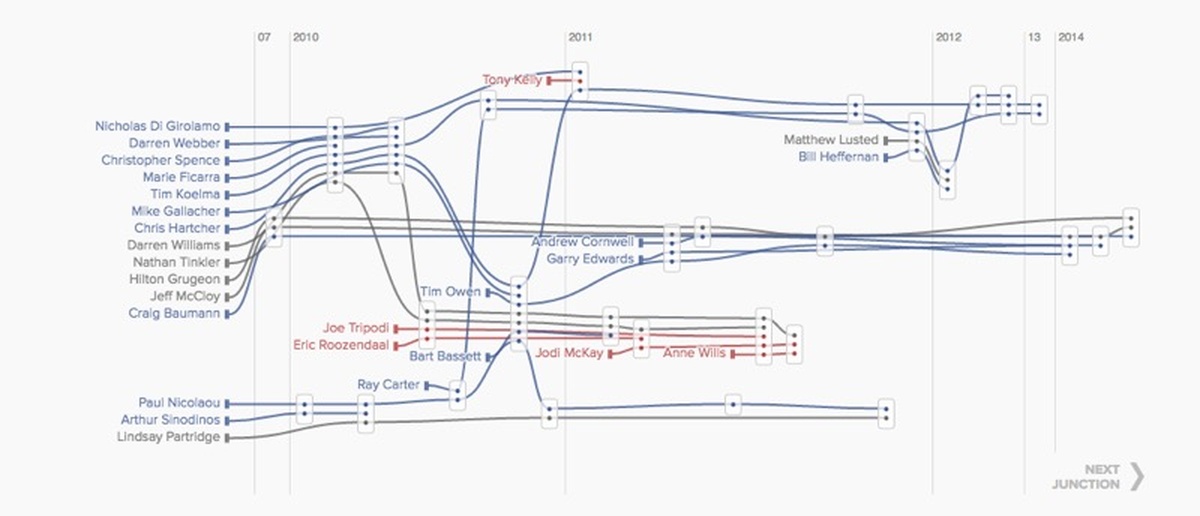
The forking paths of a scandal that became a saga. (ABC)
Ever since I first saw them, the XKCD movie narrative charts have fascinated me.
I’ve been exploring how to tell complex stories on the web for quite a long time. When presenting a complex story to an audience, the goal is often to simplify the complexity without sacrificing so much detail that important elements are lost. Another goal might be to distill the essence of a story into something which is more digestible, and at the same time expose a new angle that isn’t obvious in all the complex glory of the original.
XKCD’s movie narrative charts do this in a novel and effective way. On one hand, they show the shape of the story in one easily digested image. At the same time, they allow you to drill deeper, getting into the structure and detail of the story.
The XKCD charts are incredibly interesting as standalone artifacts, but they work most effectively when the audience is already somewhat familiar with the movie. That’s what opens up the possibility for visual gags like the panel on 12 Angry Men, which was so good I wanted to print it out and glue it to my exercise book like I was back in school.
A Political Scandal
While I had these charts bobbing around in the back of my head, a political scandal was unfolding in New South Wales, the most populous state of Australia and home to our most recognizable city, Sydney.
The Independent Commission Against Corruption (ICAC)—an organization charged with protecting the public interest, preventing breaches of public trust, and guiding the conduct of public officials in New South Wales—was conducting multiple long-running investigations, which were uncovering more and more evidence of corruption at the highest levels of politics.
There had been excellent reporting on ICAC proceedings and the political fallout as events unfolded, but the saga just kept going and going. Even for someone familiar with the story, reading each new report—despite the high quality reporting—was becoming hard to follow. Too many characters, events, and relationships combined to create a complexity that was difficult to penetrate.
A Visual and Interactive Solution
I think our first attempt at a solution, A Tangled Web, was a good start.
Technically it was a fairly simple force-directed graph, with some coding for participant status and relationship type. There was also an interactive element that let the audience explore biographies and relationships in more detail. However, this attempt didn’t do much beyond demonstrating just how complicated the story was.
As we were working through taking the story further, I pitched the idea of using XKCD-style narrative charts. I felt we had the perfect opportunity to re-invent the movie narrative charts for a new purpose. The charts would allow us to introduce the additional dimension of time—turning the story back into an actual narrative—while also making the relationships between politicians, businesses, and others easier to read, even with a high level of detail.
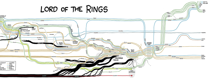
If XKCD’s technique could explain Lord of the Rings, surely it could work for us. (XKCD)
A Technical Challenge
Rather than hand-crafting the charts, we wanted the ability to generate them from different data sets—or, more accurately, from the same dataset, with different filters in place.
So the challenge was set to automate the creation of XKCD charts for the web.
Like all good developers, rather than attempt to build it myself, I had a good look around to see if anyone else had attempted the same thing, and it turns out, someone had. Unfortunately, the example I found isn’t open source, so we had to build it ourselves.
The crux of the challenge here is to take something incredibly complex and chaotic, add the further dimension of time, and produce a visual representation that minimizes the chaos.
More specific to a programming context, it’s an optimization problem at heart. In this case, we needed to optimize the vertical order of character lines and the y-axis position of each scene, to minimize the number of times a character line crosses another.
A Specific Goal
I decided to build it as a layout module for D3. My goal was to create a simple API that took as input a list of characters and the scenes in which those characters appear. That should be enough to return everything needed to draw the chart to screen.
The broad strokes of the layout algorithm look like this:
Group the characters into clusters based on the strength of their relationships. This step uses the Louvian method for detecting community structure.
Assign each scene a group based on the most common character group in that scene.
For each scene, create a unique set of characters which appear in all scenes in the same group.
Sort groups so that groups which are most often the modal group of a scene—that is, the group to which most characters in a scene belong—are at the extremes of an array. This means that the center-most group in the array should be the group which is least often the modal group of a scene.
Stratify the groups, giving each a minimum and maximum y-axis position.
Sort the characters within each group based on the average y-axis position of the characters’ scenes.
Sort the characters’ appearances within each group.
Compute the position of each character within each scene.
Compute the actual y positions of each scene.
Add introduction nodes for each character.
I know that all looks a little complicated—you can see just how complicated by checking out the annotated source. It’s MIT licensed and ready to be forked. If you can suggest a better way, I’d love to hear about it.
Here’s the finished piece, Untangling the Web.
In Retrospect…
Now that I’ve had some time to reflect, outside of a publishing deadline, I’m fairly confident that technically, this isn’t the best way to solve the problem.
An ever-present design and development challenge in newsrooms is the tension between meeting the deadline and solving the problem in the best way. Just getting it done can come at the expense of solving the problem elegantly. As the aphorism goes: perfect is the enemy of good.
As I said right at the outset, this is at its heart an optimization problem, and it took me too long to recognize that. If I had to do it again, I’d be much more trial-and-error about it. I’d probably create some kind of optimization cost-calculation function that could be used to calculate a good layout based on a bunch of simulations.
Movie Charts Strike Back

The characters at every junction.
Recently we got the chance to take this whole thing full circle and re-implement XKCD’s Star Wars panel—just for fun—in our Every Star Wars scene charted interactive, just in time for that headline to be obsolete.
Re-using our narrative charts implementation, especially in the same context as the original, gave us a good chance to assess its strengths and weaknesses. The main drawback to an automated data-driven implementation is that complex stories sometimes need more detailed curation than this technique easily facilitates. The more complex the story becomes—the more scenes and characters it has—the more difficult it becomes to read the resulting graphic.
That isn’t to say that complexity doesn’t sometimes help tell the story. Take, for instance, the obvious visual difference between the original Star Wars trilogy and the prequels.
In the end, I’m very happy with how the solution came together. While there are certainly things which could be improved, the chart was received well by the audience and, I think, does a good job of what we set out to do: make a complex saga digestible and explorable.
It’s a chart that worked well, and one I’d like to see more of. I also think it’s ripe for improvement, and I’d love to see what others can bring to it.
People
Organizations
Code
Credits
-
Simon Elvery
I’m a developer practicing journalism as part of the Interactive Digital Storytelling Team at ABC News. I’m an organiser for the Brisbane chapter of Hacks/Hackers and run a storieswithdata.community (come and say hi).


