Features:
Homicides in the District
15 months of investigation, hand-keyed data, and a multifaceted app
The Homicides in the District single-page app
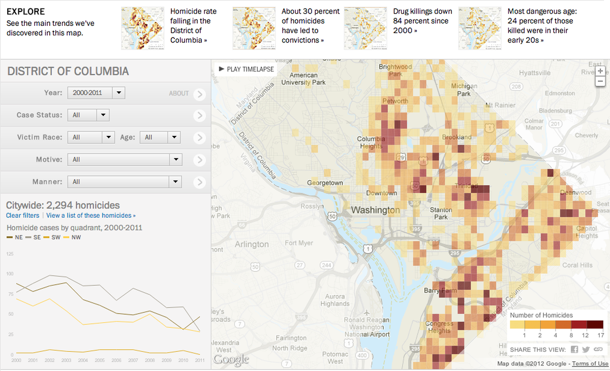
The District of Columbia, once known as the murder capital of the United States, had its lowest homicide rate last year since the 1960s. But has the steadily declining number of murders translated into more solved cases? Is law enforcement putting more criminals behind bars? Such questions led The Washington Post to compile a database of nearly 2,300 homicide cases spanning 2000 to 2011. The database, hand-keyed by our investigative team, allowed us to perform a “longitudinal” study of case status and outcomes that is rarely performed by law enforcement.
The study found that despite falling murder rates, less than a third of closed cases have led to a conviction for murder or manslaughter. And more than 1,000 cases remain unsolved.
The Data
From early in the project, we knew we were sitting on a rich set of data. Yearly homicide records from D.C. police contained each victim’s age and race; the location of the incident; the motive and manner of the crime; detectives who worked the case; suspects.
The bad news? All that incredible data was locked up in tables inside Microsoft Word documents, and those tables contained columns with inconsistent data types, missing values, and multivalued fields (multiple suspects in a single field, multiple detectives in one field, etc). Our early attempts to parse out clean, atomic data proved thorny, and we worried about introducing errors in the process of extracting the data programmatically.
Since the data set was relatively small, our reporter and investigations editor decided to hand key the data over the course of a week. That also gave them an opportunity to layer on corrections and case status discovered during interviews and by reviewing thousands of pages of court documents.
Building It
That raw input served as the backbone of our online presentation, a single-page app that lets readers explore the changing face of homicide at the citywide and neighborhood levels. (GeoDjango was our friend when it came to assigning victims to neighborhoods and cells in a citywide grid overlay).
At both levels of geography, readers can filter crimes by various attributes—victim age or race, motive, manner, etc.—and see those filters applied to the map and flot-powered charts in the sidebar. Each combination of filters and geographic level has a permalink that can be shared
That’s a lot of moving parts, and the need to support ad-hoc filtering was among the most challenging technical aspects of this project. It required us to create Tastypie-backed APIs that lean on pre-generated statistics where possible, and nimbly handle edge cases that couldn’t be calculated ahead of time. In both cases, the pandas library was invaluable for pivoting and reshaping data into a consistent format.
Those APIs power an interface developed by our user interface designer, Kat Downs, who wanted to allow people to quickly find homicides in their area by focusing on neighborhoods. People can see groupings of crimes that are meaningful in both the map and corresponding charts. To surface trends at a city-wide level, we added four promo spots above the map that send people directly to important stories in the app. And a timelapse feature lets people view trends, year by year, across the city and in specific neighborhoods.
So far, it has been a success. We’re getting great feedback from users; many people are telling us that they found surprising and intriguing information in the app. In the course of exploring it, they discovered a homicide on their block, their old street, or a place familiar to them. It’s a fascinating and sobering experience for D.C. residents.
People
Organizations
Code
Credits
-
Kat Downs
Director of Product @washingtonpost 🎉 Led @PostGraphics for 5 years 📈 @UNCMJSchool grad 👣 Lucky wife and mom 👧🏼👶🏼 I love 💡📚🗺😊
-
Serdar Tumgoren
Husband. Father. @AP data journalist.


