Features:
The Boston Globe’s Gabriel Florit on Responsive Visualizations
His OpenVis Conf talk in a nutshell
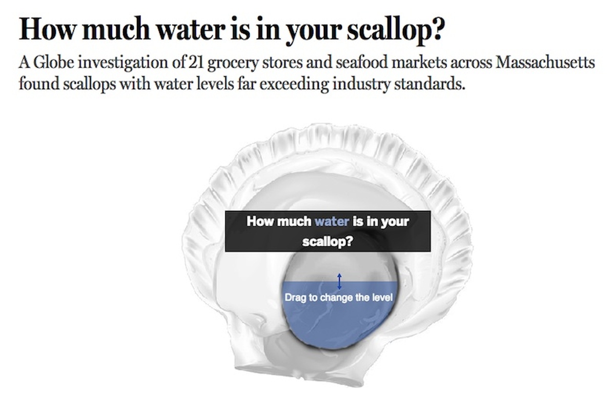
From the Boston Globe’s How Much Water Is in Your Scallop? feature
Gabriel Florit creates data visualizations at the Boston Globe, and was at OpenVis Conf to talk about the surprising difficulties of bringing the principles of responsive design to data viz. (It makes particular sense to see Florit discussing this topic, given the Globe’s early entry into responsive design in 2011.) Florit introduced the basic principles of responsive design as simply as possible: “The goal is to create data visualizaton that is of all devices, using the same source code. A PDF might live on the web, but HTML is of the web.” With that stated goal, he took a close look at an example piece that illustrates the apparent simplicity and the actual complexity of making visualizations responsive.
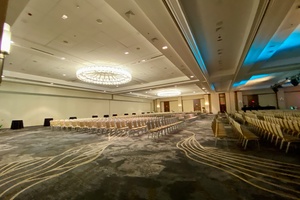
The Boston Globe data visualization How Much Water Is in Your Scallop? includes three parts: an initial game in which readers can guess the percentage of water (by weight) in a scallop, a scatterplot of water-weight in scallops sold at various Boston-area groceries, and a data block displaying the details of the selected store’s scallop content, along with a map of the store’s location.
Data Navigation
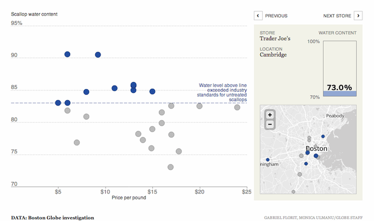
The scatterplot and map blocks from How Much Water Is in Your Scallop? as viewed on a desktop machine
At first, the process of making the feature responsive seems relatively simple: on small-but-not-tiny screens, drop the intro game; on very small screens, drop the map and store-details block as well, leaving only the scatterplot. (This is how the feature behaves at present.)

The same app on a smaller screen
But what are the problems with this approach, and how can it be improved? Florit uses the principle of mobile-first—considering the smallest screen first and getting more complex from there—as the foundation of his attempted revision, in part because this approach forces a focus on the genuinely essential. With this as a starting point, the simplest version of the visualization, available even to those without JavaScript, becomes a simple HTML data table listing water content and place of purchase. If JavaScript and Canvas are available, we can set up the code to automatically tranform the data into a scatterplot without much trouble. And that’s where the real problems begin to arise.
When you’re using a device with a mouse or trackpad, you can hover—but on a small screen, you lose that navigation option. Furthermore, navigating by touching tiny targets is either impossible or really annoying. So how can users navigate a scatterplot on a small screen? Florit walked through a series of options, along with their inherent problems.
- Previous/next buttons are too linear and limiting, and they still involve too much tapping on tiny targets. Making the whole screen into two big previous/next buttons solves the target-area problem, but is unintuitive and still unpleasantly linear.
- Mapping the data points to larger areas of the screen helps with tap-targeting, but it’s impossible to select points that are very close to each other, or that overlap.
- Mapping the graph width to point index helps with spacing, but the targets are still small, and it looks weird.
- Adding a guide-line to track touch helps visually, but if you haven’t encountered this navigation style before, you’re probably going to be a bit confused.
- Adding a zoom control (pinch-zoom or otherwise) helps with usability, but when you zoom in on a single point in a scatterplot, the context gets lost.
As Florit explained, “I thought ‘I’ll start with this scatterplot primitive, and then we’ll add appropriate data navigation for your device.’ But there are complexities…” Bottom line? Data navigation is hard.
Better Navigation Paths
Evolution of a Tycoon as viewed on a small screen
Native navigation methods, Florit noted, work really well. On a device like a phone, the most obvious native method is the scroll, as illustrated in the Evolution of a Tycoon visualization. Florit made the feature as a slideshow, and then realized that a slideshow can simply be brought down into a long vertical scroll—and that format lends itself well to mobile. “Small multiples and the combination of small multiples in slideshows is perhaps the the thing that works best on phones,” Florit explained. “When each ‘slide’ has meaning on its own and also builds to create a running comparison, that works really well on the phone.” Any time you can use a native feature like scrolling, he emphasized, you should.
Ultimately, even when native navigation methods can be used, responsive design can still pose real challenges. A Cartoon Celebration uses a comic strip format, and simply reflows the panels as needed to suit various screen widths. The result is beautifully responsive, but when you add new break points, you potentially lose connections between panels. The comic has been altered by changing the format, because format is part of the content. Florit quoted Alvin Chang on the subject: “It’s data visualization, not data representation.”
For designers, dimensions matter and placement matters, Florit emphasized. “We put things in specific places for a reason.” Ultimately, he said, the reality of responsive visualization is that “either you cheat everybody out of something, or you cheat some people out of everything.”
Designing for Features, Not Screens
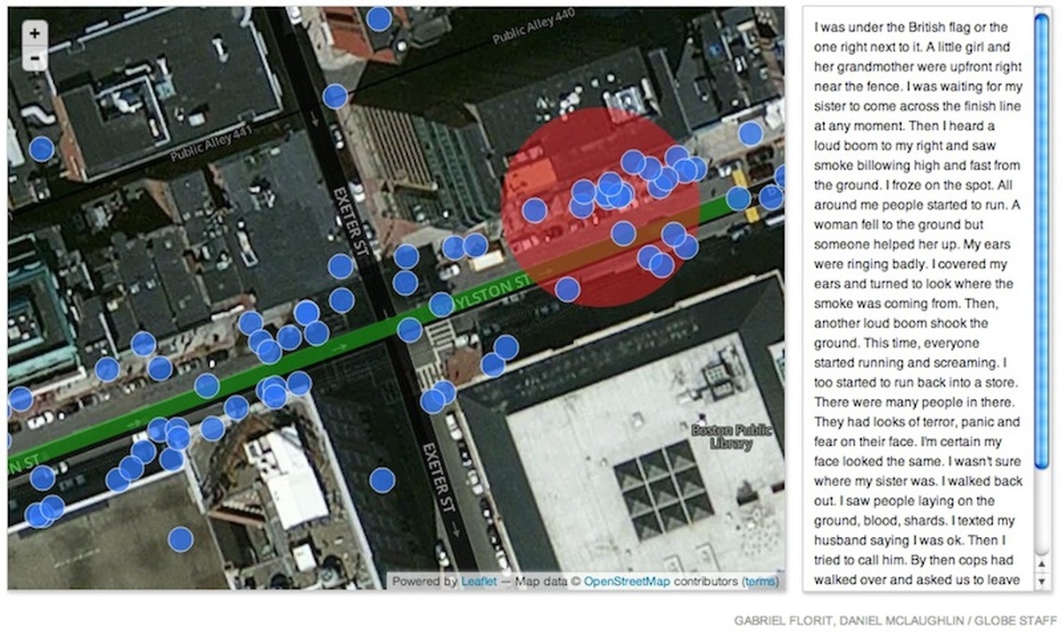
The redesigned version of Boston Marathon Bombings: Your Story
Happily, there are more options than we usually consider when trying to find ways to make visualizations responsive. Media queries have turned into a tool that enables us to design for screen size and nothing else—“OK, I got the phone done, what’s the next breakpoint?”
Florit asked us to think instead about the devices we’re actually designing for by taking a closer look at the smartphone. What are its actual characteristics? Yes, it’s small. It’s also portable and can be with you at all times. It has a touchscreen, has sound in and out. It has a gyroscope and an accelerometer, and it has GPS. It can be made to know where others in our networks are. It has light sensors and knows how bright it is where we’re using it. It’s much more than just a smaller screen. “As we move on to more devices like Google Glass,” Florit said, “these features are only going to increase. Designing for a number of pixels completely misses the point.”
Florit used his Boston Marathon Bombings: Your Story interactive for Boston.com as an example of a project that didn’t fully consider the uses cases of either desktops or mobile devices. He and his team launched the initial version of the feature at 5:30pm on April 16th, the day after the bombing. In their first version, the map occupied the entire width of the page, and the boxes that popped up on hover contained the entirety of each user submission. But Florit’s team hadn’t expected their readers to write as much as they did—more than 750 words, in some entries—and this design rapidly became unwieldy at any screen size, so Florit stayed up late into the night redesigning the app to include a sidebar that would display the full text of each entry, while the pop-up boxes contained only an excerpt.
An easy mistake, he said, would be to assume that the right way to make the app responsive would be to simply make the same features work on small screens. Instead, a better way to adapt the app—time permitting—would have been to emphasize the location-specific reading experience permitted by mobile devices with GPS enabled, so that readers could walk along Boyleston St. in Boston and move through the user-written stories as they moved through the physical space.
People
Credits
-
 Erin Kissane
Editor, Source, 2012-2018.