Features:
Animated Spray-Painting Candidates at the Guardian US
First in a series on experiments in elections coverage
Elections coverage—especially polling and results-tracking—includes a whole lot of work on necessary but semi-generic elements like results maps and lists, but also sparks the occasional burst of interactive design that approaches the same problems from a novel angle, like NPR’s Tetris-style block-drop, La Nación’s draw-your-own elections map, or the New York Times’ 512 Paths to the White House.
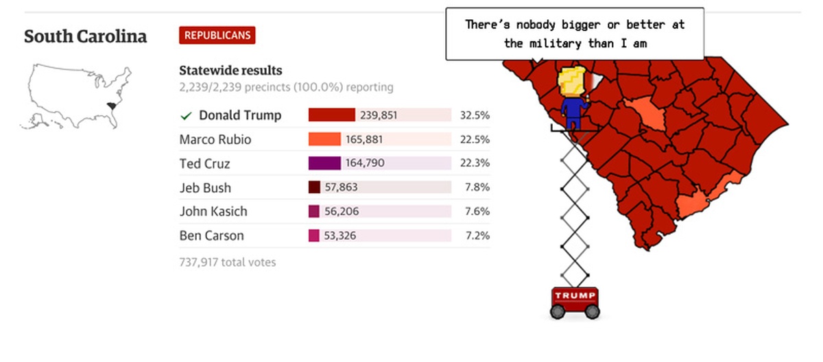
Over the course of the 2016 US election season, we’ll be highlighting plenty of hardworking projects designed to make elections coverage better for all—like elex and OpenElections—but also the offbeat, playful, and experimental approaches that newsrooms can work on when the basics are under control. Our first entry in the series comes from the Guardian US interactive team, who took a moment to break down their animated results maps that debuted in last week’s Nevada caucuses and South Carolina primary. —Ed.
One of the joys of working at the Guardian is that playfulness is very much “on brand.” With election results, we’re at a point where it’s getting really hard to differentiate yourself on factors like speed and comprehensiveness of results, but we wondered: is there another way we can make them more engaging?
Reviving an Old Idea
A few months back when we were brainstorming our election plans, we were throwing out a bunch of different ideas. Nadja, half-jokingly, proposed that on the night of the general election, we should have tiny presidential candidates run out on to the screen and color in states as they won them. For the primaries we’d originally planned to use off-the-shelf AP maps, as we were working on other big projects and didn’t have much time to plan. But, for various reasons, we had to abandon the AP maps. So, eight days before the Nevada/South Carolina races, we dusted off the idea and started thinking about whether and how we could make it work.
For one thing, it’s really, really hard to do good animations of characters walking, especially when they have to move up and down as well as left and right, and stop in arbitrary locations. Given the time constraint this felt like a fatal flaw in our plan, until Rich was struck by a vision of Donald Trump riding down an escalator to announce his candidacy, and we realised that they didn’t need to walk. From there, the idea quickly evolved to candidates riding around on a scissor lift (we originally wanted to do a cherry picker, but a scissor lift poses fewer mathematical challenges). Colouring in with a crayon gave way to spray-painting, both because it’s easier to implement in a way that looks natural, and because it reminds you of rival graffiti artists tagging their territory.
Our major concern was that it might be viewed as too flippant—or that the animation might obscure the actual information being provided (i.e. the results). But user testing an early prototype allayed our concerns. In fact, people found the visualisation made more sense, because they could see candidates literally “claiming” counties. Our testers also reported being much more engaged with the page, which was heartening.
Animated Pixel Art to the Candidates’ Rescue
Nadja’s pixel artwork sealed the deal. People loved those little folks, even Ted Cruz, who is generally not loved. Some were much harder to draw than others—obviously, Donald Trump has more distinguishing features than John Kasich—so we used campaign logos on the scissor lifts to eliminate any ambiguity.
The animations are implemented as a filmstrip of ten frames per candidate, each representing a particular state (idle/talking/excited/painting etc), and the app selects the right frame and paints it to a canvas for each turn of the animation loop. We also generated a list of phrases for each candidate, from the debates and campaign speeches, which added an extra level of personality (plus a few in-jokes for people who have been paying close attention to the campaigns).
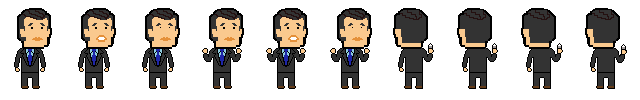
Even the unlikeable become charming at pixel-scale
Getting It Moving
There were some fun but hairy technical challenges. For example, making the motion of the scissor lift look natural meant building a mini physics engine that understood concepts like coefficient of friction so that we could calculate the stopping distance of a moving vehicle without knowing things like velocity or screen size ahead of time, and which could represent the concept of inertia (so that the scissor lift platform lagged the base slightly, making it seem less rigid). We created a GIF generator for our social team, which meant that the physics engine had to be timer-agnostic so that we could control how the simulation ran and capture frames without relying on requestAnimationFrame or setTimeout.
We also had to come up with a performant algorithm that could generate a “plan” for traversing a polygon and filling it in, in a way that didn’t look completely unnatural but which also made sense given the mode of transportation. Attention to details like these is the difference between “neat idea” and delighting people. We take our playfulness very seriously!
Credits
-
Kenan Davis
Graphics at @nytgraphics. Formerly @GuardianUS & @columbiajourn
-
Rich Harris
Graphics editor, @nytimes investigations team. Open sourceror
-
Nadja Popovich
words & graphics @nytimes @nytclimate ✨✨✨✨✨ Formerly: @GuardianUS
-
Kenton Powell
Head of design and graphics at VICE News


