Features:
How Promotion Affects Pageviews on the New York Times Website
OpenNews Fellow Brian Abelson breaks down metrics research conducted at the NYT
2013 OpenNews fellow Brian Abelson has been conducting research on pageviews as a metric, and on the relationship between pageviews and promotion at the New York Times during his fellowship there. This article is cross-posted from his blog.
The Meaning of Metrics
James Watt had a problem. The man erroneously known as the creator of the steam engine (he actually just added a small condenser to the existing steam engine which made it more efficient) needed a way to sell his new machine. While there were plenty of ways to measure how one steam engine compared with another, there wasn’t yet a good way to compare the power of a steam engine with that of less technologically-sophisticated alternatives.
So Watt came up with horsepower, which was based on this simple estimation of an average horse’s strength:
1 Horsepower = 745.699872 watts
With this new conversion factor, Watt was able to make the utility of his machine more marketable. Watt’s engine eventually replaced horses and water wheels as the primary power source for British Industry and was one of the most crucial factors in the Industrial Revolution of the 19th century.
The great irony in all of this though was that Watt’s main innovation was increasing the efficiency of the steam engine, not simply its raw power. Ultimately, he made a trade-off between the degree to which horsepower reflected reality and the degree to which it could be interpreted by a lay-person. In the end, he assumed that people would take the price of coal into account, and therefore make their decisions according to two metrics: resources expended and power generated.
Almost 250 years later, horsepower is still being used to sell engines. The problem, however, is that over time—as the cost of extracting and shipping resources around the world plummeted—the calculation of horsepower remained the same. One wonders how different the world might look if Watt had added a simple denominator that accounted for the resources required to generate a given amount of force; what if American auto-culture had been focused on selling efficiency and not horsepower?
Here, we begin to see what metrics are for and the effects they have over time. A metric is about communicating a complex concept in interpretable and actionable terms. But when it’s widely adopted—when an industry seeks to optimize its activities for a given metric—it ceases to be a mere reflection of reality. Instead, the measure comes to actively shape the industry, oftentimes leading to unforeseen manipulations and externalities. So just as the American auto-industry’s choice to optimize for power came at the expense of increased C0² emissions, incentivizing professional baseball players to hit more home runs led to the widespread use of steroids, and the success of the Economist’s Big Mac Index inspired Argentina to artificially depress the price of the burger.
In News, the dominant metric is currently pageviews, which in many ways is the digital equivalent to its analog predecessor: circulation size. While Watt used the power of a horse as the metaphor for the power of his steam engine, media organizations use pageviews as a proxy for their overall reach. They’ve done this in part because pageviews are relatively easy to measure and compare across articles and news outlets. However, the “landscape has changed” and earning money in a news organization is no longer a mere function of audience size. That being said, it hasn’t stopped media outlets from optimizing their activities to maximize this metric.
At their worst, companies use slideshows, link bait, and mugshot galleries to “juke the stats.” However, innocuous activities like placing an article on the homepage, sending out an email blast, or sharing a link on social media have the same effect. That this is the case is neither good nor bad—it simply needs to be acknowledged before one can meaningfully make comparisons across online content. But while the promotional arms of media outlets are focused on directing interest to particular stories, their metrics do not capture the impact of these energies. Just as Watt’s horsepower only accounted for the power of his engine (and not the energy required to generate it), so do pageviews fail to capture the effects of the resources expended in creating them.
Pageviews Above Replacement
What would pageviews look like if we controlled for promotion? This was the question I set out to explore earlier this year as a part of my OpenNews fellowship. Early on at the Times, I spoke with numerous journalists and editors who expressed a desire for a better way to make comparisons across varying pieces of content. For them, the difference between 100 and 100,000 pageviews was obvious, but what if one article “[got] to ‘Snow-Fall’” and the other didn’t?
An early inspiration for me in this process was the concept of Wins Above Replacement, or WAR—an advanced baseball statistic developed by sabermetricians. The idea is fairly simple: managers are interested in putting together a winning team. However, to do so, they must select the right combination of players that possess a variety of skill-sets. While it may be easy to identify high-impact players, the majority of a team’s roster is made up of backups, relief pitchers, and “role-players” for whom it is more difficult to judge relative talent.
WAR addresses this conundrum by calculating, for every player, “the number of additional wins that player would contribute to a team compared to a replacement level player at that position.” So, if a manager was in need of a shortstop and didn’t have much to spend, he could simply open a spreadsheet of available players, filter by shortstop, and sort by WAR. The players at the top of this list should presumably contribute the greatest number of wins to the team over the course of a season.
In many ways, media companies are in need of just a metric: one that effortlessly communicates value and drives decision-making. However, at the present moment, online metrics are too focused on decontextualized outcomes. But by incorporating the influence of promotion on an article’s performance, we can create a set of baselines that would enable more meaningful comparisons across a wide range of content. We might call such a metric ‘Pageviews above replacement’ or PAR for short, as it would allow us to determine how well a certain article performs in comparison to a similar article that received the same level of promotion.
In an attempt to build a prototype of PAR, I collected as much data as I could on the promotional activities of the New York Times. Every 10 minutes or so, I pulled in the posts from 20 Times Facebook accounts, 200 Twitter accounts, and the contents of the homepage and ~ 25 sections fronts. At the same time, I also collected metadata on articles and information on their performance. By cross-referencing these two sources by URL and time, I was able to construct a detailed database of 21,000 articles published on nytimes.com between July and August.
Exploring the Data
Throughout my stint at the Times I have often witnessed analysts, social media editors, journalists, and business executives sprung into action when a particular piece of content is not meeting its expectations. In most cases, the solution is to intensify promotional efforts. Whether it be through a concentrated social media campaign or simply leaving the article on the homepage longer than normal, the inevitable result is that traffic to the article increases. Following this behavioral pattern, I expected to see a clear relationship in the data between promotional energies and pageviews.
In the chart below, the data is visualized over time. The y-axis connotes the total number of pageviews the article received over seven days while the x-axis represents when the article was published. Pageviews are transformed along a logarithmic scale in which the differences between points correspond to orders of magnitude, rather than the raw number (in other words, the actual difference between points lower in the scale is much smaller than those higher up). In this chart and the others that follow, I remove axis annotations for pageviews so as to protect the privacy of the New York Times. Finally, each dot is colored by the time the article spent on the homepage and sized by the number of times it was tweeted by a New York Times Twitter account. For context, I add a line through the middle that represents the average number of pageviews for articles published on each day.

At first glance, this chart appears to resemble a series of balloons floating upwards. The metaphor is apt—articles which spend longer on the homepage (reddish bubbles) and which are tweeted more by Times accounts (larger bubbles) always rise higher. Below the average line, there are no big red balloons.
Following this insight, we might wonder how strong the relationship between time on homepage, number of tweets, and pageviews is. The chart below visualizes these relationships by placing articles in a scatterplot, where the x-axis is the time an article spent on the homepage (log-scaled), the y-axis is the number of pageviews (once again, log-scaled), and the size of each point corresponds to the number of times the article was tweeted by Times accounts. In addition, the dots are now colored according to the four combinations of two variables—whether or not an article was from the AP or Reuters (“the wire” for short) and whether or not an article was tweeted by @NYTimes.
| Original content, no @NYTimes tweets | 4553 Articles | 21.7% |
| Wire content, no @NYTimes tweets | 15180 Articles | 72.2% |
| Original content, tweeted by @NYTimes | 1184 Articles | 5.6% |
| Wire content, tweeted by @NYTimes | 89 Articles | 0.4% |
Through my explorations of the data, I found that these two variables were significantly associated with the number of pageviews an article received (discussed more below). Intuitively it makes sense—stories from the wire should not receive the same promotional energies as those that come from journalists working at the Times. Likewise, articles which are exposed to @NYTimes’ 10 million followers will invariably perform better than those which do not receive this boost.

This chart shows the stark contrast in the lives of articles that pass through the New York Times. On the left side of the graph, we see a stack of 13,000 articles (73% of the total) which were never promoted on the homepage. These articles exist in somewhat of an online ‘State of Nature’ and for most, their lives are nasty, brutish, and short. Of these, about two-thirds are wire content. The other third are stories from Times journalists, two percent of which were also tweeted by @NYTimes. Just to the right of this stack is content which was on the homepage for 10 - 100 minutes. Of these, a shockingly high 98% are wire articles. In this space, the articles that performed especially well were the fortunate one percent linked to by @NYTimes. Finally, on the right half of the chart are the six percent of articles which spent more than 100 minutes on the homepage. Over 90% of these articles are original content and almost 80% were promoted by @NYTimes.
What emerges from this visualization is a clear picture of four distinct classes of content on the New York Times’ site: (A) Wire articles which never reached the homepage, (B) Original articles which never reached the homepage, (C) Wire content which is featured on the homepage for a short period of time, and (D) Original content which receives promotion on both the homepage and across social media. While groups A and B encompass a wide variety of outcomes, groups C and B generally display a positive linear relationship between time on homepage and pageviews.
Predicting Pageviews
Given these clear relationships, I wondered how well I could predict pageviews. The idea here is that, by determining the factors that drive traffic to an article, we can create baselines that help us determine whether or not an article has underperformed or exceeded its expectations.
Surprisingly, I found that the three factors visualized above—whether or not an article was from the wire, whether it was tweeted by @NYTimes, and how long it spent on the homepage—accounted for over 70% of the variance in pageviews within my dataset. By including additional variables in my model—the type of content (video, interactive, blogpost, or article), the section the article came from, word count, promotion on Facebook and section fronts, and the highest point the article reached on the homepage—I was able to explain almost 90% of the variance in pageviews. This means that, given some basic information about an article and the degree to which it will be promoted, my model can, to a fairly high level of precision, predict how many pageviews that article will receive seven days after publication.
Of the variables included in the model, ten proved to have the highest predictive value:
- Time on all section fronts (+)
- Number of unique section fronts reached (+)
- Was the article in the paper? (+)
- Was the article tweeted by @NYTimes? (+)
- Time on homepage (+)
- Number of NYT-tweets (+)
- Max rank on homepage (+)
- Word count (+)
- Is the article from Reuters? (-)
- Is the article from the AP? (-)
+/- symbols signify the direction of correlation
While it may be tempting to latch on to any one of these variables, the general idea is that, holding all else constant, articles which receive more promotion—on the homepage, across section fronts, and on social media—will invariably receive more pageviews. While there are some serious problems in such an analysis—it is likely that content which performs well tends to attract the attention of homepage and social media editors—the power of the relationship suggests that, in general, the Times can selectively pick and choose the content that garners the most attention by simply manipulating their homepage and principal Twitter account. This is certainly not an earth-shattering insight, but the degree to which it holds true suggests that these factors cannot be ignored.
Below, I visualize a scatterplot of the actual number of pageviews versus the number my model predicted. Once again, dots are colored by the four categories outlined above, with lines pointing to the average number of pageviews for each category.
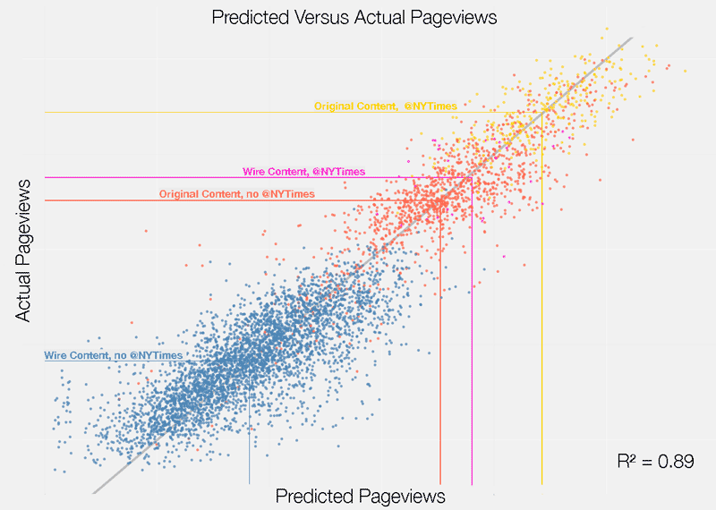
While this chart mainly communicates the predictive power of the model, it also reveals some other interesting insights. For instance, there is a much higher level of variance—or predictive error in the model—at lower levels of pageviews. This is the manifestation of the ‘State of Nature’ described above. Since promotional energies are such strong a predictor of performance, articles that receive very little promotion are harder to predict. Further investigation confirmed that the majority of the error in my model was present in articles which never reached the homepage.
More importantly, the relationship between actual and predicted pageviews represents a fundamental building block of PAR. In the graph, the straight gray line signifies the threshold of a perfect prediction. Articles that fall above this line can be thought to have exceeded their expected number of pageviews while those below the line have underperformed. Computing the error of the model, or the difference between actual and predicted pageviews, allows us to calculate the degree to which any given article has performed in relationship to its “replacement”—or a hypothetically similar article which received the same level of promotion.
Calculating PAR
While I am still in the nascent stages of this research, I explored what PAR might look like if we were to use it to evaluate the performance of various sections on the New York Times. Below I visualize the average PAR—or the degree to which a given article’s actual number of pageviews deviated from the number my model predicted— for the top sections in terms of the number of articles produced. In the chart, the x-axis represents standard deviations—or the distance a data point is from its mean—so that we may compare multiple variables on the same scale. The x-position of reddish dots signifies a section’s average PAR. These dots are also sized by the average number of times NYT Twitter accounts shared a link to an article in a given section. Concurrently, the x-position of blue dots signifies the average pageviews for articles from each section. These dots are sized by the total number of articles published in that section. Finally, the lines connecting these two sets of dots are colored by the average time articles from these sections were promoted on the homepage.

As the annotations on the chart suggest, PAR significantly levels the playing field. While Business, US, Technology, World, and Sports all rank much lower with regards to raw pageviews, PAR accounts for their relatively low level of promotion (visualized by the blue lines and small red dots). In turn, these sections rank in the middle of pack with regards to PAR. On the other hand, Opinion, Magazine, and Real Estate pieces, which rank high in terms of pageviews, are not so far ahead when calculating PAR. It is important to note, of course, that content which garners an extreme amount of traffic will still rank high in terms of PAR, as these signify outliers from the norm, and the model will never be able to fully account for these deviations.
Next Steps
While the research I’ve outlined above represents a very small step in creating a better set of metrics for online media, it powerfully suggests that the placement of promotional data alongside pageviews gives us a better understanding of what the metric actually means. To make these insights actionable, we might imagine an application which tracks, in real time, how articles are being promoted across an organization’s social media accounts and website. This application would then make a prediction of how many pageviews (or really any outcome, for that matter) an article should have received at an arbitrary point in time given the level of promotion it garnered up to that point. By concurrently tracking the performance of an article over time, it could also make predictions about the future, which would aid in deciding whether additional promotion of an article will have a meaningful effect. Researchers from MIT, Carnegie Mellon, and the Qatar Computing Research Institute have recently created a similar application for Al Jazeera, and have outlined their findings in an academic article. I have also begun work on open-source application (documentation is coming!) which tracks an arbitrary set of Twitter accounts, Facebook pages, websites, and RSS feeds, and detects and archives when links that match a certain pattern appear. This application could be used in tandem with Google Analytics (or any other analytics software) to create a dataset similar to the one I’ve outlined above.
An important task in furthering this research will be to apply it to contexts outside of the New York Times. The variance in promotional strategies across media organizations is vast, and it is likely that the factors which drive pageviews for the Times are not the same for nonprofit news sites like ProPublica or social media-oriented outlets like Quartz. The Times is most certainly an outlier with regards to the level which its homepage drives traffic, and in the future—as social media becomes an increasingly important mechanism for content discovery—the significance of homepages will invariably diminish. Another issue is the fact that, more and more, news organizations are serving different content to different users based on their perceived preferences. In this world, it will be very difficult to determine the degree to which certain pieces of content are “promoted” more than others.
In sum, the PAR approach is a band-aid—it does not fully dissolve the importance of pageviews nor does it anticipate the changes in the media landscape to come. It cannot tell you anything about the broader impact a piece of reporting has on society, nor does it ‘Save Journalism’ in one fell swoop. At best, PAR helps communicate the importance of measuring inputs, or the energy expended by a news organization to achieve a certain goal. While measuring promotional input is an important first step, we might also imagine a set of metrics which account for the time it took to put a story together or the money spent on pulling in content from the wire. As my esteemed colleague James Robinson likes to say, news analytics is about “measuring the relationship between impact and effort.” For too long we have been focused on measuring the former while ignoring the latter. It’s time to change that.
Credits
-
Brian Abelson
‘he is clearly very clever’ - @nytimes legal dept. | data @kickstarter | https://t.co/o5FjZCIDql