Features:
A Map That Wasn’t a Map
A Mother Jones case study
A preview of a non-map map solution from Mother Jones
The project: mapping the status of marijuana legislation in every US state. Colorado had just legalized pot shops for recreational use. Cuomo was making noise about New York being next. We wanted to provide a one-stop shop on the current and future legalization landscape in each state.
Good information about marijuana use in the US has been mapped elsewhere. This one from Prospect shows current and proposed legal and recreational use, but nothing on decriminalization or penalties:

This one from the Washington Post includes decriminalization, but not reduced fines or proposed legislation:

From WaPo
We couldn’t find one source that offered all of this information in a clear and detailed way. That’s the challenge we took on.
Looking for Inspiration
This would mean juggling a lot of layers of information. Three different legal categories: recreational use, medicinal use, and decriminalization. Status of these laws in each state: nonexistent, proposed, or already in place. Finally, we had a reporter compiling tons of rich details, like how many plants a medicinal user can grow in each state, how much prison time you can expect in each state, and much more.

A choropleth map from Mother Jones
Being a national publication, we do a lot of state-by-state mapping, usually in the form of a simple choropleth map made by bringing an .svg file of the US into Illustrator, giving it a “color by numbers” treatment, and exporting as a flat .png.
When we need to throw in a bit of additional information, we usually go the tooltip-on-hover route. But we hate tooltips: you’re hiding all your important context, making readers hunt and peck up to 51 times to see it all. And don’t get me started on tooltip maps and mobile.
Given our immense dislike of tooltips, and the complexity of the data, this felt like one of Matthew Ericson’s “map that’s not a map” situations. An alternative came to mind in the form of this 2012 graphic on gay rights across the US from the Guardian. I like this project; it’s basically a clever stacked-percentage column chart with the additional dimension of regional clustering. Regional distribution of gay rights is immediately clear, and regional outliers, like Pennsylvania, pop out better here than on a choropleth map.

From The Guardian
On the other hand, I know this project falls outside the “don’t make me think” comfort zone for a lot of people. Then there’s the issue of mobile: how on earth would we make this type of chart responsive? (The Guardian’s version is optimized just for desktop.)
Testing Formats
Would this approach work for our project? Only one way to know for sure: we borrowed heavily from the Guardian piece to spin up a working prototype with our data, and then sent that around the edit staff for some road testing. Unsurprisingly, reviews were mixed, enough that we abandoned this approach.

The one that didn’t make it
But we didn’t want to abandon the best part of the Guardian graphic: highlighting the regional distribution of laws across the country. Was there a way to do it all? It’s like we wanted both a table and a map, all in one …
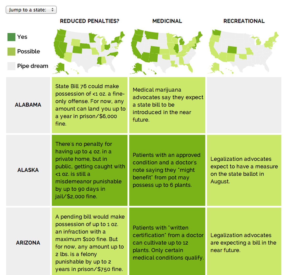
Here’s what we came up with:

Our final version, live at Mother Jones
Regional distribution? Check, via small multiples across the top.
Detailed blurbs? Under the maps, in simple tabular format.
Status? We used two shades of green (couldn’t resist) to show whether a law was passed (dark) or simply proposed (light). Gray boxes meant no legislative action to report, but also included details on penalties where they applied.
We weren’t the only ones who thought this worked (thanks, Brian!):
Every time somebody asks me to make an interactive map, I’m going to send them this. Simple and great. http://t.co/xNsFuN0RqB via @dannydb
— Brian Boyer (@brianboyer) February 10, 2014Making it Mobile

Our mobile answer
As for mobile, we considered a number of responsive data table approaches. Turning a table into charts for mobile is intriguing. But our info is largely qualitative, so no dice. Adding horizontal scroll just seemed lame, nor were we ok with ditching some columns for mobile. Then we saw this suggestion from Chris Coyier (we’re big fans) to turn a desktop table into a mobile list. Genius.
One thing I regret: we killed the maps on mobile (deadlines). It was probably a simple matter of running small maps vertically above the list, but we’ll get it next time.
Lastly, a few words on dealing with a lot of words. As you can see, some of the blurbs are fairly long for a table. We had options for dealing with this:
1. Ask the story editor to chop them down. This made us sad. There’s a lot of good context in those cells, and valuable time went into gathering it.
2. Build in an expand-collapse effect, where cells with long text would expand on hover. After reviewing a bunch of janky jsfiddles, we asked ourselves an important question: who cares if the text is long? After all, this isn’t an embedded graphic squeezed between paragraphs of story text. The graphic is the content, and deserves the space it needs. You do you, table-map-graphic-thingie.
Properly abstracted, documented, open-source version on our GitHub coming soon. And if anyone comes up with a better name for this type of graphic, I’ll buy you a nice drink at NICAR.
Credits
-
Tasneem Raja
Executive Editor of @thetylerloop, a nonprofit journalism startup in East Texas. Contributor @newyorker @theatlantic, former senior editor @NPR @motherjones.


