Learning:
Building Smart Newsroom Tools
Melody Kramer on how user-centered design process and attention to newsroom culture can make or break your internal tools
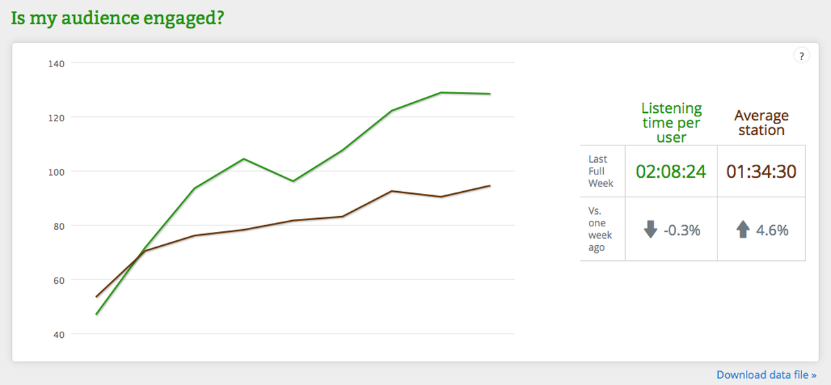
The tip of the iceberg of NPR’s social media dashboard.
Earlier this year, NPR’s two-person social media team—that’s me and Wright Bryan—were given six weeks to research, design, and implement an analytics dashboard for the NPR newsroom. As the social media team, we run NPR’s social accounts, manage NPR’s relationships with third-party tools and platforms, and develop the social strategy for the network. We also manage and lead projects to build internal tools that help our newsroom better prioritize their limited time in the social space—which was the goal of the dashboard project.
We chose to make an analytics dashboard instead of buying an already-existing product. The decision came down to two things: cost and customization. We priced out several analytics dashboards and realized we could build something cheaper in-house. Building the product ourselves meant it would be able to grow as our newsroom grows: as new NPR products are developed and launched, their analytics will be added to the dashboard as part of their development cycles. It is much easier to customize something that you build yourself.
In addition, we realized that we didn’t need many of the bells and whistles featured on the analytics products we saw. We wanted a simple product—one that everyone in our newsrooms could quickly look at and understand what they were seeing immediately. This was extremely important, because we were going to ask everyone in our newsroom to use the product, so we needed a solution that would do what people needed it to do, and do it straightforwardly.
The simple goal was to create a tool for NPR’s journalists to better understand our digital audience. At the start, we weren’t quite sure what the tool would look like—or even what it would measure. Our approach was to think about it from the user’s perspective—in this case, our producers, reporters and editors. Like many newsrooms, NPR has Chartbeat and Google Analytics to show us audience behavior. But there are some limitations to using just these two platforms to analyze an audience. Chartbeat doesn’t tell us things like when a piece from the archives starts to trend. Google Analytics, meanwhile, is really confusing—and people who are constantly filing audio and web pieces don’t have time to sift through its many layers.
Again, because this is key: we didn’t have a preconceived plan, and we knew we needed to understand what the tool’s audience—which in our case was our newsroom—might need. If we made a tool that the people in the newsroom found difficult to understand, difficult to use technically, difficult to access, difficult to use due to company culture, or difficult to share knowledge about, then what’s the point? So we had to figure out, what does our newsroom need? And how could we get the most bang for our buck with six weeks of development time?
What we knew getting started was that as part of their work every day, people in our newsroom gather sound, find sources, write copy, edit copy, track audio, file web copy, and use social media to find sources, connect with the audience, and promote their pieces. So the time they spend on social media has to be the most efficient and productive time possible or it won’t serve them well. To make that possible, we knew we wanted to build something that would allow our newsroom to see—at a glance—how a piece was doing. And we wanted to create what we called “actionable behaviors” —so that if a reporter or producer saw certain trends on the dashboard, they would be compelled to take some action, the success of which they could then evaluate by looking at the dashboard again.
Our User-Centered Research Process
We started with a UX research process, which has several stages: creating personas, listing assumptions, and determining the impact of various actions. This is a really good way to frame any new project: before diving in and developing, the team thinks about what a product actually needs to be successful, based on the types of people who will be using the tool and what they will be doing with it.
With the guidance of UX designer Scott Stroud we sketched out what UX people call personas. We came up with several: I am a homepage editor, I am an editor of a section, I am a blogger, I am a radio reporter, I am a producer, and we thought through what each of them might need from a dashboard. Interviews were conducted with representatives from each group, and their thoughts were written on a whiteboard. We knew that not every one of their suggestions would become part of the first version of our product, but it was a way to funnel both our own ideas and their ideas into something more manageable.
Scott also suggested writing out the general assumptions we had about an analytics tool because it would help us limit the scope of our project. The first assumption we wrote had nothing to do with the tool itself. It was: A change in culture is equally as important as building a useful tool. You can build the most useful tool in the world, but if you can’t change people’s behaviors so that they use the tool and understand the value of the tool, then what’s the point? Culture—and changing existing habits—is key to introducing a new product in a newsroom.
We continued: We want to empower individual journalists by providing them the tools and information they need. We believe our social media strategy should be centered around individual empowerment: We want to empower our journalists to build their own individual presences on social media. We want our beat reporters, producers, and editors to become established leaders within their topic areas regardless of platform. And we want to provide our newsroom with the proper tools and training.
Other assumptions we made:
- The tools we create should help us understand and expand NPR’s core audience.
- The tool must evolve over time.
- We should start with the most impactful solution. In other words, what could we build that would cause our newsroom to change their behaviors in such a way that we could get more dev time to further work on the tool. (Remember, we were given six weeks—which is enough time to build a minimum viable product but nothing too fancy.)
With our assumptions laid out and ideas and needs gathered from our users, we began to plan and build. Throughout the project, we held brown bag lunches for the newsroom to discuss the dashboard, met with managers to get their input, and were completely transparent about what we were building.
We took our personas and assigned everyone in the newsroom a role. Then we thought about what a person in that role would do if they noticed something on the dashboard. For example, if I’m a homepage editor and I learn a piece from our archives is spiking from the dashboard, then I should: put it in back on the homepage, update the page, let the social team know, and so on.
We made a chart of these actions and behaviors that our personas would take in the form of: “If I have job X and I learn Y, then I should do Z.” For example, if a homepage editor sees that a story from the archives is starting to do really well on Twitter, then the homepage editor updates the headline or changes the related links to make the piece relevant for a new audience.
The resulting tool shows users the results of their actions—it was created to encourage experimentation. Our newsroom can see traffic spikes correlated to various times—so they know how their behaviors are affecting incoming traffic patterns. This allows users to test hypotheses over the course of a day or week or month, and use the data from the dashboard to figure out whether their hypothesis was correct. And they can share what they learn from the tool through an internal listserv we set up so we can all learn and share together.
The Dashboard in Action
The good news is, it’s all working. The first iteration of the dashboard tells our newsroom how much traffic a piece is getting, where that traffic is coming from, who has linked to a particular piece, and how the piece is doing on social media. Reporters and producers get information and take an action, step back and assess quickly, and then take the same or a different action. Reporters are testing out various hypotheses to see how the traffic changes, or how the sources change, or how traffic from different social networks change.

NPR’s full social media dashboard.
All of the feedback we’ve received since launch fits into two categories: we love this and we want more. People enjoy knowing how their social media activities are impacting the way their stories travel online. And I think this has a lot to do with our initial insight about culture, and how we let that guide us; so, how Wright and I worked on including the entire newsroom at NPR in the building process while we were also developing the product—the interviews, brown bag lunches, and ongoing feedback we invited.
To support the necessary cultural change we also launched the dashboard simultaneously with an auto-generated daily analytics email—one that summarizes the dashboard’s stats from the previous day, and linked to the dashboard for the 50 top stories from the day before—instead of the stories themselves. This means that everyone at NPR is exposed to the dashboard on a daily basis. In addition, we send out a daily email with social tips and tricks. We now include findings from the dashboard—if we or anyone else in our newsroom notices something, they let us know and we email everyone at NPR. We are increasing awareness of the dashboard—and making sure that we’re all learning together. Both of those daily emails are helping to build a culture—along with the tool—that involves using social media effectively and sharing knowledge.
We’re not done. Eventually, we hope to build relative data into the dashboard: to me, raw numbers are meaningless unless they can be compared to something. We don’t want our politics reporters to be compared to our arts desk reporters and our international correspondents. Each of those desks has a different potential audience—and they may not overlap.
But even without this more advanced functionality, the product is a success. It allows our newsroom to assess data and create meaningful actions, and they’re doing it—which translates into a better relationship with our audience.
Credits
-
 Melody Kramer
Melody Kramer is the co-founder of Hedgehog and Fox and leads audience growth and development for the Wikimedia Foundation. She writes a weekly column for the Poynter Institute, is a visiting fellow at UNC’s Reese News Lab, and is working with the Center for Collaborative Media to document every collaborative journalism project in the world. She’s reachable @mkramer and melodykramer@gmail.com. (Photo credit: Neil Kramer)


