Learning:
Putting the User in User Experience
Zoe Fraade-Blanar on why and how good interaction design thinks about users
Copy editors, bless ‘em, they make our writing makes sense to people who are not us. Are there awkward phrases? Is it logical? Has anything been left out? Copy editors fix it. It’s a system that works because the editor can act as a stand-in for the end user, the reader, assuming that they mimic the intended reader’s literacy level. Digital journalism projects like data visualizations have no equivalent “digital” copy editor. We can never assume that the creator and the end user have the same technological literacy level, just for starters. Once a data team has created an interactive map or chart, their own familiarity with it nearly invalidates any self-critique of the end product. And by the time the piece gets in front of the end user it’s usually too late to adapt.
Interaction Design Starts at the End
Interaction design—designing with the end user in mind and incorporating them into all stages of the project—means flipping the standard order of operations. It relies not on editing against a set of rigid rules, but on creating the right user experience—what Plato would have called the “shadows on the wall.” It’s not the idealized, perfect way you meant for your product to be used, rather, it’s how a product is used by real people in the real world.
The user’s experience includes everything from their ability to understand the journalist’s thesis to their ability to comprehend the navigation to how pretty they think the graphics are. It deals in subjective matters: how they feel about the piece and their pleasure and satisfaction when viewing it, opening it, turning it on and off, and telling friends about it. We can’t control these things. The best we can do is get as much feedback from the end user as possible in order to craft the type of experience we’d like them to have, preferably in as quick and dirty a way as possible, preferably while there is still time to make changes.
How do you do this? At the beginning of a project, think: What is the mental reaction you want your project to encourage in your users? Is it learning? Delight? Excitement? Disgust? The answer will depend on the subject matter and what you want people to get out of your work. For example, an editorial piece encouraging kids to brush their teeth might want to impress them with the importance of flossing, which means either going heavy on teaching about the facts, or attempting to inspire fear if they don’t do what you say. But, if you wished to tackle the problem space of helping them to remember to floss, you’d want to encourage time management or a sense of responsibility.
Mental Models: Let the Right One In
Let’s say you’re downstairs at the office. Suddenly you realize you’re late to the super important meeting that will decide your entire future career. You run to the elevator. Do you push the button once, or do you hammer at it frantically a bunch of times? Now, imagine you’re at the office, and you suddenly realize you’re late in ordering supplies for the office event that will decide your entire future career. You run to Amazon and put everything into your cart. Do you hit the “Checkout” button once or do you hammer on it frantically a bunch of times?
If you’re average, you probably have two different answers for these two scenarios, even though in neither scenario will multiple clicks bring the intended object—the elevator or the supplies—to you faster. What we’re dealing with in both cases is a bad mental model. That is, an incorrect picture in our head of how the world works. Here we have a faucet model: the more you turn a faucet, the more water comes out. But that’s not a model that applies to most buttons.
Choosing the right mental model is necessary because your users won’t know how you made your project and they shouldn’t need to in order to use what you’ve made. They need to understand how to interact with it, but they don’t need to see the research and thought process that went into it. That means the two experiences—your experience in making the project, and their experience in understanding it—need to be completely separate. Cell phones have nothing to do with old-school land-line telephones. They’re actually a type of radio transceiver, but it’s helpful to use the mental model of them as phones. The transceivers themselves are built to support that mental model down to their shape, the positioning of the dial pad, and the addition of a “ringtone” whenever a transmission comes through.
When Good Design Goes Bad
Why do some digital products miss the mark so badly? Usually it comes down to three issues:
Not enough of the right type of information about users
Designers might know a lot about what users do—how much money they make, what their approximate age is, if they prefer kittens over puppies—and still be confused about how they’ll use the project.
Conflicting interests
The people who conceive a project are often the same people to implement and test it. Even if they’re good at design, that’s a pretty basic conflict of interest. As builders they care about budget and timing and making it work, which probably has nothing to do with whether or not anyone actually understands it. Users or no, they still get paid.
Lack of process
A lot of times, no one knows at what point something is ready for critique. The news cycle, with its tradition of “copy edit just before publication” has no set time for user testing already built-in. And the testing used for a large-scale 3-month interactive visualization is going to be different from the quick and dirty testing used on an infographic that’s due in three hours. Either way, the first time a user might see the project is often when it’s launched, and by then it’s too late.
Usability Principles to the Rescue
Usability is the secret weapon in fighting these hydras of poor design. When imaging yourself in the place of your end user, the people who were previously known as readers, consider the following:
Is this design effective? Is the project actually capable of showing what it’s supposed to show?
Is it efficient? Does it let people understand the content fast enough that it makes sense to do so?
Does it have utility? Does the product let you do everything the user might want to do on it? Does it contain all the pieces they need to understand your point?
Learnability? Can a user figure out what’s going without you standing over their shoulder (or needing to read a piece of card taped to the phone?)
Memorability? Will it stick in a user’s minds long enough for it to be useful? Many digital journalism projects have great ideas but end up far too complex for any user to describe what they’ve seen.
Apply with caution. Integrating these guidelines into dogmatic rules—hoping that the average media consumer will benefit—has the potential to be awful. It’s like the movie Office Space: misapplied goals, no matter how well-meaning, can bog down the design process and fill it with meaningless reports while working towards some distant objective. But having some kind of process is a big part of making a good user experience.
An Idealized Design Process
Let’s say we are designing a piece of digital journalism portraying the population of internet users by area. We have our data from the World Bank, clean and ready to go, but we want to make it a good experience for the end user. In my perfect world we’d follow these steps.
First, we do a bit of user research. We find out as much as possible about what the user needs and wants by asking them about themselves. In our ideal world, if the news organization doesn’t have a system set up it can be as easy as just getting a couple of readers on the phone, or sending them a fast survey. We want to know things like what technologies do they usually use to access this sort of information? Mobile? Tablet? What browsers? What do they know about the issue already? What’s their level of expertise and what parts of it are they most interested in? What parts of the issue do they find most alarming?
Second, we brainstorm up a couple different ideas based on what we know. If the users say they find the topic of international internet usage dry, we probably want to aim for a visualization with a lot of visual appeal, something fun. But if the users say they mostly access the internet through mobile devices we might want to stay away from anything too complex or heavy.
Third, we make some simple lightweight prototypes. Sketch it up real fast on a piece of paper, if nothing else comes to hand. Let’s say we decide on a heatmap showing internet usage around the world.
Fourth, we honestly evaluate our ideas, and the only way to do that is to try them out on some users. This is where user testing comes in. Give your user a goal and have the user take you through the steps they’d take to do it, and see if they’re making the right decision (“You’re an NGO trying to decide what countries most need your funding for new internet lines, walk us through finding this information.”) and ask the user the questions you’d want them to be able to answer after viewing your design (“Has Ghana or South Africa grown faster in connectivity since 1998?” or maybe “Which country had the strongest internet system in 2006?”). Was our guess at implementation right? Do they understand the point we’re trying to get across? We’re looking for signs of confusion, annoyance, incorrect answers, or even “critical failures”—where the user gets stuck on a problem and isn’t able to proceed further. This is when your end user would assume your project was broken, or aimed at a different type of person, and give up. If they can’t give you country names, it might because they don’t know their geography well enough. Perhaps instead of a heatmap we should map this information out by national country borders. And maybe we should make each country clickable so that users can drill down to get more background information about what’s going on there.
And finally, after we make some changes, we go back and try it all again. Maybe if they really can’t get our point, a clearly-labeled bubble chart is actually the way to draw attention to the differences in internet usage we want to show. This way we can try a lot of different solutions out before we get too far into development. Launching the final project happens only after we’ve already put the project in front of enough users to work out all the issues.
The swanky buzzword for working in this “try it all again” way is Agile design, a project planning methodology based on iterative and incremental development. The Agile design process has a lot of principles to it, but the ones we care about most are the idea of this design process cycle being a circle, not a traditional line with a set beginning, middle, and end. And moreover, it’s a cycle that you go through fast and often. It looks like this.
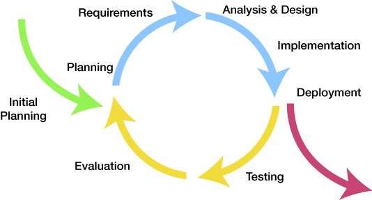
The basic Agile design cycle
On our left we have our requirements and planning, where we find out what people really need. What problem space are we trying to tackle? We choose a mental model for our project. We put it in a form that it can be tested. Is it working? Then we take all that feedback. Modify the plan. Rethink how we should change the design. Test it again. The aim is for good ideas to be found sooner and bad ideas to be dropped faster. The good ideas are the ones our users can actually use.
AMA
Remember, we can’t assume parity between ourselves and our end users. We can’t even make assumptions based on stereotypes of our end user. For example, we might assume that our elderly audience for an article about Medicare will prefer infographics with giant print. But if we actually tested it we might find that, while it’s slightly easier to read, it makes them feel condescended to, which in turn makes them less likely to pay attention to what we have to say.
We may not yet have the equivalent of a copy editor for digital journalism, but what we do have is a whole lot of people with opinions about how it should be done. So many voices can cloud the fact that the only people whose opinion really matters is the intended audience. When it comes to digital journalism, the end user can point out bad (or good!) interaction design better than any professional. We just have to ask.
Credits
-
Zoe Fraade-Blanar
Zoe Fraade-Blanar is an Adjunct Professor at the NYU Arthur L. Carter Journalism Institute and NYU’s ITP Graduate program. She is a consultant in data journalism, interaction design, and fan management, and co-owns the crowdsourced design company Squishable.


