Features:
Data by hand: Analog datavis & self-reflection
Accepting the limitations of the format I’ve chosen and embracing that my visualizations will always be imperfect
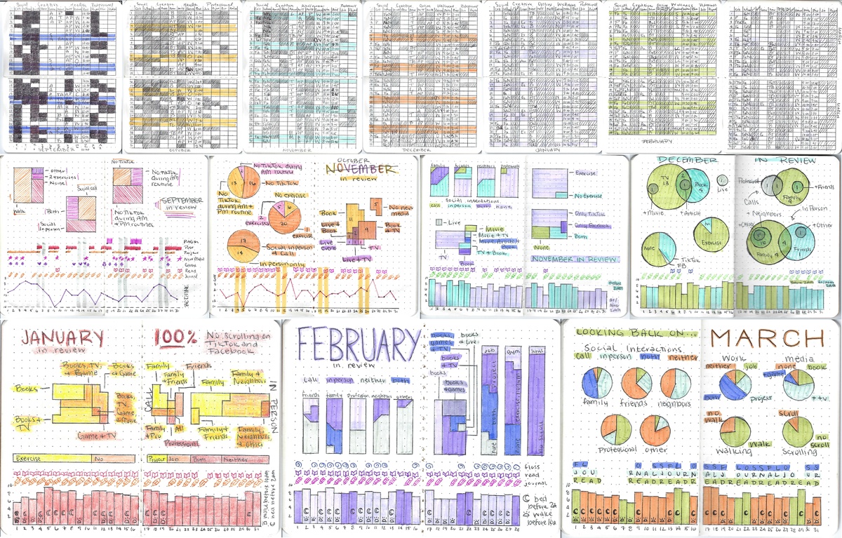
A collage of Emilia Ruzicka’s hand-drawn data collection efforts, including grids, charts and graphs all in different colors to coordinate across different months. (Graphic by Emilia Ruzicka)
There’s no shortage of digital tools to track, analyze, and visualize data. In newsrooms, we often lean on Datawrapper, Excel, R, Python, or other high-powered and occasionally automated workflows. Even in our personal lives, Fitbits, Apple Watches, Oura Rings, and other wearables are popular for tracking health and wellness data. With a simple activation, we can track our sleep, steps, heart rate, exercise, and more. The process is near frictionless.
But in this moment when artificial intelligence is on the rise and everyone seems to be trying to do things faster and easier, the concept of friction-maxxing has emerged as an effort to bring a sense of humanity back to experiences or processes that have become so streamlined they become meaningless. Friction seems to encourage focus and optimize for care and thought as opposed to speed. This trend, coupled with the concept of data humanism developed by information designer Giorgi Lupi and my increased free time after finishing my master’s degree, prompted me to ask: what would happen if I collected and visualized my own data, entirely by hand? How might that change my relationship with my data and myself?
I’ve experimented with personal data collection before, but never with collecting the same data for an extended period of time. Previously my projects lasted no more than a month, capturing what I consider a data self portrait: a snapshot in time of what I (or my circumstances at the time) look like through the lens of a specific kind of data. But in September 2025, frustrated with my post-grad job search and about to embark on a cross-country train excursion, I wanted a way to ground myself and be more mindful of myself and my habits. I wanted something portable, creative, and, most importantly, analog. I didn’t want to add yet another task where I had to be on my phone or computer and, since this data was for my eyes only, it didn’t matter whether the process was sharable.
My data collection and visualization process
I began with a pocket-sized dot grid notebook, a black pen, a handful of highlighters and colored pens, and a six inch ruler. I brainstormed a list of habits I wanted to track, including social activities (calls, in-person interactions), health and wellness habits (bedtime, exercise), creative engagement (reading, journaling), and professional goals (working on projects, publishing articles). I made a table for the month with a row for every day and a column for each habit.
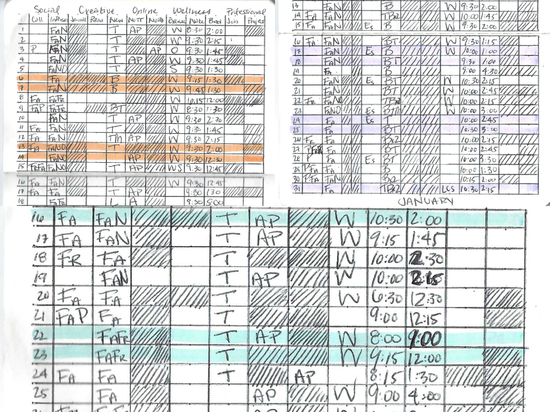
Each night before bed, I fill out the row of that day’s data. Little by little, I complete the table until, at the end of the month, I reflect on the outcomes and visualize the data in the same notebook. Though the data is often similar from month to month, I change the habits I track slightly as I find certain data helpful (or not) and as my priorities shift.
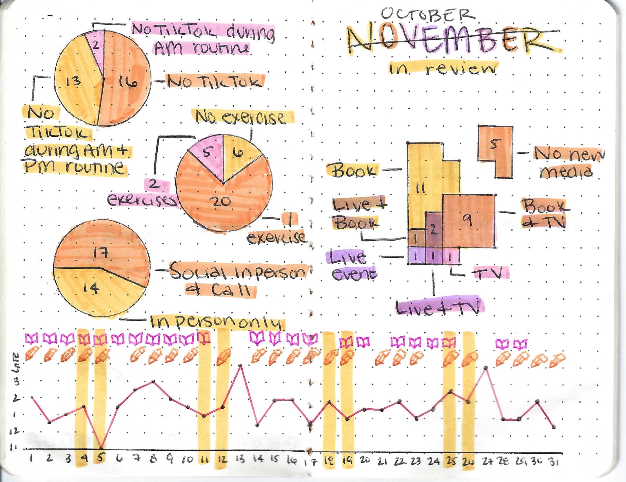
I change how I visualize the data each time, depending on what I find most interesting or important that month. Often, I draw sketches of my visualizations on another page, compiling ratios and percentages, testing colors, and approximating how much space I’ll need for each element. This process feels like the design of a print infographic for a newspaper or magazine —I only have so many inches of space to fit the most important parts. In fact, with my 3.5 inch by 5.5 inch notebook, I only get 38.5 square inches!
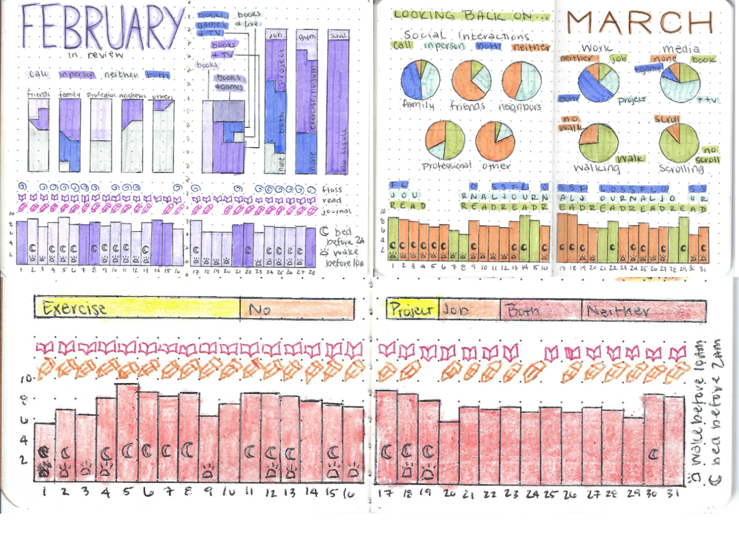
Line graphs, bar charts, pie graphs, Venn diagrams, pictographs, stacked bar charts, and more have been the results. I’ve experimented with new mediums (including markers, crayons, and some old Crayola Twistables I found in a closet at my parents’ house), new layouts, layering colors, illustrating icons, and more. Each month is an adventure both in understanding myself and stretching my creative visualization capabilities. These visualizations typically take me one to three hours to complete, with new formats taking more sketching to figure out and more complicated visualizations (like six-way Venn diagrams) take more mental gymnastics to create accurately by hand.
How this practice has impacted me
When I started this project, my goal was to increase my awareness of my own habits. I knew my sleep schedule was very irregular, my social media scrolling was out of control, and I wasn’t being as productive as I wanted to be professionally. I felt like I was flying through each day and not taking note of what I was actually doing. This project has definitely made me slow down, think about how I spend my time, and be more mindful of the parts of my life I want to grow and the parts I want to leave behind. Like the process of collecting and visualizing data by hand, I know these changes will be slow, but practice makes progress, and progress gets me closer to where I want to be.
Like many people who work with data, I can be a perfectionist when it comes to my work. I value accuracy and exactitude. When I make digital data visualizations, I align everything down to the pixel. Drawing data visualizations by hand essentially throws such precision out the window. I do my best with my dot grid notebook and small ruler, but I am simply never going to be as perfect as a computer. Accepting the limitations of the format I’ve chosen and embracing that my visualizations will always be imperfect has been an important part of this journey. I still remember when I accidentally labeled my October visualization “November in review” — I sighed, took a deep breath, slashed a line through “November” and wrote “October” in the tiny space I had left above it. I was frustrated at that moment, but now I look at that visualization and chuckle to myself because, in the end, it’s just an experiment.
In the past, I’ve often gotten in my own way when trying new things because I want it to be good right away. I didn’t like to start a project not knowing that my creative energies would result in the product I envisioned. Starting the monthly practice of collecting and visualizing my own data — something that no one was expected to see or read except me — helped me overcome some of that apprehension. I’m now more open to experimenting with new methods, formats, and media and willing to go from idea to product more quickly. This has served me both in this project and also in other things I have tried, like my aforementioned train trip and starting an asynchronous book club.
How to start your own data collection and visualization by hand
There’s no one way to collect and visualize your own data, so take these tips as (un)seriously as you’d like! They are exclusively based on my own experience working with my data on my own.
- Start small: This might mean only collecting one or two data points per day, using a piece of paper instead of committing to a notebook right away, or only committing to two weeks of data collection instead of a full month. Investing a limited amount of time, energy, or resources into something helps keep the stakes low, which can give you small wins that encourage you to build bigger next time!
- Embrace uncertainty: Collecting data by hand is an imperfect process, and visualizing it by hand introduces human error that might not be an issue with digital tools. Your data doesn’t need to be perfect to be engaging, thoughtful, and creative. The act of collecting it and visualizing it is enough to make it valuable, no matter the outcome.
- Remember, you’re more capable than you might think: If you’re reading this article, you probably already have some experience with data collection, analysis, and/or design. All of those experiences make you very prepared to try an analog data collection and visualization project. Even if you don’t have any prior experience with data, you’ve probably looked at and read countless charts and infographics just by reading the news or scrolling on social media. You’ve got this!
People
Credits
-
Emilia Ruzicka
Emilia Ruzicka is a freelance data journalist. They work part-time managing data for the Trans News Initiative, conduct accessibility trainings with Equal Access Public Media, and were formerly a Data Reporter at Stacker. They have published with the Urban Institute, the Center for News, Technology, and Innovation, and other outlets. Emilia has an MA from University of Virginia and a BS from Brown University. For more, visit emiliaruzicka.com.


 Data by hand: Analog datavis & self-reflection