Learning:
Five Things I Learned Making a Chart Out of Body Parts
The story behind a graphic on insurance that turned into an unlikely viral hit
This post is co-published with ProPublica.
Last year, an interactive graphic about insurance turned out to be one of ProPublica’s most popular pieces of the year. I’m going to tell you about some things we learned in the process of designing and building it, from its bovine origin story to the challenges of visualizing an eyeball.
The graphic came out of an investigation into workers’ compensation, led by my colleague Michael Grabell and Howard Berkes of NPR. In the United States, workers receive payments from their employers (or employers’ insurance carrier) if they are injured on the job. But over the last 25 years, the system has been slowly undermined, as chronicled in a series of powerful and heartbreaking stories.
A bizarre aspect to this generally horrible situation is that if you’re a worker who suffers a serious injury, the difference between relative comfort and total disaster depends a great deal on where you live. Losing your arm, for example, could mean a $50,000 payment in one state, and $500,000 in another. There are no federal standards for how much money you receive for lost limbs or other injuries.
We wanted to visualize the vast discrepancies between different states’ reimbursement rates.
1. Inspiration Comes From Strange Places
Michael Grabell and researcher Cynthia Cotts had painstakingly researched each state’s system for doling out workers’ comp benefits. Many states put out a “schedule of benefits,” which is essentially a list of body parts and how many weeks of benefits a worker should be reimbursed for the loss of each: an arm, a leg, a hand, a thumb.

New Jersey’s schedule of benefits, which lists worker’s compensation benefits for each body part.
Some of these state laws have provisions that are hopelessly and embarrassingly out of date– Connecticut’s law, for example, still has a provision for “incurable imbecility,” a term that may have been acceptable in the early 1900s, but is now both unclear and just plain offensive.
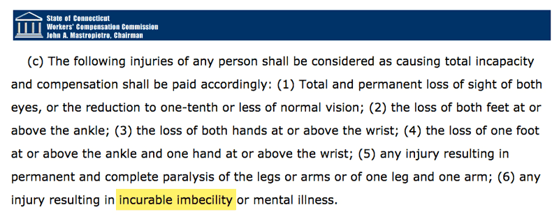
Connecticut’s schedule of benefits still includes outdated language on “imbecility.”
During the collection of all the schedules of benefits, a source mentioned that these body part lists reminded them of the famous “Angus Beef Chart” you might see at a butcher shop.

The famous Angus Beef Chart, inspiration for our final data visualization. (American Angus Association)
We thought … aha! What if we turned our data into a literal human beef chart? Let’s take advantage of a dataset on body parts and make a visualization of body parts.
This idea of visualizing data by distorting human body parts reminded me of something else: the cortical homunculus. The cortical homunculus, first imagined by neurosurgeon Wilder Penfield in the 1930s, is a cartoonish humanoid figure whose limbs are distorted to represent how important they are to the brain. In other words, it illustrates how your brain sees your body. Your hands, face and tongue all get a lot of attention from the brain, whereas your arms and legs don’t. While the homunculus often makes an appearance in biology textbooks, here are two three-dimensional models from London’s Natural History Museum:

The motor homunculus (left) shows what a human body would look like if each part were sized according to how much of the brain’s cortex is concerned with its movement. The sensory homunculus (right) is sized according to how much of the brain is concerned with each part’s sensory perception. (London Natural History Museum)
So, armed with Angus beef charts and the homunculus, we decided to go forth with this crazy idea. What could go wrong?
2. Techniques Come From Even Stranger Places
But now, the technical challenge. We needed a way to programmatically size each of 17 different body parts, for each of 50 states, based on how much bigger or smaller they were compared to the national average. I began to look around for examples of other projects that involved resizing weird but recognizable shapes.
It turns out that the cartogram does exactly this. A cartogram is a map form in which precise geographic shape and size is replaced by some other data (for example, resizing all the states in the U.S. based on their population). So in the same way that a cartogram distorts geography, we could distort limbs based on dollar figures.

A cartogram of 2012 presidential election results, sizing states according to population, not geographic size. (Mark Newman, University of Michigan)
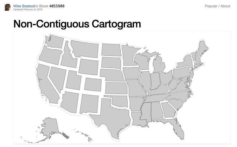
I came across an already existing cartogram that resizes each state but keeps it anchored to its center, built by Mike Bostock, creator of the popular charting library D3.js. Surely this strategy would work if I just swapped out states with limbs.

But I also needed to be able to adjust the little feet and arms and hands after the transformations were complete. I used another Bostock example, a force-directed network of states, and applied it to a human shape.

One downside of a cartogram is that if you don’t know the geography of a place already, the map can be difficult to read. But a basic human form is pretty much universally recognized, so differently sized limbs, we thought, would still be intuitive to someone reading the visualization. However, that same human form soon began to pose a different sort of challenge…
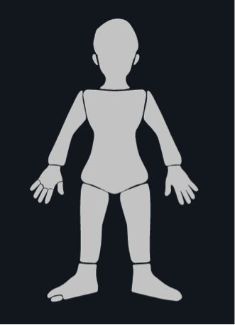
3. Human Forms Are Creepy
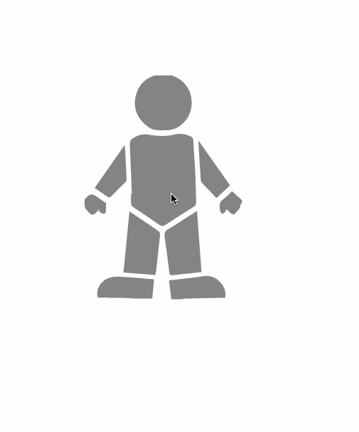
For my early experiments I used a cartoonish person.

But when I swapped out a proportional human figure…
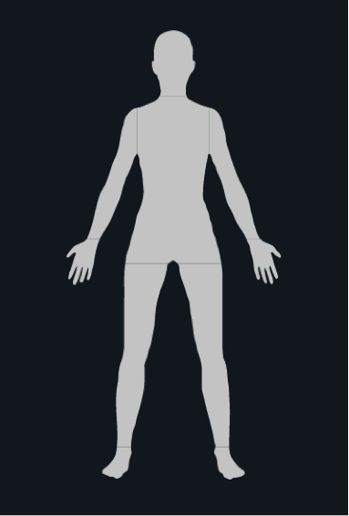
…. things got nightmarish and horror-film-worthy very quickly.

Or, perhaps more appropriately, courtroom-drama-worthy, since this assortment of body parts was evocative of the classic Saul Bass poster for the 1959 film “Anatomy of a Murder.”

So, rather than stick with a realistic human body, I went back to the cartoon. I fiddled with multiple versions of this little figure, each time making it slightly more realistic.

It was at this point that I sent a few screenshots to data visualization professor Alberto Cairo, just for fun. His response:
I would NOT use a human figure at all. No matter how much you tweak it, it’ll always look creepy as hell (sorry to be so blunt…) It sent shivers down my spine, actually. Cairo brought up some very valid points–but eventually my colleagues and I decided to keep going with our body parts approach, at our own peril. We reasoned that the figure was creepy, but then again, so was the subject. Losing a limb in a serious accident is devastating to real people, especially with our current laws. That was the story that Grabell and Berkes were writing. If our images elicited a slight bit of discomfort in those who saw them, it seemed fitting. This was a far more honest representation of the data than a dehumanizing bar chart.
And even if it wasn’t easy for readers to accurately perceive fine differences, we decided that these figures did a great job of conveying the main point: States pay out vastly different benefits for the same injuries. We didn’t need to show the exact dollar amount difference between New Jersey and New Hampshire down to the last decimal point–for that, a bar chart would have probably been the better choice. But we wanted to show the simple absurdity that your limbs are valued differently depending on where you live.
(For the record, Cairo has now praised the graphic, although he still stands by his initial impression: it’s creepy as hell.)
We tried very hard to make the figure as gender neutral as possible, because while people might have recognized a man in a hard hat, women get injured on the job, too. It was important for us not to ignore that.
But then we ran into another wrinkle. Beyond hands, feet, thumb, etc., we also had data for EYES.
Eyes, it turns out…are terrifying.

It didn’t get better when I added the rest of the body. Or made the eyes outlined. Or especially put a bunch of them together.


So, we went back to the original, and decided to include eyes as symbols.
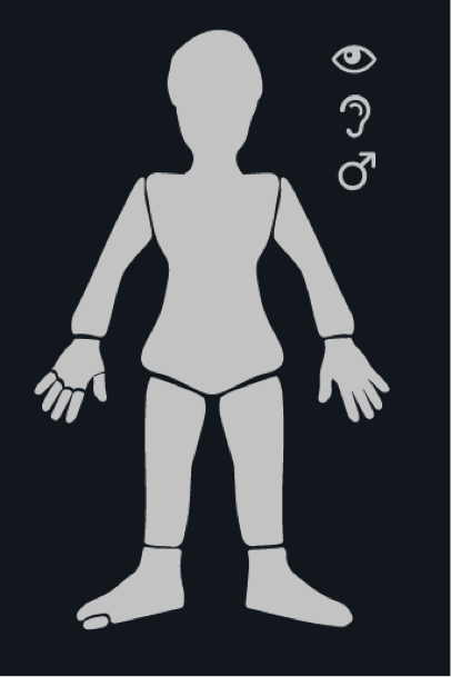
This was a fortuitous choice, because at the last minute we also decided to add in data on testicles, and thus avoided a whole other conundrum.
4. Tell the Story in Multiple Ways
To show how states compared to each other, we used a chart form called “small multiples,” which repeats small visual forms so that you can quickly compare them. We thought showing a repetitive grid of oddly shaped human figures would let people make quick comparisons across all states.
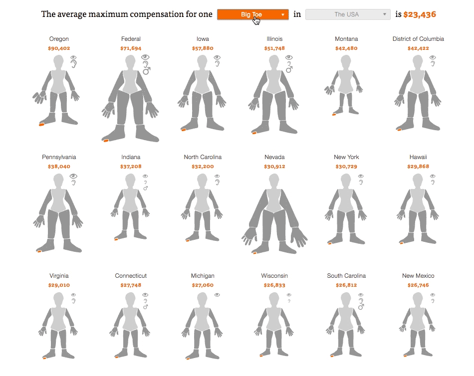
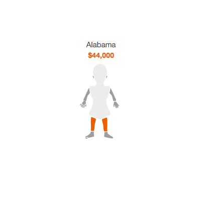
But to show how a specific state compared to the national average, we let you click to see a zoomed in version, a side-by-side comparison of the national average figure with the state figure. Here we also included detailed dollar amounts for each limb.

Finally, we made an animated GIF to share on social media.
5. In Tragedy There is Often Absurdity
Our story was tragic, with heartbreaking details of ruined lives. But that doesn’t mean that we couldn’t approach our data without acknowledging its absurdity. And even if we played it straight, other news outlets found humor. Witness Gawker’s headline:
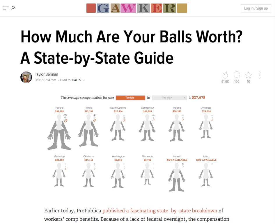
Gawker’s headline writers had fun with this one. (Gawker)
Another absurd story: A few weeks after the project was over, I ran into this poster in a nautical-themed bar.
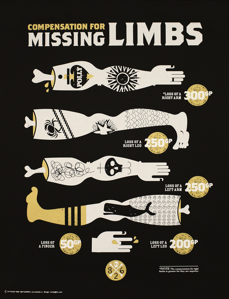
A poster that illustrates the “compensation for limbs lost via treacherous sailing incidents and other mishaps.”(826 Valencia)
Once again, inspiration is everywhere.
Credits
-
 Lena Groeger
Lena Groeger is an investigative journalist and developer at ProPublica, where she makes interactive graphics and other data-driven projects. She also teaches design and data visualization at The New School and CUNY. Before joining ProPublica in 2011, Groeger covered health and science at Scientific American and Wired magazine. She is particularly excited about the intersection of cognitive science and design, as well as creating graphics and news apps in the public interest.


