Features:
Behind the Scenes of “Fewer Helmets, More Deaths”
A Visualization’s History in Iterations

A visualization story on what happens when states repeal their universal helmet laws attracted some attention last month for both its content and unusual (but well-received) design. We thought it might amuse readers to see how heavily iterated it was, and how certain decision points along the way helped us to sculpt a design that was mobile-centric without compromising fluidity in the desktop version. We have very different skillsets, so each iteration was a full conversation weighing the reporting, design, and code together.
The project was a great first foray for us into designing interactives specifically for mobile, and Alastair built the code so it could be reused in many different ways. The next project in a similar style, which looks at how researchers can measure the success of Obamacare, uses some of the code base. It was published May 19.
First Design: Stacked Area
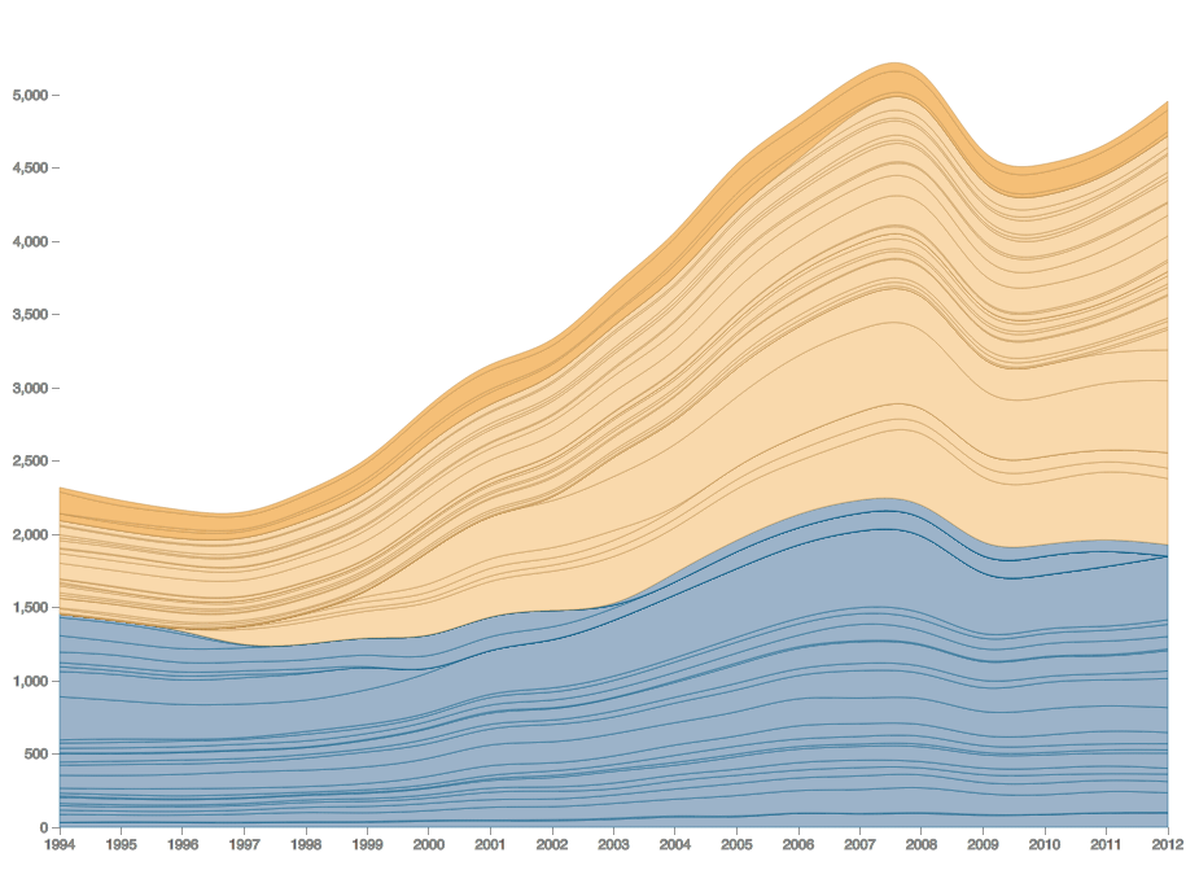
We started by charting all the motorcycle deaths in every state because we wanted a sense of the cumulative weight of every motorcycle death. This was our initial vision of the data, showing the big split between states in blue that have universal helmet laws and those in yellow that do not.
The National Highway Traffic Safety Administration FARS encyclopedia is a great example of how to do public data, compiling nearly 40 years of fatal accident reports into a series of well structured repositories. Hannah’s initial sketches used cross-tabs generated directly from their web-based query tool. In order to gain more flexibility in our historical querying, Alastair downloaded two decades of data from their ftp site, then used the marvelous csvkit to convert the DBF files into CSV format and load them into postgresql tables.
One of the best things about charting with d3 is surely the wealth of examples available online. Taking a stacked area chart as a reference point, Alastair put together the first version of our graphic in an hour or so, with most of that time spent integrating the FARS data and tweaking the styling to reflect the sketch.
The visualization was dramatic, but ultimately not very revealing; it was hard to tease out any particular state, and the increases built on each other in a way that we thought could be visually misleading. Plus, several states had changed their law in this time period, so those became the edge cases that we had to figure out how to handle in a custom way. And as we were doing that, we started to realize how very interesting those edge cases were. We needed a different design. Onward.
Second Try: Features Law Changes, Split Between Law Groups

At that point, we weren’t quite ready to scrap the earlier vision; we thought we could make smaller edits that could improve, clarify and save it. This version separated the helmet/no-helmet states by the middle axis of years, and visually solved the problem of the states that changed their laws between 1994 and 2012 (first they were blue, then they were yellow! — and one state that changed twice). This shape was more fun: sort of a grecian urn on its side, or a nod to a streamgraph.
A fair amount of work was involved in developing it. First, we split the states between two charts according to their helmet laws and un-inverted the y-axis of the one on the bottom. Next, we stirred in some data specifying the years in which certain states shifted their legislation. Coloring the layers over time to reflect these changes required splitting some of them into multiple regions by changing their stacked areas into clip paths and using them to mask colored rectangles of appropriate widths. Factoring the legal switches into the overall grouping required a custom stacking order.
We also added a sequenced transition that morphed the layers of selected states into a line chart showing normalised death rates. Although hand-coding animations will never be as fast or flexible as After Effects, there’s a lot you can do with path transitions!
However, it became increasingly clear that we’d need a new direction. It’s a tough but necessary part of this job to be willing to spike something if it isn’t working. Of course, even wrong turns offer opportunities to sharpen skills and learn new techniques. In this case, both the clip masking and sequenced transitioning would prove useful later on.
Overall, this design wasn’t right. It depended on the reader to hover on an individual line to get information, and the thickness of the lines reflected population more than anything motorcycle-specific. Normalizing for population would call for a new design because stacking rates makes zero sense. Hovering or clicking on the chart on a mobile device would be impossible.
Third Attempt: Complete Pivot to Scroll-Based Chart Transitions

We knew that there was a good visual story in the handful of states that had changed their laws in this time period, and we decided to pivot. Hannah sketched out something completely different: small charts that would unfold the story with clarity on mobile devices, but much more elegant than a traditional “stepper” design. We looked at Mike Bostock’s d3.js showreel and decided to try transitioning between each chart using animations.
This new concept was a mad departure from the earlier, and necessitated a lot of new reporting, since instead of one big visualization, our plan was now to have several charts that morphed from one to another. So the metrics in the charts had to be related, and had to grow out of each other in both data and design. Not an easy task. Hannah storyboarded about eight steps, similar to the way we would storyboard a motion graphic, and wrote some draft explanatory text to go with the steps.
At this point, a chat with Josh Williams proved extremely helpful. Since working on Snow Fall, he’s not only remained one of our leading scrolleractivity experts, but also distilled some of that wisdom into a jQuery plugin that makes it easy to detect when readers reach each chapter of a story. This made it a breeze to develop a prototype featuring a line chart that transitions between random data points as you scroll through the corresponding paragraphs of text.
Our biggest question was whether or not the scrolling text would make sense with the animating chart. Could we get it to feel smooth—not manic or cluttered—and make sure that a reader had time to read both the charts and text?
Alastair’s proof of concept made the interaction seem perfectly logical. Fast prototyping is always preferable when trying out new ideas. After adding some code to fix the chart in place as the text scrolls downwards, we spent some time tweaking the text size and produced a version that convinced us it would be worth taking this direction forward.
Early Desktop Version
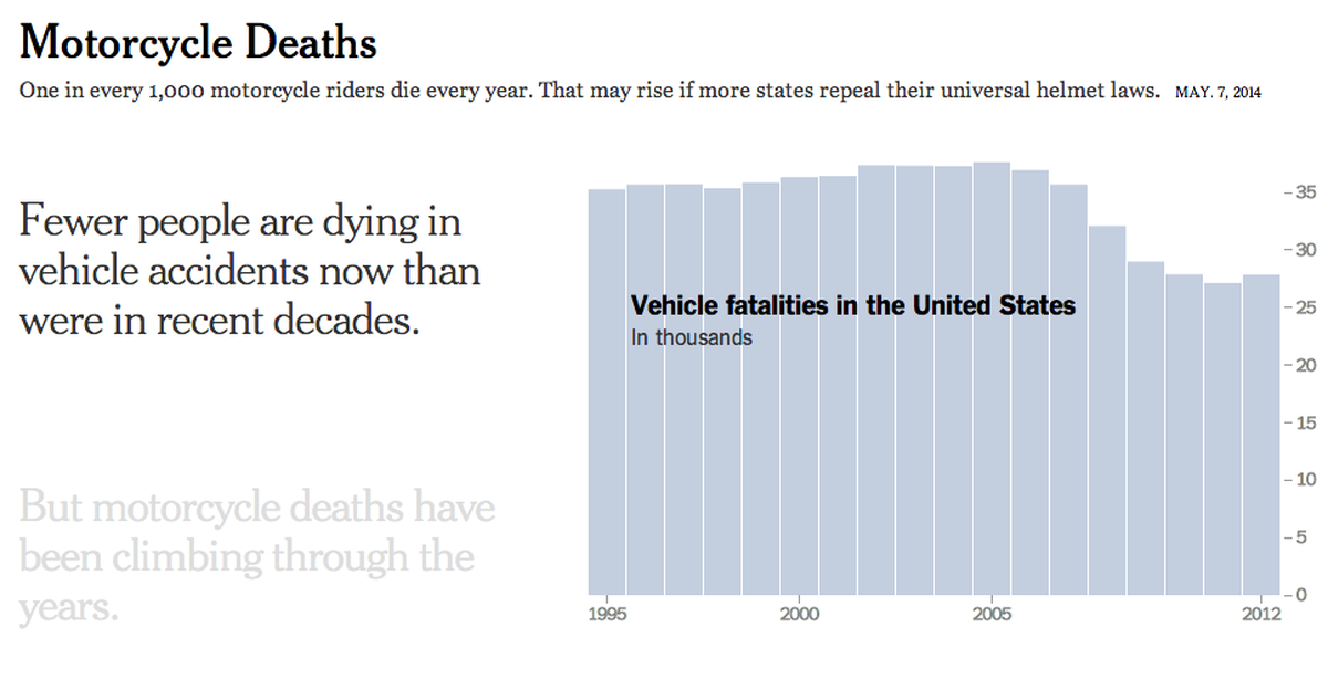
After the proof of concept, we had to work through how every animation would transition to the next. Some them, like adding the motorcycle share of all vehicle deaths, were fairly straightforward. Others, like shifting from absolute numbers (in a bar chart) to the rate (in a line chart) were trickier. We talked through a bunch of possibilities for each transition then dialed things back to be as visually simple as possible.
Sensing that we needed to be flexible with both the order and content of each “card” in the story, Alastair took advantage of some handy features of our build process. We put the running order and text of the cards into a Google spreadsheet. A node script fetches and merges this content with the FARS data and chart annotations to create a JSON file that feeds the interactive. In addition, each animation was coded in a separate source file containing a function wrapped in a require block. A column in the Google doc links each card with its corresponding animation function.
As the reader scrolls through the story, events are fired whenever they reach a new paragraph. Because these paragraphs are built from rows in the Google doc, this allows us to trigger one of the animations. In order to cope with people scrolling quickly or erratically, Alastair decided to code the animations so that any animation could flow into any other. To this end, the graphic objects are all layers of the same view. This way, the elements (bars, lines, axes, etc) can be reused (or hidden) between animations and provide object constancy.
Final Desktop Version
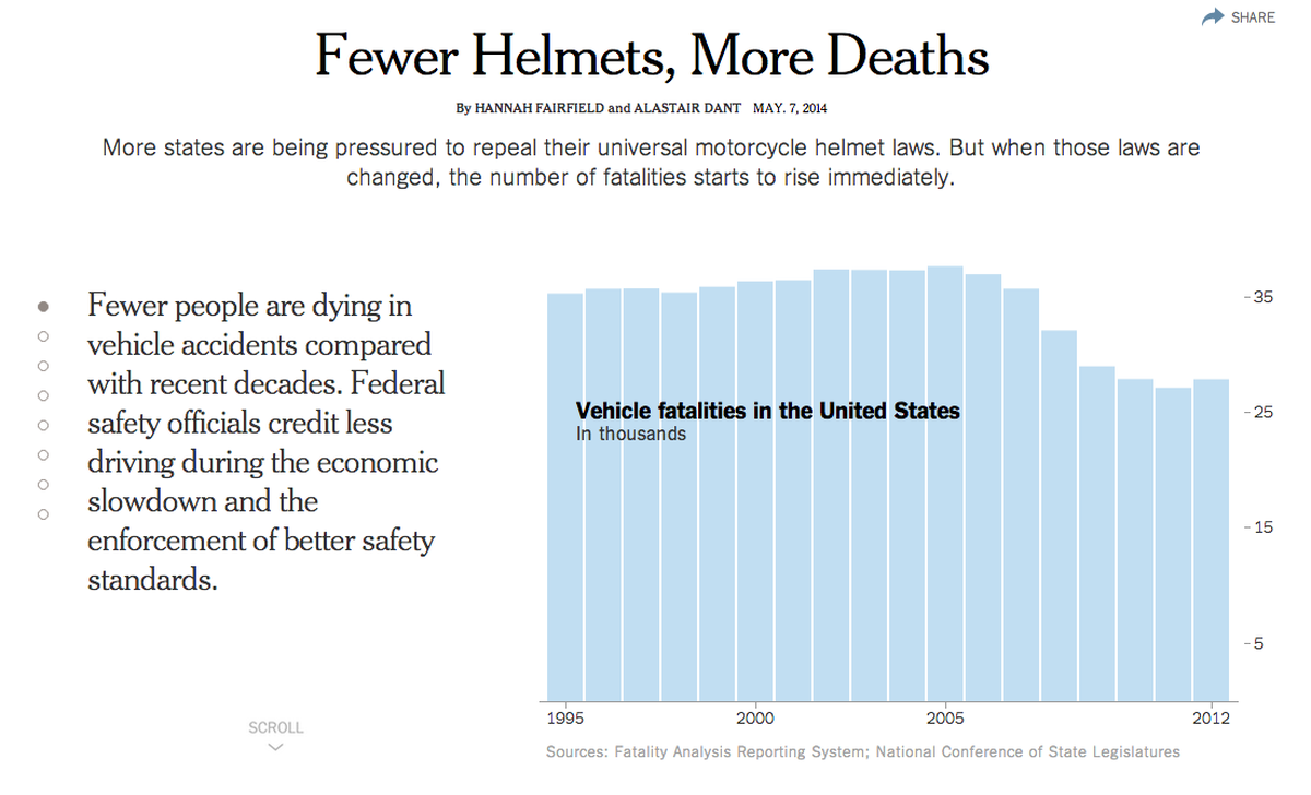

We wanted to look more closely at the states that had changed their laws during this time period to see what the effect of the laws had been. We queried the FARS data to find the number of fatalities in which a helmet was worn or not worn — data we didn’t have when we originally started to build. Instead of showing just national data, or every single state, the visual win was in closely looking at the states where there was a clear before-and-after for the helmet law.
By this point, the piece had endured many rounds of styling and layout tweaks. (The curse of the web developer may well be the death by a thousand CSS revisions required to make something look and work as planned on many different platforms and screen sizes.)
Amidst all this back and forth, Alastair set up the chart components to work responsively. By allowing the charts to be replotted at any width and height, we allowed the app to adjust more smoothly to changes in screen size and aspect ratio.
We were keen to get the reveal-by-scrolling behavior to feel as natural as possible, To this end, Alastair added something to set the paragraph opacity as a function of its distance from the chart. Each block of text thus fades up and down as it moves in and out of focus. By playing with the dynamics of this function and the distance between paragraphs, we got to a point where the pacing felt right.
Mobile Version
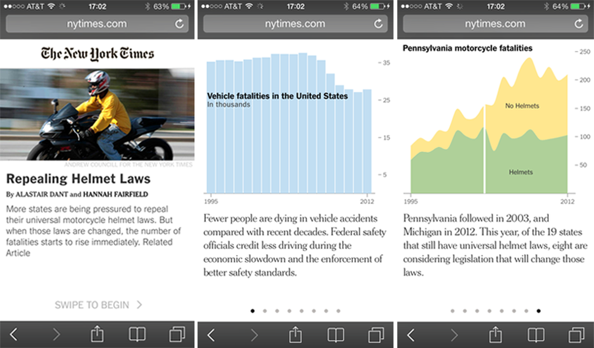
The mobile version of the graphic came together fairly quickly. Three prior decisions made this possible: 1) our design broke the story into a series of independent cards 2) our code split the accompanying chart animations into separate modules 3) our responsive view was capable of plotting these charts at arbitrary widths and heights. Alastair realised that this would allow us to replace the scroll-based navigation with a horizontally swiping carousel that held the same content but felt more at home on touch devices.
With this plan in mind, we still had some questions to settle. Some answers came quickly. Will we have a landscape view? No. Should the balance between chart and text be 50/50? No; chart should be bigger. Some required a bit more thought. Our standard page furniture (headlines, credits etc) took up too much space on small screens and disrupted the uniformity of the chart design and behavior. After some editorial input from Matt Ericson, our solution was to include an initial screen with “swipe to begin” instructions, a photo promo and a dollop of jQuery that lifts the page furniture from elsewhere in the DOM.
For us, the final project felt like a natural progression in design and code. It took a next obvious step in development: because our mobile audience is growing swiftly, we are thinking about how best to tell visual stories that take advantage of the mobile platforms and as well as looking elegant on the desktop.
Organizations
Credits
-
Alastair Dant
Bespoke mediaglyphics @primer_ai. Formerly @NYTimes, @Guardian. Legal alien
-
Hannah Fairfield
Climate editor @ The New York Times. Alaskan. New Yorker. Also in D.C.