Features:
Covering the European Elections with Linked Data
An Exploration from the BBC News Labs
From the (as-yet) unreleased BBC News Labs Linked Data dashboard
Many journalists will reckon that one of the most exciting times to be in a newsroom is around an election time. There is much to do to prepare the coverage and report on the campaigns, debates, and polls—and even more to do on election day, when results pour into the tickers to be sent out directly for live broadcast of the event, with an immense pressure to be as accurate as possible.
At BBC News Labs, well, it’s not quite like that. As an R&D department, we don’t have to run everywhere or to book interviews between two much-needed caffeine shots. The News Online team was in charge of the election, and did a truly fantastic job by putting in place a platform to cover future elections, which was first tried for the UK local and european election, under codename Vote2014. The background of it is very interesting, and I strongly encourage you to read Paul Rissen’s blog post about it.
I, too, wanted my fix, and I decided to make it happen, News Labs style, while operating under the legal restrictions around covering elections. I talked with Iain Collins, one of our developers, to get some help on the project, as he knows plenty of computer magic.
What we wanted to do was:
to use Linked Data in a news context (something that the Vote2014 team was trying to do with Paul’s new model, article above),
to provide some background on this important event for the UK and Europe,
and to offer alternative coverage of the election (sort of).
In the end, we built an experimental dashboard for the elections, and eventually discovered some potentially editorially challenging stuff in our data—detailed below—which led us to decide not to release the experiment to the public. Despite being unable to release the project, this one or two weeks rush taught us lots, and we are today coming up with improvements to our data model, following the questions raised by our findings. Before we get to the findings, though, I’ll walk through the process of making the dashboard.
Building It

Our work in progress
I won’t lie: the building process in its early hours was super hacky. If you wander in the repo’s old history, you will see that we did that like it was a hackathon project, Iain and I working on separate HTML pages with internal CSS styles and internal JS scripts. Collaboration that way was made easier, and it was very handy to test features this way.
That’s not a proper method of development, though, so soon, Iain took over to centralise the code and tidy up the repo. As we started bootstrapping the index, I started designing the page, and we opted for a now-classic page layout, with two or three big chunks of information on the page, as well as tabs and drop-down lists.
A downside of this method is that it can sometimes be tricky to keep precise track of the ideas we have. The project was a spinning ball between myself and Iain, working sometimes separately, sometimes together. Alas, one of the original idea was lost in the process, or rather altered: I wanted to return news articles about a region and the elections, where we ended up providing news articles about the candidates instead.
Next time, we will keep a more precise record of the features, the same way we keep track of our code with Git.
For those interested in the technology behind it and too lazy to have a look at the repo, we opted for simplicity. We started the UK map with D3.js, but quickly resolved to use a simple SVG map of the constituencies, extracted from the Wikipedia EU elections in the UK article (map changed since). The charts could have been done with D3 too, but we opted for Chart.js instead, giving preference to a canvas element and simple data arrays. When, after a while, the page began to be more complex and rich, the results were taking quite some time to calculate. So, left without an API responding at the speed of light, we chose to pre-calculate and pre-cache the results. The legwork behind that was done by a Node.js module written by Iain.
The Data on Media Coverage
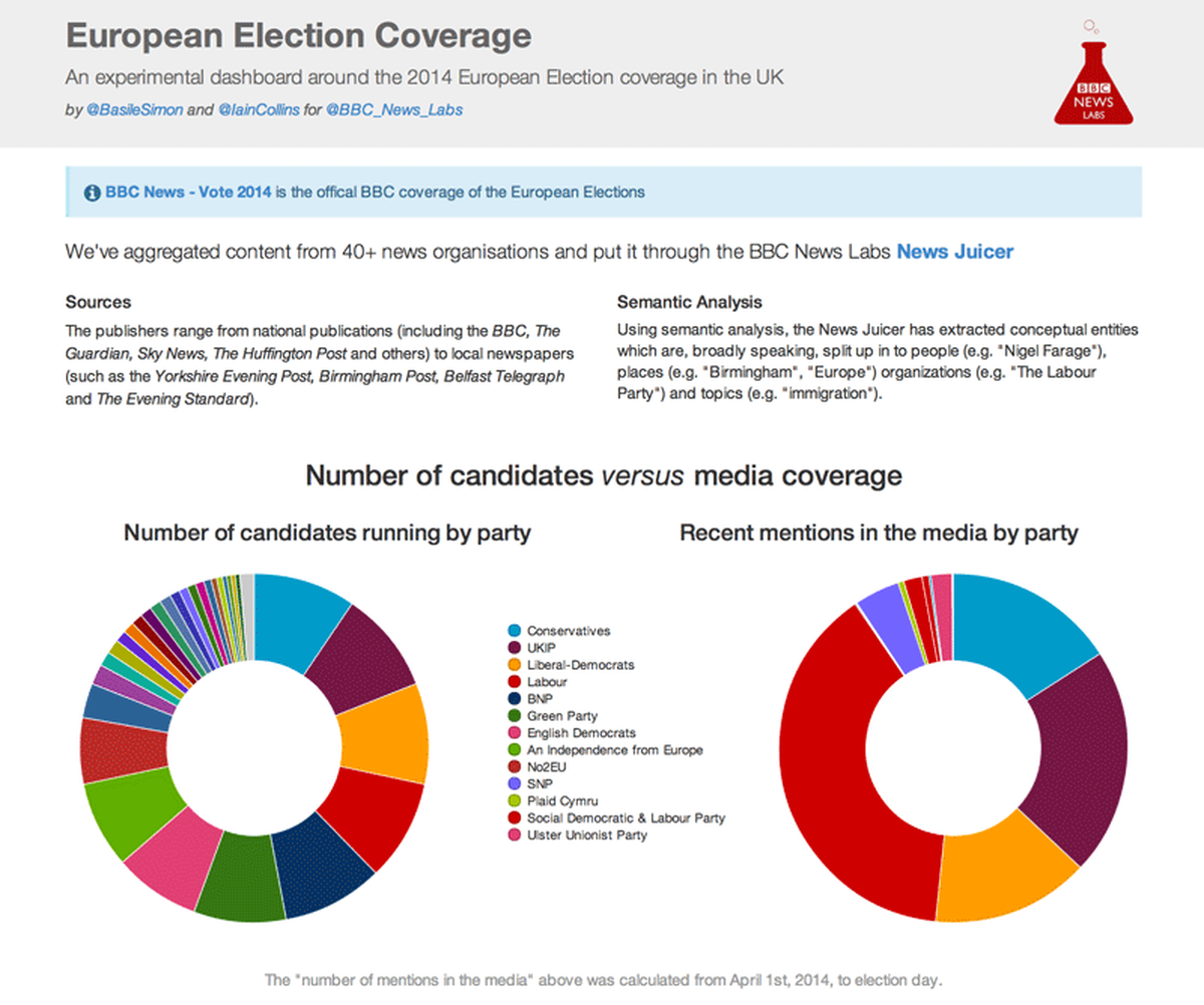
One thing that particularly interested me was to exploit a feature we have in our semantic analysis engine, the Juicer, which counts an entity’s number of mentions in the media for a given period of time.
To be really precise, the count is based on more than 40 publishers we aggregate content from. These publications include the big guns (the BBC, the Guardian, Sky News…) but also local papers from across the UK (the Yorkshire Evening Post, the Belfast Telegraph…). This produces quite an accurate picture of the news in the UK, but also a very diverse one.
The Juicer’s job is to extract conceptual entities which are, broadly speaking, split up into people (e.g. “Nigel Farage”), places (e.g. “Birmingham,” “Europe”) organizations (e.g. “The Labour Party”) and topics (e.g. “immigration”).
And once you have that, well, it’s fairly straightforward: you define a timeframe (in our case, from April 1st to May 25th), you feed an entity to the Juicer, and voilà, you get back the number of mentions.
I first went with a classic doughnut chart presenting the number of candidates by party. Nothing too interesting to say here: 748 candidates distributed rather equally in 48 parties. One observes that the “big” parties all present around 70 candidates, a number that progressively declines as the party’s size shrinks.

Candidates by party
Immediately next to this chart in our dashboard was another that threw up interesting editorial questions. This chart presents a breakdown of the media coverage by party. How many times this x party has been mentioned in the media between April 1st and May 25th?

Mentions by party
The results are quite clear—and also very interesting. According to this data, anti-EU party UKIP has been mentioned 2604 times, quite more than the Conservative Party’s 1964 mentions. But all of them don’t even compete with Labour’s coverage, which tops 4795 mentions—almost double the Conservatives’ number, and almost triple the Liberal Democrats’.
Explaining these results is not an easy task, largely because we did not distinguish between publishers—what we see here is a result of the UK media taken as a whole, and not at all something only about the BBC.
News and Candidates
Another feature I wanted was to display news articles related to the different EU constituencies, so the user selects where he lives, and can enjoy news about his region in return. Here, we were lucky. Only a couple of weeks ago, the queries to the Juicer were returning results between 70–80% relevance—not enough for us. But one of our developers, Karl Sutt, had the great idea to implement Booleans in the requests. As a direct consequence, we were empowered to ask the Juicer for articles about the London constituency and European elections or EU elections or European Parliament, thus bumping the relevance of our results drastically.
As I said earlier, we wanted to give background and linked data information to the reader. That turned out to be really interesting to do, and full of surprises.
Users can explore their region’s results, as well as the list of candidates in their constituency. If a candidate is selected, several pieces of information are available:
A chart graphing the number of the candidate’s mentions in the media
Concepts and entities associated with the candidates (more on that in a second!)
News articles about the candidates and the region
Conceptual Problems

So many tags
Each entity present in the Juicer is associated with other concepts. Here, the main use of these links is to present the entities associated with the European election candidates. The results were…interesting, on at least two levels.
First, displaying on a screen the entities a person is associated with surfaced some surprises for several candidates. On the picture attached here, I displayed the concepts associated with anti-EU UKIP leader, Nigel Farage—I chose him for this article because of his very high presence in the news. One will notice several potentially controversial connections, for example with “Racism,” “British People,” “Romanians,” and “Bulgaria.” Oh, and speaking of controversial, Farage is associated 165 times with “Controversy.”
Before going further, bear with me just a second while I make clear that our engine considers related two entities that are mentioned together in articles. There isn’t necessarily a meaningful connection between them (as one of the examples will prove). Moreover, the connection may very well be a dissociative one.
That’s the case for Nick Griffin, a British National Party candidate, who is associated with “White British” as an ethnicity, and 11 times with “Adolf Hitler.”
The problem here is that the data is blind. All it tells is that this guy is linked with Hitler. The linkage would be the same if here were an apologist for the Third Reich or if he published a successful book saying that Hitler is the most evil man who ever lived. We just know that they are linked together—and I guess he won’t be given the benefit of the doubt. (As an example, I can find several co-occurrences of Mr Griffin and Hitler after the BNP Leader appeared on BBC Question Time and extensively discussed Hitler and racism—video and good summary from 2009.)
The second interesting debate raised by this project is that some people are linked to other entities only because of articles including both their names. In our dashboard, Griffin also is associated with the murder of Stephen Lawrence in a 1993 racially motivated assault in London. Did he commit the murder? Absolutely not. He simply commented on this event and took part in the national row that followed. (Griffin was charged of using words or actions intended or likely to stir up racial hatred following the murder, and continued to make news for his remarks on the subject through 2006.)
Another example of these potentially misleading connections in the data is Gerard Batten, who is also associated with Lawrence’s murder, because he is briefly mentioned in a 2013 Guardian article about racist attacks against Lawrence’s mother. Batten’s name is mentioned in the last paragraph of the article as a previous attendee of an annual dinner another politician attended. He has in fact nothing to do with this story’s main subject, which itself not about Stephen Lawrence and his murder. Still, Batten is associated with it in the data.
For completeness, two more classic uses of linked data that we looked at:

Party mentions in the media, charted over time: as in the doughnut chart above, Labour is flying pretty high

Topics associated with parties: this communicates nothing very interesting but the overwhelming importance of party leaders, in the media
Lessons Learned
- Linked data for the media just works. With a good quality database and a broad model, it is possible to publish relevant, interesting information.
- Features are easily lost when collaborating, refining, cleaning-up, etc. Keep better track of the original ideas—a feature should be scrapped if judged unneccessary, not just left out.
- Prototyping a feature is the way to go. Every day is a hackathon day. As Noah Veltman said, "Go from paper to code as quickly as possible.
- A small team and a self-driven project are the dream. Iain and myself stayed up late at night working, because we wanted these features, not because we had to implement them. I can’t thank enough Matt Shearer, our BBC News Labs Innovation Manager, for giving us that much freedom for this project.
- Now that we know that this model works, we must take a step back from meta-journalism to see if linked data is viable and useful in a public-facing context. (But collaboration between nerds and journos is not a given. It must be built progressively, with small projects, before jumping into important events such as elections.)
If you liked this project and want to try something similar, or have a chance to work with the BBC News Labs tools on Linked Data journalism, email us at connectedstudios@bbc.co.uk.
Credits
-
Basile Simon
Interactive journalist @thetimes + @airwars + lecturer @cityjournalism PGP: https://t.co/obWvSwQNCq


