Features:
COVID-19 story recipe: How to analyze your region’s hospital capacity
Where to find the data, how to explore it, and questions to ask to reproduce the story for your community

Analyzing your region’s hospital capacity can help a community understand how prepared its health-care system is for different rates of COVID-19 infection (Photo by Glenn Russell/VTDigger)
After hearing reports of Italy’s health-care system straining from a high caseload, several of my editors started to ask me: Is Vermont ready for an epidemic? That question proved hard to answer. Being a data journalist doesn’t give you a crystal ball into the future of COVID–19, and I’m not an epidemiologist, so I couldn’t just whip up a model of different scenarios.
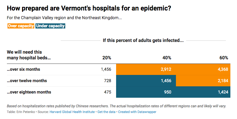
That’s why I was excited to find that the Harvard Global Health Institute had published its own analysis of how COVID could affect hospital capacity by region. With guidance from published stories by ProPublica and the New York Times, I localized the data to the Vermont region and showed readers the risk: A widespread epidemic could overload Vermont’s hospital system—as it would the rest of the country. Chances are, your region is at risk as well.
The story we found
Our main story, written by Anne Galloway, reviewed the data and asked: In the event of community spread, is Vermont’s health-care system ready to handle a huge outbreak? It’s still hard to say exactly how many people will ultimately be infected with COVID–19, but experts agree that we have not yet hit the peak of cases.
Harvard’s data on hospital capacity is organized by Hospital Referral Regions, or HRRs, which describe market areas where people generally go to the same hospitals. To understand how the outbreak could affect our community, I analyzed the two main HRRs that overlapped with Vermont: The Burlington (VT) region, which includes some of the Champlain Valley and New York as well as most of northern Vermont, and the Lebanon (NH) region, which includes southern Vermont.
I found that in many scenarios, Vermont could have far more infections than the hospital system has beds, creating painful problems for those who work in the health system. But I also carefully presented the data with different predictions of the infection rate and how that would change things, because the ultimate pace of the epidemic is still unknown.
How you can analyze the data
You can find a Google spreadsheet of the data on the Harvard Global Health Institute website. We’re looking at the spreadsheet under the “View The Data” link—as of publication, it’s still called “HRR Scorecard: 20% / 40% / 60%” and it’s view-only, so you’ll need to make your own copy of the data. You can go to File > Make a Copy to work with the spreadsheet in Google Sheets, or File > Download to download it as an Excel spreadsheet.
Once you have the data, you’ll want to find the Hospital Referral Regions that serve the area you’re covering. HRRs often cross city, county, or even state boundaries, so it’s not quite as simple as looking for place names. The Harvard website includes a zip code lookup, but this map makes it much easier to spot HRRs for a wider area.
The Harvard data includes three spreadsheets for each region, presenting different infection scenarios. Some good news: For the most part, you won’t need to clean the data! The spreadsheet already includes the final tallies and a percentage total of how cases will compare to hospital capacities. But understanding it can be a little bit tricky, so let’s break it down.
The data analyzes capacity based on three categories of variables:
- What aspect of the hospital system is being studied: Total beds, available beds, and ICU beds. While I used total beds to get the broadest picture possible of hospital capacity, a more realistic picture of hospitals is that many beds will be occupied by non-COVID patients, and some COVID patients will need more intensive care.
- What percentage of the population will get COVID–19: 20%, 40%, or 60%. The data uses adult population figures to estimate how many people would get the virus under each of those percentages. Those numbers are presented in different sheets—to make them easier to compare, I created a new sheet and copied each row for my regions there.
- How long it will take for that percentage of the population to get the virus: Six months, 12 months or 18 months. Measures like social distancing could slow the virus and extend the outbreak, leading to a “flattened curve” that lowers the number of people infected at any one time.
Harvard also provides a data guide that explains what they mean by each variable.
I have to admit, I found it a little confusing to view the percentage number as three different rows. You may find it helpful to transpose the data, making each percentage its own column rather than its own row. To do that, you can copy your data, then Edit > Paste Special > Transpose.
Where to look for your story
I went back and forth about which numbers to compare—the number of variables can be confusing for readers, particularly if you haven’t already explained the concept of “flattening the curve” or how COVID patients can have multiple levels of health-care needs. But I did think it was important to present all the different scenarios: low or high infection rates, and fast or slow spread of the virus. I’m no epidemiologist, so I can’t say for certain that one scenario is more valid than another. I wanted to emphasize that any of these scenarios could happen and show how well Vermont hospitals are prepared for each one.
In the end, I simplified our visualization by focusing on a single variable: total number of hospital beds needed under each scenario. In the spreadsheet, those are the columns that start with “Hospital Beds Needed”. I compared each number to the “Total Hospital Beds” column to determine whether a given infection rate would put our hospitals over capacity.
Generally speaking, when talking about something that runs low to high, or best to worst, I try to use the most conservative estimates in my reporting. And I think it’s always important to consider that stories on COVID–19 are affecting people’s lives and livelihoods, so we should do what we can to avoid making people feel overly anxious or alarmed over unknowns. I suggest you consider skipping more dramatic elements in your visualizations—like bright red numbers—to help people feel safe even when they have to read about worst-case scenarios.
There are also other variables you could compare, including some based on ICU capacity and beds considered “potentially available,” and different ways to visualize them. I think you can get creative, too. I suggest looking at how ProPublica and the New York Times visualized the data to get inspiration on what works with your timeline, skill level, and the unique results of your data analysis.
I recommend you also contextualize the data with interviews of local hospital officials, hospital organizations, and your region’s health department. After all, this data only covers the number of beds, and factors like staffing, personal protective equipment, and ventilators have also come up as potential issues with hospital preparedness. Elected officials, particularly if they serve on a relevant committee or have worked on health-care issues, can also describe how they are working to support hospitals right now and discuss the general preparedness of the health-care system in your region. But keep in mind they are not public health experts.
You can also cross-check the Harvard data with USA Today data on hospital beds per person published by Big Local News, or review your hospital’s latest Medicare cost reports to get an in-depth look at each hospital’s bed count. Note that total beds, staffed beds and ICU bed numbers can change as hospitals reallocate rooms and floors.
And remember, hospitals are not the sole places where the health-care system interacts with COVID–19 patients. EMTs, ambulances, long-term care facilities and primary-care doctors may also need to deal with an influx of patients, even though they may end up at a hospital for treatment. It’s worthwhile to consider whether those places are prepared.
Stay safe, be well, and do data.
Find more step-by-step COVID-19 data story recipes like this one. If you have questions about a story you’re working on, our free peer data review program is here to help.
Programs like these are part of the OpenNews COVID-19 community care package. If you’re using this story recipe, please let us know — we’d love to promote your work! If you’ve got a story recipe idea, we’d love to hear about it. Drop us a line at source@opennews.org.
Credits
-
 Erin Petenko
Erin Petenko is a data reporter who uses new tech to tackle age-old local journalism stories. Follow her on Twitter @epetenko.


