Features:
The Guardian’s Sandy Incidents Map
How we made the verified events map
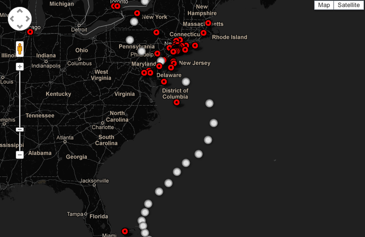
The Guardian’s map of Sandy’s path and verified effects
The project: Verified Sandy Events Map
When a big crisis happens, the first thing to disappear is often a sense of perspective: what’s really going on, where is it happening and how bad is it? Sitting in London, 3,500 miles away from events, it felt like that for us with Hurricane Sandy. We weren’t short of information—constant breaking news, and social media saw to that—but we were short of the key information. The noise becomes greater than the basic facts.
That seemed to me like somewhere we could do something useful: provide the basic information about what was going on. What did Sandy actually do?
The Tools
Our approach was pretty basic—certainly compared to some of the great examples on Chris Cross, including a location search and a button to ’share view’, which creates a zoom-specific url for sharing on Twitter and Facebook.
The style of the map is the result of a lot of trial and error to create a map look I like (it’s a very personal process, this), mainly using the API wizard, which is a neat playground. So, by the time Sandy came along, we had some tools we could use again, rather than start from scratch.
Fusion table has two things that make that simple: the “add row” function means that myself and John Burn-Murdoch could just add events to the map as we got them. Importantly, the geocode function works in the same way as Google maps—enter an address and it will find it for you, with a high degree of accuracy. It’s flexible too, so where we had really detailed geo info, i.e., road junctions, we could get the lat and long, and they would appear in exactly the right place.
The other handy thing is that customising the info windows to include links and pics is simple too. That just left getting the info: the reporting work. And that was what took the time.
The Information
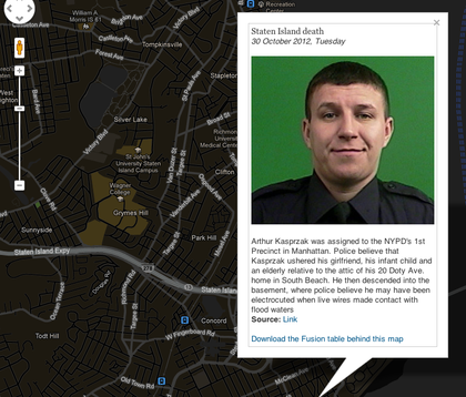
Incident detail with photo and source link
We decided to focus on the after-effects: not the closures and evacuations, but the resulting destruction and casualties.
Our starting point was the wire feed that all news organisations have. But that was just a starting point.
Take the case of hero off-duty cop Arthur Kasprzak who rescued his family but died in his basement on Staten Island. The initial report we saw was on AP, but with very few details. So we had the basic story but none of the detail. But it gave us a place to look, and we then found SILIVE a local site for Staten Island. That gave us address details such as the road so we could locate it on the map.
Another great source was the NY Daily news live blog—which had a lot of detail for us to then look elsewhere to find more information.
Crowdsourcing & Outputs
We knew that we would miss stuff, so we called on the best resource we have: our readers. We had a form below the map for anyone to submit information. This wasn’t going to automatically make it to the map; we needed to check each one before adding.
The whole process meant that we had a dataset we could analyse. The“Filter” on Fusion tables allows you to embed a map showing just part of the data, and we did that for this post on is there for anyone to download—and hopefully produce something more sophisticated that we can then showcase on the site.
Credits
-
Simon Rogers
Datajournalist, and Data Editor @Google. Formerly @Twitter and editor of Guardian Datablog. Author, Facts are Sacred http://t.co/v8gdsFxdWW. All views my own


