Learning:
Making Good News Judgments
Shane Shifflett on the fine art of news judgment and why it’s as important for data journalists as ace coding skills
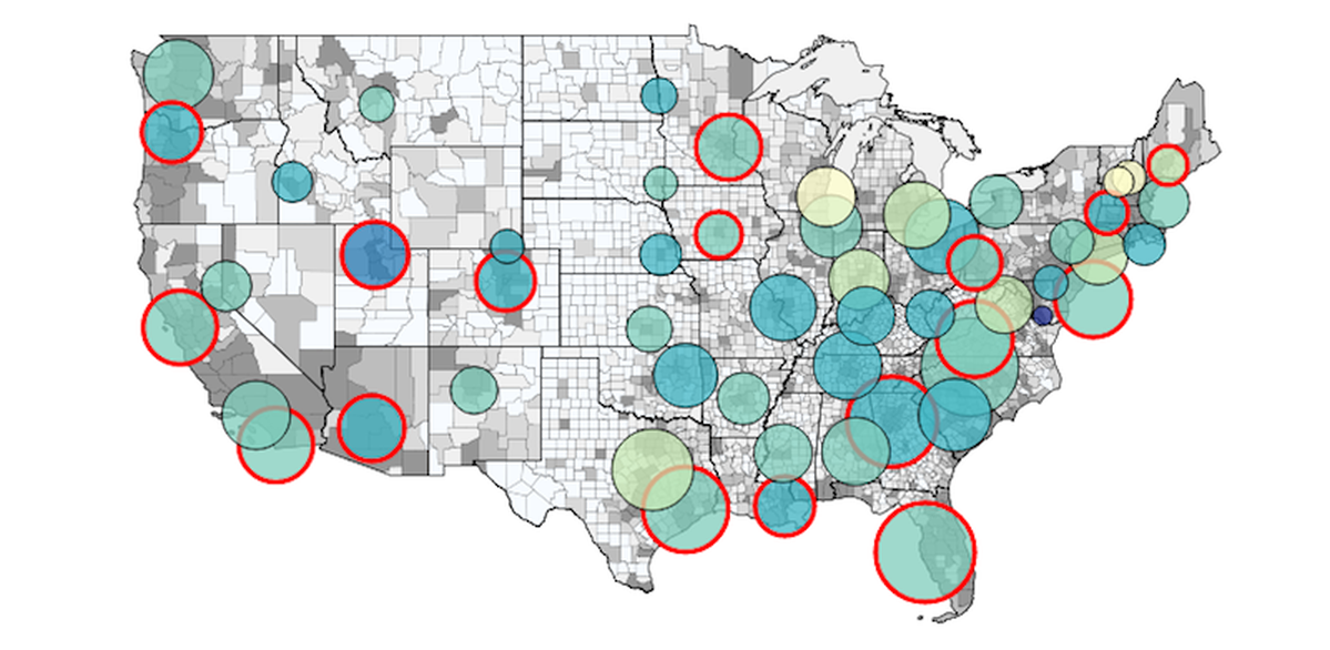
The author critiques his choice to map national veterans’ disability backlog data: “Looking back at it, the geography wasn’t terribly important…what was important was the magnitude of the backlog and its change over time.”
News judgment—making good calls, doing solid investigation, communicating and displaying information meaningfully—is a skill that requires more than remembering to print your date strings in AP Style. It sits at the vague intersection of ethical reasoning, moral insight, and well-honed intuition. It can mean the difference between publishing a well-sourced project or a potentially libelous database. It’s something hiring editors look for in technical candidates, and they shy away from those who aren’t willing to embrace the sometimes ambiguous questions that come up at each stage of a project. It’s doubly difficult as a developer because it’s easy to conflate code whiz-bangery with journalism’s core precepts. Hacker journalists have to embrace questions that can’t be answered with more code.
Story selection, approach, data, and your storytelling method all matter. You can make a map or a chart because it’s fun. But sometimes charts are chart junk so you have to ask: How do I add journalistic value to apps and data projects?
Good Calls = Good Questions
Look for weak signals
Turning your antenna towards a strong signal is easy. Countless weak signals exist during the news gathering process when you’re hunting for a good story or project. The best way to do it, I’ve found, is identify the super stories—the strong signals—and look for threads inside them. The Iraq and Afghanistan wars are obvious examples. The cost-benefit of higher education and student debt another. Quartz News calls them obsessions and if you look at your stories through a broader frame you’ll identify themes cutting across disciplines.
For example, casualty data was typically available for stories about the wars in Iraq and Afghanistan. It’s an important angle but it doesn’t reveal how the wars were executed and only highlights part of the burden Americans carry as a result of both campaigns. At a cost, advanced medical care saved more soldiers injured on the battlefield than in prior wars. It’s a more difficult thread to conceptualize as a news app, but one with much more latitude than exploring casualties alone.
By slightly adjusting the frame to focus on medical technology that saved thousands more on the battlefield than it failed, you open the door to exploring issues in addition to casualties: topics like budgetary constraints related to care, the quality of life of severely injured troops or even the regional differences in safety among troop deployments. By giving yourself a few more options in the same domain, you’re not forced to commit to projects that yield expected answers.
Ask questions of things people are already talking about
Ben Welsh said here on Source that you should tie your project to a news peg. That’s pretty good advice and it amounts to looking at what people are talking about and asking a question that hasn’t been asked. Or maybe one that has been asked but for various reasons—lack of expertise or the complications of access to sources and data—was never answered.
If your obsession is already in the news this is the most likely path to your next project. It’s a fine place to be but so many projects are limited by the newsroom’s perspective. Your job is to use your judgement to expand that perspective when you can and show readers something that words don’t convey as well.
A good recent example is Quartz News’ Gaza Rockets map. Most Americans haven’t seen a rocket fired and it’s difficult to connect with something that’s unrelatable. It’s helpful to know that if the same rockets were fired from Manhattan they could reach parts of New Jersey and upstate New York (and it doesn’t hurt to see that The Gaza Strip is roughly the size of Manhattan). It adds perspective without being obtrusive or complicated. Despite it’s simplicity it conveys a lot of information that can be localized to a reader’s backyard.
Then, ask harder questions
Taking it a step further, and I’ll use my own project to illustrate this because I know it, is to investigate. While working in San Francisco at The Bay Citizen, the woes of the Bay Area’s transit systems were a constant source for stories. And while the idea that the SFMTA had been cooking the books concerning the on-time rates of buses and trains floated around the office, it’s a difficult thing to prove.
In front of a terminal banging out code is typically the last place you want to be when you’re trying to figure out if someone juked the stats. Your chance of success increases dramatically when you start picking up the phone and asking focused questions. In this case, while it seems every San Franciscan is ready to bash their beleaguered transit system it’s not a very helpful path to explore.
By looking for people who were actively trying to fix problems with public transit, inside and outside the SFMTA, and talking to them about their challenges I was able to glean some insight as to how the agency tracked and compiled statistics. It meant meeting with people on weekends and working on other things until I had enough detail. Despite all the legwork the story literally came down to one question—how did the agency define time when compiling their reports?—and a simple public records request. I had to learn a lot more than I ever used to know to be able to get the story, which also had a map.
Simple Data, Simple Process
Before importing and cleaning the data, consider how your audience is going to interpret your data source. In a newsroom, any project can potentially critique an individual or institution. In these cases your work has to be unassailable or you stand to undermine your credibility among your audience.
For the MUNI Minute story there was one other approach I didn’t mention. Someone with even basic programming chops might start looking at published stats and the transit API. The question might come up if it was possible to build reports from the source data and compare on-time rates to reports published by the transit agency.
But the concerned hacker-journalist might note a few problems. It’s complicated. How do you explain your process to readers and instill confidence? How do you account for error if the results you hope to generate don’t match what the city claims to be true? The complication of recreating on-time reports from raw data was a good indication it wasn’t the right approach though it might be possible.
As the developer on duty you have to ask these questions and try to imagine the best and worst possible outcomes. The best scenarios with regard to data munging are those that can explained in one sentence with confidence. The more complex your process becomes the greater risk you run of confusing your audience and losing them in the details.
In Data We Trust
Just like some potential sources, data itself can be deceptive and come packaged with an agenda. Questionable sources can cause readers to question the trustworthiness of your work and worse, the work of your publication. So call around, talk to people and aim for independently verifiable data. It’s not always possible, especially on daily deadlines, but it’s a target that helps to filter out the untrustworthy sets.
I have two extreme examples. First, the census might be the most commonly cited source of data among reporters. The Constitution mandates that the population be enumerated once every 10 years and the Census Bureau is transparent about its methodology. It’s unlikely anyone in charge could benefit from skewing data in one direction or the other.
But when data comes pre-packaged it may be from a source with an agenda or somehow incompatible with existing data sets that might bolster your case. Once I was forwarded something resembling a press release about a potential gender pay gap for employees of lawmakers in Congress. It even came with the raw data but there were issues with the analysis that could have been improved (like making comparisons in absolute dollars instead of an average wage or gross hourly wage). In the end the most unsettling issue was that the data seemed cherry picked. It focused on a few offices and didn’t mention the average pay among a substantial population of women and men working as staffers in D.C.
In cases where an opposition exists you have to report the data fairly and accept that some minority will be biased towards criticizing you for undermining their position. If you’re transparent and fair then you have nothing to worry about, but apply caution. Almost always it’s better to walk away instead of running with a pre-packaged story.
Putting Pen to Paper, Code to Editor
Picking the right medium and format for a story takes the most refinement and thinking outside yourself. It’s possibly the most challenging part of any project and increasingly, stories are integrated with data apps and multimedia. Whether a piece is solo or part of a package, the takeaway has to be right there in the clearest possible expression. So picking the right format is key but there are no hard and fast rules.
While text, audio or video stories are generally an edge case for the hacker-journalist they shouldn’t go without consideration. Elections are great examples of data driven stories and my piece on the mayoral race in San Francisco was no exception. The mayoral fund there was set up to match a candidate’s fundraising up to a certain limit in hopes of deterring big monied interests. Many candidates (9 of 16) tapped the fund to propel their stalling campaigns leaving San Francisco taxpayers on the hook for a growing bill.
My idea was to combine polling numbers with each candidate’s cut of the public financing fund in one or more charts. While compiling data I noticed several candidates were polling in the single digits despite dipping deep into the coffers. I kept asking why and a few phone calls laid out the story. Even improbable candidates were encouraged to stick out the race because city law required them to repay public funds used to campaign and the city’s voting system introduced a slight degree of randomness. The details were nuanced enough that a chart seemed minor to the story and insufficient to explain it. It took two sentences to describe what the chart would have shown and the rest of the story explained the circumstances. Subjectively speaking, the cost benefit given few resources (myself) made the story a better fit.
Normally, charts are better at explaining complex quantitative relationships and great resources exist to help guide your process. ProPublica created a news apps style guide. Dona Wong and Edward Tufte both wrote seminal texts on visualizing data. The tech boom has produced a generation of designers and developers who have created countless free guides on how to structure, analyze and parse data.
The trap for developers is that it’s easy to make a mistake when you substitute clarity with technical urge. It’s a mistake I believe I made when building a map plotting the veterans disability backlog across the country. While next to stories by Aaron Glantz it made a strong case for reform, the display asked a lot from readers. Looking back at it, the geography wasn’t terribly important. What was important was the magnitude of the backlog and its change over time. So why make a map? Partly because it was an opportunity to try out some new technologies and partly because maps were a common grammar in the newsroom.
It’s another subjective decision and each situation is unique. The Huffington Post’s gun death map similarly charted change over time and incident counts. But here the geographic aspect aides the storytelling. It shows that shootings are occurring across the country with surprising frequency. The individual incidents are represented but the real power is in the aggregate display.
There Are No Right Answers
These are decisions without clear answers. Coding is generally the most straightforward part of the process. In isolation, building something for the web becomes trivial with enough practice. Things like writing a web scraper or a script to parse a file or making a page responsive are all sunk costs the same way interviews are for a print story: something that has to happen before you tell the story. The more interesting part is figuring out what tools and approaches are needed then applying them to a clear journalistic goal.
People
Organizations
Credits
-
Shane Shifflett
Is a journalist doing data analysis & visualization @HuffPostData


