Features:
Network Diagrams Are Hard
NPR’s Alyson Hurt on the challenges of making good network diagrams
They seem like a natural solution to showing the interconnectedness of related things, but too often network diagrams look more like abstract string art—some discernible clusters here and there, but few obvious takeaways beyond “yes, this is a complicated thing.”
To me, the better network diagrams offset that sense of overwhelming complexity with 1) legibility—elements (or at least clusters) and their labels are clear, and the connections easy to follow—and 2) clear points of entry to guide the user to the most important information. Bonus points if they work well on tablets and mobile phones, too. It’s a real challenge to do well.
With that in mind, here’s how I approached two projects at NPR—both involving campaign finance—where networks of connections were central to the story.
(Note: Neither project involved large datasets or dynamically-generated diagrams. Both were smaller projects with limited technical complexity, where I had full control over the output. “Big data” and dynamic network visualizations have a host of other challenges, on top of legibility and responsiveness.)
A Web Of GOP Influence (October 2010)
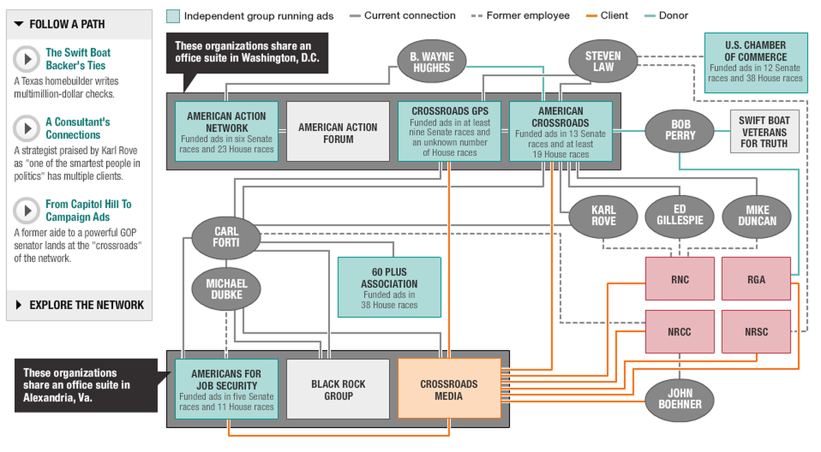
Network diagram for A Web of GOP Influence
This story was about several self-styled “independent, grassroots” political organizations that were actually closely connected to major political influencers—and to each other, to the point of sharing office space. Reporters Peter Overby and Andrea Seabrook had done a series of whiteboard / Post-It exercises to help them give shape to the story they were trying to tell, and then they went through a few more rounds with me, fellow designer Nelson Hsu and digital editor Erica Ryan.
Digital diagram, physical starting points
Our plan:
- Create a clean visual representation of the full network, insofar as it was possible
- Call out the most important takeaways with narrated explanations of key “paths” in the diagram
To translate the whiteboard diagrams to the screen, I started by mapping things out in OmniGraffle. What I like about OmniGraffle (as opposed to Illustrator) is that I can draw boxes and connecting lines, and the lines stay connected even as I move the boxes around. My goal was to emphasize clusters of related entities, rather than a particular flow or sequence. I went through a few iterations trying to get the placement right, grouping related entities as best I could without the connecting lines being too spaghetti-like. Then I took the result into Illustrator to produce a polished diagram.
I passed the Illustrator diagram to Nelson, who timed animation to Peter and Andrea’s voiceovers and added annotations. (Being 2010, we built this part in Flash. Today, I would probably approach this with Popcorn.js and jPlayer.)
Secret Persuasion
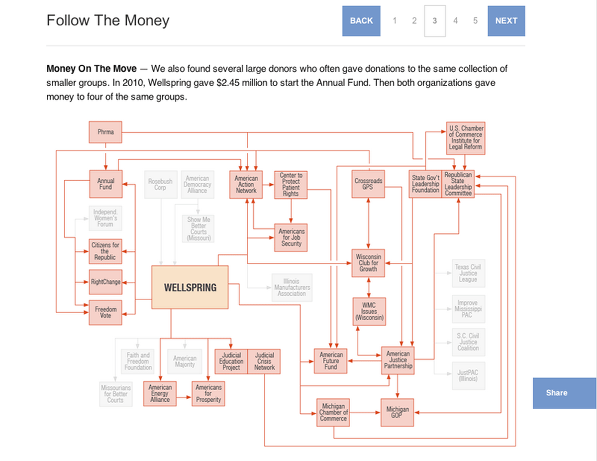
Network diagram for Secret Persuasion: How Big Campaign Donors Stay Anonymous (diagram in state 2 of 5)
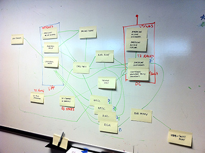
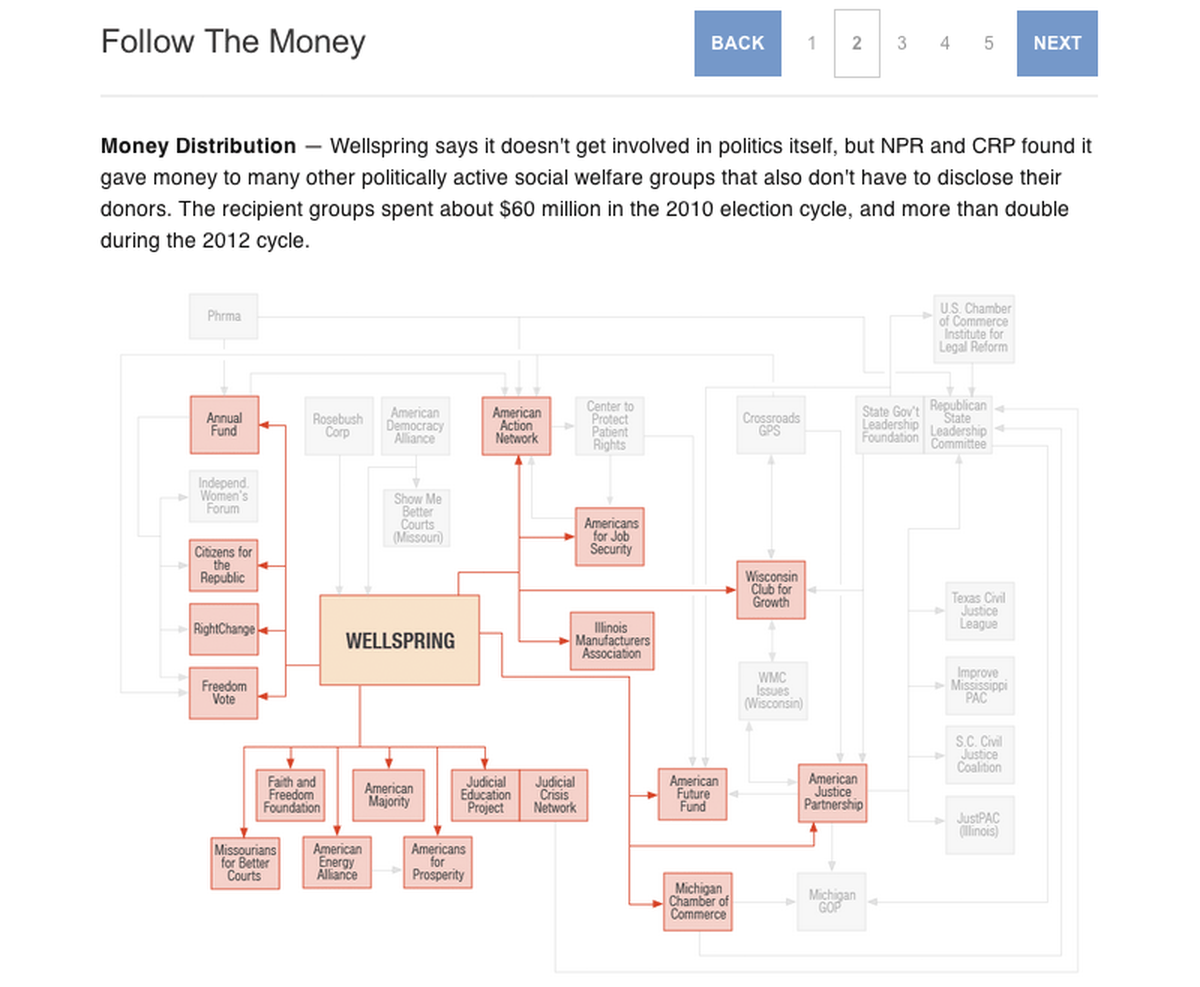
This story involved a network of donations among politically-oriented nonprofits (in this case, 501(c)4 “social welfare” groups) trying to play a role in national and state elections. Peter Overby (NPR) and Viveca Novak (Center for Responsive Politics) focused on one organization—Wellspring—and went through several iterations of their network on the whiteboard walls of a small meeting room at NPR.
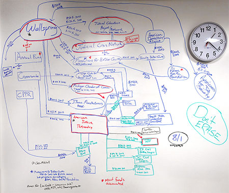
Whiteboard spaghetti
(Their sketches also included donation amounts. I briefly entertained the idea of varying the connector line weights to represent the total amount of donations between organizations, but the available data wasn’t consistent enough. And, looking at the final diagram, I think that would have added unnecessary complexity anyway.)
Our original plan was to approach this graphic like the earlier project: A tidied-up network diagram, with Peter narrating some of the key paths.
We had a few challenges we hadn’t had in 2010, however:
- Evolving web standards (and team “mobile-first” mantras) meant that a) this graphic couldn’t be in Flash and b) it had to be responsive, rather than a fixed width. The responsive mandate meant some significant challenges for layout and design: If we did the diagram as a static graphic, the text would be unreadable on small screens. If we instead went with dynamically drawn/placed boxes and lines, the text in those boxes would be easier to read, but the complexity of the network would be difficult to render clearly.
- We had many more entities to map, and we needed to emphasize the “flow” aspect of the story—the idea that money started in one place, then went to another, and so on. I went through at least eight OmniGraffle iterations of the network diagram. The result isn’t perfect, but the general logic has entities that donated to Wellspring at the top (even if entities further down the chain in turn donated to those top-level entities); nationally-oriented entities grouped together below and to the left; and state-oriented entities grouped together below and to the right.
- Competing deadlines with other projects led us to scrap the idea of audio narration. After some conversations with News Apps editor Brian Boyer, Investigations web editor Alicia Cypress and Investigations editor Robert Little, we took a slightly different angle: Instead of highlighting individual case studies (e.g., “Wellspring donated to org x, who in turn donated to org y, who in turn spent money on election z”), we would instead step the user through different classes of entities in the diagram (Wellspring donated to these entities, who in turn donated to these types of entities, etc.). Plus, the first story in the series was a detailed case study, so it seemed appropriate for this graphic to take a broader look.
News Apps intern Shelly Tan translated my OmniGraffle mock-up to a more polished Illustrator diagram and worked with Alicia to highlight and explain the relevant entities for each step. Then Shelly and I set up the JavaScript and CSS to allow users to click through each phase of the graphic.
The resulting graphic is imperfect, particularly on mobile: since this is a static graphic scaled down to fit a small screen, the text in the diagram itself is illegible. But because the explanatory text above each phase of the diagram is readable (rendered in HTML) and the highlighted flow is still clear, I feel like the main ideas still come through.
It does underscore another design/UX challenge in our current age: responsive graphics are also hard.
Credits
-
 Alyson Hurt
Alyson Hurt is the graphics editor at NPR, serving on the Visuals team (formerly News Apps + Multimedia). Previously at the Washington Post and the Arizona Republic. Graduate of ASU’s Cronkite School and Georgetown’s CCT program.


