Features:
Source Project Roundup, May 27
Interactive features, data journalism, and best practices

Here’s a few things we especially appreciated recently: green spaces, small multiples, and forking paths of perception.
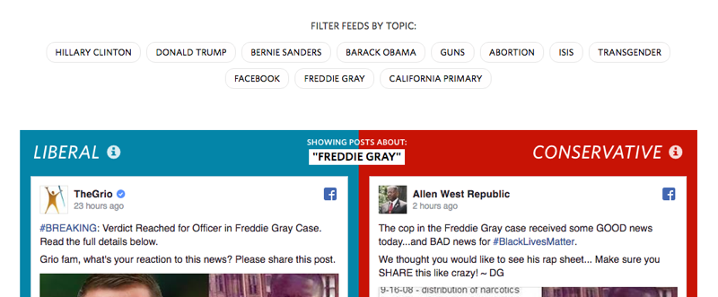
Blue Feed, Red Feed
(Wall Street Journal, May 18, 2016)
With a few clicks, generate two hypothetical Facebook feeds based on topics such as “Freddie Gray,” “Donald Trump,” and “ISIS.” Then compare the “blue” and “red” feeds, for a stark reminder of how algorithms create echo chambers. Explore media sources used.
Unequal Rights: Abortions and guns in America
(Fusion, May 17, 2016)
This interactive documentary follows two roads: the journey to owning a gun and the path to accessing an abortion provider. Switch between the two stories along the way, structured as a reflection on what “undue burden” really means.

These are Germany’s Greenest Cities
(Berliner Morgenpost, May 10, 2016)
Many German cities claim to be the greenest. But who’s right? This project zooms out for a view from space, evaluating and assembling satellite images to create a detailed picture of where the green is.
How Far is Europe Swinging to the Right?
(New York Times, May 22, 2016)
Stacked bar graphs and small multiples show the swing of a continent.
What matters in this graphic is not to compare all parties, but to emphasize the hard-right ones, and then to compare them to all other parties as a whole. Therefore, I think that the decision of coloring all center-right and center-left parties identically makes sense: It’s red versus white and gray. — Albert Cairo

U.S. Senate—the Georgia Voter Guide
(Atlanta Journal Constitution, 2016)
AJC.com featured this guide for May 24th’s primary voters, in partnership with the League of Women Voters. It’s one of several papers to implement this kind of voter guide, where users can make a “ballot” based on information about the candidates.
Even More Things

Capitals of the world, all in one place.
Digital work culture at the Hindustan Times.
Comparing a dozen chart tools and a dozen libraries, all using the same dataset.
Or is leather your Python charting pref?
Lessons from launching the Miami Herald online in 1996.
A sestina on sunsetting content.
Don’t send pages over the horizon by sunsetting just because it’s been awhile since readers visited them — for example, caucus information or how to take part in the census, those kinds of things. You shouldn’t delete and relaunch valuable, accurate content because of the cyclical interest of the public.
A huge trove of Buzzfeed data, libraries and guides.
Stop running from your CMS problems, like the Marshall Project team. Change your diet like an American. Follow your passion for portraits like Brandon Stanton of Humans of New York. Or: track a snowy owl.
On our last OpenNews community call, we heard from David Sleight about ProPublica’s new app. Missed it? We took notes.
Our next call is June 2 at noon ET. See you there.
Credits
-
 Lindsay Muscato
Editor of Source from 2015-2020


