Features:
Twitter Mapping: Foundations
Twitter’s Data Editor Highlights Challenges and Possibilities
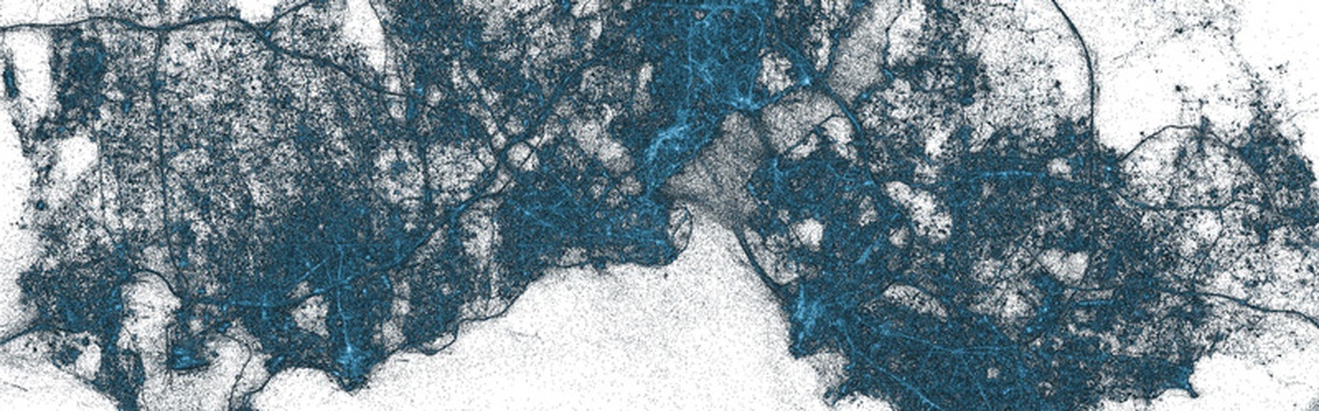
A slice of Istanbul tweets, mapped
With more than 500 million tweets sent every day, Twitter data as a whole can seem huge and unimaginable, like cramming the contents of the Library of Congress into your living room.
One way of trying to make that big data understandable is by making it smaller and easier to handle by giving it context; by putting it on a map.
It’s something I do a lot—I’ve published over 1,000 maps in the past five years, mostly at Guardian Data. At Twitter, with 77% of users outside the US, it’s often aimed at seeing if regional variations can give us a global picture, an insight into the way a story spreads around the globe. Here’s what I’ve learned about using Twitter data on maps.
We Tweet As We Live

This map by @miguelrios shows billions of those geotagged tweets on a map. The coolest thing? The map behind has been removed. You can see in this zoom-in to New York how natural and man-made features are reflected in tweets—even the Staten Island ferry at the tip of Manhattan. People tweet following patterns of the way, and places, they live. This is both a strength and a complication if you want to map tweets around breaking news—I spend a lot of time refining the and filtering the data down so that I don’t necessarily get every tweet around a story; but you do make sure that every tweet you’re counting is talking about the story.
Everyday Moments Get Amplified by Tweets
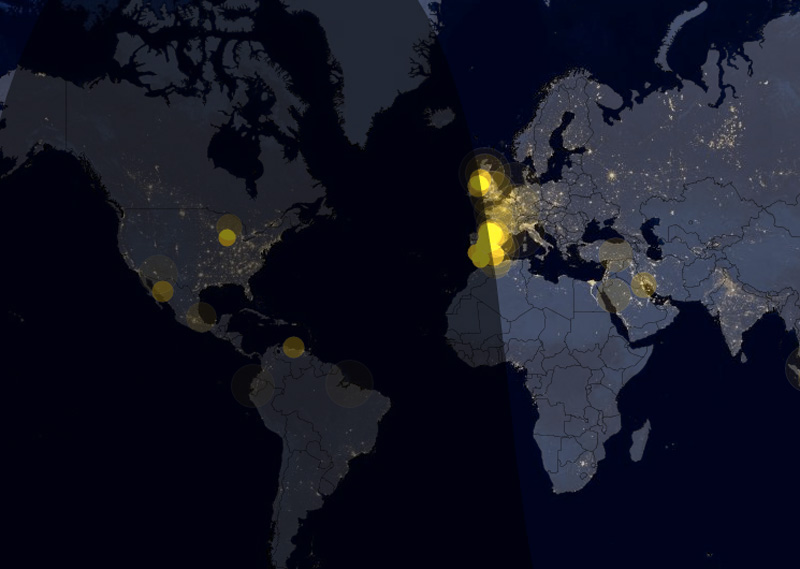
Sunrise around the world

In the past, you may have turned to a friend and said “what a beautiful sunrise.” Now you can see those patterns unfold across the world: this map shows geotagged tweets mentioning the word “sunrise” in different languages—as the sun rises. The above map shows how people tweet that on a random day of the year.
You can see it too with this map, which shows tweets of “happy new year” in different languages across the world as the clock strikes 12.
Some of these everyday moments are eternal—like sunrise, obviously. Others come and go—such as tweets about a new trend, or the latest iPhone, or whatever it happens to be.
Geography Tells Its Own Story
If you read the reports of the #BringBackOurGirls story, then you could assume the hashtag was started in the US or Europe. In fact, as this map shows, it began in Africa as a grassroots campaign, before eventually spreading across the globe. It’s a useful way to counter the prevailing narrative with actual data.
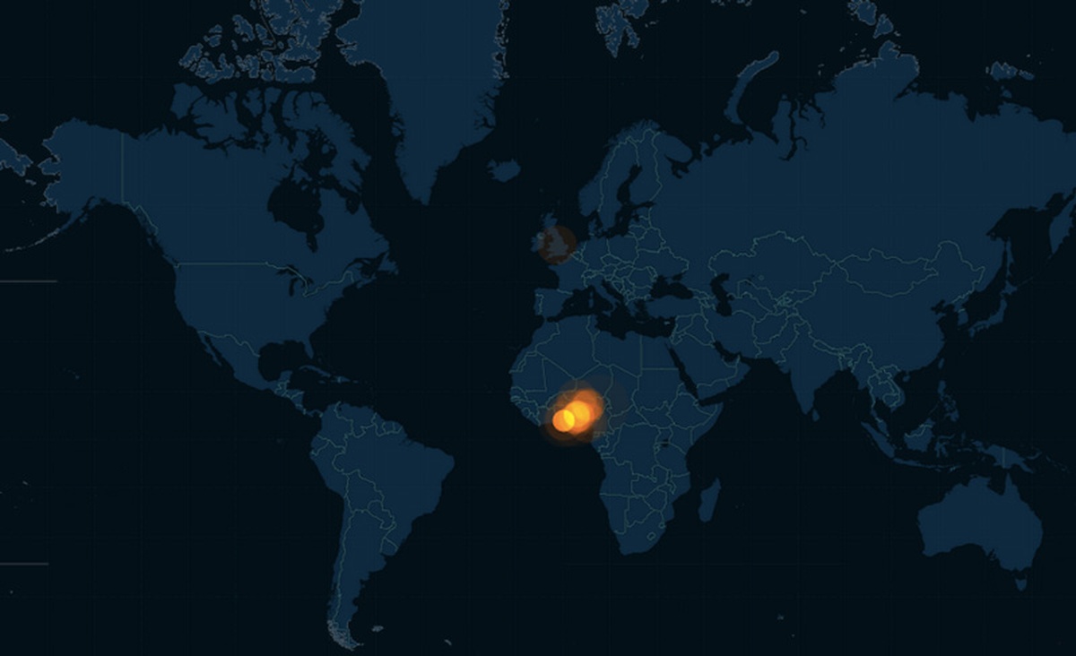
Animated #BringBackOurGirls map
Twitter Maps Don’t Show Every Tweet
Say you want to get started with this, where do you begin? Most times that you see Tweets mapped, it’s because they are geotagged, which is the process of adding geographical information to a tweet by opting to add your location:
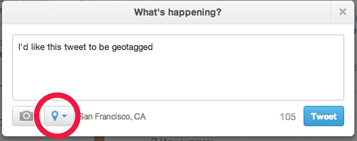
Opting to geotag
It’s important to note that this is a voluntary opt-in Twitter feature, and users can turn it off anytime. That means this is a sample of tweets which will vary by which keywords you’re measuring and which country you’re looking at.
Some data services will georeference tweets—guess where you are tweeting from depending on factors such as your biog or what language you’re tweeting in. GNIP (now owned by Twitter) provides this service. However, for more precise geography, that means geotagged tweets only.
Of course, in order to work with the data, you’ll have to get hold of it—this article is not about that but there are a variety of data providers you can use. This list will help you get started.
Some Maps Aren’t
Despite its appearance, this is not a map in the traditional sense that a cartographer would be content with. At one level, the data shows you simply where Tweets happen and where people live. If it were not animated it would be a pretty good approximation of this map from XKCD.
But animated over time, it’s a kind of visual time series line—with the flashes of moments corresponding to peaks on a chart. For instance, the animation above shows geotagged tweets using the hashtag #icebucketchallenge, and the most interesting thing for me is how:
- the tweets build up over time, and
- they spread over the world, from North America at the beginning to Asia, Africa and Australia by the end of the animation
Again you can see it with this animation of the Germany v Brazil 7–1 game from the World Cup, with explosions of tweets at the moments that goals are scored. These are the visual peaks of the conversation, overlaid on a map.

Normalizing Matters

“Normalizing” the data behind these maps is something cartographers online will often talk about. What that means is taking account of other factors, such as population. So, for instance, Wyoming with its small population of 600,000 may have a very active small community of tweeters on a given issue, making up a large proportion of its population. Comparing that to a big state like California or Texas with 26–38 million people just doesn’t make sense. So that’s where you “normalize” it, either by comparing the numbers to the population, or the number of all tweets coming from that state. Normalizing the data what we did here, for instance, with this map showing the most-mentioned artists in the “video of the year” category at the VMAs—it simply shows the most-mentioned artist and video in each state:
Yes, the Deep South loves @Beyoncé, the Midwest is all @MileyCyrus, while the West Coast is ‘Happy’ with @Pharell.
This type of choropleth is great for coloring up parts of the country, i.e. states, in this case. But because you’re comparing different size areas with different populations, these can never be used for displaying raw numbers. Instead they should show percentages, ratios or some other proportional amount, which means you have to aggregate the data into totals. For instance this map, from our interactive guide to the State of the Union speech shows conversation around different parts of the speech geographically—compared to the total numbers of Tweets from each state.

There are other ways of aggregating Twitter data too—this map by academics at Oxford University looks at how you could group tweets by even smaller geographic areas, using hexagons in this case.
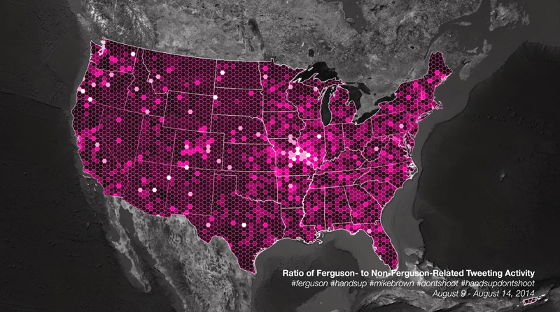
Eric Huntley’s map displaying Ferguson-related and unrelated tweets
This is a technique we have used too, in this guide to how football team follower numbers changed during the World Cup.

These are attractive maps and certainly more proportional, and they don’t tell the story of a waxing and waning event or moment over time in the same way. But if you’re trying to produce a static visualisation—for print, say—then this technique is much more appropriate.
Making an Animated Map Is Pretty Easy
Creating data visualizations is simpler now than it’s ever been, with a plethora of tools (free and paid) meaning that any journalist working in any newsroom can make a chart or a map in a matter of minutes. Because of time constraints, we often use CartoDB to animate maps of tweets over time. The process is straightforward—I’ve written a how-to guide on my blog that shows how to create an animated map of dots using the basic interface, and if the data is not too big it won’t cost you anything. CartoDB is also handy for other reasons: as it has access to Twitter data, you can use it to get the geotagged tweets too. And it’s not the only one: Trendsmap is a great way to see location of conversations over time.
Have you made a map with Twitter Data that tells a compelling story? Share it with us via @TwitterData.
Credits
-
Simon Rogers
Datajournalist, and Data Editor @Google. Formerly @Twitter and editor of Guardian Datablog. Author, Facts are Sacred http://t.co/v8gdsFxdWW. All views my own


