Features:
Now This Is a Story All About How We Found the Wet Princes of Bel Air
Satellites, mapping, and math helped us pinpoint the biggest water users in L.A.

Published in partnership with

We explained the basics of our analysis in our story trying to unmask the Wet Prince of Bel Air—the top residential water user in Los Angeles—but we learned quite a few new tricks in the process, so this is a nonlayman’s guide to replicating our process.
The Problem
We knew by looking at data from California’s largest utilities that four of the five biggest residential water users under their jurisdictions were in zip code 90077—the Bel Air neighborhood. But the Los Angeles Department of Water and Power wouldn’t tell us who those customers were.
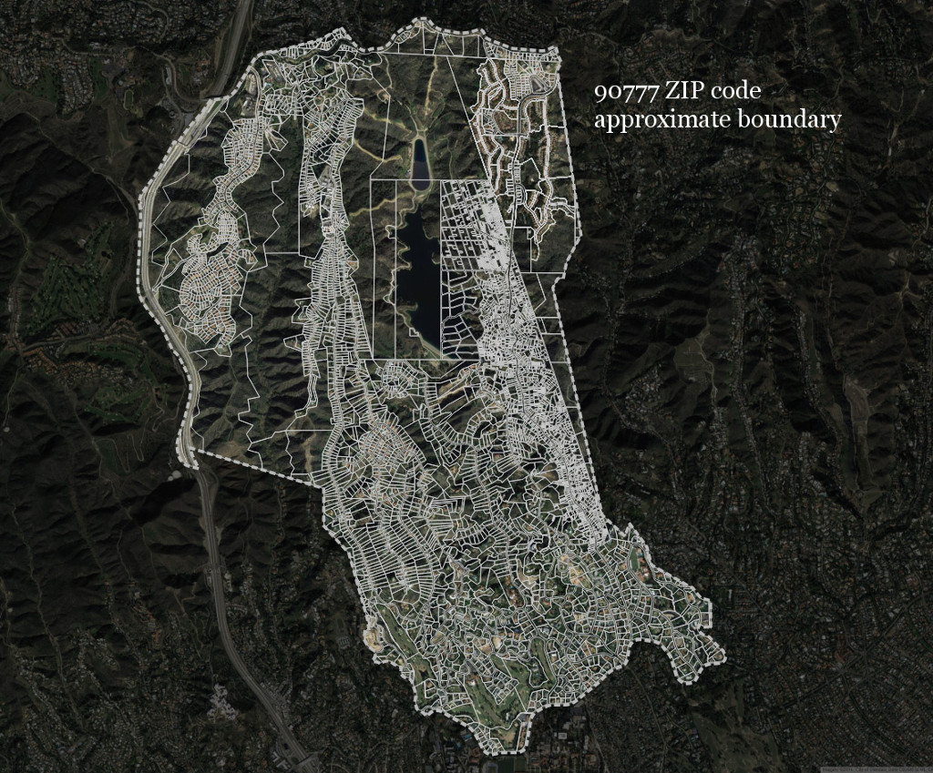
That Bel Air zip code has more than 5,000 parcels—it’s not like we could just knock on doors or make phone calls. We figured that unless we got a tip, we would probably never find them. (City of Los Angeles, U.S. Census Bureau, Google/DigitalGlobe)
Enter Remote Sensing
After our original stories ran, David Murray, a doctoral student at the University of Oklahoma, sent an email to Reveal senior reporter Lance Williams. “Couldn’t you use satellite imagery to figure out who the biggest customer was?” he asked. Lance came to the data team: “This guy says you could use satellites and ‘NDVI’ or something to find the Wet Prince. Does that mean anything to you?”
Senior data reporter Eric Sagara and I had the same thought: Why didn’t we think of that? We were both familiar with NDVI, or the Normalized Difference Vegetation Index, but the idea hadn’t occurred to us. Eric had even done some great work using NDVI to illustrate wildfires.
First, a word about satellites.
This is Landsat 8, which was launched by NASA in 2013. Its powerful cameras are used by countless scientists worldwide to understand climate change, track wildfires, and analyze agricultural production, among many other things.

(Wikipedia Commons)
Human eyes can see color in the visible spectrum of light—the colors of the rainbow that everyone is familiar with. But the cameras on a satellite can see a broader spectrum of colors, which can tell scientists much more than we can see with our naked eyes.
Landsat 8’s cameras work like your digital camera. Except that instead of just recording the RGB (red, green, blue) bands you might be familiar with, Landsat has 11 bands that can be combined in different ways to observe different environmental processes.

A diagram shows Landsat 8’s bands. Only bands 1, 2, 3, 4 and 8 are within humans’ visible range. Bands 10 and 11 are not pictured but would be well off the screen to the right, in the infrared spectrum.
One of those Landsat bands records light in the near-infrared portion of the spectrum. As you’ll recall from high school science classes, plants absorb light from the sun to carry out photosynthesis. But much like a satellite, plants are more interested in some parts of the spectrum than others. Healthy plants will try to absorb as much red light as possible, but will try not to absorb as much near-infrared light as possible—that’s basically just heat, which is useless to the plant.

(Allison McCartney/Reveal)
So scientists have learned that they can use photographs to measure the health of vegetation by calculating the ratio of near-infrared light to red light that is being reflected back at the camera. And that’s NDVI.
But there’s another problem. This isn’t a story about how well Bel Air’s resident plants are photosynthesizing; it’s a story about who was using more water. And not all plants need the same amount of water. (For example, a cactus will happily photosynthesize with much less water than a lawn.)
Luckily, remote-sensing experts have a few other tricks.
One of them is my all-time favorite technical term, the “tasseled cap transformation,” also suggested by our doctoral student friend. And tasseled cap can be used to measure relative soil moisture. Tasseled cap works by combining six of Landsat 8’s 11 bands with some matrix multiplication, using coefficients derived from observational data. It’s a sort of reverse-engineered approach to remote sensing. One of the resulting bands indicates the brightness of each pixel, one indicates greenness and one indicates wetness.

The “tasseled cap” in tasseled cap transformation.

The Sleepytime bear. Note the cap.
It’s called “tasseled cap” because the scatter plot of an image’s brightness and greenness pixels looks kind of like a little hat. You know, like the one worn by the Celestial Seasonings Sleepytime Tea bear. How adorable is that?
To make sure I was using the techniques correctly, I ran our methodology by remote-sensing experts James Campbell and Laurence Carstensen in the geography department at Virginia Tech.
What Are We Even Doing Here?
Using all those tools, we wanted to find the largest, greenest, wettest parcels. That would lead us to the biggest water users.
Step 1: Parcels Minus Buildings
As in most cities, parcel maps are public records in Los Angeles, so we requested a shapefile of parcels from the city. Because we were talking about big estates with big houses, we subtracted the footprint of known buildings from each parcel inside the 90077 zip code, available from Los Angeles County, using the Quantum GIS difference tool.
(Zip code boundaries are approximate, by the way. We used TIGER zip code tabulation areas—ZCTAs—from the U.S. Census Bureau.)
Step 2: Median NDVI for Each Parcel or “How Green Was My Parcel?”
Landsat 8 photos have a resolution of 30 meters per pixel, meaning that one pixel represents a 30-by–30-meter square. If you think about it, that’s a fairly big area—easily bigger than my own lawn, for example. Luckily for us, we were dealing with pretty big properties in Bel Air, but even luckier, we had a much better option than Landsat 8.
The U.S. Department of Agriculture shoots aerial photos—from a plane, not a satellite—of states with a lot of farming. Those have a resolution of 1 meter per pixel. And, since 2010, those National Agriculture Imagery Program—known as NAIP—photos have included a near-infrared (NIR) band, which means they can be used to calculate NDVI. The trade-off for that higher spatial resolution is lower temporal resolution—you get one photo of a given location every two years. (For comparison, Landsat 8 captures most places on Earth once every 16 days.)
I started out doing this manually. NAIP imagery is available from the USDA Farm Service Agency or from the U.S. Geological Survey’s EarthExplorer. I downloaded the most recent NAIP images for Bel Air, which were shot on May 14 and 15, 2014—near the start of the range of water-use data we had requested (April 1, 2014, through March 31, 2015).
I used QGIS’ raster calculator to find the NDVI for each pixel. The formula is pretty simple:
NDVI = (NIR - Red) / (NIR + Red)
Using a map of Los Angeles parcels that we requested from the city, we calculated the median NDVI for each parcel, using the QGIS zonal statistics plugin.
Greenness: check. On to wetness.
Step 3: Tasseled Cap or “How Wet Was My Parcel?”
Tasseled cap was not quite so easy, or at least not at first. I read through a bunch of scientific papers and finally found a Python implementation of the transformation. Except the Python script was for use with Landsat 7 images, not Landsat 8. Landsat 7’s bands are at different wavelengths than Landsat 8, so you need different coefficients for each band to do the transformation. So I went back to the literature, found coefficients for Landsat 8, and tweaked the Python script, making sure I checked my work with our doctoral student friend.
There’s no way to calculate tasseled cap with NAIP imagery because you need all those extra Landsat bands. So for now, I was stuck with Landsat’s 30-meter resolution.
(The European Space Agency’s new Sentinel–2 satellite has a resolution of 10 meters. As far as I know, no one has yet written an implementation of tasseled cap for Sentinel–2, but it should be possible, and it would be a big improvement.)
Because my NAIP image was collected near the beginning of our data request, I wanted a Landsat 8 image for tasseled cap that was at the end. I used Landsat-util, a great command-line tool, to search the area by date. By coincidence, the area was photographed on April 1, 2015, the day after our request range ended. So we had measurements that bookended our request range: greenness at the end and wetness at the beginning. This made it less likely we were measuring a short-term phenomenon, like watering a lot before a garden party, for example.
The numbers stored in Landsat files range from 0 to 255. However, to do statistics like tasseled cap, I had to take those scaled-down numbers in the file and convert them back into top of atmosphere reflectance values. After using my Python script to create a tasseled cap version of my image, I used the QGIS zonal statistics plugin again to find the median tasseled cap wetness value for each parcel.
Wetness: check.
The Much Easier Way
I did much of that work manually at first. But as I learned, your life can be easier. Google has a fairly new product called Earth Engine. If you’re familiar with Google Maps, you know that it has to keep several very large global maps up to date, and those maps change all the time. That requires a ton of parallel computing power. A Brazilian scientist studying deforestation approached Google a few years back, saying that having access to both archives of satellite data and Google’s computing power could revolutionize his and others’ research.
So Google started adding petabytes of historical satellite and aerial imagery to Earth Engine, and you can now do some things that were quite literally impossible for most of us before it existed.
For example: Why pick one Landsat photo of a given location when you can just make a composite image of that location, made up of the median pixel values of every Landsat 8 image of that location ever?
In Earth Engine, that can be done in two lines of code:
var l8 = ee.ImageCollection("LANDSAT/LC8_L1T_TOA");
var median_l8 = l8.filterBounds(boundary).filterDate('2013-01-01', '2016-12-31').median();
In addition to all Landsat data ever (not just Landsat 8), Earth Engine has an extensive collection of other imagery, including NAIP and Sentinel–2. Most of the users are scientists, and there’s a pretty active community doing a wide range of things you can tap into.
And there are a lot of tools built in. For example, to do the NAIP NDVI calculations in Earth Engine:
var naip = ee.ImageCollection("USDA/NAIP/DOQQ"),
boundary = ee.Geometry.Polygon(
  [[[-118.48025321960449, 34.067449577393454],
    [-118.41836929321289, 34.06787617820782],
    [-118.4187126159668, 34.10711426272431],
    [-118.48291397094727, 34.1076117303537]]]);

[ var naip_2014 = naip.filterBounds(boundary).filterDate('2014-01-01', '2014-12-31');
var naip_2014_median = naip_2014.median();
var ndvi_naip_2014 = naip_2014_median.normalizedDifference(['N', 'R']);

var ndvi_naip_viz = {min:-0.32, max:0.7, palette:'black,gray,yellow,red'};
Map.setCenter(-118.44710, 34.08365, 15);
Map.addLayer(ndvi_naip_2014, ndvi_naip_viz, 'NDVI NAIP 2014');
Earth Engine’s support for vector features is a little strange, but you can still do a lot with it. To get the parcel map into Earth Engine, I had to convert my shapefile into a Google Fusion Table. (There’s a good online guide for doing that.) Then, you can reference the Fusion Table in your Earth Engine script.
var parcels_minus_buildings = ee.FeatureCollection("ft:your_fusion_tables_id");

Map.addLayer(parcels_minus_buildings, {'color': 'FFFFFF'}, 'bel-air-parcels');
To calculate the median NDVI for each parcel:
var parcelMedianFeatures = ndvi_naip_2014.reduceRegions({
  collection: parcels_minus_buildings,
 reducer: ee.Reducer.median(),
 scale: 1,
});
You can output the results to a CSV or GeoJSON, which is sent to your Google Drive account:
Export.table.toDrive({
 collection: parcelMedianFeatures,
 Description: 'BelAirParcelMedians',
 fileFormat: 'CSV'
});
You even can do tasseled cap in Earth Engine (I found a recipe, I didn’t figure this out on my own):
var l8 = ee.ImageCollection("LANDSAT/LC8_L1T_TOA");
var filtered_l8_story = l8.filterBounds(boundary)
 .filterDate('2014-04-01', '2015-03-31')
 .select(['B2', 'B3', 'B4', 'B5', 'B6', 'B7']);
var median_l8_story = filtered_l8_story.median();

// Define an array of tasseled cap coefficients.
var ls8_coefficients = ee.Array([
 [0.3029, 0.2786, 0.4733, 0.5599, 0.508, 0.1872],
 [-0.2941, -0.243, -0.5424, 0.7276, 0.0713, -0.1608],
 [0.1511, 0.1973, 0.3283, 0.3407, -0.7117, -0.4559],
 [-0.8239, 0.0849, 0.4396, -0.058, 0.2013, -0.2773],
 [-0.3294, 0.0557, 0.1056, 0.1855, -0.4349, 0.8085],
 [0.1079, -0.9023, 0.4119, 0.0575, -0.0259, 0.0252]
]);

   // Make an Array Image with a 2-D Array per pixel, 6x1.
var l8_arrayImage2D = l8_arrayImage1D.toArray(1);

// Do a matrix multiplication: 6x6 times 6x1.
var l8_componentsImage = ee.Image(ls8_coefficients)
 .matrixMultiply(l8_arrayImage2D)
 // Get rid of the extra dimensions.
 .arrayProject([0])
 .arrayFlatten(
   [['brightness', 'greenness', 'wetness', 'fourth', 'fifth', 'sixth']]);

var tcw_viz = {bands: ['wetness'], min:-0.2, max:0.1, palette:'gray,blue'};

Map.setCenter(-118.44710, 34.08365, 15);
Map.addLayer(l8_componentsImage, tcw_viz, 'TC wetness');
Putting It All Together
We combined the NDVI and tasseled cap wetness values into a single number by averaging their z-scores.
Then I made a scatter plot, with the size of each parcel as the x-axis and the greenness-wetness index as the y-axis. Parcels at the top right of this scatter plot should be large, green, and wet.

Blue dots are residential parcels that I looked into in more detail. For comparison, yellow dots are parcels on golf courses. Many properties on our final list are made up of multiple parcels, hence the blue dots with lower z-scores.
Parcels to Properties
Once we had our scatter plot, I manually looked up in QGIS each of the parcel numbers for the dots that looked interesting. First, were they residential properties? Many weren’t. Not surprisingly, some of the largest, greenest, and wettest parcels were part of a golf course, the Bel-Air Country Club. (Those are the yellow dots in the scatter plot.)
Once I found that a parcel number was part of a residential property, the next task was to figure out if any more adjacent parcels were part of the same property. Some were obvious—a parcel boundary might go right through a single lawn. In other cases, I had to cross-reference records on ZIMAs to see if they were all associated with the same address.

The three parcels that make up Robert Daly’s Bellagio Road property, with building footprints subtracted. (City of Los Angeles, Los Angeles County, Google/DigitalGlobe)
Then we had to figure out who owned each property. ATTOM Data Solutions, a real estate data service, provided us with property ownership information for Bel Air’s zip code, but many of the properties were owned by trusts or LLCs and needed further reporting. That was up to Lance Williams, who is much better at this sort of thing than me. But wait, there’s more. All of this work essentially just got us a list of semifinalist parcels to look into more deeply. None of this told us how much water the owners of those parcels might have used.
Who Rules? The SLIDE Rules
Luckily, landscape architects have to deal with this issue all the time: How much water will it take to keep a planned project healthy? For a big piece of land, it’s worth knowing because it could mean it needs a lot of water. Enter the “SLIDE rules.” The Simplified Landscape Irrigation Demand Estimation was developed by several horticultural researchers as a science-backed way to estimate irrigation needs. I talked to Dennis Pittenger, a horticulturalist at the University of California Cooperative Extension and one of the creators of SLIDE, to make sure I was doing things right.
To calculate irrigation needs, SLIDE requires:
- The general type of plant being irrigated
- The size of the planting (e.g., 0.25 acres)
- The efficiency of the irrigation system
- The local evapotranspiration rate—how fast water is absorbed back into the atmosphere by evaporation and transpiration (aka plant sweat)
So for each parcel of interest, I traced individual parts of the property to measure their size: Here’s a quarter-acre lawn, a one-acre patch of shrubs, etc. I wanted to be conservative in our estimates, so I counted only areas that appeared to be irrigated (no scrubland), and when in doubt, I classified each type of land cover as the less-water-intensive option. (If it wasn’t clear whether something was shrubs or grass, I chose shrubs, for example.) Each type of planting is assigned a “plant factor” to adjust for differences in water needs:
| Plant type | Plant factor |
|---|---|
| Tree, shrubs, vines, groundcovers (woody plants) | 0.5 |
| Herbaceous perennials | 0.5 |
| Desert-adapted plants | 0.3 |
| Annual flowers and bedding plants | 0.8 |
| General turfgrass lawns, cool season (tall fescue, Kentucky bluegrass, ryegrass, bentgrass) | 0.8 |
| General turfgrass lawns, warm season (Bermuda, zoysia, St. Augustine, buffalo) | 0.6 |
| Home fruit crops, deciduous | 0.8 |
| Home fruit crops, evergreen | 1.0 |
| Home vegetable crops | 1.0 |
| Mixed plantings | PF of the planting is that of the plant type present with the highest PF |
(Source)
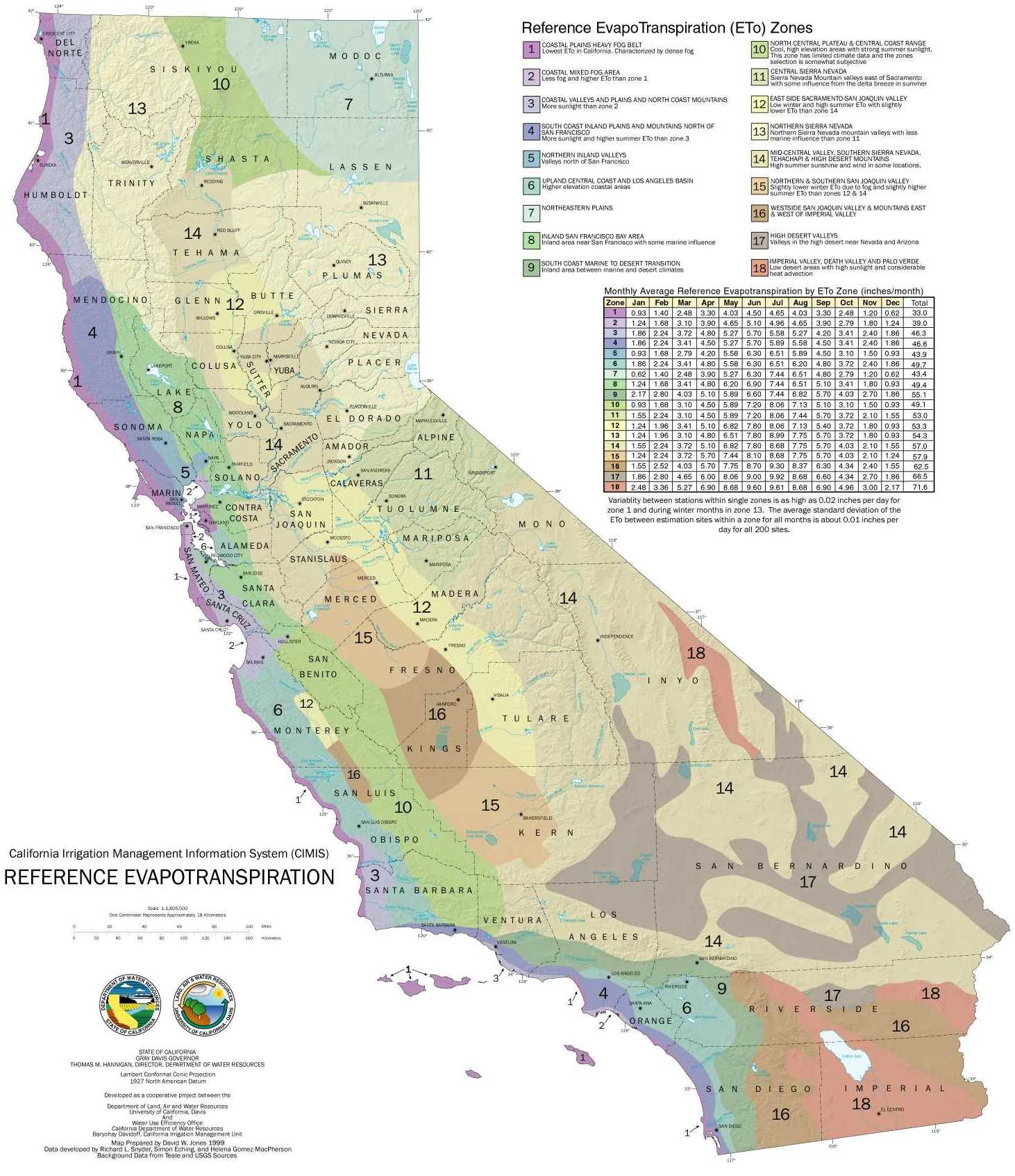
Evapotranspiration varies quite a bit, but in this case, I was looking only at one zip code, so I could use a single value for evapotranspiration, or ETo. In California, the state publishes a map of ETo zones.
Then everything goes into the SLIDE formula:
ET0 (annual) x Plant factor x Land area (square feet) x 0.623 = gallons/year
So, for a 0.5-acre patch of grass:
50.1 (ETo) x 0.8 (PF) x 21,780 (area square feet) x 0.623 = 543,843 gallons/year
Yes, it takes almost 550,000 gallons of water in L.A. to keep a half-acre lawn healthy each year. And that’s assuming that your irrigation system is 100 percent efficient, which it never is. We decided to use a range: a low-end estimate, which assumes an 80 percent efficient system, and a high end, at 50 percent efficient. This seemed realistic to experts I consulted.
For an 80 percent efficient system, that makes 679,804 gallons. At 50 percent efficiency, a whopping 1 million gallons.
In the end, I ran 19 properties through the SLIDE formula. We decided to name seven in the story because there was a nice break in the numbers at just under 4 million gallons for the high-end estimate.
Then it was back to Lance, who started making calls to see whether any of the owners of these properties would comment on our findings.
Did we get it right? Only one person so far has told us his actual water use. We estimated that Robert Daly, a former chairman of Warner Bros. and former CEO of the Dodgers, was using between 2.1 million and 4.2 million gallons a year.
He told Lance he was billed for about 4 million gallons.
What’s Next?
At a local level, this should be quite repeatable. So why not do the whole state of California? The whole country?
Even though Earth Engine could do the calculations, it’s not an easy problem. First, you’ll have to get parcel maps for lots of different jurisdictions. Second, you’ll have to deal with evapotranspiration differences. Third, in most places, it actually rains, unlike California in an extreme drought. Making comparisons would be quite difficult.
Also, SLIDE doesn’t work for every landscape—it currently shouldn’t be used for nurseries, greenhouses, sod farms, commercial farms, sports fields, golf greens or tees, according to the Center for Landscape and Urban Horticulture at the University of California Cooperative Extension.
But if you want to replicate this analysis in your area, here’s what you’ll need:
- A parcel map vector datasource
- A list of who owns each parcel
- Multispectral images that include a near-infrared band, such as NAIP, Landsat or Sentinel images
- Landsat imagery for tasseled cap calculations (until someone develops a tasseled cap equation for Sentinel–2)
- GIS software, e.g., QGIS, ArcGIS or ENVI
- High-resolution RGB imagery for tracing sections of vegetation to put through the SLIDE rules (I used the unofficial Google Satellite layer in QGIS, but if I were starting over, I probably would use Earth Engine.)
- A local value for evapotranspiration
Questions? You can reach me at mcorey@cironline.org or find me on Twitter: @mikejcorey.
Credits
-
 Michael Corey
Michael Corey is a senior news applications developer at Reveal. He specializes in mapping, science, front-end Web development and interface design. Keep Reveal weird.


