Learning:
Connecting with the Dots
Jake Harris on data visualization, empathy, and representing people with dots
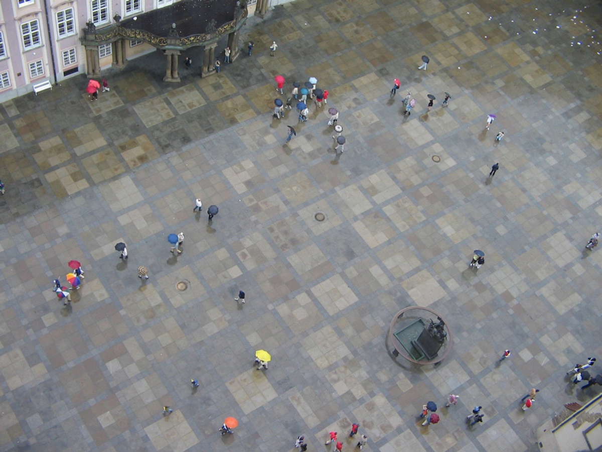
Dots or people—what do you want your readers to think? (Ryan Norton via Flickr.)
One of my favorite movies is the classic 1949 thriller “The Third Man.” The story is about a writer who arrives in gloomy post-war Vienna on the promise of a job only to instead unravel a criminal conspiracy to peddle diluted—and thus ineffective—antibiotics. In a pivotal scene during a clandestine meeting on the top of a Ferris wheel, the hero confronts a duplicitous friend about his lack of conscience and angrily asks if he has ever seen one of the victims of the tainted medicine he sells. Mr. Duplicity offers this cynical reply while looking down on the amusement park below:
You know, I never feel comfortable on these sort of things. Victims? Don’t be melodramatic. Look down there. Tell me. Would you really feel any pity if one of those dots stopped moving forever? If I offered you twenty thousand pounds for every dot that stopped, would you really, old man, tell me to keep my money, or would you calculate how many dots you could afford to spare?
From a distance, it’s easy to forget the dots are people. That’s the dark lesson of the movie and also of course the war that wrecked all of Europe. But what does this have to do with journalism? After all, unlike the villain in this film, we are not amoral monsters. I’ll answer that by telling a story of my own. When the New York Times reported the Wikileaks war logs, it seemed like we finally had a chance to better map and quantify the massive sectarian cleansing that swept across Baghdad in the wake of US occupation. Times reporters had been witnesses to the violence raging around them, but the only quantitative analysis available was done by a few international aid organizations trying their best to put numbers to the scale of the slaughter. The war logs included every report that individual units filed on civilian deaths, with locations and the number of the dead. The data was far from perfect–there were many duplicates and omissions and obviously we had no information about the methodology by which these cases were reported–but it could at least provide a rough overview of the neighborhoods most affected by the violence and the trends of accelerating violence from year to year. Below is the final version of the graphic we produced, representing both the deaths recorded on a single day and the trends from year to year.

A section of the New York Times interactive “A Deadly Day in Baghdad”
Ultimately, I think the graphic produced by the Times did an excellent job of reminding readers about the human costs of the violence. By making the focus of the chart a single day of violence, we could cross-check the data and provide some context for where the worst violence occurred. It also served to anchor the swelling violence shown in the smaller annual charts below into a neighborhood context. In a similar vein, the Guardian produced their own visualization of the violence that humanized the data by profiling in detail the violence of a single day.
Before it was a final graphic though, it was a demo piece I hastily hacked into Google Earth using its KML format. I remember feeling pretty proud of myself at how cool even a crude rendering like this looked, and the detailed work I had done to pull out all the data within reports to see these dots surge and wane as I dragged the slider. Then I remembered that each of those data points was a life snuffed out, and I suddenly felt ashamed of my pride in my programming chops. As data journalists, we often prefer the “20,000 foot view,” placing points on a map or trends on a chart. And so we often grapple with the problems such a perspective creates for us and our readers—and from a distance, it’s easy to forget the dots are people. If I lose sight of that while I am making the map, how can I expect my readers to see it in the final product?
All of this has made me wonder what other approaches people have used to anchor their graphics in empathy. I investigated a few techniques that data journalists have used to connect readers with the dots. These aren’t just specific to tragedies like war and disaster, they’re important for any datasets we are using to report data about from people or that affects people (i.e., pretty much every dataset).
Near and Far
These graphics illustrate a common and successful technique for bringing the reader back down to earth by focusing on a smaller range of data. Scott Klein of ProPublica took inspiration from Sesame Street and declared that many of the best news applications contain both the near and the far. For instance, a look at school test scores should both show system-wide trends and let readers look at how their local schools are doing. Or, in the case of Baghdad’s dead, we focused on a single day to show the near of what years of violence looked like day after day.
Unfortunately, many data journalism examples focus exclusively on the far distance and leave out the near view. Usually, we cede the foreground to traditional narrative treatments crafted by “traditional” journalists. I’m tempted to blame this on false newsroom dichotomies treating stories and interactives as unrelated forms of content. But too often, it’s likely that our own laziness is at fault. As tools have improved, it has become phenomenally easy to put a bunch of dots on a map or in a chart, yet the legwork of understanding the “near” of that data remains just as time-consuming. Under deadline time pressure, it’s easier to just plot the map and call it a day. But we lose something in the process.
To illustrate what I mean, here is a similar chart posted to a clickbait Twitter account called @BrilliantMaps of all the car bombings in Baghdad since 2003. It wasn’t originally clear who made this map–lack of attribution is common for these kind of accounts–but the contrast between this map and the Times and Guardian interactives mentioned above is glaring. The problem is that this map is not only wrong, it’s also terrible. Gawker figured out the origins of this map and discovered that it was actually derived from Guardian data of all fatalities in Baghdad from 2003 to 2009, including accidents, so it exaggerated the data. Brilliant Maps later issued a correction, but still got it wrong. I’m beginning to think clickbait twitter accounts aren’t entirely reliable.
Wrong as it is, the map doesn’t fail to startle; the replies and retweets are filled with tweets shocked at the overall picture of violence. The problem is that once you get past the original shock of the image, there is nothing else to learn. Are the clusters random or significant to the underlying geography of Baghdad’s neighborhoods? Did the violence surge and wane or has it maintained a constant level of carnage from one year to the next? Neither of these questions are hard to explore, and the lack of such context means the reader can only gasp in doge-like awe (“Wow! Such dots. Very violence.”) and walk away with the general impression that Baghdad is a horribly dangerous place, a conclusion that is definitely nowhere near as true today as it was during the heights of bloodshed in 2006. It’s not a brilliant map. When the map is barely distinguishable from a Clickhole parody that’s a clear sign it’s actually a terrible map. What would make it better? Finding the near is one approach. What are some others?
Putting People First
One possibility is that if your data is about people, make it extremely clear who they are or were. Here is a crude example of that approach from the New York Times in an interactive reporting military deaths in Afghanistan and Iraq called Faces of the Dead. The pixels of the chart default to being a canvas for showing the picture of the fallen service-member as a way of emphasizing the human cost of war in a more forceful way than the chart view of this data does. This is effective, yet it feels a bit clumsy, possibly because we can only see one face in the crowd at a time.
In such circumstances, it often makes more sense to abandon the chart entirely and just report the details of each person that matters. Please read the excellent Source article What If the Data Visualization is Actually People? for one such example where it was better to report on the people than the data in the story. The best example of this approach is the site Homicide Watch, which tracks every homicide in Washington, DC. This is a dataset for which it’s very easy to lead off with a big map, which is why it’s notable that Homicide Watch chooses not to. Instead, their homepage is filled with pictures of the latest homicide victims, because remembering every victim means not first presenting each one as another dot on a map.
Wee People and When to Use Them
Often, it is enough to just suggest the human form as a reminder. Take this lovely sports graphic from the Guardian on the heights of college basketball players. Instead of showing all the photos of players, it’s more effective with the scaled silhouettes depicted instead. A quick scan of the 6‘0 tall players on several teams confirms these are not the actual shadows of the players named–that information would be difficult to get and not really add much to the graphic. Of course, this chart could be implemented using standard bar chart boxes instead, but the use of little figures adds something quirky and human to the data presentation.

A section of the Guardian’s interactive “March Madness: do the tallest teams always win the NCAA championship?”
In another example, this Washington Post graphic on the racial demographics of death penalty punishments and the victims of their crimes uses a lot of little people to show the growth and ebb of capital punishment in the US since it was legalized again in 1976. Given the high-profile nature of these cases, it would not be difficult for the newspaper to get more information on each case, but the point of this graphic is just to illustrate the sheer number of executions that have happened in each state and the ways in which they have been skewed towards particular races, states, and genders. Any additional detail beyond that would obscure the forest for the trees. And yet, I find it a little too frustrating when I want to compare two years against each other. Even when the rows don’t wrap around to a second line, the staggered nature of the wee people shapes makes it harder than a vertical bar chart to compare rows against each other.

Section of the Washington Post interactive “An Eye for an Eye?”
Is there a point where using wee people in your graphics is overkill? Well, yes but what’s a good rule for when to revert to using more traditional means of representing people in graphics? I would argue that once you get above a certain threshold of data points, or you want to make it easier to visually compare two amounts over time, it makes more sense to use dots or blocks. For instance, this Washington Post interactive that compares the infectiousness of Ebola to other diseases works well because it’s easy to compare the simulated outcomes of each disease with each other. In another example, the moving timeline at the top of the Guantanamo Docket works better for comparing totals between countries because it uses blocks instead of people (notice you can hover over any block to see who that person is). Furthermore, I would argue that it is not effective to use wee people in any circumstance where a single depicted person does not equal a single actual person. For instance, here is a chart from the New York Times where each figure on the chart represents a million people; at that point it makes more sense to just use abstract blocks. Or a combined format like this later piece
And of course, sometimes it’s necessary to remove the dots entirely when they interfere the story you need to tell. Here, a more recent NYT graphic of the sectarian purging in Baghdad does not overlay violent incidents because the dots would obscure the sorting effects of the violence. The supporting text makes it clear though that these changes did not happen without coercion and violence.
Empathic Design
These anecdotal examples illustrate a few of the varying means in which interactives can evoke empathy in their readers. But I’m curious if anybody has attempted to systematically explore when certain approaches make sense and when they are a distraction. Google suggests no one has, but of course this is not a very SEO-friendly concept. Still, we have guides to inform us when to use a bar chart vs. a scatter plot vs. a pie chart. Would a similar guided approach work for interactives we feel are too emotionless? Is there a collection of graphics design patterns for empathy we can draw from or is this something we can assemble on our own?
Ultimately though, the main question is this: should we even try with our graphics to make readers care? The Devil’s Advocate would argue that it’s not the responsibility of our interactives to make people feel something about a topic—that is usually handled by a narrative piece paired with them—but I feel that in these days where charts may be tweeted, reblogged, and aggregated out of context, you must assume your graphic will stand alone. Neither of these arguments consider what the reader actually expects. What does the reader expect to feel from journalism and how can we learn from their experiences?
Credits
-
Jacob Harris
Jacob Harris is a Senior Software Architect who works with a kickass team of fellow newsroom developers at the New York Times.


