Learning:
Interactive Data Journalism: A One-Semester Syllabus
A tested framework for teaching, and a practical guide for learning

Imagery from a WPA poster advertising free adult education classes. (Library of Congress)
Data journalism draws on a remarkable array of skills—everything from statistics to graphic design to FOIA requests. It seems impossible to fit everything that aspiring data journalists might need into one semester. And it is. But so many people have asked for it that I tried teaching this course anyway.
This is a cleaned-up version of a course framework that I used at the CUNY Graduate School of Journalism in the fall of 2015. The structure is based on a previous CUNY syllabus by Russell Chun (now at Hofstra University), while the materials are adapted from a week-long immersive data journalism workshop I co-created with Yolanda Ma, to train Chinese journalists.
This syllabus is written for instructors teaching a course and the students taking it. But there are enough resources here that someone working on their own can learn valuable skills by following the materials and exercises—especially if they know an expert or two to ask when you get stuck. Here, you’ll find complete class plans and links to all materials—assignments, slide decks, sample data, and source code. The readings are mostly from open sources but include some textbook chapters. Russell, Yolanda, and I are placing all of the material we’ve authored in the public domain.
Data journalism is changing rapidly, so please adapt and remix as necessary!
About This Syllabus
Over 14 sessions, students in this course go from having no previous data or coding experience to creating interactive visualizations in D3. Although we get heavily into coding, the orientation of this course is eminently practical. The goal is to get students comfortable adapting HTML/JavaScript sample code and inserting their own data to illustrate their stories. Students will be expected to do a great deal of learning how to learn. They’ll need to get comfortable with everyday ways of answering technical questions, including asking other people, Googling error messages, and searching Stack Overflow.
Each class begins with something I call the “Festival of Data”: One student, according to a previously determined schedule, selects a data journalism story and presents it to the class along with a critique. We also critique all student-created stories during class time, so that we learn from each others’ experience and judgement.
How the Course Works, for Students:
This course includes a few lectures to get important theory across, but most of the class time is spent coding, and most of the homework time is spent reporting. The homework is three complete data journalism stories, culminating in a mobile-first interactive.
During in-person class hours, we do technical exercises, first with Excel and then HTML/CSS/JavaScript. We cover finding data, cleaning it, anaylizing it in Excel, visualization, mapping, interactivity, and scraping.
About the Role of the Instructor:
The instructor needs to be comfortable playing the role of editor for students’ reporting work and playing technical advisor for coding work. The value of learning to code in class (rather than homework exercises, online training, or a MOOC) is that the instructor can act as a personalized coach and expert problem solver. The instructor should also make themselves available for weekly office hours, where students can get help debugging their code before it’s due.
A Few Terms:
An in-class assignment is done (as you might guess) during class, with the instructor circulating to help students with problems. An instructor demo means the instructor goes through all necessary steps on their own computer while talking through the logic of the process. For a code along exercise, the instructor puts a sequence of source files on screen, proceeding to the next step only when all students have typed in the changes and gotten them working. All homework is due the week after it is assigned, and each homework counts equally towards the final grade.
Materials and Tech:
Students need individual laptops with Microsoft Excel installed. Throughout the course we also install free software packages such as Open Refine and a text editor.
Student stories are initially published to a WordPress blog. Account permissions must be set to allow embedded HTML and JavaScript so that students can use tools that generate embed codes. Later in the course, instructors need a web server that students can publish their work to, via FTP.
Readings:
- Cairo, The Functional Art, pages 25–31, 36–44, 118–129
- Illinsky and Steele, Designing Data Visualizations, chapter 4
- Stray, The Curious Journalist’s Guide to Data chapter on causal models.
Class 1: Finding Data
We begin the course by asking: What’s data journalism? These slides illustrate the different types of data-driven stories, everything from simple text reports to interactive visualizations to sophisticated news apps backed by a big database.
Today we cover the basics of finding data: classic open sources (including government, commercial and academic data sets); techniques for finding data, including Google advanced search and archive.org; and tools to extract tables from PDFs.
We also talk about the reporting process and review how homework works. Then we schedule students to present stories in the Festival of Data for the next 13 weeks.
Homework:
Find a data set that interests you. Be prepared at the next class to tell us where the data can be found (the URL), who maintains it, and in one-two sentences, explain why the data is interesting. Email the URL for the data to the instructor.
Reading Cairo, The Functional Art, pages 25–31, 36–44, on thinking through a visualization as a tool for the reader; what graphical form best serves the goal?
Class 2: Finding the Story

Slide from this class session.
The class opens with the first Festival of Data presentation (and so does each class after this one.)
Next, homework review. The instructor will put each student’s data set on screen while the student briefly (in one minute) explains what it is and why it’s interesting. As a class, we’ll ask questions to try to draw out the challenges in finding useful data, and we’ll consider other places a journalist could find data on each topic. This is also the beginning of our discussion on data cleaning, as we will discover lots of data problems.
In-class assignment: We’ll dive right into the basics of Excel with an exercise for complete beginners. This is a list of every passenger on the doomed Titanic, their gender and passenger class, and whether or not they survived. Download this file, open it in Excel, then work in a group (of at most three students) to answer the question: which gender and class had the highest survival percentage? Groups may solve the problem using any Excel features they like, but your instructor will not explain how to do this. The point is to learn how to learn to solve a technical problem. You can ask your fellow students, look online, or contact someone who knows—any source of information except the instructor.
This exercise should take less than an hour. During this time, your instructor should walk between groups to discuss their problem solving strategies. The instructor will give advice on where to look for solutions, but not the solutions themselves. Then one or two groups will come up and present their solutions.
Instructor demo: The basic Excel features that can be used to solve this problem, which are also the basic functions of a spreadsheet: sorting, filtering, and pivot tables. This demo also covers data types, formatting (especially percentages), and very basic formulas—just enough to calculate a percentage using something like =A5/B5
The class will finish with a lecture on data interpretation—the art of asking what your data means. These slides introduce the concept of “interviewing the data.”
Homework:
Class 3: Cleaning Data
First, we’ll ask: What is a “rate” and how does that turn into an Excel formula? Why can’t you simply average the rates for different groups to get an average rate?
Instructor demo: The connection between algebra and Excel formulas. Cell references are the same thing as variables, meaning that you can use all the tricks of algebra to figure out what your formula should be. Your instructor will use algebra to prove that you can’t average rates together for groups of different sizes, and to go backward from percentage change to the previous year’s quantity: from percent = (new-old)/old to old = new/(1+percent). Algebra is the solution to wondering if you’ve got the right formula.
Data is never error-free, or in the right format, as these slides illustrate. We’ll see examples of common data problems and learn how to think about histograms.
Instructor demo: How to clean data with Excel. Your instructor will show you how to find extreme values using sorting, blank cells using filtering, and garbage entries using pivot tables. You’ll also see the “convert to columns” command, and how to use the LEFT, MID, and RIGHT formulas to break text apart.
Then we’ll watch a short video on a powerful tool called Open Refine.
In-class assignment: Do this Open Refine exercise on this data. Your instructor will help you get Open Refine installed.
Homework:
Class 4: Visualization
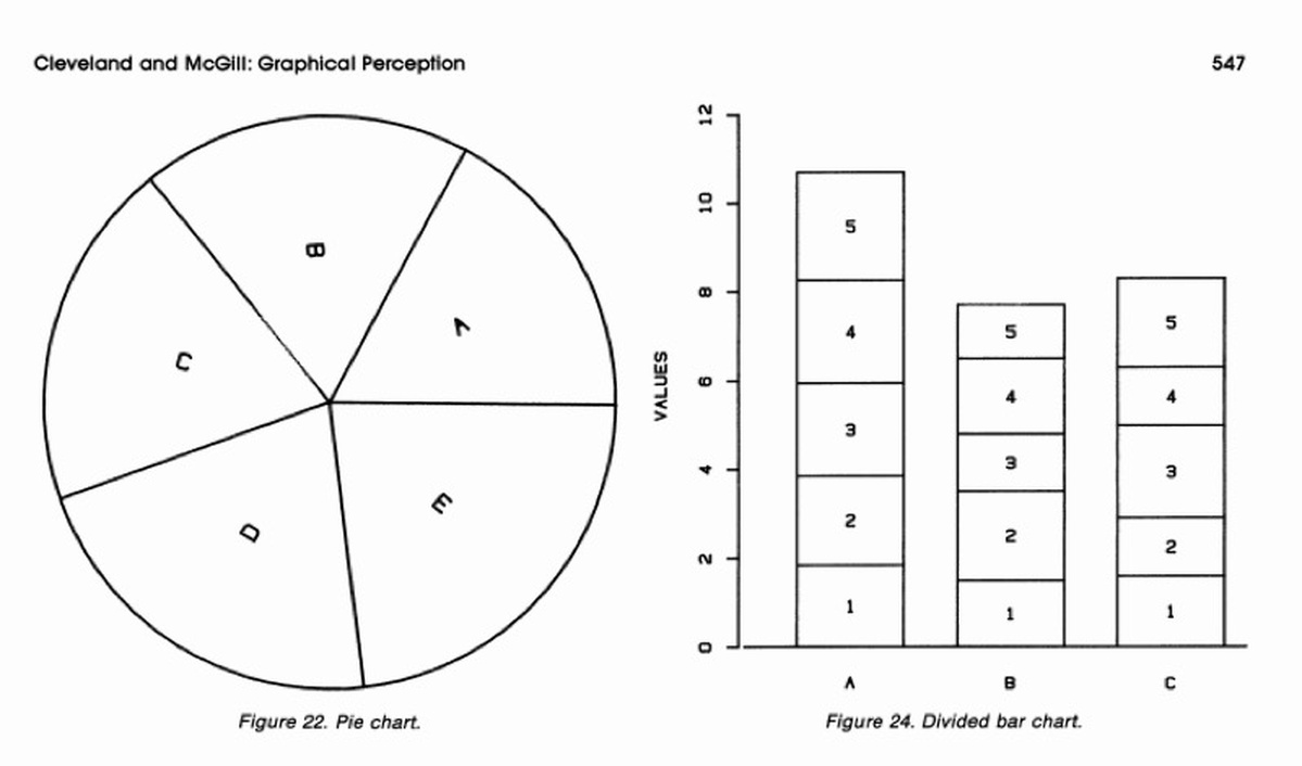
From the classic work of Cleveland and McGill.
First, we’ll discuss the homework: What answers did you get? How did you get them?
These slides introduce basic data visualization design principles. Visualization depends on human visual perception, and we know a lot about how the eye processes visual information in different “channels.” Today we review the classic experiments of Cleveland and McGill and their recommendations.
Then we’ll watch the GapMinder video of global health and wealth, and the associated interactive visualization. Discussion questions might include: how many different visual channels does GapMinder use to present data? Why did they choose those channels for these variables?
Then we’ll discuss the basic chart types and graphic design foundations: visual hierarchy, white space, colors and fonts. But data visualization isn’t just about plotting data: you need a clear narrative to explain why the data is interesting and where the reader should look. This is why annotation is so useful, as in this visualization of climate change models.
Finally, we’ll look at some different tools for creating visualizations:
Many of these will produce an “embed code,” a piece of HTML that your instructor will demonstrate how to include in a WordPress post.
In-class assignment: Download some data, make a visualization. Then publish it to the class blog using an embed code.
We’ll end this class by creating your story groups. You’ll work in groups, three people maximum, for much of the rest of the class. Form your teams today.
Homework:
First data story pitch. This story will be done in your groups. The pitch must include a link to the data you will use, and a “nut graf” that explains what is going on and why we should care. You must also include the name of one source you have already spoken with, or three sources you plan to speak with. These sources should be experts who can explain or contextualize your data. You must publish your pitch on the class WordPress blog.
Reading:
- Cairo, The Functional Art, pages 118–129, on Cleveland & McGill’s perceptual accuracy.
- Steele and Illiinsky, Designing Data Visualizations, Chapter 4: Choose Appropriate Visual Encodings.
Class 5: Mapping
This week’s slides demo the basic uses of maps and introduce the idea of geocoding. People have been putting data on maps for quite a long time, for example John Snow’s famous map of cholera cases in London. Today it’s easier than ever to work with geographic data, but just because you have spatial data doesn’t mean you should use a map.
For this course we’ll use CartoDB to make our maps.
Instructor demo: Geocoding with CartoDB, using New York daycare permits data. The completed map should look like this.
In-class assignment: Register for a CartoDB account and make a map that plots one of the indices from the UN’s Human Development Index, including cleaning the data in Excel (it comes with extra header garbage), uploading to CartoDB, making a chloropleth, and customizing the infowindow to display the data you have mapped when you click on a country.
Instructor demo: Load the shapefiles for a particular state’s census blocks into CartoDB and merge them with census data to create a map of household income, following these instructions.
In-class assignment: Download some data with city names or addresses, load it into CartoDB, geocode it, and make a map. Then publish the map, generate an embed code, and put it in a WordPress post.
Homework:
First story draft. This must be a complete story that your instructor and classmates will be able to evaluate without your explanation. You should have completed all reporting, all data cleaning, and all visualizations. Don’t forget details such as legends, source links and photo credits, as well as a good headline. You must talk to at least one human source who can explain or contextualize the data. You don’t have to quote them in the story, but you do have to be able to tell the class what you learned from talking to the source. Post the draft on the class blog.
Reading: Cairo: The Functional Art, Reading part 3: pages 73–86, on presentation
Class 6: Visualization Ethics, Intro to Coding
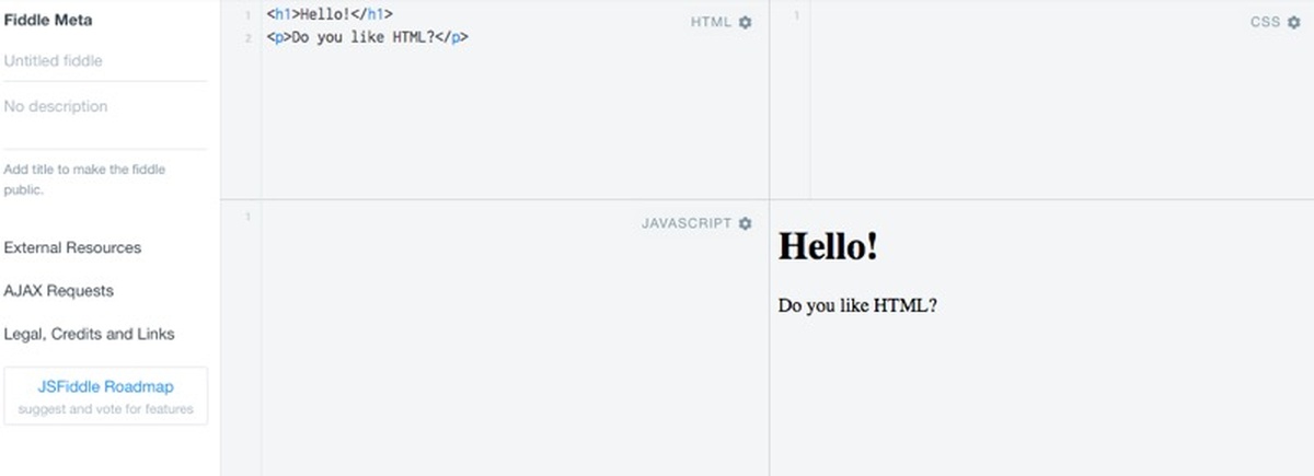
Experimenting with JSFiddle.
First we’ll critique your story drafts. The whole class will take a few minutes to read each story, then we’ll discuss what we like about it and where it could be improved. We must be able to see that you understand the data (i.e., you’ve asked the “interview the data” questions and talked to appropriate experts) and we must understand the story itself (i.e., your writing and visualizations are clear and compelling.)
Not all visualizations are created equal, as we’ll see in The most misleading charts of 2015, fixed. Data choice, scales, and context can all change the meaning of data, and there are ethical issues here. Sites like Junk Charts keep collections of bad graphs.
Together we discuss questions such as: How do we avoid misleading data visualizations? Is there such a thing as an “objective” data visualization? Where do you stand on the “y-axis should always start at zero” rule? Not everyone agrees on this.
Now you’ve got the basic theory of data journalism. The rest of our class time will be spent on learning to code the languages of the web: HTML, CSS, and JavaScript. We’ll use JSFiddle as our interactive environment to learn how these three languages relate, and experiment with the basics.
In-class assignment: Follow these instructions to create your very first interactive page out of HTML, CSS, and JavaScript.
JSFiddle is great for working out an idea, but real web development involves creating source code files with a text editor and uploading them to a web server.
Instructor demo: What’s really in a Microsoft Word file. Your instructor will paste some code into a blank Word document, save it, and open the file in a text editor. Web browsers don’t want all this extra stuff, plus Word doesn’t give us syntax highlighting.
Instructor demo: How to combine HTML, CSS, and JavaScript into a single HTML file using <style> and <script> tags. And how to FTP this file to the class server using an FTP application such as CyberDuck or FileZilla.
In-class assignment: Install a text editor on your computer, such as Notepad++ for Windows or TextWrangler for Mac. Then work in your story groups to rewrite your story draft as an HTML file. You should be able to include your embedded visualizations just by pasting the embed codes into your source file. You should end up with a single .html file that you can view in your browser. Then upload this file to the class server. You will end up with a URL that you can type into any browser on the web to view your story! It probably won’t be as pretty as the WordPress version—we’ll work on that in the next class.
Homework:
Final draft of your first story, with improvements suggested by the class and your instructor.
Class 7: Causation, Javascript Charting

Slide from this class session.
Very often, data journalists want to write stories about the causes of things: this pollution is causing cancer, these taxes are causing unemployment. But “cause” usually cannot be read from the data. This week’s slides illustrate why, and they offer some hints on correct causal inference.
In-class assignment: After the lecture, each story group will be assigned one of the charts at the end of the slides. Your group will work for 10 minutes to list every possible way that the variables could be causally related—every story that could be true—including possible confounders. Then each group will present their list to the class, argue for what they think is the correct explanation, and tell us what other reporting would be required to make sure.
After that, we’ll continue coding. We’ll learn how to create a visualization right on the page using JavaScript, rather than including visualizations through images or embed codes. This is the key to interactivity.
Instructor demo: Now that we’re writing more advanced web pages, we need more advanced debugging tools. The JavaScript console lets us view error messages when our page doesn’t load, and write out debugging messages using console.log(). The Web Inspector links the page to its source code. It displays the DOM, the “document object model,” which is the logical structure of our HTML page defined by our nested tags. You can use the Inspector to figure out how any web page is put together. And of course you can always view the entire underlying HTML using “View Source.”
In-class assignment: Recreate one of your story’s visualizations using Google Charts. Start by cutting and pasting example code, then modify it to put in your own data. You will need to deal with the <script> tags and make sure everything goes in the right place when integrating the example pages into your story page. You might also want to experiment with Highcharts, which is popular among news developers and works similarly.
In-class assignment: Pick any online data journalism story with an interactive visualization. Use the web inspector to figure out how they made the visualization. Did they use a JavaScript library? Which one?
Homework:
Second data story pitch. This story will be done individually, not while working in groups. Post a pitch for the story on the class blog, including a link to your data and a source list, just like last time.
Reading: Stray, The Curious Journalist’s Guide to Data chapter on causal models.
Class 8: Interactive Web Pages
This class is a guided introduction to the basics of CSS, jQuery, and interactive visualization. CSS, the awkwardly named “Cascading Style Sheets,” is the language used to set colors, fonts, and layout on a web page. jQuery is a set of pre-defined JavaScript functions, which programmers call a “library,” for doing basic manipulation of the elements of a web page. You’ll use jQuery and JavaScript to build a simple interactive chart.
Code along: You will follow this sequence of files to build up to a page with borders, formatting, and images. This is our first code-along exercise, where your instructor will put up a series of files on the screen, explain what’s happening in each step, and you will type in the new code. Note: students should only download the first file. It’s important to type in the code for each step yourself, because you’ll make mistakes and learn how to debug them.
In-class assignment: Format the HTML you wrote for your story last class. Give it margins and center the charts.
Code along: Interactivity with jQuery in these steps. Now that we can style elements by hand, we’ll learn how to change the styling interactively, when the user presses a button, using small amounts of JavaScript code and the jQuery library.
Code along: An interactive Google Chart in these steps. As usual, you should start with the first file, and your instructor will talk you through each step.
Homework:
Second data story draft. Your story must be complete including all interviews and visualizations. This time, your story must be written in HTML and uploaded to the class server. Again, this story will be done individually.
Class 9: JavaScript 101
Time for story critiques again. The whole class will take a few minutes to read each story, then we’ll briefly (in two minutes) discuss what was involved in getting the story to this point, what we like about it so far, and where it could be improved.
So far you’ve been cutting and pasting JavaScript without really understanding it. In this session, you’ll learn the basics: variables, arrays, functions, conditionals, and loops.
In-class assignment: CodeAcademy Javascript Getting Started with Programming, just the first unit (lessons 1–28).
Instructor demo: JavaScript types, array and object notation, following this tutorial. How to declare and access arrays of objects. Using a “for” loop and console.log() to print the fields of each object in the array.
In-class assignment: Use Mr. Data Converter to convert the data from one of your stories into JSON, and then paste it into an HTML page. Assign the data to an array variable and use a “for” loop to print each field of each row to your browser’s JavaScript console.
Homework:
Final second stories, with changes suggested during critique by your fellow students and your instructor.
Class 10: Creating Visualizations in D3
The D3 gallery.
This class is an introduction to D3, a powerful library which originated at the New York Times, which can be used to create many types of interactive visualizations.
Instructor demo: You can make a D3 visualization by hand-coding each element like this. But this requires a line of code for each bar or point or circle. It’s much better to put the data in a separate block so we can edit it easily or paste it in from elsewhere. Your instructor will build up to a working example visualization following these tutorials (1,2, and 3.)
Also, D3 can read the data from a separate CSV file.
Instructor demo: Absolute and relative URL paths. A modern web page will include many different files, such as JavaScript, CSS, and data files. To tie these all together, you can use relative URLs that tell the browser how to find each file starting from the URL of the main page.
In-class assignment: Working in your story groups, pick a visualization from the D3 gallery. Or perhaps try this simple scatterplot. Download the files and get the example running on your computer. If the example contains multiple files, you will need to make sure that where you put the files on your computer matches up with the relative URLs that link everything together (if you have trouble, either move the files or edit the URLs.) When everything is working, replace the sample data with some of your own. (You may need Mr. Data Converter again.)
Homework:
Third story pitches. Your pitch must include your data, a human source list, and sketches for what the story will look like. (You can use any sketching or mockup tool you like, including paper + camera phone.) This last story will once again be done in your story groups. It must be uploaded as HTML to the server, it must contain some element of useful interactivity, and it must work well on mobile.
Class 11: Interactive Libraries

The simplest and fastest way to add interactivity to your stories is to use an interactive library that someone else has already built. To do this, you’ll need skills like downloading JavaScript source code, modifying examples, and reading the documentation.
Instructor demo: Creating an interactive timeline using Timeline.js.
In-class assignment: Put an interactive element in the HTML for one of your stories. You can create a timeline using Timeline.js or put interactive tables into your story using a variety of table libraries. Actually, any interactive JavaScript library is fair game for this assignment. If you want to put a 360-degree panorama viewer in your story, go for it.
Homework:
Third story first drafts. As usual, the story must be complete, including all visualizations and reporting. It does not need to be interactive or work on mobile yet.
Class 12: Mobile and Interactive

Slide from this class session.
Final story draft critiques. As usual, the class will read each story and then briefly discuss.
Next, we’ll go through a few slides on mobile design. Your final story must work on mobile, and to do this you will need to think about issues such as layout, font size, and overall design.
Code along: How to use CSS media queries to build responsive web pages.
Code along: Interactivity using JavaScript, CSS, and D3. These steps build up to a scatterplot where you can fade between data sets at the press of a button.
In-class assignment: Put the firearms data into your scatterplot and use the button to switch between OECD and non-OECD countries. Add country labels to the dots by using this code as a reference. If you want to change the axis as well, try this.
Homework:
Third story, second draft. Your story must include all interactive pieces and work on mobile, too.
Class 13: Story Workshop
During this class, your instructor will be available to help you with the reporting, writing, design, and coding of your final stories.
Homework:
Final versions of your stories.
Class 14: Scraping
For this last class, we’ll start with scraping, and we’ll save the good stuff (your final stories) for the end of the class.
Sometimes the data you want is online, but you can’t download it. In many cases you can “scrape” a series of pages, or a database behind a search box, by writing a small program that reads the HTML of the page and extracts pieces of it. Helpfully, there are also a number of simpler scraping tools. In this class, you’ll scrape using functions built into Google Sheets.
Instructor demo: The tabs of this workbook show how to scrape with Google sheets using ImportHTML and ImportXML, and xpath to get specific items on the page. Further references.
In-class assignment: Use ImportXML to scrape a page of apartment rental listings. Be aware that if everyone tries to scrape the same site, your whole classroom might get shout-out for a while due to too-frequent accesses from the same source.
Finally, we’ll look at your last stories. We’ll look at them on mobile as well.
Welcome to a Learning & Teaching Community
Congratulations, you’ve got data skills. Look what you made!
Humans have been working with data for thousands of years and today it appears in every corner of society. Finding data, analyzing it, making visualizations, coding interactives—there’s a lot to learn. And working with data goes far beyond journalism. This course is just the tip of the iceberg.
But you don’t have to be a master to do good work. Instead, what you need is the willingness to learn. Use the web, study other people’s work, build on open-source examples. Most importantly, work with your colleagues—both inside and outside the newsroom, both in-person and online. You’ll never be an expert on everything, but you’re surrounded by experts. The people who truly love their subject will delight in sharing.
Sooner than you think, you’ll get the chance to pay it forward. Data journalism doesn’t live in a stack of textbooks or even on GitHub. It’s a living, breathing community, and you’re now a part of it.
People
Credits
-
 Jonathan Stray
Co-founder & Advisor of Workbench. Jonathan is currently working as a research scholar at Columbia Journalism School. He has written for the New York Times, Associated Press, Foreign Policy, ProPublica, and Wired.


