Learning:
Well Hello, Census
Joe Germuska on the iterative, human-centered process that’s made the new Census Reporter project especially awesome
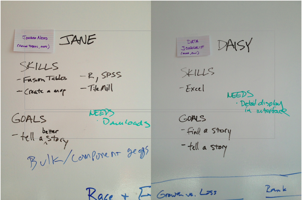
User personas from the Census Reporter development process
While open government data has recently become trendy, the U.S. Census Bureau has been releasing troves of data for years. They release an overwhelming amount of raw data, and also provide access to ten data products through the American Fact Finder website, including the decennial census, the American Community Survey, as well as information about housing, economics, and local governments. All the data they release is pure gold for journalists. But it’s really hard to mine.
We’re building Census Reporter to mitigate that—to make Census data easy for journalists. To be honest, as we constructed our project plan, I’ve developed a lot of sympathy for the Census Bureau. We chose to work with a single data product, the American Community Survey (ACS), which alone has almost 1,500 data tables. Each year the data is released in three overlapping sets, and the largest set has data for almost 750,000 places. We have our hands full figuring out how to make that usable, and it’s only one of ten data sets that the Bureau offers in American Fact Finder.
With Census Reporter, we have the freedom to make editorial judgments to highlight some data and leave some out entirely. We’re applying the same principles that we’ve used to build news applications for a general public: we prefer clarity over completeness. For example, the ACS tabulates data for 86 summary levels, but many of those sort out arcane details such as how many people live in each part of a census tract which is divided by a city boundary. We’ll only include whole summary levels, and even some of those may be hidden from more casual users. For the summary levels we do support, all of the ACS data tables will be reachable, but we will create pages which highlight the facts most commonly sought.
The best way to make census data easy for journalists is to ask them what’s difficult about it. We have an amazing community liaison, Sara Schnadt, who has done a series of interviews and surveys with journalists to understand what’s most important to them about accessing census data. From the information she collected, Sara created a series of personas representing different types of journalists. For each feature we add to the site, we consider how it helps one or more of them solve a real problem they might have in using census data.
We’ve also been developing in the open, releasing updates to our website on nearly a daily basis. We’ve already gotten valuable feedback from early users, such as the fact that in New England, New York, and Wisconsin, the “county subdivision” summary level (060) is a more effective way to analyze “towns” than the “place” summary level (160). (Thanks, Katie!)
Our official launch was scheduled for the ONA conference that begins today, but when the government shut down and the official Census Bureau data became unreachable, Census Reporter was pressed into full service a couple of weeks early. In any case, now it’s freshly updated with the first component of the 2012 ACS data and it’s ready for all journalists to use it for real research and reporting. We’re excited for you to see it, and to tell us what you think!
What’s in There
As I mentioned earlier, the Census Bureau provides data through a number of programs and Census Reporter is focused on the American Community Survey. It’s an ongoing survey with annual data releases that provide data about not only the age, sex, and household structure of people living in the U.S. but also information about their education, employment, income, and more. We chose to focus on the American Community Survey (ACS) because it provides the best combination of recent and local data. We think that what we’re building could be pretty readily extended to include data from the decennial census, the Current Population Survey, and maybe more. Focusing on the ACS enables us to streamline the site, so journalists can get answers to their questions and get on with their work.
Census Reporter is organized around two main approaches to finding information: data profiles, which present the key facts about a single place; and a comparison tool which makes it easy to compare data about a group of places, or as our board member John Keefe put it, to find the “places of a fact.”
Profiles: the Facts of a Place

Screenshot of the top of a Census Reporter profile page for Chicago
For any place about which the ACS has data, Census Reporter has a page showing the most frequently sought figures. More importantly, each datapoint will be presented with context: values for the entire U.S. and for the county and state containing the place. Most values will be shown first as a percentage of the population instead of an absolute value. Whenever it improves clarity, we’ll use charts to illustrate the relationships between statistics.

Screenshot of the transportation to work chart from the Chicago profile page
In addition to knowing how data for a place compares to other places, journalists often want to get a handle on the story of how that data has changed over time. Because the ACS is a relatively new program, there are a number of wrinkles to comparing ACS data over time. The one-year datasets can be compared readily, and there are now six years worth of them. However, that data only includes places with more than 65,000 population. This means that for something like a comparison of data for U.S. counties over time, only about 25% of counties have any data. (Those counties represent more than 83% of the U.S. population, but the ones that are missing make for big holes when you make a map.) Data from multi-year ACS releases should only be compared between non-overlapping data sets, so for places with 20,000-65,000 population, we only have a single historic data point we can compare, and for places with less than 20,000 population, which are only represented in the 5-year releases, there are not yet two non-overlapping releases. To make things more complicated, the census geographies changed in 2010, so sometimes it’s not exactly an “apples-to-apples” comparison even if the data is for the same “place.” In short, comparison over time is pretty challenging, so we’ve deferred work on it until after this current milestone release.
We are still wrestling with exactly which data to include on the profile page. We got some input on this from journalists, but we felt that we really needed to create a first draft to get effective feedback. That’s where we are now, so please start trying to use Census Reporter to answer basic facts and win bar bets.
If enough people come looking for missing data points, it will be a sign of how we should adjust for our next iteration. We will probably follow the Census Bureau’s lead and add topical profile pages which go deeper into an area like economic or family statistics, but chose to defer that. We don’t want to overload any one page, but we want people to find what they need without too much hunting. Actually adding new statistics won’t be that hard, but finding the ideal balance between clarity and completeness will be a fun puzzle. Please let us know what you’d like to see.
For now, we have a simple name-search tool to find a profile page for a place. We’ve given it a little bit of smarts, but we know that this is going to be the starting point for just about everything, so we want to know how it works—or more importantly, how it doesn’t work—for your needs.
Comparisons: the Places of a Fact
In addition to profiles, Census Reporter offers a powerful yet easy-to-use tool for comparing ACS data for a number of places at once. Our top design goal is to make it as easy as possible to go from a reporter framing a question in her head to finding the data that can best answer that question.
The comparison tool begins with the selection of a table. With 1,476 tables to choose from, it can be pretty daunting, so we offer a menu of five broad categories containing 31 topics which you can use to filter the list. As you type in the search field, tables matching the text you type show up, limited by your filter choices. Right now, this still requires more familiarity with the way the Census Bureau describes tables than we’d like. We’ll be observing and talking to our users to learn more about how we can make this even easier.
Next, Census Reporter asks you to identify the places for which you want data. The tool is optimized to find all places of similar type (“summary level” in census parlance) within a larger place: for example, “all counties in Illinois,” or “all states in the U.S.” This is another area where we’ve exercised some editorial judgment: we’ve selected the most useful summary levels for journalists, leaving aside dozens of more esoteric choices that clutter universal tools like American Fact Finder. However, we also know that some summary levels are more relevant in some states than in others. If you think we’re missing an important one, let us know.
Once you’ve chosen your topic and your places, Census Reporter delivers a table with the appropriate values. By default for most data, the values are displayed as percentages instead of absolute numbers, to make visual comparison easier–but absolute numbers are just one click away. We’ve also built two visualizations that you can use to compare values for any single column of the table: a map view and a distribution chart. These visualizations work pretty well in general, but they can break down when the range of values is narrow or there are too many places in the data set. We will be looking for ways to fine-tune these, but we are not planning to make Census Reporter into a general purpose data visualization tool. Instead, it’s easy to download the data you’ve selected as a CSV which you can use however you like. (Chris Amico has already posted several data visualizations on his blog which he created with data downloaded from Census Reporter.)

An example of one of Chris’s visualizations
Help!
Even if we succeed at making it very easy to find data, there are many nuances to understanding the numbers. Census Reporter wants to help you know how to get things right. We expect to learn a lot about what areas need more explanation as we develop a more active community of users. We’ll have some overview text for each category that gives some idea of which kinds of data are available. We’ve already heard from some people that a glossary could be helpful. And we’re looking at the possibility of emulating Source and commissioning some veteran census reporters to explain how they approached stories and how you could adapt those methods to the places you cover.
(Until we get to creating our help resources, I highly recommend reading “What the Media Need to Know” (PDF) and perhaps watching some of the video presentations from the 2010 McCormick Foundation Census seminar.)
What’s Next
When the grant was originally announced, we imagined the project as a core application which is much like what you can see today, and a handful of “stretch goals” that we might tackle after getting to this point. But along the way, we’ve identified a number of less exotic but more clearly useful features that we’d like to work on ahead of those stretch goals. We also realize that we are going to learn a lot from user observation and feedback that will lead us back to make improvements to what’s already “done.”
The whole Census Reporter team will be on the Midway at ONA13 in Atlanta, October 17-19. If you’ll be there, please drop by the Knight Foundation table and let us observe you using the site. Our team will stay in Atlanta the day after the conference to set a road map for the rest of the grant. We’re about halfway through, so we will probably set two more release milestones, setting out pretty specific details for the next four months of work, parking some other things for our final iteration next Spring.
Here’s some of what we’ll be considering. Let us know what you think about these, or things we haven’t mentioned that you’d like us to consider.
National level data
Some of the interesting census tables, such as “Detailed Occupation by Median Earnings” (B24121) only provide data tabulated at the national level. And in other cases, you may just be interested in a single nationwide figure for the U.S. Our current model doesn’t have any good way to handle national level data. Also, the Census Bureau divides the states into four regions (Northeast, Midwest, South, and West) and nine divisions (subsets of the regions). We’ll be extending our comparison tool to support selecting geographies by region and division.
Lists
Lists can be lazy journalism, but sometimes there is an interesting story behind the “biggest this” or “smallest that.” Our comparison tool supports some kinds of lists, but for some things it seems heavier than it ought to be. It shouldn’t be too hard to organize the data into lists. However, a simple ranked list where the values aren’t evenly distributed can be misleading. Using percentile values might be the solution to this. If you find yourself looking for list/ranked data, let us know how you’re thinking about it.
Refinements to the Profile Pages
As mentioned above, we’ll tune the facts and charts we have on our profile page. We’ll almost certainly make topical subprofile pages. We will be exploring how to best handle comparison over time, with all of its vagaries. Our teammate Ryan Pitts has proposed a search for index statistics we could compute, inspired by sabermetrics analysis of baseball. We welcome suggestions for data crunching that might be tedious for individual reporters but which Census Reporter could do efficiently and make widely available.
A Data API
Census Reporter is already designed as a web front-end speaking to a JSON API. We aren’t planning on making a general purpose API, but we plan to document how developers can access the same sort of data which we use to present our profile and comparison pages.
Embeddable charts and maps
We’d like to make it easy for web producers to grab charts and maps which we display on Census Reporter for easy embedding on news sites. Again, we won’t make a general purpose wizard where you can tweak all of the presentation details. If that’s what you need, you can get the raw data from the API. Our GitHub repositories are all public, so you might be able to hack the embed code once we’ve made it.
Dare to Dream (but Know When to Say When)
What about those stretch goals?
- At least one of them seems clearly a high priority—as previously mentioned, we want people to be able to embed the charts on Census Reporter directly in their own pages.
- Another seems ambitious, but may still make the cut: a way for Census Reporter to provide custom tabulations for geographies that the Census Bureau doesn’t support, such as city neighborhoods. This is very appealing, but given that census estimates are less reliable with smaller geographies means that even if we could do it technically, it may not be something we want to encourage.
- I don’t know a lot about statistical analysis with R, but I find its data packaging model interesting. I suggested a stretch goal of packaging Census data, but I’ve since learned that people who do know more about R than I do are already on that project, for both the decennial census and the ACS.
- Finally, while my nerd-self really loves the idea of dynamically generated thematic map tiles that could be used in a Google Maps or Leaflet-type API, reality has set in. It would be hard for us to come up with many universally applicable approaches, and tools like TileMill are available so that journalists can tailor the thematic maps to their specific needs. Census Reporter will make it easy to get data which could be used as input to a project like that, while leaving visual journalists the freedom they make smart presentation choices.
Feedback, Please!
If we don’t see you at ONA, we still would love to hear from you. You can reach us many different ways: via email at irecensusreporter@gmail.com or @CensusReporter on Twitter. And probably by the time you read this, we’ll have a feedback form directly on the site. Let us know the questions you bring to Census Reporter, especially if you have trouble finding the answers. Tell us if you don’t even know how to frame the questions. As I wrote, the best way we can make census data easy for journalists is to listen to what journalists need.
Credits
-
 Joe Germuska
Joe Germuska is the Chief Nerd at Northwestern University’s Knight Lab, a community of designers, developers, students, and educators working on experiments designed to push journalism into new spaces. Before joining Knight Lab, Joe was one of the founding members of the Chicago Tribune News Apps team. In his free time… who are we kidding, Joe doesn’t have free time any more because he’s also enrolled in NU’s Masters in Product Design & Development program.


