Features:
A Conversation with Data Visualization Experts
Working notes on the art and its tools from a General Assembly panel
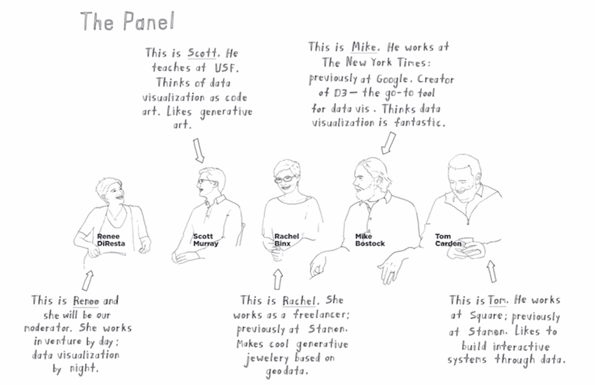
The panelists (Jeremy Sypniewski, courtesy of General Assembly)
Back in September, I started a project in which I crowdsourced a set of Google Autocomplete answers to an interesting question. Responses came in from all over the country, and within a few weeks, I had a spreadsheet with hundreds of thousands of rows…and no idea what to do next. I had a few questions in mind at the start, so I started slicing the data in various ways (in Excel, with pivot tables), and insights began to emerge. But I couldn’t help wondering: was I asking the right questions, or was I missing something important because I didn’t know to look for it? Were the visualization designs that I’d come up with the best ones for the story I was trying to tell? What would professionals do?
So I started bugging a few data viz expert friends to tell me what they would do with the data, and interesting stories of process began to emerge. We all see the amazing final products, but almost never hear the story of how the code artist arrived at that point. In an effort to shed some light on the process, Sha Hwang and I brought together a panel of four experts—Rachel Binx, Mike Bostock, Tom Carden, and Scott Murray—to talk about their work last month at San Francisco’s General Assembly. They spoke to a sold out, enthusiastic house, and although the panel wasn’t recorded, General Assembly has graciously allowed us to use some of their beautiful sketch-notes here, and I’ve assembled some of the evening’s takeaways.
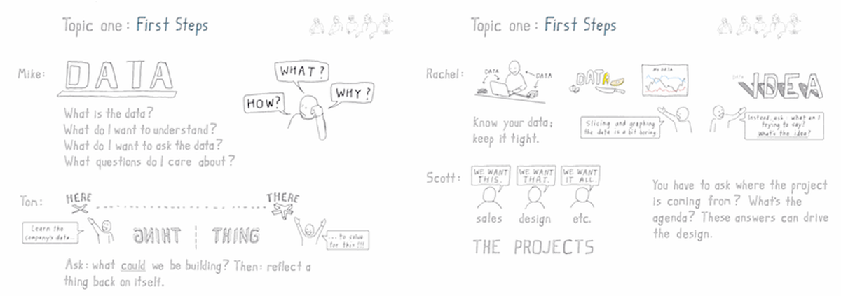
Which came first, the question or the data set?
(Jeremy Sypniewski, courtesy of General Assembly)
The panelists began by emphasizing the importance of focus. “What data do you have and what can you ask of it?” is not the same as “What understanding do you want to bring, and do you have the data that answers those questions?” In most cases, you should start with a question, and work from there. Sometimes you’ll discover that you have to find a different data set to answer the question you actually care about. The data is the backdrop for the larger idea.
Visualization as tool vs. visualization as art
The panelists emphasized repeatedly that data visualization exists on a spectrum. On one side are the pieces that are purely aesthetic and emotional, and on the other, the focus is purely on conveying the insights found in the data. Tom Carden, a data visualization engineer at Square, asks himself if the goal is to grab attention for a new idea, or to build a tool that will be used on an ongoing basis: “Tools need to be actionable, auditable, and they have to stand up to scrutiny long-term.” Tools should be able to accommodate new data, he said, and should grow with companies in such a way that people aren’t surprised by a difference between this week and last week.
Designs that are about grabbing attention can have a more artistic focus; there is more freedom to try new things. Moving visualizations require more of the audience’s attention, so if you’re using an animation, it has to be worth it. Motion can be an encoding itself; if the same object appears in multiple views, you can use motion to explain how the data shifts from one state to the next. One effective way to use this, the panelists said, is to give people agency – giving the user a slider may draw them in more, and help them better understand what’s going on. It’s also important that the animation be an integral part of the visualization and not tacked on as an afterthought. And of course, some browsers may not display certain effects properly, so it’s good design practice to make sure that most of the value of the graphic is there in the static form.
Data visualization is an iterative process; seek feedback
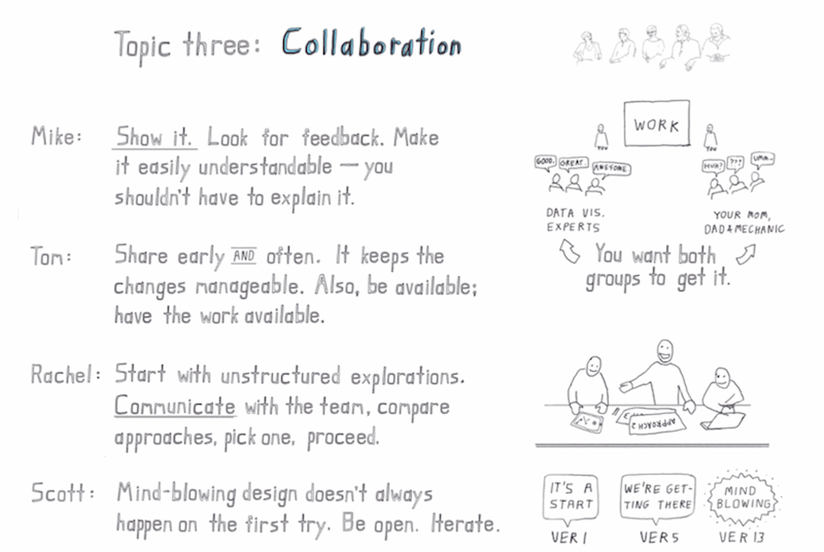
Collaboration makes it happen (Jeremy Sypniewski, courtesy of General Assembly)
While you may have an initial design concept in mind, you don’t know how well something works until you’ve built it. Rachel Binx, formerly of Stamen, described the professional process as ‘exploration’: “At Stamen, teams were made up of two to three people per project. The first week was spent on structured individual exploration time, but we were very much in communication, visually checking in and getting feedback. When exploration time was over, we would converge on one design.” Bostock confirmed that his team at the Times does this as well, using a git repository to track all of the iterations the visualization has been through…sometimes as many as 250 changes to a single piece. Carden stressed the importance of seeking feedback early and often, referencing Pixar President Ed Catmull’s talk “Keep your Crises Small.” If you constantly share your work with people, he said, you never have the awful experience of doing a big reveal several weeks in and discovering that the work isn’t what was hoped for.
Beyond seeking the feedback of fellow professionals, the panelists emphasized the importance of reaching out to people outside of the data-visualization community to make sure that the work is intelligible to a broader audience. They suggested asking non-technical friends what they think: if you’re finding that you need to explain a lot, you should revisit the design. “Part of being able to show your work every day, and get feedback on it every day, is just training yourself to be non-defense about receiving that feedback and showing yourself to be open to input from other people,” said Scott Murray. When it’s your design, it naturally makes sense in your head, he explained, but without feedback, you may select the visual elements that make sense to you…but not necessarily to others.
Of course, some of us don’t have the benefit of fellow professionals who can deliver constructive criticism. So where should we go? Murray noted that there are many active data visualization groups on Meetup.com, and also suggested finding a welcoming community online. (Avoid the temptation of asking for feedback on Reddit, he said; it is many things, but “welcoming” isn’t one of them.) The D3 Google Group is a good place to turn start. Bostock’s site is another convenient option because it allows the creator to share their visualization in a website, and share the code at the same time (via GitHub). The panelists cautioned that it’s best to get feedback from people you know personally, and ideally in person (so you can watch them interact with the piece), rather than from anonymous people online. Even if the people sharing their thoughts aren’t visualization experts, they can still give you valuable feedback and act as a reasonable proxy for your final audience, so reach out to your friends and family first.
The right tools for the job
Almost universally, the panelists used D3 as their tool of choice. Other open-source tools that they relied on included Processing.org and Processing.js, Cartograph, Leaflet, and Google Refine. Mike Bostock, graphics editor at the New York Times and creator of D3, stressed that it’s important to use the right tool at the right time: “There are two general categories of data visualization: one of them is exploratory, and the other is explanatory.” In most situations at the Times, the final graphic is explanatory—it’s about the presentation of facts or events.” But in order to make that graphic and to know what to show in the first place, they often make exploratory visualizations first. R is an useful tool for initial exploration, the panelists said, especially if it’s necessary to group the data or look at descriptive statistics. Bostock noted that the ggplot library is another popular choice for the Times team because it allows for rapid iteration, after which they move to D3 for the final product.
Good questions, iteration, and feedback
And there you have it. Think of interesting questions, try many things, solicit feedback from community members and non-practitioners alike (but not on Reddit), and you’ll be on your way to becoming a better data visualization artist.
Data Visualization panel sketch-notes from Jeremy Sypniewski at General Assembly SF
Credits
-
Renee DiResta
researching computational propaganda & disinfo w/ @data4democracy. prev: founder at @havenmx🚢🗺, VC @OATV, trader @ Jane Street.


