Features:
How to make sense of all the COVID-19 datasets right now
Where to find data to help your community understand case numbers, deaths, testing, hospital capacity, and more

The COVID-19 Case Mapper from Big Local News is one of the data sources that journalists can use to cover the outbreak.
This article is published collaboratively with Mother Jones.
There’s an overwhelming amount of COVID–19 data. Epidemiologist Abdul El-Sayed, former executive director of the Detroit Health Department, told me a few days ago that globally, the last time we were all this fixated on one thing simultaneously was probably World War II. Every data scientist, epidemiologist, private health care company, think-tank, and journalism organization that I know of is analyzing datasets—but not all the data is reliable.
Our job as journalists right now requires us to be more skeptical than ever, so I compiled some trusted, reliable data sources for newsrooms while covering the pandemic.
Cases and deaths
Global
The most reliable sources for tracking the number of COVID–19 cases and deaths come from Johns Hopkins University. I am sure you all have seen this interactive map of cases and deaths broken down by country. Johns Hopkins researchers collect thisdata from a variety of official government sources and update it daily.
The World Health Organization also puts out detailed situation reports every day. They are a wealth of information because in addition to case numbers, they include updates on tests and new regions with the virus. For example, situation report 77 highlights that South Sudan was the newest region to report cases of COVID–19. The situation reports are PDF files, so unfortunately pulling out numbers isn’t as easy.
Though World-o-meter is a popular website for COVID–19 data, there’s been some controversy questioning the accuracy of some of its numbers. I like to look at World-o-meter because they break down active cases, recovered cases, and cumulative cases at a glance, but if I want to publish something, I cross-reference its data with Johns Hopkins’ and the WHO’s.
Our World in Data compared three primary data sources—Johns Hopkins, the WHO, and the European Center for Disease Control and Prevention—to track how they differed in their reporting. They settled on ECDC data (which they find “consistently published and cleanly maintained”) for their own interactive dashboard, with annotations that explain how to interpret different slices of the data. Most of their sources are official government reports, their maps are embeddable, and their data is all downloadable.
United States, federal level
USAFacts.org has updated geocoded data on the number of cases in the U.S. by state and county. The New York Times also has a data repository with cases and deaths by state and county, updated on a daily basis. The two sources are mostly similar, with minor formatting differences. USA Facts also provides county and state data in the same file, whereas The New York Times breaks down county-level and state-level data into two files. USA Facts includes population counts from the census, which can be handy. They both compile data from a variety of official state sources—feel free to play with either or both to see if one works best for you.
Many of the data sources mentioned here and in the sections below are also available for free on Big Local News, a platform from Stanford University run by experienced data journalists and data scientists. If you’re a journalist, you can sign up to access their collection of data, which you’ll find under the Open Projects tab.
They also published COVID-19 Case Mapper: an interactive, easily embeddable map of COVID-19 cases using the open-sourced New York Times data. If you click on a county or state, you can embed case numbers and other information just for your county or state.
United States, local level
The city of New York provides this information at the ZIP-code level. King County, Washington, (which includes Seattle) also reports data at the zip-code level.
Several regions and states—including San Francisco in California, Connecticut, Delaware, Louisiana, Michigan, Minnesota, North Carolina, South Carolina, Washington D.C. and Milwaukee county in Wisconsin—are reporting cases and deaths broken down by race. Data 4 Black lives, a nonprofit group of data scientists, activists, and organizers are keeping track of which states are releasing this data.
Testing
The COVID Tracking Project, a volunteer-run project that incubated at The Atlantic, gives us daily updates on the number of tests conducted at a state level. They have been collating and tracking this data from individual state websites from the beginning of March and are one of the strongest data sources for testing numbers in the U.S.
Hospital capacity and medical resources
The Accountability Project from The Investigative Reporting Workshop based out of American University has a wealth of data sources for any journalist reporting on any beat, some of which are incredibly useful while reporting on this pandemic. For example, they have geocoded data of all the hospitals in the country with information on the number of beds in each of those hospitals. They have also processed this data to include demographic data from The Census. (Added bonus: their data comes with detailed data dictionaries and metadata that’s a godsend for a time like this. They also have small grants to work with journalists, and you can apply by telling them about your story idea.)
The Harvard Global Health Institute has data on hospital-bed capacity by Hospital Referring Region, or the market areas where people tend to go to the same hospitals. The data covers nine different scenarios on how many hospital beds would be required based on how many people are infected and how much time it takes for the infections to spread. (ProPublica used the dataset for this story, and you can find a story recipe with step-by-step instructions for how to use it in your own coverage on Source.)
Projections
A warning about projections: While it’s helpful for lawmakers to see what is coming so they can plan accordingly, statistical projections for the future can also be scary for the public and hard to read without context. For a global pandemic like this one, there is so much we don’t know yet. It’s important to remember that projections are best guesses that allow lawmakers and leaders to plan for a scenario of outcomes, but projections of outcomes themselves may change based on interventions and actions we take collectively. For example, knowing when a community will run out of hospital beds may help leaders start thinking about alternative arrangements; if leaders seem unconcerned, it may help the public hold their leaders accountable and demand that they take action. But the exact number of projected hospitalizations may or may not happen depending on various factors (such as practicing rigorous social distancing.)
The Institute of Health Metrics and Evaluation has a dashboard with projections on daily deaths, total deaths, and whether and when every state will run out of hospital beds. They update this data daily.
Policy response
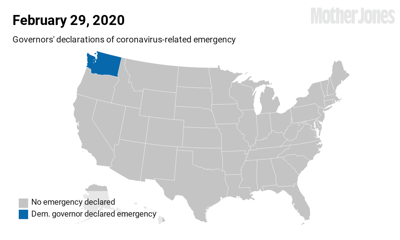
Most states have been doing their part to implement social-distancing. Professors from the University of Washington have tracked when every state implemented different policies, from declaring emergencies to closing schools (I created this gif based on their data.)
The American Enterprise Institute also tracks this data in an interactive web application, where it’s easy to check something quickly. If you want to analyze policy trends more deeply, the data from researchers at the University of Washington is probably more helpful because it’s already cleaned and available as a CSV file.
The main data source for tracking policy data is the National Governors Association website, which has detailed notes on every policy implemented in a state.
The Marshall Project has tracked how justice systems in every state have responded to the pandemic.
Location data
COVID–19 has inspired several private entities to share user location and tracking data that we kind of knew existed, but never saw until now. Unicast, a company that tracks cell-phone and location data to study movements of concertgoers, has a dashboard that shows how people have been practicing social distancing (or not). Tectonix, a similar company that offers location-data analytics to its clients, mapped the movement of spring beachgoers from Florida.
Community-driven data resource lists
This overview of COVID-19 datasets is designed to help you find reliable sources to use in your coverage. There are also crowd-sourced lists that can help you surface more and learn about new data sources as they emerge. Geoff Hing started this Google Doc to keep track of data being used by members of the News Nerdery Slack and other journalism communities. And this collaborative effort lists research on COVID-19 travel, financial, social, and other policy responses.
Find more step-by-step COVID-19 data story recipes like this one. If you have questions about a story you’re working on, our free peer data review program is here to help.
Programs like these are part of the OpenNews COVID-19 community care package. If you’re using this story recipe, please let us know — we’d love to promote your work! If you’ve got a story recipe idea, we’d love to hear about it. Drop us a line at source@opennews.org.
Credits
-
 Sinduja Rangarajan
Sinduja Rangarajan is the senior data journalist at Mother Jones. She previously worked at Reveal at the Center for Investigative Reporting, where her series on the lack of diversity in Silicon Valley led to many tech giants publicly releasing their data. Her work has won several awards, including the National Edward Murrow Award in 2019. She wrangles and analyzes datasets to tell stories and finds innovative ways to report on issues by collaborating with academics. She started her journalism career as a Google News Lab Fellow in 2015. She has a bachelor’s degree in computer science from the University of Mumbai and a master’s from the University of Southern California’s Annenberg School for Communication and Journalism. Email her tips at srangarajan@motherjones.com.


