Features:
Feats Thru Sheets: The Wonders of Go-To Templates
Clean up your newsroom workflow with ready-made tools that are easy to use

Templates: not just for adorable gingerbread houses. (Inhabitat)
I’ve never been much for cleaning my room. As a kid, I was too lazy for something that sounded so inconsequential. But my mom would scold me and remind me that, just by doing a little bit of work, I could save a lot of time looking for “lost” things. I’d be much less frazzled. She was right, of course. Having everything you need, right where you need it, saves tons of time and energy—even if it means more work upfront.
That’s why, as Data Visuals Editor at International Business Times, I did the equivalent of cleaning my room. I created Feats Thru Sheets, an interactive, filterable, searchable database that can be reskinned for different types of stories and updated solely by reporters.
I was at International Business Times from last fall until this summer, part of a tiny team of two—and then just one. I quickly learned that, with few resources, you find ways to make your job as the only coder in the newsroom just a little less insane. We didn’t have a dedicated team of newsroom developers who made editorial tools for the newsroom. As a newsroom coder and data journalist, I needed to go beyond finding data stories and making pretty graphics—I also needed to figure out ways to make my coworkers’ jobs easier and more manageable.
So I did. Here’s how.
The First of the Feats
It was November 18, 2015—a few days after the tragic Paris attacks. French police raided the Parisian neighborhood of Saint Denis resulting in a shootout that ended with three suspects killed and five suspects arrested.
During breaking news situations, names and locations fly around, fast and furious, making it hard for both reporters and readers to keep up as facts are confirmed. One of our breaking news reporters asked if I could create a graphic breaking down the identities of each suspect and their respective fates. It would have to be done quickly and be easily updated as news changed.
If we’d had more resources on hand, this would’ve been no big deal. However, I could get it done quickly that day, or I could make it able to be easily updated in our content management system. I couldn’t do both.
So I opted for speed.
That day, I built a simple database that was both filterable and searchable with every suspect’s name, age, nationality, a brief description, source link, and picture (or an icon if a picture was unavailable). There were many fields labeled as “unknowns” that would later be filled in as new details emerged. I decided to put the code for the interactive directly into the CMS, which turned out to be a bigger pain than I had anticipated.
First of all, it was difficult to put raw code directly into the CMS because something always ended up clashing with the graphic within the article. We had to make sure the code in our graphics didn’t mess with the code on the main site and vice versa. It got exhausting.
If code was put directly into the CMS, it was at the mercy of every site redesign and change. For example, this worked once upon a time. (This is the main reason why I eventually gave up on putting raw code directly into the CMS and instead began to embed things as iframes using pym.js.)
Secondly, it was too confusing for our reporter to go in and update the text found within the raw code in the CMS. Even if our reporter could figure out how to update it, the graphic could only be changed in the “code view” version of our CMS, which is an editor-only feature. There was no way around it—it would have to be manually updated, by me.
I did have our reporter put the info in an Excel sheet, which I then turned into a JSON file that I uploaded into our newly acquired Amazon S3 server. My quick-and-dirty plan was to add all updates directly into that JSON, which fed the graphic.
This would have been okay for a graphic where the data was set in stone. However, this was a breaking news story that required constant updates.
Across the newsroom, several emails and Slack messages went back and forth as we got new facts from the event. The graphic only got updated if the reporter saw the new information, emailed it to me, and I was at my desk and could update it. That’s why details on the female “suicide bomber,” who then turned out to be not a suicide bomber, were not added until hours later. To top it off, it was hard for our copy editors to fix simple typos without having go through me or the reporter first.
This was the end result. A bit of a train wreck.
But it was a train wreck that I’d seen coming. I could do this so much better, I thought. So I did.
My goal was to create interactive graphics where the reporters could update the text and data themselves, without the need to look at code or use complicated software. How? At first, I wasn’t sure. If only they could use something they already knew well…
Answer: Google Sheets
Every reporter at International Business Times had their own work-related Google account for Gmail, which meant they also had access to Google Drive. Because the CMS could be unreliable at times, many reporters opted to work on their stories in a Google Doc and share that with their editors.
If they were working out of their Google Drives anyway, I thought it wouldn’t be that big of a stretch for them to work out of a Google Sheet. A lot of our reporters were familiar with Google Sheets spreadsheets, and those who weren’t could easily learn.
So I needed to connect Google Sheets to the graphic, turning it into a lightweight database.
It was a really simple solution that was even simpler to put together. I connected the spreadsheet using Jonathan Soma’s wonderful Tabletop.js. I tried to connect the spreadsheet to as much of the graphic possible. For example, the headline and explainer text are controlled by a second spreadsheet within the same document so an editor can easily make changes. There’s even a timestamp to let readers know when the last changes were made.
This is what it looked like, and it was all powered through this spreadsheet.

I opted to make the grid layout of the breaking news template using Isotope.js, which can be easily customized or completely replaced by something else. With Isotope.js, I not only had different layout options, but could also easily make filter buttons and a search bar. In addition, reporters could add new filter buttons by adding different categories in the “filter_category” column.
As reporters filled the spreadsheet with their data, I could focus on customizing the CSS and JavaScript to make it as pretty as possible.
Reskin, Redeploy, Reconquer
Feats Thru Sheets, as I dubbed it, was used and recycled many times for many different instances while I was a International Business Times. We repurposed it for many different projects:
A graphic looking at words in Obama’s State of the Unions

A tool that where you click on a popular artist’s tour or festival and see cheaper alternatives

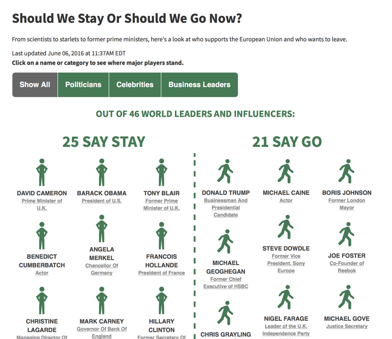
A database of what politicians, business leaders, and celebrities think of Brexit, that can be updated as more world leaders comment or change their minds.
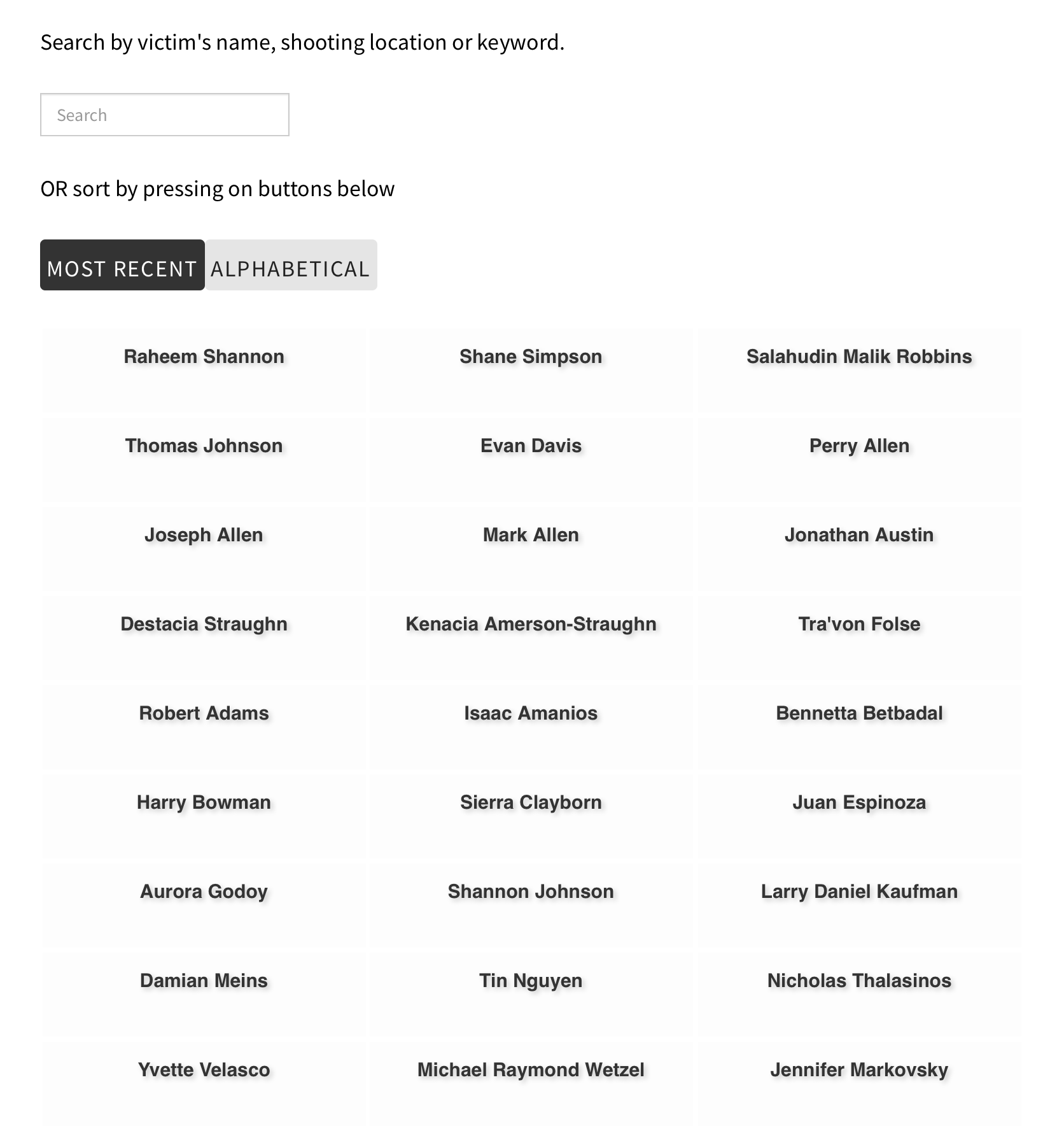
Because it was in our International Business Times GitHub account, my former data graphics partner Hanna Sender was able to easily put her own spin on it, when she created this graphic of mass shooting victims in 2015.
By setting up a Google spreadsheet for the reporter to use, we spent less time going back and forth with the reporter on content and more time adding bells and whistles to the presentation.
Limitations and Improvements
Feats Thru Sheets never felt fully done, and I could always see room for improvement. For example, I wanted to add a feature where the reporter could add new columns in the spreadsheet that would automatically add new sections to the database. I also wanted to make it look a little better on mobile, especially if it was description-heavy.
This solution really worked for us. I must emphasize, though, that Google spreadsheets might not be the answer for every newsroom, so your mileage may vary.
One big caveat is that because Tabletop.js uses the Google Spreadsheet API, you’re at the mercy of Google. This means if they make changes to the way their API is set up, there’s a possibility that Tabletop.js will break. Also, any bugs found in the API will affect your project, which is exactly what happened a couple of years ago. Plus, if Google is slow, goes down, or your project hits the API limit quota, there’s very little you can do.
A possible solution is to cache your spreadsheet. Jonathan Soma offers several options for how to do that here, including Flatware, an app he created that uploads the JSON response to Amazon S3. You can also schedule it to periodically turn your Google Sheet into a JSON and call the JSON instead.
Another thing to be aware of is that it’s very easy for someone to look at your code and find the Google spreadsheet link through your API call. This makes all of your data viewable. That wasn’t a huge deal for projects at International Business Times since much of the data was open, but it could be a dealbreaker for some newsrooms or sensitive stories.
In the end, I weighed the good and the bad and decided it was worth it, and this was the best solution for us.
Goals and Monsters: Lessons Learned
Sometimes the most crystal-clear takeaways are the hardest to learn, even when they’re staring you straight in the face.
First of all, for some reason, I always had it in my head that the best newsroom tools are the most intricate. That in order to truly solve a problem, I must dedicate hours and hours to write an extensive newsroom app that would completely revolutionize the way we do journalism. For newsrooms with a team of developers that may be possible, but when you’re the lonely coder, it can be a tall order. Start small with a simple goal, and then keep adding new features along the way.
Another thing that took me so long to understand: gearing everything I built toward our existing newsroom workflow, rather than trying to change the workflow itself. Newsrooms are generally slow to shift, so it’s easier to adapt yourself to it than try and change it. That’s why I opted to use Google spreadsheets, since many writers already preferred to use it for data.
One last lesson I gleaned: Think of any big, complex project as a bunch of tiny, reusable parts that can be easily templated for future projects.

Every project is like Frankenstein’s monster. Yes, the end result is nice, but what’s most important is the dead body parts that make up that monster, which can be reused to make other monsters. The goal is to build those small parts with the aim that they will be used in the future. It would have been a waste if some feature I spent hours building served just one project and could only be used for that one project.
Feats Thru Sheets, for me, was the “torso” of so many projects that built after that, because I took the extra time to make it reusable and easily customizable.
Organizations
Credits
-
 Carla Astudillo
Carla Astudillo is a data reporter and interactive graphics maker at NJ.com and The Star-Ledger. Follow her at carla_astudi.


