Features:
How We Made “Billions of Birds Migrate”
National Geographic’s web-based takeoff on the classic bird migration print poster

“Billions of Birds Migrate” is a data-driven feature showing the journey of several species of migratory birds across the western hemisphere, through text, audio, photography, and animated maps.
The project began as part of National Geographic Magazine’s involvement with the Year of the Bird campaign, an effort to bring more attention to the role of birds in their habitats and why birds matter. This project was meant to be the digital manifestation of a topic also covered by a supplemental poster map created by Lauren E. James and Fernando Baptista.
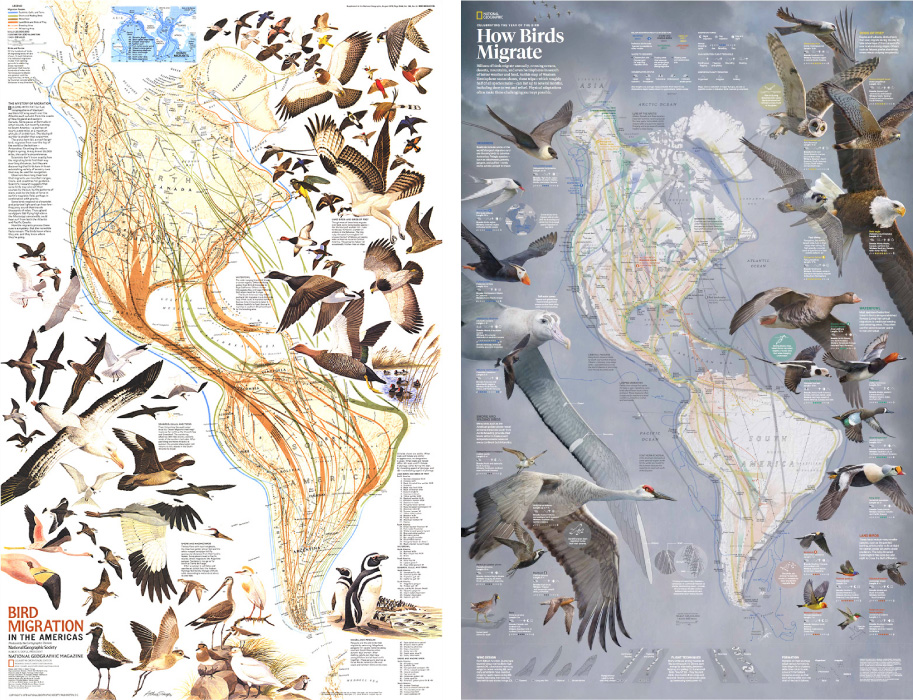
Left: Bird Migration in the Americas, supplement to the August 1979 National Geographic Magazine. Right: How Birds Migrate, supplement to the March 2018 National Geographic Magazine. Not shown, the 2018 eastern hemisphere flyways on the flip side, and the 2004 eastern/western hemisphere flyway poster. A lot of bird love at Nat Geo over the years.
This poster shows maps and bird illustrations of the Eastern and Western hemispheres, included in the March 2018 issue of National Geographic magazine. It’s a concept that’s previously been covered in posters in 1979 and 2004.
This new map updates bird routes to reflect the knowledge we’ve gained over the past decades about where birds go, and it features original illustrations that highlight important species. This map is breathtaking in scale and detail, but how would it translate for the web?
It’s always tempting to take an existing print graphic like this one, the result of many hundreds of hours of research and artistry, and adapt it for screens. Some projects lend themselves well to that, but some are so complex and heavily annotated that it becomes a burden to funnel it into a vastly different medium. For this poster, there was a danger of doing a disservice to the vision of the graphic in shoehorning the double-sided layout into a pocket-sized screen.
That, combined with the more practical fact that I would need to work simultaneously on the digital piece during the completion of the poster, led to us decide that I would not fully adapt the poster for the web but take an approach that takes better advantage of an interactive screen-based medium with time-series data, highlighting different aspects of bird migration through fewer species. The creation of this web-based spin on the topic of bird migration is what I’ll go through in this article.
Ultimately what was used from the poster above was a re-colored (and reprojected) single image, the “flyways” of the western hemisphere, or, the interstate system of seasonal migration for five different groups of birds.
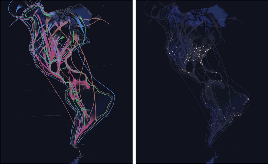
Left: This flyway image is warped slightly compared to the 2018 poster above, which used a bipolar oblique projection. My map was warped, or reprojected, because the original projection was incompatible with my automated video creation workflow. This map was also recolored in neon to work better on a dark background, like NASA’s night lights (right).
Data and Design
Like many projects, the framing and design of this project started with the data that we were interested in visualizing, which led to a selection of bird species to highlight. Through a collaboration with the Cornell Lab of Ornithology, I consulted with eBird project lead Marshall Iliff. I knew that eBird had created what they call STEM data–Spatio Temporal Ebird Modelling. eBird is a vast, crowdsourced database of bird sightings around the world. Sightings tell us where birds are, but they’re also a reflection of where birdwatchers go. The STEM models account for this and attempt to paint a broader picture of bird abundance, combining sightings with bird habitat information and satellite data to model the movement of entire species of birds. eBird had previously published animated maps of these models and this was our starting point.
Animated abundance map of the Wood Thrush, by eBird.
Marshall advised as to what species constituted quality data from these models. We also tried to strike a balance between what species would show a robust enough pattern in visualization, and what species could tell a story about the diversity of migration strategies amongst different bird types and geographies. Unfortunately, STEM modeling does not exist for the Eastern Hemisphere, so we would focus on the west. This data and research to understand what drives bird migration led to initial designs.
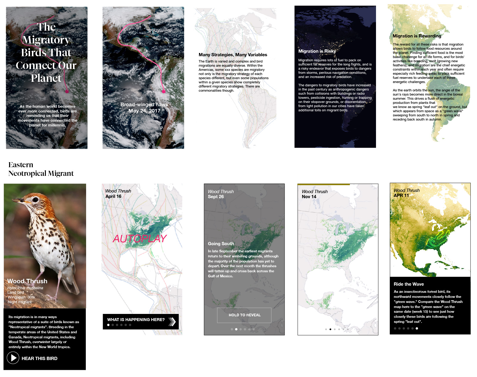
Mockups showing some screens of a mobile layout.
From initial mockups we’d not only show individual species through photography, maps and birdsong, but also place these birds into a larger context of (inter-) continental migration through introductory graphics. The concept was to set the reader up with a general understanding of what drives bird migration. As they scroll down the page, casual readers would be able to see autoplay looping map animations to give a sense of the pulse of migration. More dedicated readers would be able to go deeper, stepping through time incrementally and tracing some notable features of migration of each of these species through additional text descriptions. Mockups were crucial in presenting this concept to folks in my department before making this all happen.
Creating Animated Maps
While this project uses a lot of data from disparate sources, the animated maps have a lot in common. They’re the result of data processing scripts that allowed me to regenerate the animations many times in order to tweak the visualizations. Each of these map animations starts with folders of images, and they are eventually compiled into videos.
Left: Animated GOES–16 satellite imagery. Right, animated STEM imagery. Each of these videos are compiled from sets of images, the result of Python data processing scripts and command-line tools.
Any visualization starts with raw data. The raw data for these maps came in the form of GeoTIFFs from the eBird project. GeoTIFF is a common raster format that includes geospatial metadata. This metadata describes what part of the world is depicted, how it’s warped (the map projection), and what units are used to describe it (the coordinate system).
This is a JPEG for 1 of 52 files for a Western Tanager, one file for each week of the year. This data shows the abundance of the species over America stored in a sinusoidal projection.
This is grayscale data, as in, it’s a single channel of data, as opposed to the three channels (red/green/blue, or RGB) that combine to form a color image. It’s gray, but there’s more than meets the eye in this file—the data contained is a pixel grid of 64-bit floats. This means that within each pixel, instead of storing values from 0–255 like a typical web image, there’s numbers with precise trailing decimals (e.g: 0.0024342…, 504.343497…). Your monitor can properly render color images with 256 values per RGB pixel, but this data instead has millions of possible values per pixel. This type of data gives a lot of extra precision for doing analyses and transformations, and is a common occurrence with scientific or satellite data sources.
How do I know what this data consists of? I’m using the incredibly powerful suite of tools known as GDAL to poke at images like this before I do anything drastic to them. As described in this tutorial, gdalinfo can help to describe a GeoTIFF. Knowing how my data is structured is crucial for responsibly transforming it.
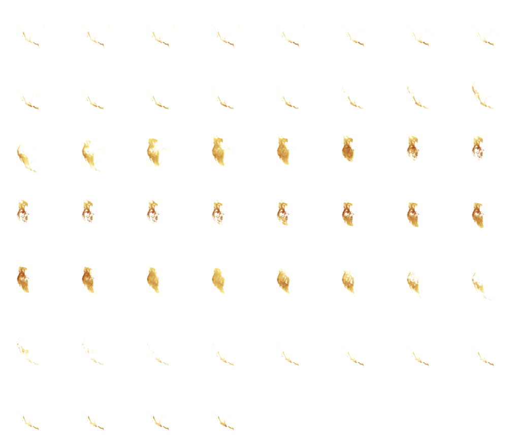
Migration happens over time, and so does this data. The distribution and abundance of each bird is represented by a collection of 52 files like the grayscale one above, representing the entire year I’m angling to animate.

Previewing 52 weeks of raw data.
To get a consistent animation and make a species’ migration pattern more comprehensible, I do these same steps for each set of imagery associated with the seven species of interest seen in the interactive:
- Reproject the migration data
- Apply a color ramp
- Composite with a base map
- Create a video from the composite
- Add labels
Initial Cartography
I start in Adobe Illustrator and work one species at a time. Take the case of the Western Tanager, the yellow/black/orange songbird of the west.
Understanding my data by previewing it (like in the grid of images above), I create a basemap with a particular projection (the Lambert azimuthal equidistant projection, centered on the Western Hemisphere) and a crop that represents a spatial extent a little larger than the range of a species. To create this map, I’m using the Mapublisher Illustrator plugin to import Natural Earth shapes of landmasses. Mapublisher lets me use the power of Illustrator’s styling and labeling capability for cartography, but I could have used QGIS or ArcGIS at this stage.
For now I export this map as a GeoTIFF file. This file will do double-duty: it’s a basemap, it will act as the geographic context for the migration pattern. But more functionally, I use the metadata associated with the map file as a template to establish the parameters for my bulk processing script run on each of my 52 files. Pointing at this file, if I later modify its crop or projection parameters, the bulk-processing script will adjust the processing accordingly and will continue to align.

Left: the map used as the basemap for the Western Tanager. Right: A composite of all Western Tanager files in one image, helpful for previewing what extent I should be using.
Geographic Processing
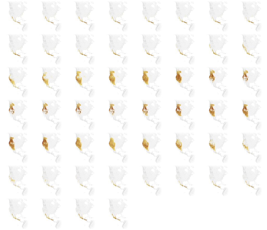
For automating the processing of each set of 52 files my tool of choice is Mapbox’s Rasterio. It’s a Python library that uses GDAL for geographic transformations, and it plays nicely with other Python tools I like to use (like NumPy for data manipulation and Spectra for color ramp generation). I use Rasterio to reproject and fit each of the 52 files to the geographic metadata within the exported basemap.
52 reprojected, colored images. Compare the shapes in each frame to the previous grid. Reprojection warps the data to a more familiar west-coast shape.
Before creating new images, I first have to rescale my data. Each of my files represents a distribution of bird abundance. And each pixel represents the amount of birds that are expected to be observed within a one-kilometer area at 7 a.m. From week to week, the minimum and maximum values of abundance can vary wildly. So I first analyze the entire 52 weeks of files to tally the very lowest and highest values. With this total range of activity for the year, it gives the ability to visualize the data apples-to-apples. To do so, I rescale to a different range, a visual range.
The new range of pixel values is 0–255, in order create a monitor/web friendly 8-bit image. I create a color ramp of the same length (256 colors), using the Spectra library, and I map the intensity of each value to each color.
I run these two steps again and again (via Python script), as I experiment with colors and boundaries.
Composition and Effects
I could create a video from the grid above, but I need a basemap beneath the data. Browsers don’t universally support video with transparency (check this out in the latest Chrome/Firefox), so I’m going to composite each colored frame with an identical image.
The image is the basemap described above, with additional shaded relief to show how migration patterns match up (or not) with elevation changes. There are good reasons not to embed state/country boundaries into a video: to avoid excessively thin/thick line weights when a video scales or to avoid compression artifacts—but I’m doing it here so I don’t have to bring in additional SVG layers in the browser. A trade-off for sure.
How do I then take the 52 images above and merge each of them with a common basemap? It sounds like a tedious or (Action panel) job for Photoshop but there’s a more scripted way. Enter ImageMagick and its convert commandline tool. ImageMagick is the open source Photoshop of the commandline. Its documentation and cookbook is… quirky, but being over 30 years old it’s robust and reliable.
I use convert for two purposes: to composite each image to the basemap, and to add a feathered vignette to fade out the edges of the image.
52 weeks of data, composited on to a common base, with a vignette effect on the edges of each.
From a folder of processed images, I then use the 17-year-old, uber-powerful ffmpeg command to encode an MP4 video at a desired speed, with a few sizes for desktop and mobile. Care must be taken to create an MP4 with the right encoding to properly load on mobile and desktop devices.
This script was a lot to set up and debug initially but it saved an immeasurable amount of time because I could tweak some settings and output new videos with tweaked color ramps, framerates, new basemaps, etc. I probably could have cobbled together steps with QGIS (namely the TimeManager plugin), Photoshop, and After Effects to do this, but this being fully automated within a single environment also seemed like an investment in future projects that would use video maps.
Labelling
There are labels on all these maps. While I made some concessions in putting boundary lines within the videos themselves, I’m not willing to compromise at all on labels. Legibility is crucial, as is adhering to the National Geographic cartographic style and policy. So I render labels in the browser as HTML text. I use Illustrator to register label placement and style atop the same basemap I’ve used previously, and also add vector leader lines to point some things out. I use ai2html to export the labels from Illustrator to HTML/CSS positions. I export the leader lines as SVG so I can control their visibility step-by-step in the browser, and render them with the desired stroke width according to map size (a.k.a. responsive cartography).
In the browser, each layer is aligned with CSS and they appear as a unified map:
- HTML labels (top)
- SVG leaders (middle)
- Animated map (bottom)

Screengrab of all the labels and leader lines used for all the steps of the Western Tanager.
The map above looks bonkers because it’s a composite layer of all the steps of my animation stepper. When rendered in the browser, all labels and leader lines are initially hidden, then strategically turned on for each step via Javascript/CSS. Custom labeling for seven species and five to seven steps across desktop/mobile was a manual and monumental task.
When I had all the pieces together, the maps were sent to Scott Zilmer, our map editor, for review.
Animated Bird, Animated Earth
The migration animations weren’t the only video in this project. The piece starts with an animation of the earth, a segment of time from October 8–12, 2017 and a broad-winged hawk traveling through it. With this visualization I could show the breadth of a single bird’s journey, that it travels through a dynamic earth, and start with some drama.
GOES-16 animation from October 8-12, 2018, with state/country boundaries.
Having previously experimented with data from the GOES–16 satellite and seen some impressive animations, I knew that depictions of the entire western hemisphere could be seen on a continental scale, and as fast as an image every 15 minutes. I also had a feeling that some of our species of interest had been GPS tagged for study. So I thought, could these two things be combined, to show a bird’s route synced over time with an animated Earth?
Data Acquisition
After looking in Movebank for GPS tracks of our birds of interest I got in touch with the Hawk Mountain Broad-winged Hawk Project for a track of a broad-winged hawk whose data existed since about March 2017—GOES–16 data only exists past this point, and its spatiotemporal resolution lends itself well to animation (it provides high-detail imagery of the same image of the earth at much more frequent intervals than other satellites). The organization agreed to let us use a track of Patty, one of a number of birds that the organization has tagged with a GPS device. Patty spends much of her time in her summer range towards the Northeast United States, and in the winter range around North Peru. Between those times, she’s on the move, crossing a continent.
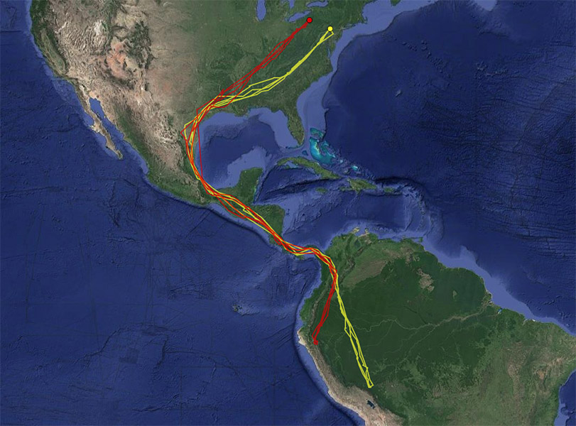
Patty, the broad-winged hawk, is shown in red. Her entire route from North to South America along with another hawk, Rosalie. Source: Hawk Mountain Bird Tracker.
Knowing Patty’s date range of migration narrowed the search for satellite imagery. But even with a restricted time range, I downloaded a few terabyte’s worth to experiment with from the AWS Public archive, scripted using the Boto3 Python library. Each 15-minute increment of a GOES–16 image is a view of the whole planet, or, “full disk.” Each file is about 400mb, and my hard drive filled up fast. Pro tip: don’t fill up your main hard drive entirely with data. To avoid crashing your system with a full disk of full disks, use an external drive.
Experimentation was informed by data limitations. Patty’s tracker did not record locations at even increments. Throughout her migration there are times of multiple locations recorded per day, but other times there are multi-day gaps, between which she might cover a significant distance of flight. So I tried different spatial extents that would encompass routes that expressed movement but where you could also get a sense of the continental landmass.
But how much time to animate, and how fast? I didn’t expect people to watch this animation beyond about 20–30 seconds (that’s asking a lot, but it’s fairly hypnotic and I would have people scrolling through a few different overlays). I would have loved to animate Patty’s entire route and technically there was nothing stopping me from doing that. However, animating weeks of earth imagery in 20 seconds looks really intense–aside from the hyperkinetic dance of clouds, GOES–16 captures the earth in day and night, and so it flickers from light to dark at a disorienting rate when animated in fast-forward. So I opted for a much shorter clip to reduce disorienting flicker, at the expense of route distance.
Lastly, GPS tracks are typically pretty messy as animals don’t move in straight lines. To tidy the visualization I generalized the lines to, at most, one location per day. This was an OK concession, at the scale I was showing the track.
Left: Patty’s filtered GPS recordings. Right: Same data, connecting the dots in the browser using D3.
Processing GOES data
The key thing with an animation like this was to ensure the GPS track of the bird was aligning in space and time; the right place at the right time over an animated basemap. Aligning things in space proved to be the bigger challenge. While the bird’s GPS data provided latitudes, longitudes, and timestamps, getting control over the GOES–16 image geospatially took some sleuthing.
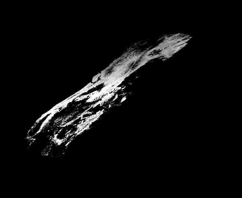
The raw GOES–16 data forms circular image, a “full disk” of planet Earth.
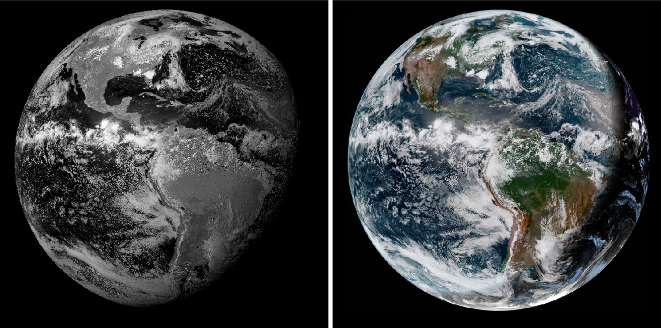
Left: A depiction of a single, grayscale, band of GOES–16 data. Right: Multiple bands of GOES–16 data combined together to represent a more familiar depiction of Earth. Note that on the right, where earth is in nighttime, the clouds are shining bright when compared to total darkness on the left. This image is using an infrared channel to bring out clouds at night. Source: RAMMB
Map projections are 2D representations of 3D objects, and this image is just that—this satellite captures the Western Hemisphere with a particular perspective of the earth’s curvature, a result of the (geosynchronous) orbit-distance of the satellite (see Near-side perspective maps simulate views from space). To manipulate the GOES–16 data geospatially, it must be projected to align other maps to the disk. To do this one must know the satellite’s distance from the earth, and the center coordinates of its focus. This is the basis of the geostationary projection. How do I know this? By doing some internet research and finding tutorials of other people who have processed this data.
GOES–16 raw data comes in the form of a NetCDF file. It takes a few extra steps to extract the geographic information from this format, but it’s in there. This is a pretty common scientific data format, but it’s trickier than GeoTIFF because its metadata isn’t standardized for geographic data—you need to manually point to the arbitrarily named fields you’re interested in. GDAL’s tools don’t automatically understand what to do with it.
So I read each file with a Python script, access the metadata, and calculate the geostationary projection. I write a new file out, again using Rasterio like I did before. I then test the file out in ArcGIS by overlaying country boundaries and seeing how well the borders align with coastlines. It took a spectacular amount of trial and error to get things to finally reproject correctly, with the help of some blog posts and tutorials. The GOES–16 documentation is lacking.

Three frames of processed GOES–16 imagery.
Working with satellite imagery isn’t like working with a normal photo. As I discussed in detail in a previous article, data doesn’t typically come neatly as RGB channels, but as a collection of files that represent bands, each band corresponding with a different wavelength of light, and you make combinations according to what you’re trying to express. In the case of GOES–16, these bands represent visible light, near infrared, and infrared. For what I was trying to show, a bird flying over a familiar (to a general audience) view of the earth, I was interested in a true-color view of Earth. This constitutes an additional step from the process described above, taking the red, green(ish), and blue bands from within the NetCDF file and assigning them to the three RGB channels of an image. To get the clouds to be visible during the nighttime view of the earth, I embed the infrared band across all 3 channels.
Basically every step I described (and more), for geoprocessing a single GOES–16 image from a NetCDF can be found in this Python notebook. Additionally, this other resource is one of a long series in processing this data: maninpulating GOES–16 data with Python. These days, I’m not the only one to have worked with this data, some more examples here.
Like before, I used a map prepared in Illustrator to use as the basis for cropping and reprojecting my prepared GOES data. Instead of acting as a base, this additional map is meant to be overlaid atop the GOES imagery to show state and country boundaries. Because it’s the same dimensions, I proceed the same way as the other animations, using convert to composite each GOES frame with my Illustrator map. All frames are again composited into a video with ffmpeg.
Merging Video with Patty
I wanted fine-grained control over the appearance of Patty’s line atop the satellite imagery, across desktop and mobile devices. In order to do that, I don’t include Patty in the video itself, much like how I didn’t include leader lines and text within migration animations. Instead, I loop the video, and animate a line using SVG in lockstep with video progress. This is a similar concept to another bird project, where colleague Kennedy Elliott layered animated explanatory SVGs atop slo-mo hummingbird videos.
I’m drawing Patty’s route in the browser directly from GPS data, a web-friendly GeoJSON file that contains latitudes, longitudes and associated timestamps. Knowing the parameters that determine the map projection of my GOES–16 video, I make an identical map frame with D3. With that frame, I can reproject the GPS data to match my video. Theoretically at least. Browsers scale SVGs and videos in different ways, so a good amount of trial and error went into figuring out frustrating misalignment issues.
Patty’s path aligned in space and time with GOES-16 imagery.
Animating Patty was aided with the help of a tutorial and example visualizing a typhoon’s path. This also took some trial and error because broad-winged hawks don’t migrate at night. Because Patty’s data was only so granular, I wrote in some custom overrides to try to ensure that she only moved during the daylight parts of the video, while respecting the timestamps in the data. There are some perceptual problems in combining two datasets with different time-steps, but one thing was for sure: I was not about to remove frames from the GOES–16 video to stutteringly match Patty’s timestamps. A smoothly animating glittering blue dot from space is too spectacular to pass up.
The End
I knew from the designs that this project would have a lot of maps, but it turned into a larger affair than I expected due to the combination of the many techniques and technologies used to bring all this animated data together. With different layers interacting, I had to experiment and problem-solve to bring the data and graphics together in a reasonably graceful way. But with the resources of the internet and a supportive department as the wind beneath my wings, I was able to make something I was proud of and was able to learn a ton in the process.
Organizations
Credits
-
 Brian Jacobs
Brian Jacobs is a Senior Graphics Editor who designs and develops interactive maps and graphics for National Geographic Magazine. Brian uses open source visualization and data processing tools to create and envision custom editorial experiences across platforms. He was previously a Knight-Mozilla fellow at ProPublica, where he worked on “Losing Ground”, an interactive story about the slow-motion environmental catastrophe taking place in southeast Louisiana. Find him at @btjakes.


