Features:
How We Made the New Big Mac Index Interactive
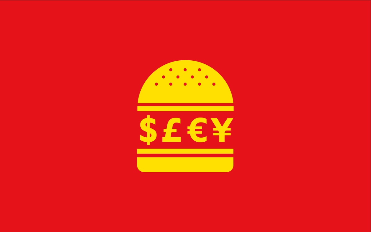
How the Economist redesigned their interactive Big Mac index and open-sourced the underlying data
What began with a small box in print has become one of The Economist’s flagship interactive tools. Started in 1986, and made interactive in 2012, the Big Mac index has had an astonishing shelf life. But at the beginning of this year, we, the data team at The Economist, decided it was time for an inventory and we saw that we needed to spice up our Big Mac index. Legacy code, a staid color palette and an outdated desktop-only design needed to go, making space on the page for clean designs, easily reusable scripts, and less clunky front-end code. Here’s our new version.

The redesigned Big Mac index.
The Big Mac index is based on the theory of purchasing-power parity (PPP). It’s a comparison tool for currencies, based on Big Mac prices and exchange rates. It helps to show whether a currency is under- or over-valued in comparison with a base rate currency. It comes in the shape of a fairly complex dashboard with plenty of interconnected components.
Since it is one of The Economist’s longest-running interactive graphics, we knew we had to approach its redesign cautiously. The index gets a lot of repeat visitors, so the last thing we wanted to do was break a tool that people used regularly and were familiar with. At the same time, interactive web graphics have come a long way since 2012—when the previous version was launched—and we felt a new, responsive Big Mac index could improve on the current user experience.
The first step was to work out how people used the previous interactive. We added a survey to the page to get a better sense of what people were looking for and how easy they found the tool to use. We also installed HotJar on the page, so we could review heat maps and screen recordings of user interactions.
The survey responses were illuminating. After filtering out the (very few) profanities and rants about fast food, we put the useful suggestions into broad categories.

What the people say. (Image: Matt McLean)
The most common suggestion was for more explanation of how the index works and what it means. This chimed with our instincts that exchange rates and concepts like purchasing-power parity are not widely understood, and the old interactive relied on a lot of assumed knowledge, which might be a barrier to entry for first-time visitors. Another common request from the survey was to see currency valuations over time, something the old version did, but which was only accessible by clicking on a country, so many users were clearly missing it.
From this exercise we were left with some broad principles about what the redesign should achieve.
Be more explanatory than the current version, so that as well as presenting the data, it was a tool to understand the underlying concepts.
Allow the user to view the whole dataset over time and compare currencies without having to find things behind tooltips and click-throughs.
Work responsively, with a solution that works on mobile and tablet without reducing the scope of the full desktop version.
To Map or Not to Map?
We then began making design decisions. The first question to answer was how users would navigate the index. In the previous version a world map was the main device to select a currency. This is problematic for several reasons.

This version of the Big Mac index is now past its sell-by date.
Countries are different sizes, so it is a lot easier to select Russia than, say, Lebanon. The user also needs to know where a country is in order to select it.
The index only covers around 50 currencies, including the euro which is used by more than one country, so there is a lot of dead space on the map.
The currency valuation data doesn’t reveal any surprising geographic trends, so plotting it on a map didn’t feel like the best way to visualize it.
The limitations of choropleth maps are well documented in data visualization circles, but assessing whether to keep the map on the Big Mac index forced us to acknowledge that, even if it wasn’t the optimal way to navigate the index, it was serving a purpose. People feel comfortable with world maps and they provide a valuable shortcut to orient the user. You instinctively know that there is a global scope to the dataset and that countries (or in this case, currencies) are being compared. Maps are also an engaging visual element to break up the lines, bars and points.
Ultimately the map’s compromises outweighed the benefits for this project, but it provided a useful example of the considerations required in visualization design. It is rare that a visualization device (especially one as ubiquitous as the choropleth map) has no merit, but it is a question of balancing both sides of the ledger.
Try, Try and Try Again
The next step was to iterate on the design. From the earliest sketches we settled on the basic design structure. The full index would run as a sortable table down the left-hand column, allowing the user to select a currency and see it highlighted in the time-series chart on the right. All the filters would be clearly labeled at the top of the interactive so users could easily see the parameters of the index.

An early sketch of our bread and butter. (Sketch: Matt McLean)
We experimented with various different ways of presenting the over- and under-valued currency data, doing initial mockups in R using ggplot, and then styling up in Illustrator. Another design consideration we settled on early in the process was the use of color. We wanted to limit the palette as much as possible and use color to aid explanation. To achieve this we used a binary blue/red combination to highlight the over/undervalued against the base currency, which is consistent across all the charts and in the explanatory text.
Even with these elements in place, the design went through several iterations as we tested how the various elements would fit together and how to ensure that we could fit the graphic onto smaller screens in a way that made it easy to select a currency and explore the charts. The GIF below shows the various options as we narrowed in on a solution.

(GIF: Matt McLean)
Keeping Things Moving
The app is made with React and D3. To integrate both we wrote a small helper that makes it easy to work with them on the same component. For example, the line chart labels are declared in React but the line paths were written with D3. Although React is perfect for state-driven dashboards we couldn’t find a good way to do transitions without D3, especially for complex components such as axes.
This is the code of our D3 container component
And this is how you would write a small chart mixing D3 and React with this approach:
Most of the complexity comes from the sheer number of comparisons that are possible by changing between the raw and the GDP-adjusted index, plus the different date-vintages of the data. Dozens of currencies have been added since its conception so we had to hardcode fallbacks for when you switch to an older index (we chose the dollar and the pound).
Another interesting component is the “explainer text.” We have a long configuration file that sets the properties of every currency. Some of them need their symbol before the amount, others afterwards. Luckily we have an up-to-date Style Guide that served as a reference.

(Screenshot of explanatory text: Martín González)
We calculate as many figures on the fly as possible, and even with this strategy the CSV that drives the app is quite big (140KB).
Safari Strikes Again
The main table is written using ReactTable, a great library that has a multitude of options. It was easy to add everything we wanted, even small charts. The only surprise was a bug with Safari and SVG. Initially the small charts were implemented using SVG masks, a clever feature that allowed us to append only one path for both negative and positive values and color them by composing two shapes on the background. It was great on every browser but on Safari some areas were simply not masked. After a small test we switched to clipping paths. This time it was working well…until you triggered a rerender.
After a long evening we simply created two paths instead of trying to clip one with the under and overvalued areas. Sometimes trying to be too clever is not the best solution.
The Desktop is Still Out There
The Big Mac index interactive is not a standard article. First of all, it’s a dashboard. It has several layers of customization and prioritizes exploration and comparison. Although we wanted to create a responsive graphic, we don’t expect people to spend hours exploring the index on their phones. The data confirmed our assumptions. According to our analytics, 60% of visits are from desktop computers. Additionally our survey showed that about a quarter of the users come for academic purposes, as students or lecturers, a group that is likely to use desktops.
So we focused there and tried to go above and beyond. The main chart worked well on our 27’’ screens at the office, but when we switched to a laptop we discovered that it was simply too tall. It was easy to get lost. In the end, we decided to have two different versions of the same chart, depending on the screen height.


Big desktops and laptops can be approached differently, too.
Sharing Our Script
As part of the revamp, we also looked at the way we publish the data from the index. We have long released the index in an Excel sheet, which was a good solution when we began publishing the index online years ago. This is less helpful today, as more people are familiar with statistical programming languages like R or Python that have trouble dealing with our broken-up Excel format. Also, the index is intended to be an easily digestible introduction to how relative currency valuation works, so we wanted to show its inner workings. It is quite hard to follow formulas and work out how numbers in a spreadsheet are calculated, so we decided to release a script that calculates the index.
Unfortunately, we didn’t have a script, even internally—the index has always been calculated by hand in Excel—so we first had to plot out the process and turn it into an algorithm we could code. The math behind the index is, in principle, fairly simple—calculating the “raw” index is basic arithmetic—but it has its quirks, like the way we calculate an aggregate price for the euro zone (a GDP-weighted average of some eurozone countries). Once we had a solid understanding of the way the index was calculated, we rewrote it in R, and carefully reconciled our results from the script with those from the manual process to make certain that they were bang on.
We’ve provided the annotated script as a Jupyter notebook on GitHub, along with the underlying data and the index results, now as a CSV as well as an Excel workbook. (We used a Jupyter notebook despite the code being in R. This is mostly because GitHub understands and presents Jupyter notebooks more clearly than it does R-native alternatives, like RMarkdown. It’s also because Jupyter also provides a better experience for experimenting and exploring data with code than does RStudio.) The Big Mac index has often been imitated—there are now, for example, a Billy bookcase index, a Spotify subscription index, and a Grande latte index—and we hope that it will now be easier than ever to remix and build upon. Please take a look, and let us know what you think.
People
Organizations
Credits
-
 Martín González
Martín González is an interactive journalist at The Economist. He spends his days coding and designing graphics and was shortlisted for the Data Journalism Awards in 2018 and 2016.
-
 Evan Hensleigh
Evan Hensleigh is a visual journalist at The Economist, focused on creating data-driven news stories online.
-
 Matt McLean
Matt McLean is a visual data journalist at the Economist
-
 Marie Segger
Marie Segger is a social media and data journalism fellow at The Economist. She has an MSc in Digital Journalism and is a former Google News Lab fellow at Spiegel Online.
-
 Alex Selby-Boothroyd
Alex Selby-Boothroyd runs the data journalism department at The Economist. His team writes data-driven articles and creates all of the static and interactive charts and maps for the website, apps and weekly print edition.


