Features:
How We Visualized an Election with No Political Parties
Covering an uncertain Afghan election, without many visual precedents, for the BBC World Service
(BBC World Service)
Afghanistan last voted for a parliament in 2010, and voters were originally scheduled to return to the ballot box in 2016. With a system that doesn’t follow the script for regular results coverage, we had to think creatively to visualize the data available to us for the vote.
As part of the BBC World Service Visual Journalism team, we were tasked with covering the first Afghan parliamentary elections held in eight years. We work with stories and events that have a regional interest, where there would not be capacity in the central Visual Journalism team, and our area covers Afghanistan (Pashto, Dari), Iran (Persian), Turkey, Kyrgyzstan, and Uzbekistan.
It was an uncertain election, pushed back several years with the possibility of outright cancellation. There was unhappiness about the lack of electoral reform and the introduction of electronic voting systems which was a continued topic throughout the election preparation.
In Summer 2018 I opened Wikipedia to learn about the Afghan voting system, downloaded the raw data of the previous parliamentary election from the Independent Electoral Commission of Afghanistan (IEC), and set about thinking through how we might turn the autumn’s much-delayed polling day into pictures. Unfortunately, my dreams of a hemicycle graphic were quickly dashed.
Background
The Wolesi Jirga is the lower house of the Afghan parliament. Thirty-four provinces are allocated 239 seats, with an additional 10 seats allocated to the nomadic Kuchi tribe, and one seat reserved for a Sikh representative. Additionally, there is a quota system for women candidates, which is distributed across the country and is calculated based on a total minimum representation of 69. In 2010, the Nimroz region elected two women candidates, one more than their quota, bringing the national total up to 70.
Each region is allocated a number of representatives who are voted for by “Single Non-Transferable Vote” which means each voter casts a single vote on the day and these votes are tallied up, with the candidates scoring the most votes winning the seats. This leads to a dilution of votes as there is high competition for seats, with the ratio as high as 22 to 1 in Kabul (over 700 candidates standing for 33 positions).
Trying to capture these details of the political system was a priority, and one of the key themes from the 2010 vote data we had was the small vote count required to secure a seat. We created a bespoke graphic, showing that a majority of the seats both the 2010 and 2018 elections were won with less than 10% of the region vote share. We also illustrated suspected irregularities in voter registration, with the voter registration count exceeding the estimated population by over 40% in one region.

Two graphics showing the results of the Afghan election—top showing how candidates cluster around very similar vote counts, bottom comparing the percentage share of the successful candidates against the rest of the country.
What We Did
We covered the Turkish election in summer 2018, and at the end of that process, I felt like elections could be an iterable set of products which we could enhance over time, rather than needing to build something new each time. Interactive visual election coverage was limited in the World Service until the 2020 project, and the World Service Visual Journalism teams collaborated to create a series of components that are used in the elections we cover globally, which are worked on and improved each cycle.
Using the Wikipedia article on the system as a primer, the small vote counts were startling —many candidates in Kabul were elected in 2010 with a few thousand votes and less than 1% of the vote share.
From there I started creating exploratory graphics. I had an idea in mind of adapting a graphic format I had seen in the Financial Times 2017 UK General Election coverage that showed victory margins for Conservative and Labour seats. This type of graphic could be used without needing strong party ties, as you could visualize each seat as an “independent” and compare them region by region.

Left to right: FT inspiration, rough draft, final outcome
Using the rough draft, with a partial data set from Wikipedia, we were able to successfully pitch the idea to BBC Persian and BBC Pashto, do the data analysis and start the groundwork to cover the election. We expanded our points of interest to voter registration, gender representation, and polling station safety on vote day, putting together data to explore these topics.
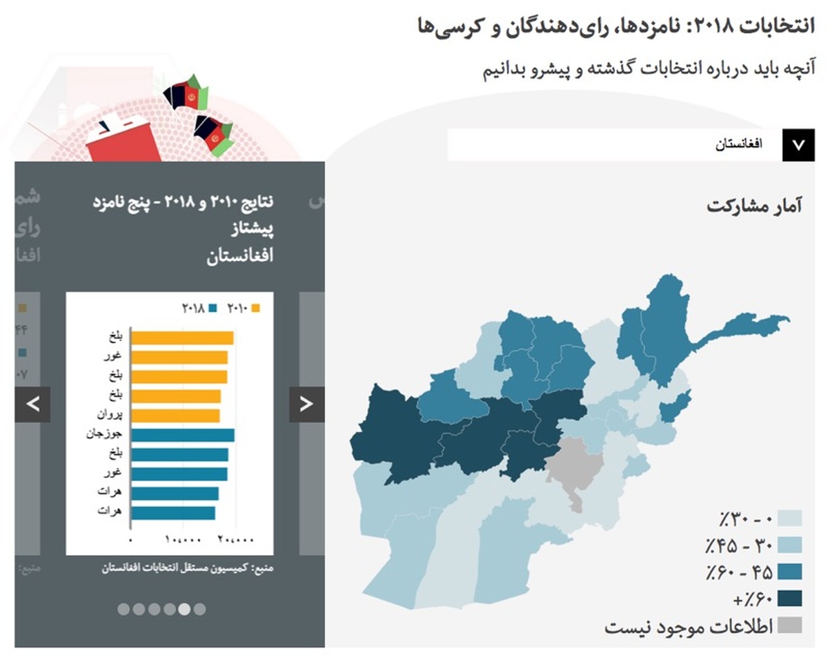
Despite maps being of limited use to the actual results (with no way to show red vs. blue), we used a regional map to show trends across the country. This provided some insights, and also showed how Kabul was an outlier compared to the rest of the country. It also gave some visual indication of the problems in the province of Ghazni, which has not voted yet because of instability—we created a static graphic showing the voter turnout district by district which showed the disparity between the northern and southern parts of the region.
At the start of October we started publishing graphics, initially on social media, which explained how seats were allocated per region (and how the women’s quota was split across the country). This graphic was a modification of a graphic I pitched to try and better represent the outcome in the Turkish legislative election which I created as a hex map.

Left: Candidates-to-seat ratio. Kabul was the most competitive, with 22 people competing for each post. Right: Seats per province. Ghazni is greyed out due to the cancellation of the election in that region.
Late October we published the first version of the data dashboard, in which we created simple graphics comparing historical turnout and voter registration in the area, voter registration by gender, votes cast for successful candidates against the voter turnout, candidate registration by gender (and tracked over time).

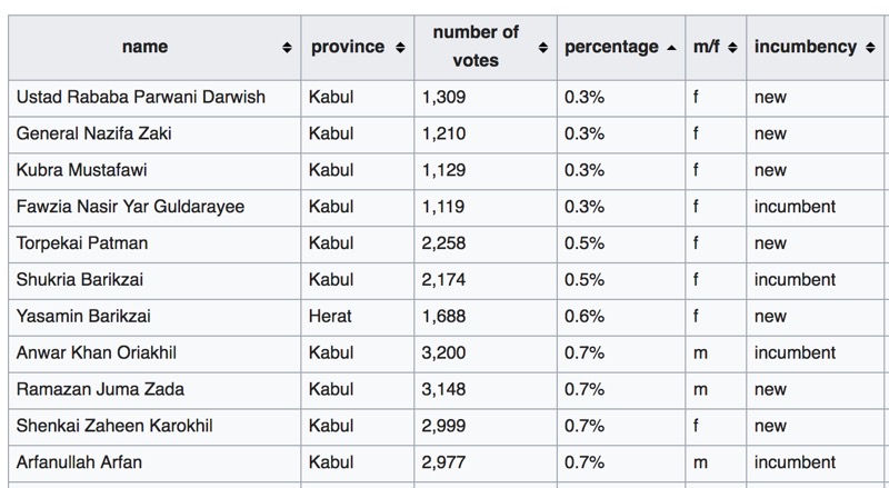
As the provisional results came in, we worked on an improvement to the dashboard and incorporated the results into this, removing some graphics and adding a table of the vote counts.
How We Did It
As it was a story with a long-scheduled deadline and data from prior elections, it made sense for our team to prepare in advance. We started data analysis a long time before approaching our language teams about working on the project, looking for interesting data stories and then reaching out for the context. The initial data set was tens of thousands of lines: one row for each candidate voted on in each ballot box, with a great number of empty rows. Over half the candidates appeared on at least 100 ballot locations, with some candidates in Kabul standing in over 400. It was daunting to know where to start.
The raw data didn’t indicate winners, so we created a script that calculated the winning candidates, and accounted for the women’s quota. We also had candidate gender stats manually calculated by our producer from BBC Pashto who went through all 2,500 candidates to create region-by-region numbers.
We aggregated the data using Python (plus pandas) and node.js to make more manageable JSON files for the dashboard. We were able to slot in new data as it arrived over a long period of time, and we could combine the partial 2018 dataset with the existing 2010 data on the fly.
Making it visual, finding trends
There were few reference points of graphic-led content for the Afghan elections, so we brought in research and learning from UK and US election coverage. Additionally, the Afghan Open Data project provided examples and data for how to map data in the country, and there were occasional graphics in the NDI reports.
Without the traditional party structure to fall back on, we needed to come up with imaginative ways of using the data, choosing to look for trends across the country including how the gender-segregated polling stations voted and how this data changed between 2010 and 2018.
This created talking points and ideas for social media cards. Some of the graphics and data points we created were for our own understanding of the vote, and others were used in the touchscreen broadcast on BBC Persian TV and on the BBC News website.
The front-end of the project was built using client-side d3.js to create the graphics and maps. More recently we have been working on moving the d3 requirement server side, as we are aware of the additional page weight the library adds—our first server-side election map was published in the Nigerian election. It also means that we can deliver a “core content” experience for users with slow internet or no JavaScript.
We made our project work in multiple formats: it was published in Persian and Pashto on BBC News, on TV, and as a social media card generator. We felt this would be the most productive way to reach our audience, and the intention was to build one project that would output in three ways.
Team and timeline
We started talking about this project very early in the year before the voting day was delayed again from July to October. Once we got the go-ahead, we were working on it from late August to the election day in October, and then sporadically working on it to add the provisional results as they came in until mid-January. The data and design were fixed from mid-September—the rest was just development time and testing.
I worked with a small team on this project:
Leoni Robertson, our data journalist did research work on population statistics as determining the eligible voting population in Afghanistan was complicated: She found that the registered voter count was a contentious figure because voter registration cards from several prior elections were eligible, meaning people could end up with multiple cards and hence be counted twice or more.
Alice Grenié transformed the rough data visualisations I made in d3.js and created the design for the web and TV..
Haroon Shafiqi and the BBC Pashto team provided data, context and created video content using the dashboard for BBC Pashto.
Whilst we were preparing the TV dashboard, we worked closely with the BBC Persian TV team including Mariam Aman and Zia Shahreyar, who presented with our project on a studio touchscreen on their live election day coverage.
Last Thoughts
This project took a complex election system and produced useful explanatory content that complemented the coverage that was being done by BBC Persian and Pashto leading up to and on the polling day. We delivered several graphics to explain the election. These graphics were used on the election dashboard with 2010 data and also repurposed into a scrollytelling format explaining the 2018 results. From these graphics, we created talking points for TV, created social media graphics, and offered an alternative visual format to the one offered by the election commission.
Covering elections is important as the data sometimes disappears—providing an alternative data source that will be preserved in the future is important. When I was researching the 2010 election, I found that BBC Persian was one of my sources.
Despite, or perhaps because of, the challenges, I found it fascinating to describe and map the Afghan electoral system. It’s been interesting to research a relatively new political system, seeing both its flaws and the solutions that make it viable. We’ve also learned about the ongoing peace process and where their legislative branch fits into the wider context of the country.
This type of work has been enabled by the World Service 2020 project and the Visual Journalism hubs stationed across the world. We have been able to focus on in-depth stories where there is less international interest and provide interactive projects when there wouldn’t have been capacity previously. We hope to build on this for the upcoming Afghan presidential election in September this year, and elections around the world in the coming years.
Credits
-
 Josh Rayman
Josh Rayman makes election graphics and other interactive features for BBC World Service. Occasional racing driver.


