Features:
If You Build It, They Will Come…But You Have To Remind Them
How KPCC Built Its Fire Tracker app

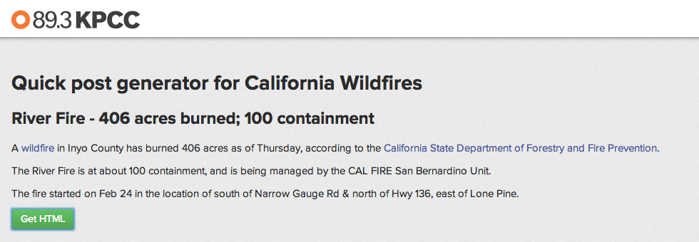
Fire Tracker launched last summer, but just last week another fire started burning near Glendora, California. (KPCC website)
The first photos I saw came from an email sent by Jose Jimenez, my cubical mate at KPCC. They showed a plume of gray smoke—clearly visible from downtown Los Angeles—drifting from a fire burning in the San Gabriel Mountains. From Jose’s vantage point, the smoke blotted out the sun and left a hazy orange glow in its place.
Still in bed, I closed the email and from my phone checked our news application dubbed Fire Tracker, which we built last summer to aggregate data about wildfires in California for this exact situation.
Nicknamed Colby Fire, the fire burning near Glendora, California wasn’t in the database yet so I knew right away that either the fire started sometime after 3 a.m. or that one of the three sources we watch for wildfire data had not yet cataloged it.
Still in bed, I logged into the application admin and clicked a button that reads “Add cal widlfire.” I entered a few basic data points and a photo from our image database and pressed submit. The fire, alive and burning for a few hours by this point, was now alive in Fire Tracker, and a question of workflow raised nine months earlier was again answered.
Ideas Are Easy
Since its launch in late July 2013, Fire Tracker has had more than half a million pageviews. At the height of August’s Rim Fire Fire Tracker and its embeddable “fire card” feature was a top referrer to our website, trailing only search, Facebook, and Twitter.
However, those anecdotes can’t relay how Fire Tracker became the answer to a workflow question posed by Eric Zassenhaus, our Assistant Managing Editor for Digital.
Fire officials said conditions were ripe for a record-setting year in 2013 and there were already a pair of nearby wildfires by spring. We recognized an opportunity.
So we set out to build a dashboard of information—the kind discussed at #NICAR13—that could take our repetitive story-based coverage of wildfires and add a couple new wrinkles. Put another way: Could we build a historical record of wildfire data, and offer a tool that would allow our web producers and reporters to shift their focus to the human element and big picture aspects of a wildfire?
We knew each wildfire shares similar and predictable elements that federal, state, and local agencies collect as a matter of course. We knew that some were data points that could be collected in a more efficient manner. And we knew that no level of “automation” could replace the need for human eyes to sort out what it important.
We also knew that building a tool to alert a given population to the danger a particular wildfire poses is best left to the authorities. So we aimed to provide a well-rounded picture of information about a given wildfire to our audience, both internal and external.
Making It Run: Part I
As the Springs Fire burned in Ventura County last May, several reporters and editors were asking for basic information about wildfires so far in 2013. As it turns out, California’s Department of Forestry and Fire Prevention—known as CalFire—offers a rich source of active fires as well as archival data dating back nearly 10 years.
As I went through so much of the information available on CalFire, the abundance of it all impressed me. But I found myself wanting an easy way to compare the number of wildfires year-over-year with a single glance. An itchy mouse finger right-clicked on a wildfire and found the information contained in a series of tables. Many linked over to an individual profile page.
Within a couple hours I had a Python scraper writing data into a Google Spreadsheet, and a few hours after that I had Tabletop.js feeding the data into a simple, searchable table.
Then I started to wonder if I couldn’t draw on the Mad Libs approach to news—using code to structure simple narrative paragraphs—championed by Matt Waite, Ben Welsh, and many others.
So I made that spreadsheet the basis for a “super-simple wildfire story generator” that used JavaScript to write a short paragraph from basic data points:
- The date and time a wildfire started.
- A description of the fire’s location and in which county.
- How many acres had burned
- The percentage of fire containment.
Taking this demos not memos approach made sure we were ready for a small-circle discussion that took some loose ideas and made Fire Tracker a reality.
Making It Real
We knew what Fire Tracker could be and what purpose it could serve. Once designer Jon White got involved with shaping the user interface and hierarchy of information, Fire Tracker found its voice and its style.
Jon, who started at KPCC in November, joined us from Seattle via webcam during a formal planning meeting. So we spoke of lending structure to unstructured data and how to store it, Jon was sketching right along and showing off ideas to the group via webcam.
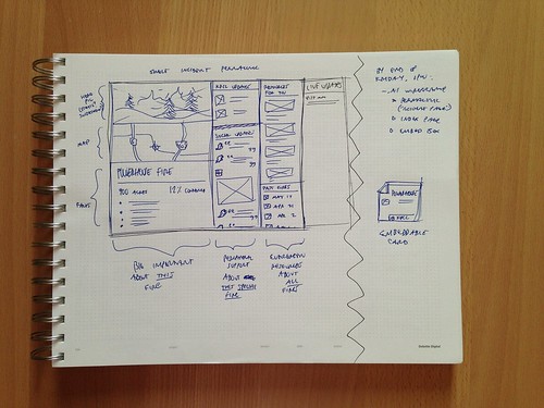
Initial site sketch from Jon White.
Those initial sketches became Illustrator-based wireframes which turned into Photoshop iterations fairly quickly. After refining the approach and garnering stakeholders’ approval, Jon set about crafting the markup to make the design a reality.
Above everything else, we wanted Fire Tracker to be a natural extension of KPCC’s visual identity. Two things complicated this goal and heavily affected Fire Tracker’s look and feel:
- Unlike a traditional news article with paragraphs of text forming a narrative structure, Fire Tracker’s content elements would be short and piecemeal.
- The content elements of a wildfire are made up of many individual components that don’t come arranged in obvious groups.
- The data available for any given fire varied. For some fires we’d have access to the number of homes damaged, resources deployed and evacuation notices. For some, we’d have nothing more than a start date, the number of acres burned and a containment figure.
The swing between the sparse data associated with a small fire and the amount associated with a large fire is pretty broad, and proved an interesting challenge for Jon from an information architecture standpoint, hence the light-on-dark color scheme.
Said Jon:
“When the negative space itself is a color, especially a dark one, you can get away with a communicative design that feels ‘full.’ I never want to add complexity-for-complexity’s sake to a layout, but I also don’t want users of a “smaller” detail page to feel like they’re getting a deprecated experience. This is where the subtle compartmentalization and labeling came in.”
KPCC has long used a specific orange to distinguish its brand, so that—plus white—would be Fire Tracker’s foreground/communicative color, with desaturated blues marking secondary material.
Typographically, Jon kept the Proxima Nova family—as is used throughout the KPCC website—but took advantage of its thinner and condensed faces, in order to mimic a “just the facts,” report-form aesthetic.
Making It Run: Part II
From the beginning, Fire Tracker felt like a news application that would live outside our primary content management system powered by Rails. Because of the progress I had already made with the Python scraper, and because of our server architecture, we were able to go with Django to power Fire Tracker.
By this time I had been seriously “learning” Django for just over a year, though I had been trying for nearly three years, which is to say often times the hardest thing for a beginner is just getting the development environment up and running. But with that hurdle well behind me, and a couple Django projects deployed on a personal server, I felt confident I could make this happen. But the fact that this would be the first of this magnitude and this potential audience was always in the back of my mind.
As I worked on the codebase locally, programmer and web developer Bryan Ricker set up the server infrastructure, and thanks to Passenger, we were able to serve the application from the same server that hosts our Ruby applications. Bryan’s work also gave me a first-hand glimpse of just how powerful the Python library Fabric can be.
The guts of the initial scraper I wrote is still there, though it’s gone through several versions by now to allow Fire Tracker to query CalFire and other sites three times a day for instances of new wildfires in the state. When the application finds a wildfire, it analyzes the available data, and decides whether it should create new database records, update existing records, or just leave things alone.
This process to ingest data was shaped by #NICAR12 Python workshops, the work others have shown and some glorious tips of the cap.
When it came to managing the data, some of the best foreshadowing of what obstacles might be waiting came in the form of a timely series of articles that appeared on Source over the summer.
Sane Data Updates by Adrian Holovaty, Django’s co-creator and founder of EveryBlock, became a manual of sorts.
Early on, my focus on was solely on the process of ingesting data and storing it in a way that it could be displayed to the user. But I was able to see that while overwriting the data each day with updated information wasn’t wrong, it did limit our ability to do more. Rectifying this remains a work in progress.
In other ways, I was able to take ideas from Sane Data Updates and add features to the data ingestion process. For instance I was able to add quickly a “locking” mechanism to keep a fire from being updated automatically when we’re in a breaking news situation.
Projects That Keep Giving Lessons
In many respects, we’re still learning what Fire Tracker wants to be when it grows up and how we can take it from a minimum viable product to a portal that adds value and context to the structured data we’ve been creating every day.
My role in Fire Tracker has taught me a lot. One thing that sticks out right now is the lesson that developing a news application is as much about the technical ability required as it is about seeing the final product from multiple points of view.
It’s a given that you have to look at your project as a journalist and an end user, among other perspectives. In the case of Fire Tracker, I’ve found there’s also a certain public relations role to play when it comes to the audiences it serves.
In terms of the external audience, the last week meant reminding news partners and other organizations that we make an embeddable “fire card” available that contains specfic data points about a fire.
So far the approach has been an overwhelming success, and was inspired directly by WYNC’s Data News Team’s efforts and the Fire Forecast map created by the NPR News Apps team.
The first time we added a “fire card” to a KPCC post was on Aug. 20 for the Rim Fire that was burning in Yosemite National Park. As the Rim Fire continued to grow, its embeddable card became one of the largest referrers of traffic to KPCC’s website. In all, between Aug. 20 and Sept. 20 the Rim Fire embed card was seen 355,164 times thanks to embeds from the Daily Guardian, NPR, KQED, Time, and the New York Times.
But there’s also that internal audience that can use a kind of sales pitch.
Admittedly, it took me too long to eat my own dog food when it came to Fire Tracker. Last week’s fire near Glendora allowed me to do that.
It gave me some alone time with the application. And by virtue of some time and distance apart, I found a new perspective on everything from our initial workflow discussion, to how I structured the admin interface, to the dual purpose we hope Fire Tracker can serve as an external source of information and internal tool for managing data about wildfires.
Credits
-
 Chris Keller
Chris Keller is the deputy director of data visualization for the Los Angeles Times. He joined The Times in 2017 and has held a variety of roles in various newsroom departments in his career. Most recently Keller was at KPPC, where his work on officer-involved shootings and California wildfires was recognized with multiple awards. Keller grew up near Madison, Wis., and studied communications and journalism at the University of Wisconsin-Stevens Point.


