Features:
Magic spreadsheets to help you investigate neighborhood inequities
Use these tools and techniques to bring “receipts from streets” with little-to-no code

(Image by Gabriel Hongsdusit)
![]() This article was copublished with The Markup, a nonprofit, investigative newsroom that challenges technology to serve the public good. Sign up for its newsletters here.
This article was copublished with The Markup, a nonprofit, investigative newsroom that challenges technology to serve the public good. Sign up for its newsletters here.
In The Markup’s first citizen science project, we built tools and an experimental blueprint that enabled anyone to test for internet disparities in the U.S. without having to write a line of code. The same underlying tools are useful for any story that compares a dataset with demographic information from the American Community Survey (ACS). I’ll walk through the decisions we made for our investigation at The Markup in the hopes that this will help you test for neighborhood-level disparities for your next story.
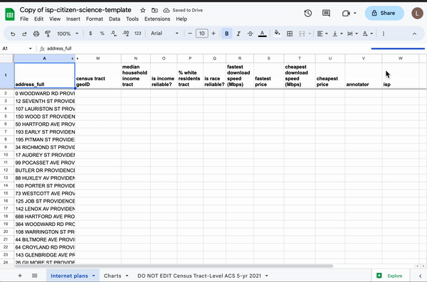
Using spreadsheet magic to pull American Community Survey data into a spreadsheet of random addresses.
The story we found
In October 2022, The Markup released an investigation into internet disparities in major cities across the United States. Aaron Sankin and I found that four of the nation’s largest internet service providers (ISPs) charged the same monthly price for drastically different internet speeds in different parts of town. In all but two of the cities we tested, we found that neighborhoods with lower incomes, a lower rate of White residents, or which had been historically redlined (or a combination of those factors) were disproportionately offered “slow” speeds—which we defined as speeds below what the Federal Communications Commission (FCC) considers broadband internet—for the same price as faster speeds offered to neighborhoods that were richer or had more White residents.
At least nine local news outlets used our data to report on the digital divide in their cities, and the FCC asked for public comment on our findings as part of its congressionally-mandated effort to root out the causes of digital discrimination.
We worked on that investigation for eight months, and I spent a big chunk of it developing a method to collect representative samples of street addresses from 45 cities, merge socioeconomic data to the samples, and finally scrape internet service offers from four ISPs for almost one million individual addresses.
Shortly after we published, journalists, civil servants, and grassroots organizations asked us if we had collected data in the cities they lived in. Unfortunately, we limited our data collection to a 10% random sample of the largest city in each state served by at least one of the ISPs in our investigation. Moreover, our small team lacked the resources to maintain long-running data pipelines, let alone build new web scrapers for providers we hadn’t initially investigated.
Our investigation required time and technical muscle, which Aaron and I thought seemed like a big barrier to entry for others. So we invested a few months into building tools and straightforward steps to follow—so that anyone with internet and a computer could test for internet disparities in their neck of the woods. It’s a technique that can also help you report about other inequities in the communities you cover, from transit access to proximity to healthy food and health care.
How you can use this technique for your own project
There were two major technical hurdles we needed to address to make this project accessible to non-coders:
- Sampling street addresses anywhere in the U.S.
- Matching socioeconomic data to those addresses
To solve our first roadblock, we partnered with Stanford University’s Big Local News and Joe Nudell to build the United States Place Sampler tool to easily sample random street addresses from any Census “place” in the U.S.
To build the tool, we indexed more than 200 million addresses from the open-source project OpenAddresses mapping Federal Information Processing Series (FIPS) codes to addresses down to the Census-block group level, which made querying our tool more efficient across vast geographies.
With a search and a few clicks, you can build a sample of addresses from any city, county, state, or zip code, then export those addresses to a CSV file. (You can read more about why we built the tool, and try it out at usps.biglocalnews.org.)
Next, we needed to find a way to join addresseses with socioeconomic data. To do that, I built a custom Google Sheets template that allows users to import that CSV and automatically merge Census tract-level demographics using a simple formula. Although our initial investigation used block groups, we opted for Census tracts for this story recipe because they provide more reliable population estimates in less dense regions—and, more importantly, there are about 240,000 block groups1 in the U.S. but only about 85,000 tracts, which, with the formulas we wanted to run against them, was just barely manageable in Google Sheets.
We tried several approaches to merging this data. We tried scraping Census Reporter in each spreadsheet cell by using the Census tract code to format a URL and feeding that into the IMPORTXML function in Google Sheets. This worked for a trial of about 10 addresses but immediately crashed the spreadsheet when we tested more than a few dozen addresses. Although that didn’t work, we did create a column that formatted the URL so that users could quickly reference Census Reporter:
=IF(ISBLANK(A2),"",HYPERLINK(CONCATENATE("https://censusreporter.org/profiles/14000US",TEXT(I2, "00"),TEXT(J2,"000"),TEXT(K2, "000000")), CONCATENATE("14000US",TEXT(I2, "00"),TEXT(J2,"000"),TEXT(K2, "000000"))))
Note: In our template, the I, J, and K columns are numerical codes representing the state, county, and Census tract of an address. We pad each code with the appropriate number of leading zeros to properly format the FIPS code of each Census tract.
We also tried merging the data based on Census tract codes using the classic VLOOKUP function that referenced a separate tab in the spreadsheet with socioeconomic data organized by Census tracts. However, this proved to be too inefficient given the large number of tracts in the U.S.
Luckily, my wife is an Excel wizard, and after laughing in my face over lunch, she showed me the performant magic of chaining INDEX and MATCH. By doing so, we were able to easily search the ACS tab (of more than 85,000 rows) to merge median household income and the percentage of non-Hispanic White residents for any Census tract:
=IF(ISBLANK(A3),"",INDEX('DO NOT EDIT Census Tract-Level ACS 5-yr 2021'!A:L, MATCH(M3, 'DO NOT EDIT Census Tract-Level ACS 5-yr 2021'!A:A,0), 3))
We received our Census data as a well-formatted spreadsheet from Joe Germuska at the Northwestern University Knight Lab. He even calculated a reliability metric to warn users if the range of error was too high for a given Census tract.
Where to look for your story
We combined these steps in The Markup’s first “Build Your Own Dataset” guide, which is being used this summer by the Chicago community youth group Fresh Supply. Watch this video of Fresh Supply students collecting internet plans from AT&T:
We also have a separate guide and existing datasets for local reporters in cities where we’ve already collected data.
Beyond the original use cases, the tools we built have utility. You can use U.S. Place Sampler to collect random samples to test for address-level disparities for other topics. This could include utilities outages, access to grocery stores and medical centers, or the cost of rides across town using rideshare applications.
Note that these addresses from OpenAddresses mostly come from Enhanced 911 data used to direct dispatchers during emergencies. Some of the addresses may be outdated or incomplete. Even so, this is the most complete dataset of U.S. addresses to our knowledge.
You could even use the same spreadsheet template to merge socioeconomic data. You can collect other survey questions from the ACS and merge these new fields based on Census tract. The formula-chaining trick mentioned earlier will come in handy if your project requires manual data entry.
In our initial investigation, we also looked at historical redlining grades using digitized maps from the phenomenal Mapping Inequality project. If you’re a coder, we have a code snippet on our GitHub that you can use to determine if an address’s geographic coordinates fall within a graded neighborhood.
If you teach students in data journalism, statistics, or computational social science, the Build Your Own Dataset guide, or any of the tools we mentioned, would make great class projects. In fact, all of this started with an idea to create a guide that any high school science class could use.
If you use this story recipe, please let us know — we’d love to promote your work! You can find more step-by-step pieces like this one here on Source, and if you have an idea for a new story recipe, we’d love to hear about it. Drop us a line at source@opennews.org.
Additional credits: Engagement: Maria Puertas. Copy Editing/Production: Sabrina Toppa. Editing: Soo Oh, Sisi Wei, Ryan Pitts.
Credits
-
 Leon Yin
Leon Yin is a data journalist at Bloomberg. Previously he was an investigative data journalist at The Markup. He builds bespoke datasets and uses interdisciplinary methods to report on technology. He is also the main contributor of Inspect Element: a practitioner’s guide to auditing algorithms and hypothesis-driven investigations. In 2022, he received a Gerald Loeb Award for the series “Amazon’s Advantage.” (Photo by Lauren Nakao Winn for The Markup)


