Features:
Mother Jones’ Voter Suppression Map
Tasneem Raja explains how (and why) her team made the map

The Mother Jones voter suppression map after the elections
The project: Verified Voter Suppression Map
Over the past year, Mother Jones has tracked state-by-state efforts to block minority votes with restrictive new laws. As Election Day neared, everyone knew snafus and shenanigans would pop up on the ground as well. From long lines to confusing-on-purpose mailers to missing polling places, we wanted to collect local complaints about voter suppression and try and make sense of what was fact, what was fiction, and who was fixing the problems.
We decided to pool reports of voter suppression on Election Day, verify notable problems (more on this later), and plot credible reports on a national map. For more context, other layers would show which states’ legislatures had recently passed restrictive laws, along with with county-level vote results from the 2008 presidential election.
Tools

Jaeah Lee, interactive producer, working on the map
Though the Mother Jones nerd desk tries to avoid turning every news app into a map, mapping was the right choice here for two key reasons: a map would offer both local and nationally aggregated views at once, and allow us to layer on geographically relevant context.
Not knowing exactly how Election Day would play out, we faced a highly variable set of needs. We might end up plotting just a dozen reports, or several hundred. We could encounter compelling video and audio captures and want to display them on the map, or not. And we hoped to provide a simple public tipline for reporting problems directly to Mother Jones, and capture that information in an easily mappable format.
Over the last year we’ve tried a bunch of mapping approaches, from Google Fusion to BatchGeo to custom SVG mapping. Each has its pros and cons, but none felt right here. In previous projects, Google Fusion couldn’t handle county-level data without getting draggy. We’ve had good experiences with joining data to SVG maps via Google Spreadsheets and Tabletop.js, but we didn’t have time, or the design bandwidth, to come up with an elegant map interface for a project of this scope. Inspired by fast, beautiful, data-rich maps produced in Tilemill by NPR, we decided to give Tilemill and MapBox a try.
We surely broke any number of sensible project management rules in experimenting with a platform we’d never tried on a high-stakes, tight deadline project, but fortunately, MapBox’s Eric Gunderson was immensely generous with troubleshooting help and advice along the way, and their support forum is alive and well (we put it to good use).
A few words about Tilemill and MapBox for the uninitiated. Tilemill is a free desktop app for making nice maps. It takes your geospatial data and spits out map tiles you can use in all sorts of ways. It’s got a friendly, sensible interface and even lets you apply CSS-like styling to your map display. There’s a number of useful things it doesn’t do, like data editing, but its reference docs include helpful tutorials on using other free, open programs to prep your data for Tilemill. MapBox hosts projects you produced in Tilemill, among other things, and provides an API for doing interesting things to your maps. Right away, we liked that it’s fast, its API does a good job of stitching together different map layers, and built-in UI elements like legends and tooltips are attractive right out of the box.
MapBox hosting isn’t cheap, so if you can throw some dev time at hosting Tilemill maps on your own, it’s probably a good idea to consider. Then again, we found the support and customer service to be excellent, so if you’re just getting started with next-level maps, like we are, they might just help you power up faster.
Inputs
Our newsroom is well-trained in storing and manipulating data in Google Spreadsheets, and we were psyched to find a MapBox blog post on using the Google Spreadsheet Data API and the MapBox JavaScript API to plot incoming reports on a custom MapBox map. Essentially, you provide your spreadsheet’s unique key and the MapBox.js API converts your sheet’s JSON feed into mappable GeoJSON, plots it on a custom MapBox Streets base map, and provides a way to customize the marker and tooltip displays.
We set up a Google Form as a public-facing tipline to pool crowdsourced reports on Election Day. Given the nature of our project, we decided against connecting the form’s spreadsheet directly to our live visualization. Instead, we assigned an editor to monitor the tipline and surface notable reports to the reporting desk, who’d check it out and move verified reports onto a second spreadsheet, which synced up automatically with our live map.
Between our DC bureau and editorial offices in San Francisco, we had about eight reporters feeding information to our map. Research interns scoured local news sites, blogs, and Twitter feeds on Election Day to corroborate information coming through our tip line, contacting tipsters directly in some cases. The reporting desk also watched news reports from all the usual outlets to add more voter-suppression reports directly to the map, and update an explainer-style article below the map as well.
We also embedded a reporter at the Berkeley office of a group called Video the Vote. Video the Vote was also collecting citizen complaints about voter suppression on Election Day at its website, and sending its own videographers to swing-state hotspots. Another reporter was in constant contact with organizers of a national network of voting rights groups known as the Election Protection Coalition, which was compiling yet another pool of Election Day voting complaints.
Ours wasn’t the only national database of voter suppression hotspots this election, but as far as we could tell, we were the only team aggressively verifying all information that made it onto our display.
Pulling It All Together
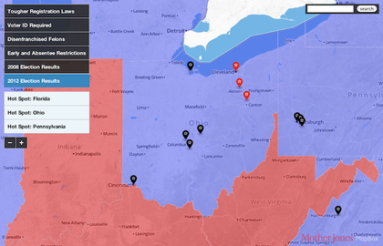
The zoomed-in Ohio hotspot
By the end of the day, our map would show some 50 verified reports of voter suppression and poll problems, including links to corroborating news articles and additional photo or video documentation where available, all served dynamically from a Google Spreadsheet. The map also featured six static layers produced in Tilemill, showing state-by-state voting restrictions and vote tallies from 2008.
We also made a couple of significant on-the-fly additions halfway through Election Day. First, we added easing controls that “zoom” the user to geographic hotspots that had popped up in three swing states: Florida, Ohio, and Pennsylvania. As it turned out, most of our notable reports were centering on these spots, and we wanted to tweak the map to reflect that. We also decided to layer on electoral results as states got called that evening. You might call this feature-creep, or you might call it news-responsive design. We were just proud that the workflow we’d built prior to Election Day actually worked, leaving us free to add on a couple of simple but effective tweaks on the big day.
Down the Road
A number of things we’d improve next time (beyond some obviously glitchy glitches):
- Less is more: we probably piled on too many layers, and needed to edit down to the most meaningful ways of providing additional context
- It’d be nice if the map provided some quick takeaways, such as the total number of verified reports
- Tooltips that don’t cover up half of the map display (tooltips kind of suck in general, and we’d love to avoid them altogether next time if at all possible)
- Density clustering: At higher zoom levels, it’d be really nice if marker clustering kicked in
Thanks for reading, and feedback is always most welcome!
Credits
-
Tasneem Raja
Executive Editor of @thetylerloop, a nonprofit journalism startup in East Texas. Contributor @newyorker @theatlantic, former senior editor @NPR @motherjones.


