Features:
If Your Reporters Aren’t Making Their Own Charts You’re Wasting Everyone’s Time
Faster, Better Chartmaking with the Right Tools and a Little Bit of Training

“Someone could screw it up” is a terrible excuse not to cede control. We hear it often as a defense of why a newsroom doesn’t let its reporters make their own charts.
Sure, it sounds reasonable enough. Accuracy is paramount in our industry. Anything that could jeopardize that accuracy should rightly be scrutinized.
But when you consider the deluge of other types of content that come out of a newsroom getting swiftly edited to the highest standard, it becomes easy to see how the possibility of “screwing it up” is a terrible excuse. In reality, reporters could screw everything up without the proper training or oversight. A story could be accidently published early because of a typo, a quote could be misinterpreted or a name misspelled.
The volume of corrections we see—however minor—are proof that reporters and editors make mistakes even in the medium most of them know best: words. Yet we still let reporters write words, even though they’ve been shown to screw them up from time to time. If we let a reporter report numerical facts and figures in words, why shouldn’t we let them report them as charts?
It is time to think about and produce graphics in the same way that we do paragraphs: crafted by a reporter and vetted by an editor for both substance and style.
How It Works

A Wall Street Journal chart made by a real live reporter
Reporters are likely to find that visualizing data is a useful part of the reporting process. Readers, meanwhile, love to see those quick sketches. At The Wall Street Journal, fast, reporter-generated posts like, “The June Jobs Report in 10 Charts” are a hit.
Having less bureaucracy helps speed publication, too. At Quartz, all of the charts in coverage of financial markets are reporter-generated. The team isn’t relying on anyone else to get its stories published.
Economically speaking, reporters making charts saves organizations money. The alternative, of course, is designating a person with specialized skills—who likely gets paid at a higher rate—to make boilerplate graphics as a service to those who can’t, as many times a day as they can muster.
How to Make It Happen
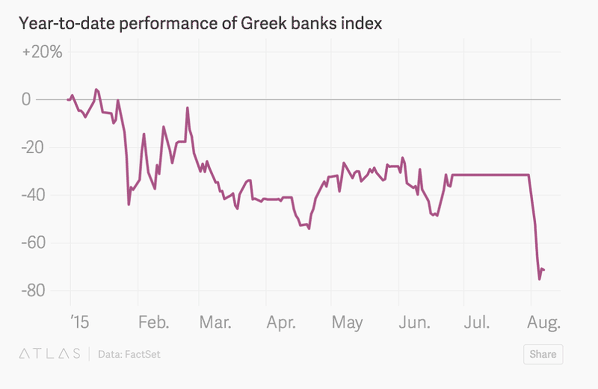
Quartz reporters use Chartbuilder to make their own charts, like this one
Given the right tool set up with the proper constraints and a little bit of training, a reporter can make a chart that matches all of the finer points of an organization’s visual style with little effort. Of course, this may mean that editors will need to become familiar with some aspects of the visual style guide, just as they are with the AP style guide.
This is not a daunting task—assuming that your visual style guide includes visualization. Design aspects such as color, size, typography, and layout can be made immutable, given the right tool, allowing an editor to all but ignore them. Editing a simple chart should not take any effort to review its design, just as editing a simple article should not take any effort to review its layout. At this level, content and design are separate concerns.
Titles, labels, units, and annotations must be matched to style—but those are just, you know, words. Training editors and reporters to exercise good judgement in selecting a type of visualization for their data is no more complex a task than training them to exercise any other type of good news judgement. We trust them not to screw that up.
When reporters and editors can start becoming self-sufficient with their charts, the poor soul who was once the newsroom chart monkey will have more time to work on more complex projects, better suited to her specialized skills. If need be, she can act in an advisory role to the newly minted chartist-reporters, guiding them to make better and better charts and at the same time reducing their own dependence on her.
Tools to allow reporters to make charts with minimal training have been built at many organizations, from the largest papers such as the New York Times, the Wall Street Journal, and the Washington Post to smaller organizations like Quartz and KPCC. (Though, access to them is not always universal.)
There are publicly available managed options that will customize your charts and provide access to a chart making tools for a fee such as Datawrapper and Plotly. There are also free and open source tools—such as Quartz’s Chartbuilder—which can be implemented by an in-house development team. All of these tools are being used by news organizations of all kinds and sizes.
What’s your excuse?
Organizations
Credits
-
Becky Bowers
Deputy global economics editor for @WSJ. Superfan of @WSJecon. Previously of the @TB_Times. Try to keep up with @jeremybowers, #TheSqueezle and #TheGiblette.
-
 David Yanofsky
David is a reporter for Quartz. He has exposed law breakers by tracking Instagram posts, expanded the capability of his fellow reporters by developing newsroom tools, and is currently suing the Department of Commerce to gain access to some of its data.


