Features:
The NYT’s Amanda Cox on Winning the Internet
Her opening keynote at OpenVis Conf

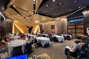
The NYT’s Amanda Cox during the Q&A for her opening keynote
The inaugural OpenVis Conf closed a few minutes ago, ending two packed days of single-track talks on data handling, visualization design, and a lot of code. The conference organizers promised an event focused on “the practice of visualizing data on the web”—and it delivered, across a broad range of talks that included spotlights on physical model-building and internal dashboard and IT visualizations as well as the more expected project walkthroughs and discussions of which technologies and methods to use when.
On Thursday morning, the conference opened with an hour-long talk from Amanda Cox, of the New York Times Graphics desk. The very first thing in her talk was a short video running through a series of all the things that make up the Graphics desk’s output. Unsurprisingly, it turns out that the Graphics desk creates…a lot of great things. But what makes some of them better than others? And what kinds of better should we pay attention to, anyway? Those are the questions Cox’s keynote set out to address—drawing on intelligent guessing, data visualization, and emotional storytelling along the way.
Spotting Winners

Two drought graphics—the internet loved the first and comparatively ignored the second
Cox graphed the most popular NYT graphics based on social media mentions—which she compared to batting averages in baseball: a horrible measure of holistic quality, but not entirely uncorrelated with some kinds of quality. In looking at the best-performing graphics, she guessed that four factors would mark out graphics that win the internet:
- Surprise (ex. the DealBook graphic on Facebook’s IPO)
- A sense of comprehensiveness, even if it’s illusory
- Goofy comparisons
- A clear takeaway/message
But Cox didn’t stop with an impressionistic assessment of success factors. Instead, she assessed and manually coded the characteristics of the top 400 graphics using the following categories:
names(links)[-c(1:6)]
 [1] "surprise.reveal"
 [2] "explicitly.emotional...atmospheric"
 [3] "goofy.comparison"
 [4] "big.breaking.news.big.breaking.news.adjacent"
 [5] "comprehensive...way.more.detail.than.you.actually.need"
 [6] "useful"
 [7] "mostly.things.you.already.know"
 [8] "difficult.topic"
 [9] "data.really.hard"
[10] "design.really.hard"
[11] "development.really.hard"
[12] "mostly.a.bar.chart"
[13] "takeaway"
[14] "vectory"
[15] "requires.participation"
[16] "slideshow.video.like"
[17] "moves..non.navigation"
… and then graphed the results. Here’s what she found—some of which she’d predicted correctly and some of which she hadn’t:

Cox’s results
Cox pegged her success line at 400 on the scale, and found that the top six visualization qualities on social media were:
- “development.really.hard”
- “big.breaking.news.big.breaking.news.adjacent”
- “useful”
- “explicitly.emotional…atmospheric”
- “surprise.reveal”
- “comprehensive”
Unsurprisingly “difficult” topics—mostly related to war, violence, climate change, and other highly complex topics—performed least well, but “takeaway” pieces with an obvious message also performed poorly as a class. In contrast, visualizations that requires extensive technical resources tended to perform particularly well, as did features Cox classed as emotional and useful—and, of course, those closely tied to breaking news.
In the wrap-up of her analysis, Cox considered the problem of indicating importance to the paper’s readership across platforms: “How do you signal that something is important? You do that by using the resource that is scarce.” In print, the NYT can use scarcity to indicate importance by giving an important graphic a desirable spot on a “good page.” On the web, the equivalent scarce resource isn’t placement, but the allocation of valuable internal tech/development hours.
The Right Wow
Early in the keynote, Cox played an audio story from Cowbird’s Jonathan Harris to set up the problem of evoking the right response:
The story is short and you should really just listen to it. It’s about the two kinds of “wow” an artist can evoke in an audience: the handwavy, spectacle “wow” vs. the “wow” of connection and intimacy. Describing her realization that she wasn’t sure how to evoke the right “wow” Cox dropped an Ed Ruscha quotation—“Good art should elicit a response of 'Huh? Wow!' as opposed to “Wow! Huh?’” (And a reference from Zadie Smith’s profile of Jay-Z, for extra goodness.)
Later, returning to the idea of the responses newsroom designers and developers want to inspire in their audiences, Cox focused on her realization as a non-designer that design wasn’t ultimately about typography and whitespace, but about empathy—about creating visualizations that readers can both understand and engage with emotionally.
Process at the Graphics Desk
Cox noted that the Graphics desk doesn’t do much templating or produce many visualizations that are intended for reuse—in part because “the best journalism isn’t a mad lib.” Templates can be safety nets, she explained, but the best stories emerge as something crafted—something that takes advantage of the unique characteristics of the data in question. The team does use a small number of frameworks, including one Matthew Bloch made for maps, but at a relatively abstract level.
Transparent versioning, on the other hand, Cox called out as an important park of the Graphics desk’s process—even when it’s not possible to huddle around a desk. Shan Carter and Mike Bostock, who both work out of SF, post their versions to the desk’s GitHub, so their colleagues are able to see the actual visual evolution of their ideas—this is something you’ll want to watch the video of the talk for, once it’s up, because the visual evolution of their work is mesmerizing.
Cox discussed the sampling used in the desk’s “Counties Blue and Red, Moving Right and Left” wind map, in which big counties counted for more than little counties, visually. In print, it might have seemed odd, she explained, to emphasize only certain counties—but on the web, randomness and sampling can be used as a way of respecting and opening up the data. Instead of “showing it all,” randomness allows us to “show it all at the same time” (with slightly different values of “all”).
What We’re Missing

The sketch that became the viz
Cox compared the Graphics desk’s initial sketch, which was made in R, with the final Bostock and Carter map of how US state political positions have shifted since 1952, and notes that the disparities arising as the team worked through versions and moved between tools raise an important question: “What are you skipping or just not seeing because it doesn’t come for free to you in the tools that you’re using?”
At the talk’s conclusion, Cox left the audience with a challenge she’s set for herself: “I believe strongly that all of us are missing something because we think about it differently. My goal is to find things I’m missing.”
Credits
-
 Erin Kissane
Editor, Source, 2012-2018.


