Features:
Same Diff: Trump’s Budget Proposal
Stand-alones, inliners, and big-ass numbers

The White House budget proposal was released on March 16, and while the document itself was “skinnier” than in years past, news organizations’ efforts in parsing it were as robust as ever.
Let’s take a look at how they found their way into and visually reported out the 60-page document.
The Stand-Aloners
Eight major publications published stand-alone projects: the New York Times (times two), Bloomberg, the Los Angeles Times, the Washington Post, CNN, NBC, Reuters, and the AP.
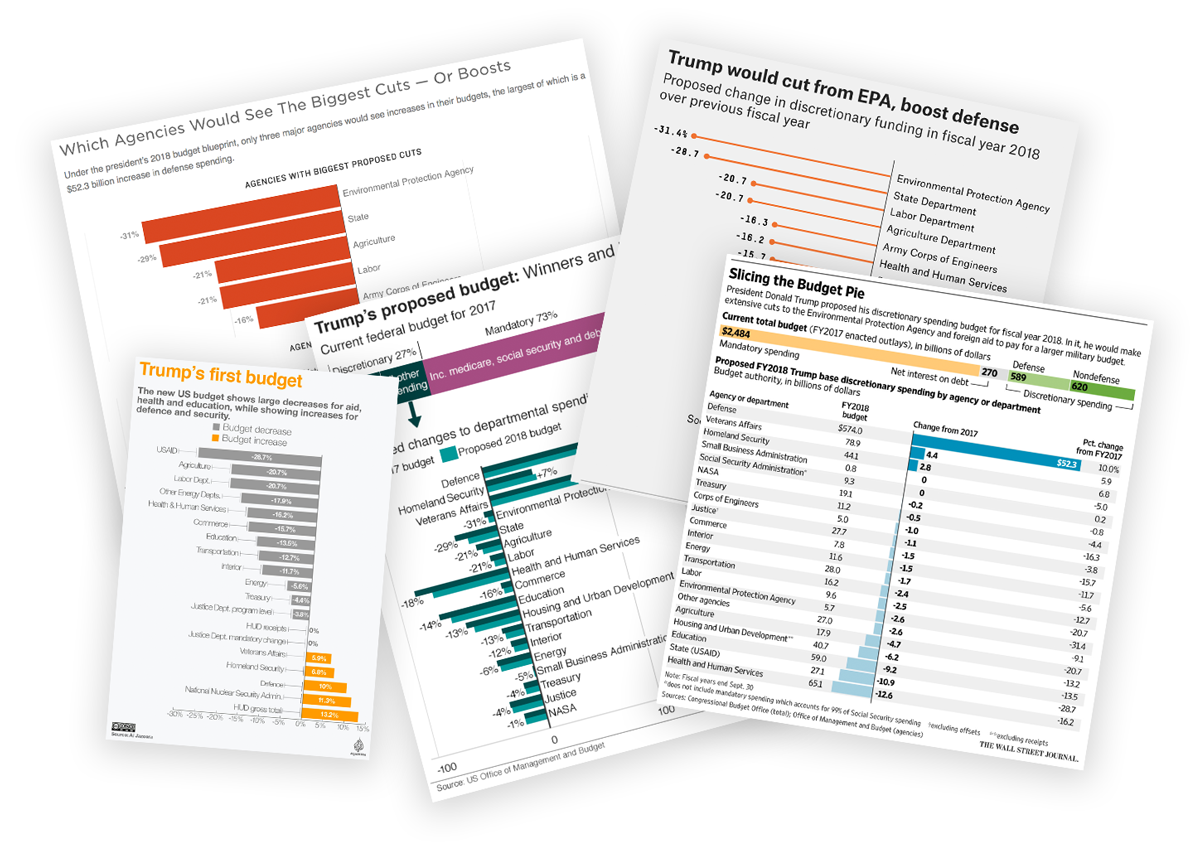
The Washington Post’s Budget Central

The most graphically dense was the Post’s.
It led with a breakdown of the whole proposal overall, moved into an overview showing all the departmental changes at once, then got into the real meat of the thing. For each department, it provided a breakdown of the proposed annual change through both a chart and big-ass numbers (BANs), along with a 40-year line chart of funding levels, text analysis, and a list of specific changes. To top it off, each section had links to other Post stories on the budget’s implications for that department or agency. All of that, combined, positioned the item to serve as a repository and hub for budget-related curiosity.
The Los Angeles Times’ Skim-Friendly Hub

The LA Times took a similar, but less involved, tack as the Post.
The top is very similar in both content and visual form, using the same types of charts that the Post did. Each department got its own section, too, with a graphic showing the proposed change and a description of the proposal. There are big numbers, but they don’t feel like BANs, no links to other stories, and no historical chart. However the section headers here aren’t used as labels, they’re used as section headlines, a nice feature to perhaps catch a skimmer’s attention.
Bloomberg’s Scattered Plot
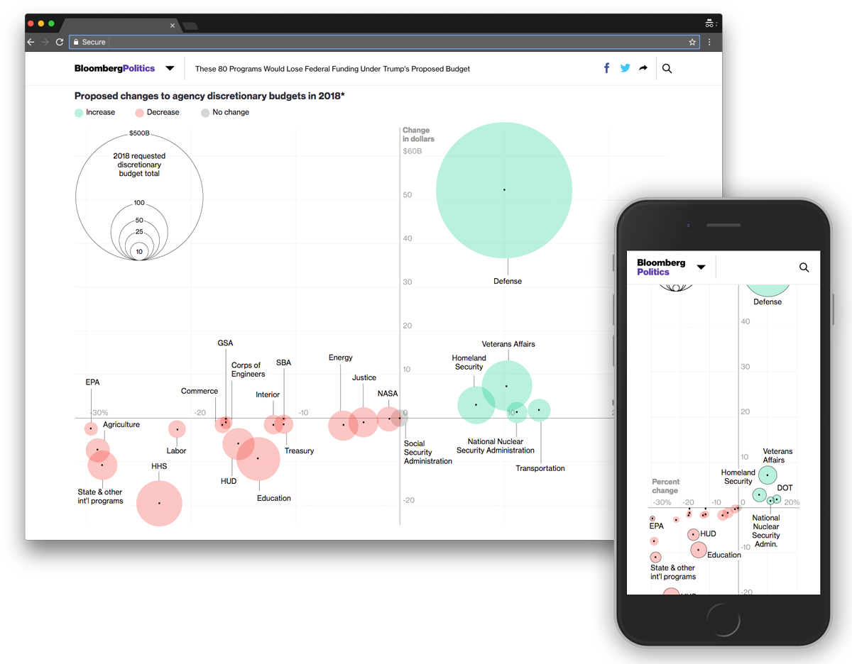
Bloomberg took a different direction. Opening with visual complexity rather than graphic simplicity, it put a scatter plot encoded with three factors at the top. The chart has a data point for each department. After that it gets really text heavy, putting all of the eliminated independent agencies and programs into single ruled boxes with low-contrast descriptive copy. In classic Bloomberg style, those boxes are seemingly intentionally designed to be hard to read. (However, the experience is much better on mobile where all of the frames align into a single column). The Bloomberg Visual Data Twitter account leveraged those blurbs for a nice little tweet storm to promote each of those callouts.
The New York Times, Two Ways
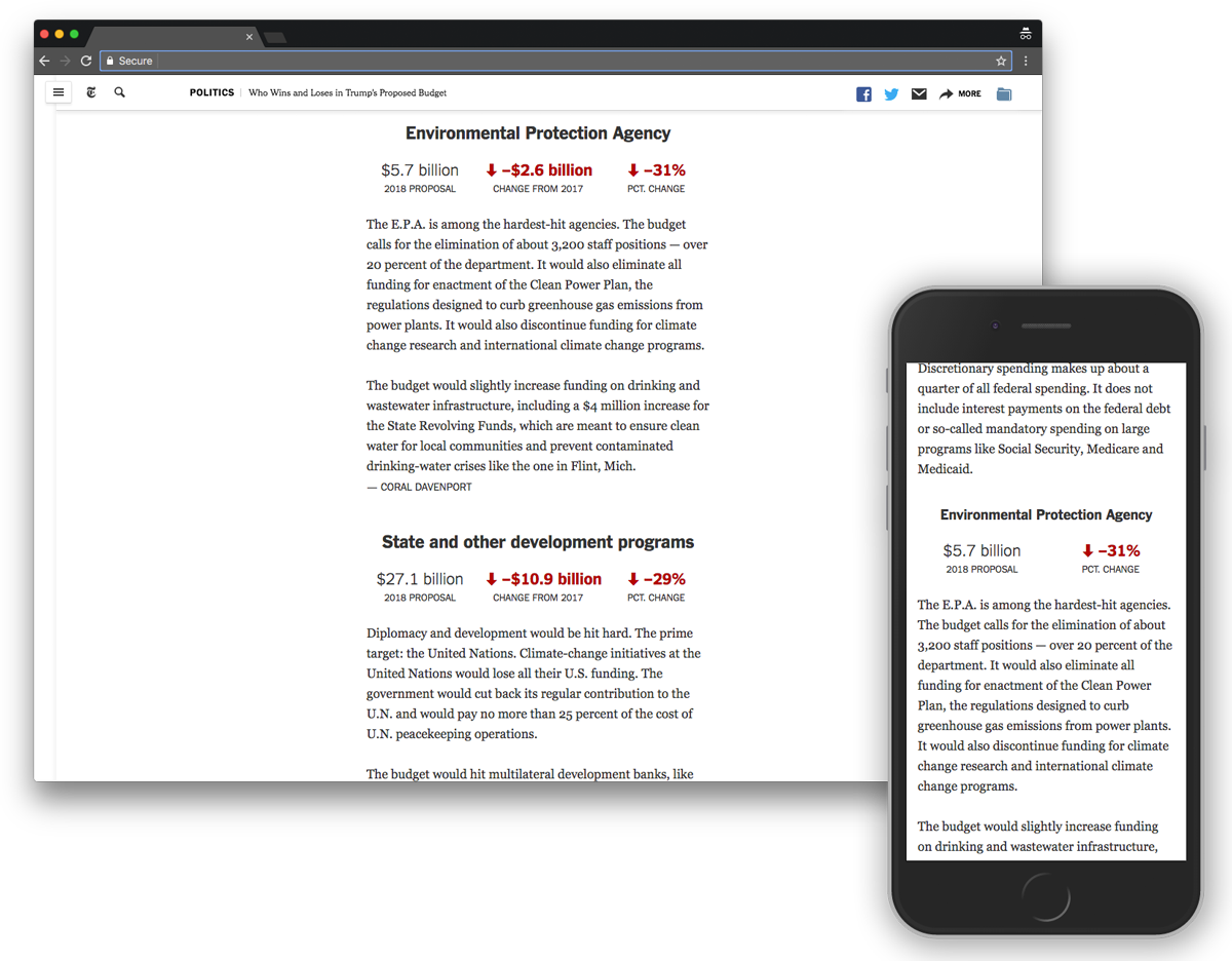
Surprisingly, the New York Times’s visual coverage was sparse and disconnected. It published two pieces. One led with a table—a nice-looking but boring listing of the proposals by department, and followed it up with blurbs about changes on a department-by-department basis. Each blurb is accompanied by some BANs. And in a nice collaboration, the copy in each section bylined various beat reporters.
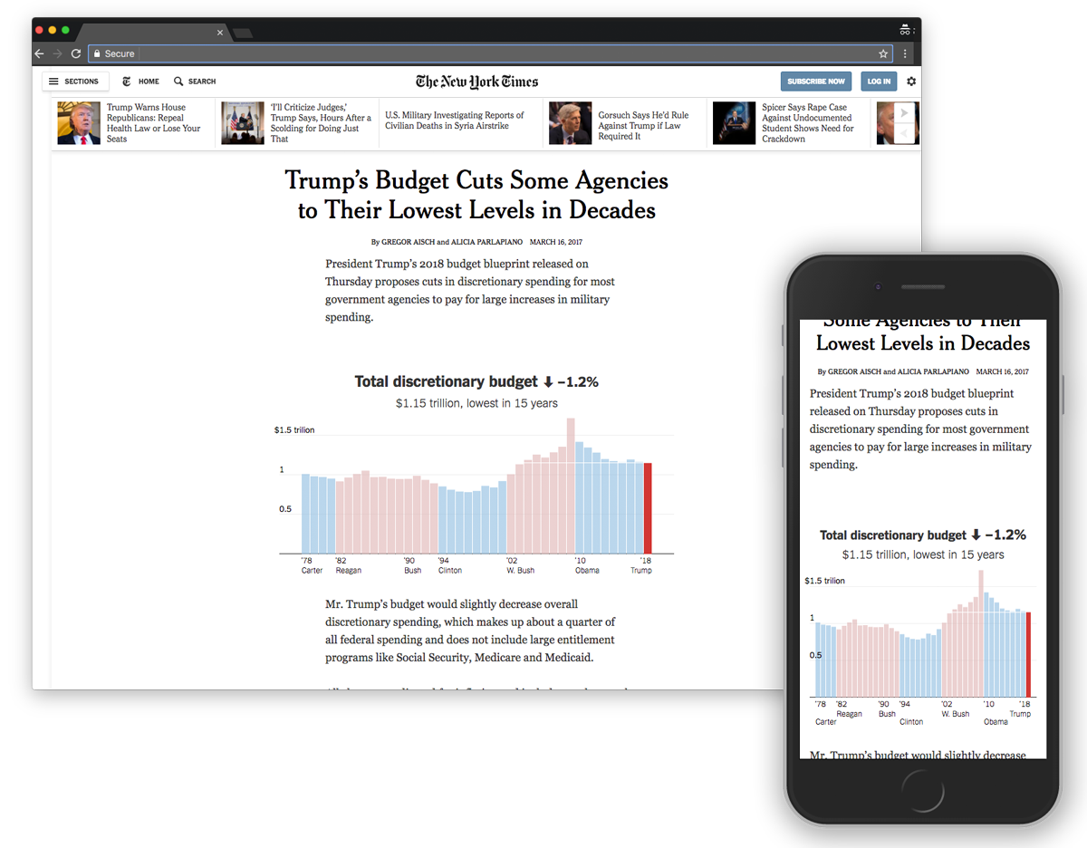
The other has charts showing the last 40 years of various department budgets and the level proposed by the White House for 2018. There are BANs but fewer descriptions—most of the charts have no analysis attached.
CNN’s BANs

CNN went all in on the BANs. After 100 words of setup (following an auto-playing video) CNN’s piece provides three figures for each of the “major cuts” in the budget proposal. Two of them are always the raw change in budget and percent change in budget. The third is some sort of other notable metric, whether it be the number of programs reduced, staff lost, or other metric. Then there is a group of department seals. Each seal is paired with a BAN, showing the size of the budget cut that the department is facing. The same information is then enumerated below as text, which is good because I’m not especially deft at identifying government agencies via their seals. (I assume most readers aren’t either.) There are then more seals and logos related to programs facing elimination, without BANs, but also followed by text explaining them.
Reuters’ Simple Charts
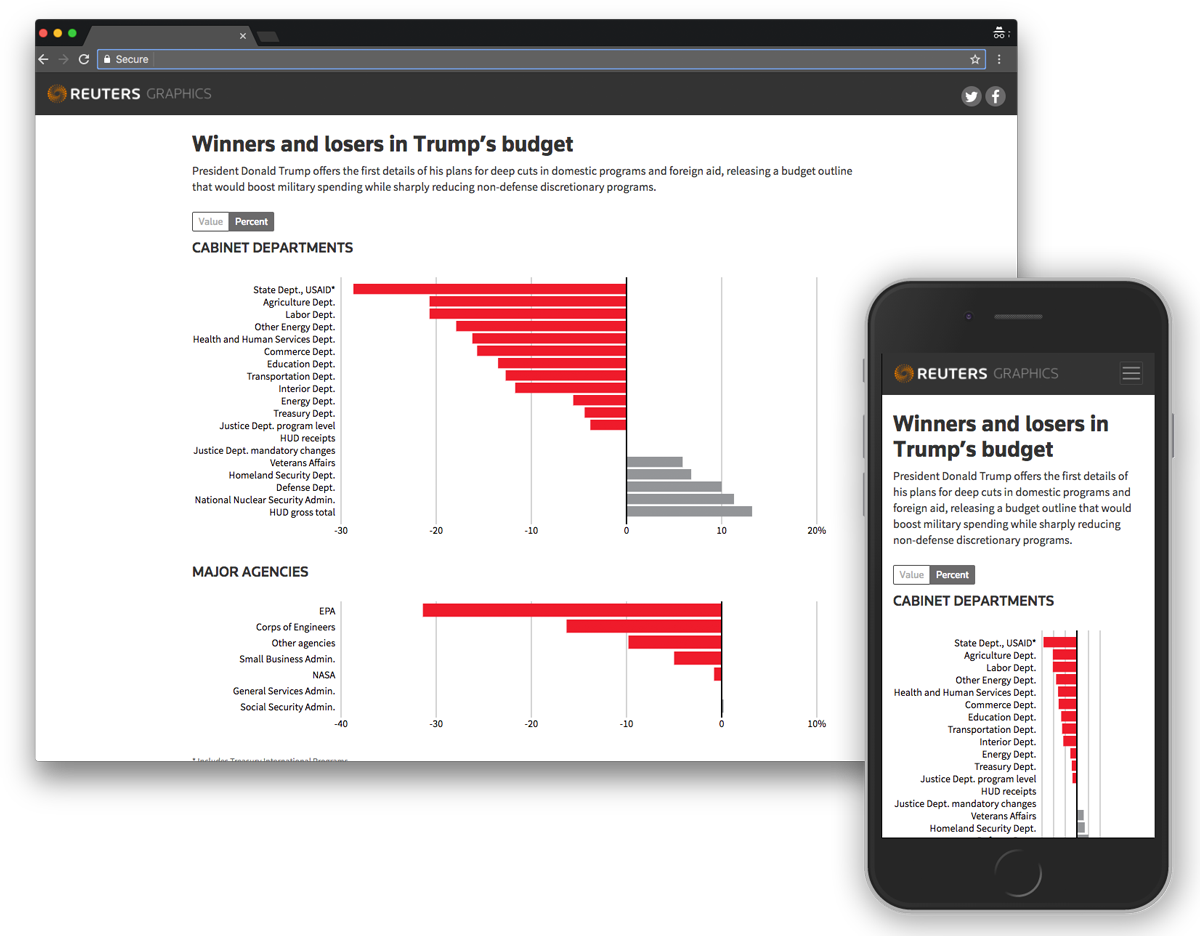
NBC and Reuters each took a pared-down approach. Reuters’ is two bar charts, one for departments and one for agencies. There is a toggle to switch between the value of the budget change and the percentage change versus the prior year. There is a sentence of introduction but no other analysis.
NBC’s BFAs

NBC’s has a single bar chart for the percentage change in departments and agencies followed by a section for the top three “winners” and “losers” in the budget proposal. Those are expressed with BANs but are upstaged by some BFAs (big fat arrows).
AP’s Whimsical Adventure

Completely different from the rest was the AP which plopped some force-directed bubbles on top of a scale. There was no analysis, and the primary interaction was to explore rather than to be guided.
Unfortunately the whimsy of the experience and delight of the design didn’t reward the user past first blush. Tapping a bubble revealed the agency name and change in budget, nothing more. No BANs. No BFAs.
Let’s talk about the BFAs, because if you’ve been following along, by now you’ve probably noticed a bunch of them.
| BANs | BFAs | |
|---|---|---|
| New York Times | 💯 | ⬆️ |
| Bloomberg | ||
| LA Times | ||
| Washington Post | 💯 | |
| CNN | 💯 | ⬆️ |
| NBC | 💯 | ⬆️ |
| Reuters | ||
| AP |

The LA Times used some swoopy arrows in its piece, and those have a passionate group of supporters, but the BFA is a directional indicator and icon that has seemingly fallen out of favor in recent years. Perhaps this spells its resurgence.
The Inliners
Rather than build out a piece to stand on its own, some organizations took the less-involved route of making an inline graphic for a traditional text-based story. Those include NPR, the Wall Street Journal, FiveThirtyEight, Al Jazeera, the BBC and Quartz (the last of which I work for). NPR, Al Jazeera, and the BBC picked a selection of departments and agencies; the rest use the full list. The Journal and Al Jazeera went one step further and included a breakdown of the total budget, not just the discretionary portion.
All of them are effectively bar charts (FiveThirtyEight’s is styled as a lollipop chart) and unremarkable but for their informational impact. This tweet of a budget bar chart, from the Quartz reporter who created it, was retweeted thousands of times. In a business where time is money and prestige, the cost effectiveness and time-efficiency of creating simple charts like these cannot be overstated.
There are aspects of some of these that I’m not thrilled about, but they’re just bar charts. Let’s move on.
Metrics
Who published first and how fast did they do it? Let’s take a look. In the telltale sign of an embargo, the first posts came in right around midnight, March 16, on the East Coast. Nonetheless, more posts arrived later in the morning and throughout the day.
| Pub Time | Type | |
|---|---|---|
| Quartz | 12:01 AM | Inline |
| NPR | 12:02 AM | Inline |
| CNN | 12:06 AM | Stand-alone |
| New York Times Analysis | 12:20 AM | Stand-alone |
| Reuters | 12:29 AM | Stand-alone |
| Wall Street Journal | 8:47 AM | Inline |
| Bloomberg | 10:23 AM | Stand-alone |
| Al Jazeera | 10:54 AM | Inline |
| Washington Post | 11:06 AM | Stand-alone |
| LA Times | 11:31 AM | Stand-alone |
| FiveThirtyEight | 1:29 PM | Inline |
| NBC | 2:08 PM | Stand-alone |
| AP | 4:35 PM | Stand-alone |
| BBC | 5:18 PM | Inline |
| New York Times Charts | 6:36 PM | Stand-alone |
There was quite a range to the bylines on these projects—some were one-person jobs, others took a village.
Bylines / Credits
Al Jazeera
None listed / Al Jazeera
AP
None listed
BBC
None listed / BBC
Bloomberg
David Ingold, Chloe Whiteaker, Michael Keller and Hannah Recht / Arit John
CNN
Tal Kopan / Gregory Wallace and René Marsh
FiveThirtyEight
Ben Casselman / FiveThirtyEight
LA Times
Los Angeles Times Graphics Staff
NBC
Sam Petulla
New York Times Analysis
Alicia Parlapiano and Gregor Aisch / Coral Davenport, Mark Landler, Yamiche Alcindor, Matt Apuzzo, Robert Pear, Nicholas Fandos, Alan Rappeport, Helene Cooper
New York Times Charts
Gregor Aisch and Alicia Parlapiano
NPR
Jessica Taylor, Danielle Kurtzleben, Scott Horsley / Katie Park
Quartz
Tim Fernholz
Reuters
Matthew Weber
Wall Street Journal
Jeffrey Sparshott and Ted Mann / The Wall Street Journal
Washington Post
Kim Soffen and Denise Lu / Devlin Barrett, Lenny Bernstein, Abha Bhattarai, Emma Brown, Jose A. DelReal, Brady Dennis, Max Ehrenfreund, Darryl Fears, Amy Goldstein, Sari Horwitz, Sarah Kaplan, Dan Lamothe, Michael Laris, Jonnelle Marte, Peggy McGlone, Chris Mooney, Carol Morello, Steven Mufson and Lisa Rein
Did I miss the graphic or feature that you made? Are you the anonymous person whose name didn’t end up alongside your work? Notice something else interesting about the way these publications made them? Let me know by shooting an email to david.on.source@yerit.com.
Catch you next time.
Credits
-
 David Yanofsky
David is a reporter for Quartz. He has exposed law breakers by tracking Instagram posts, expanded the capability of his fellow reporters by developing newsroom tools, and is currently suing the Department of Commerce to gain access to some of its data.


