Features:
The Week In News Dev, Oct 25
Projects, code releases, and announcements
NPR’s Swing State Scorecard app
This week, journalism coders throughout newsrooms hunkered down to run election tests and an Amazon cloud outage produced wails of frustration up and down the East Coast. We also saw quite a few app launches, events, and code updates.
NPR & WNYC

The WNYC interactive map of legal rights for US same-sex couples
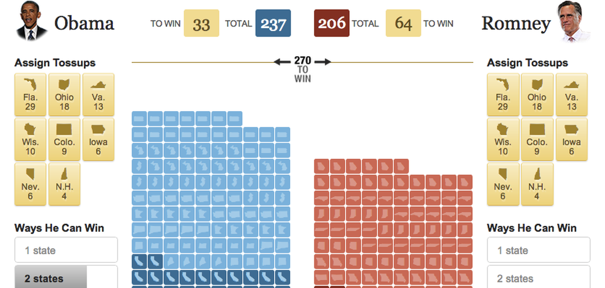
NPR released Swing State Scorecard (pictured above), an interactive web app that allows readers to assign swing-state votes to a US Presidential candidate and walk though resulting scenarios.
The data and code team at WNYC created an interactive map that visualizes legal rights available to same-sex couples in each US state, and produced a just-in-time embeddable map to track the path of Hurricane Sandy.
US Newspapers

Drone documentation from the Washington Post apps team
The Washington Post created a new tracker to document US drone strikes in Yemen, Pakistan, and Somalia.
The New York Times’ @timesopen crew threw a live event, Bigger Data and Smarter Scaling, and published photographs, notes, links, tweets, and slide archives from the event.
The Times also published an interactive painting X-ray that lets readers explore the “ghost” image recently found beneath the surface layers of Picasso’s “Woman Ironing” and a Voter ID law map that sizes US states according to their electoral college strength.
UK Newsrooms

Timeline of Apple product releases
Over at the Guardian, the development team published a responsive design walkthrough and the second post in their Datablog series about women in the UK media. Gabriel Dance, interactive editor at the Guardian US, was interviewed about interactive journalism at TPMIdeaLab.
Guardian data journalists also created visualizations on topics including British casualties in Afghanistan, Apple product launch frequency, and US Presidential election fundraising.
More! More!

Draggable, zoomable map tiles from MapBox
The MapBox team launched a new blog to track their Knight Foundation-funded work on OpenStreetMap, and Juan Velasco launched National Infographic, a new blog about the process of making art, maps and graphics at National Geographic.
On the media analysis side, The Society Pages published a critical analysis of CNN’s Racial Voting Block calculator from Alex Campbell of Reed College.
Additions and corrections
Want to add or correct information? Comment below, send a note to source@opennews.org, or find us on Twitter at @Source.
Organizations
Credits
-
 Erin Kissane
Editor, Source, 2012-2018.


