Features:
When The Designer Shows Up in the Design
How our assumptions, perspectives, intuitions—and yes, our biases—shape what we design and how we design it.

This story was co-published with ProPublica.
I want you to imagine the American Midwest.
Don’t think about what it looks like as a landscape—instead, imagine you were to put the Midwest on a map. What would it look like geographically?
Have you got it?
Some of you may be picturing the Midwest like this—the way the Census defines it. It includes North Dakota and South Dakota, as well as Wisconsin, Illinois, and Indiana.
The Midwest, according to the Census. (Census)
For others, things may look a little different. Here are just a few published maps of the Midwest, from an educational resources site, an interior design council, and a manufacturing company:
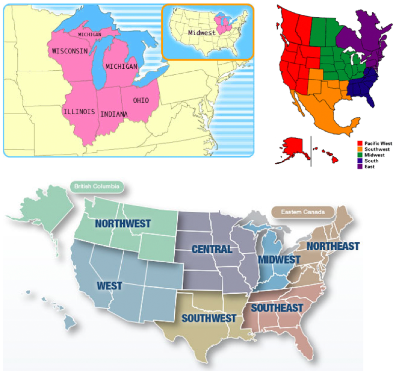
The Midwest: sometimes it’s only the states bordering the Great Lakes, other times it includes Canada. (Learner.org, IDEC, National Precision Bearing)
Sometimes the Midwest is only states bordering the Great Lakes, sometimes it’s larger. Sometimes Kentucky counts as the Midwest, other times it’s in the South. We assume the Midwest is a generally fixed and stable thing, but that’s not the case. It turns out that there are lots of Midwests.
What would happen if we mapped out all the different Midwests that came to mind for you and for others? What would that look like?
This is exactly what cartographer Bill Rankin did in 2013. He overlaid 100 published maps of the Midwest. Here’s what they all look like together:
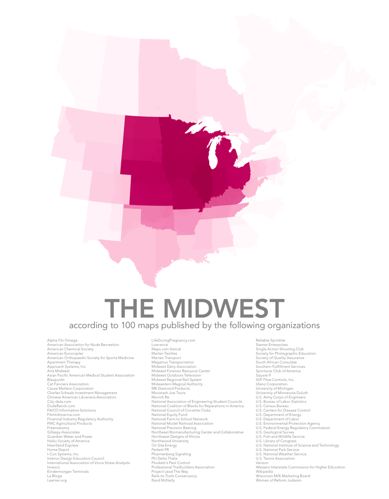
The Midwest, as displayed in 100 different published maps. Not one area was shared by all maps. (Bill Rankin)
The Midwest is literally all over the map, stretching from Newfoundland to Texas to Idaho. So even if we think we’re using the word “Midwest” to mean the same thing, it turns out that different people interpret that word in very different ways. Few of us probably realize how different our map is from someone else’s. Only by seeing the range of points of view do we even realize we have one of our own.
That’s just one map, one example. But it speaks to something broader. Just as we draw different mental maps of a single region, we each carry our own assumptions and ideas about the world.
Here we’ll focus on the unintended ways that assumptions, perspectives and biases find their way into our work as journalists, designers and developers. We’ll look at how the decisions we make—what data to base our stories on, what form those stories should take, how they’re designed, who they’re created for—always come out of our particular point of view.
What Data Gets Selected?
Much of our work as visual journalists is based on data. Even before we interpret or analyze it, we’ve already made assumptions about what data we’ll focus on, or what data will help us answer a question.
For example, if we’re looking at the impact of crime on local communities we might choose to focus on the victims of crime, and seek out data about the frequency and locations of specific incidents. This is the general pattern of most “crime mapping” tools or visualizations, like this one from Trulia.
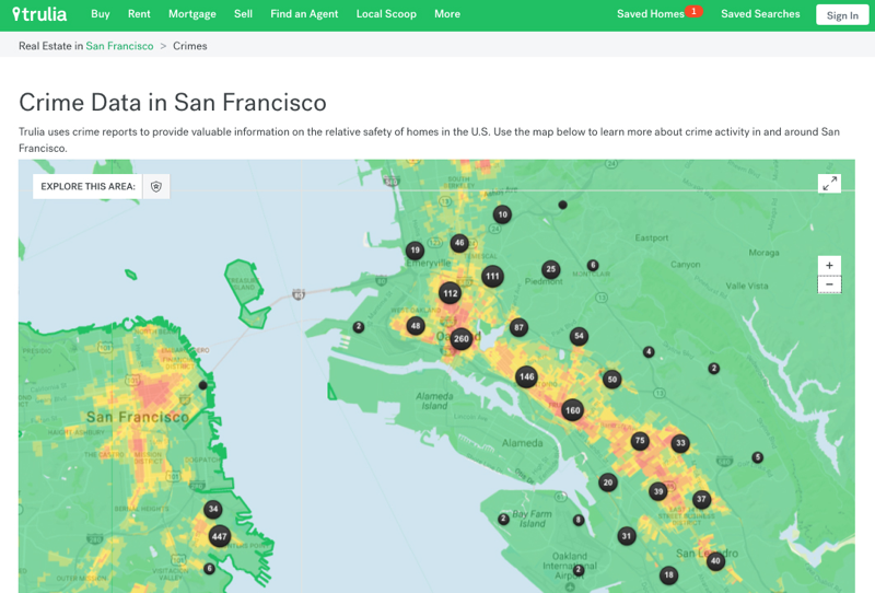
Trulia crime map of San Francisco (Trulia)
On the other hand, we could also look at the impact of the criminal justice system by choosing instead to focus on those imprisoned for a crime.
A few years ago Laura Kurgan of Columbia’s Center for Spatial Research made a criminal justice map from a different perspective than the typical crime maps. Instead of looking at the frequency of crimes, she looked at neighborhoods in terms of the percentages of residents who were in prisons, with an eye toward understanding the effect of mass incarceration on the people left behind. In her research, she found that most incarcerated people in American cities come from just a few neighborhoods—mostly poor neighborhoods of color. The resulting project is called Million Dollar Blocks.
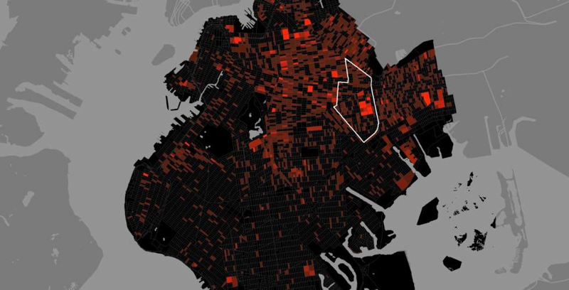
The Million Dollar Blocks project, visualizing prison expenditures in Brooklyn. (Columbia University)
New York, for example, spent over $11 million to incarcerate people who lived on these 11 blocks in Brownsville, Brooklyn.
In 2003 it cost $11,839,665 to imprison people from these 11 blocks. (Columbia University)
Kurgan found that these same neighborhoods are desperate for other kinds of public resources. In interviews, she makes the case that the typical crime-mapping tools are actually part of the problem of mass incarceration, because they frame crime in an oversimplified way—as bad acts to be eradicated, and not the product of a system whose heavy costs are often borne by the very population law enforcement is meant to protect.
“Rather than looking at where crimes are committed, we looked at where prisoners live,” Kurgan said in an interview for BOMB magazine, “and the maps that resulted showed the urban costs of incarceration and suggested how those dollars might be better spent on investing in communities.”
What data set to focus on, and how to frame it, is a decision. Kurgan looked at the same data and framed it completely differently, and that changed what we were able to see.
What Data Gets Collected?
The way in which data is collected often reflects something about the people who collect it.
A few years ago, the City of Boston released Street Bump, a smartphone app that uses GPS and accelerometer data to detect potholes as Bostonians drive through the city. Every bump gets submitted to the city, and three or more bumps at the same location trigger an inspection and in theory a quick repair.
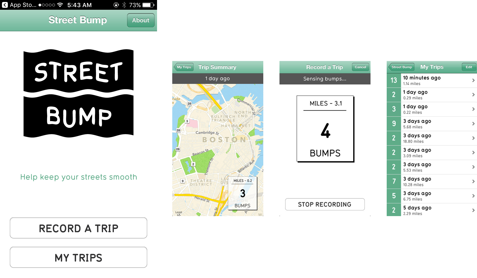
Street Bump, a project to improve neighborhood streets. (StreetBump)
Sounds like a great idea: A massive stream of data that reveals the status of street surfaces at low cost to the city! And it is a great idea—but there’s a problem. Not everyone in Boston has a smartphone. The experiences of people without smartphones (people who tend to be poorer and older) don’t show up in the data.
Luckily, Boston was aware of this issue and addressed it from the beginning, by giving the app to city workers to use as they drove around the city. But the implication is clear. Data doesn’t speak for itself—it echoes its collectors.
Or to take another example: A study came out a few years ago that looked at Twitter and Foursquare data generated during Hurricane Sandy, which included millions of tweets and posts.
The researchers found some interesting things in the data, like a spike in nightlife right after the storm, and some unsurprising things, like a surge in people buying groceries right before the storm.
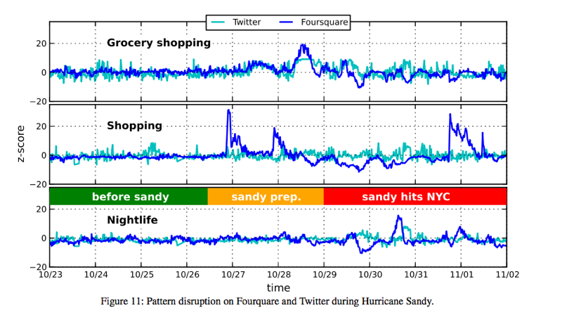
Activities in the days before and after Hurricane Sandy, gleaned from social media data. (Rutgers University)
But these findings, interesting or not, were made based on data that came mostly from Manhattan, where there are a lot of people with smartphones and a lot of people who use Twitter and Foursquare. If you had been looking at this data as the sole metric of Sandy impact, you’d have thought that Manhattan was the center of the disaster. But in fact, the data failed to capture the hard-hit regions in the outer boroughs, like Breezy Point, Coney Island, and the Rockaways. In those places, blackouts, drained batteries and limited cell access made tweeting much less of a priority for residents seeking safety. So people in those neighborhoods—considered some of the ones that needed services most acutely—wouldn’t show up in the data.
In an article for Harvard Business Review, Microsoft researcher Kate Crawford calls this a “signal problem.” Data is usually assumed to accurately reflect the social world, she says, but there are significant gaps, with little or no signal coming from particular communities.
How Is the Data Visualized?
Beyond selecting and collecting a data set, the way we display data is the result of decisions that can carry political or cultural weight. Even small visual elements can have significant meaning.
Even a single line can take sides in a political dispute. The people who make Google Maps are careful to avoid doing that. When showing disputed territories, Google Maps will display the same reality differently for people in different parts of the world. For instance, Russian users see Crimea—the disputed region formerly part of Ukraine—as part of Russia, and marked off with a solid line. But Ukrainian users see it completely differently. Instead of a line, Ukrainians see the border as a subtler, almost invisible dashed stroke, leaving an open question as to who controls the area.
What Crimea looks like on Google Maps in Russia versus the Ukraine. (Google Maps)
What’s more, users everywhere else see yet a third thing—a hybrid bold, dashed line, emphasizing Crimea’s disputed status.
What Crimea looks like on Google Maps in the United States. (Google Maps)
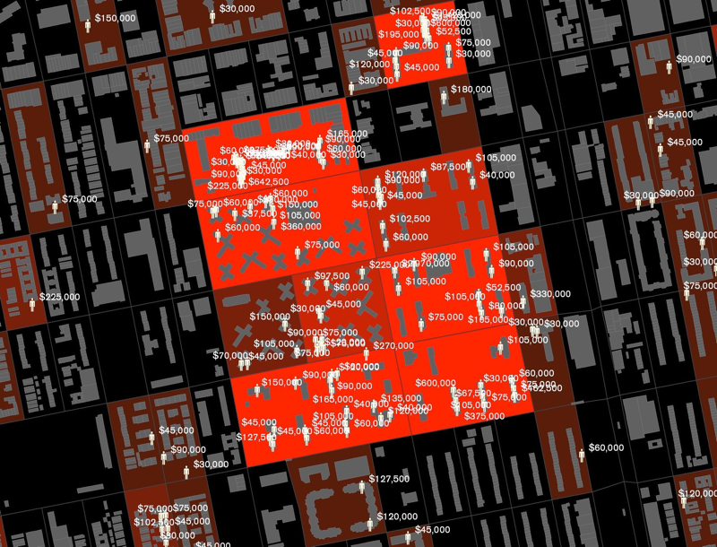
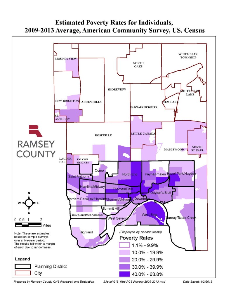
In a great series on how data visualization can perpetuate inequality, designer Stephanie Evergreen writes about a visualization of poverty in Minnesota, where poor people were represented as red dots. As in many American cities, poverty in Minnesota is closely tied with communities of color. People from these predominantly African American communities were not happy with being visualized this way, saying they felt like this represented them as an “infestation” and that they were “perceived as a threat.”
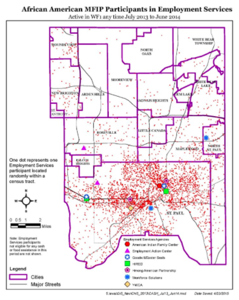
An approximation of a Minnesota poverty map. (Stephanie Evergreen)
In a redesign, Ramsey County Senior Program Evaluator Mark Herzfeld changed the color to a less angry purple and aggregated the data by census tract, which helped fix that perception.
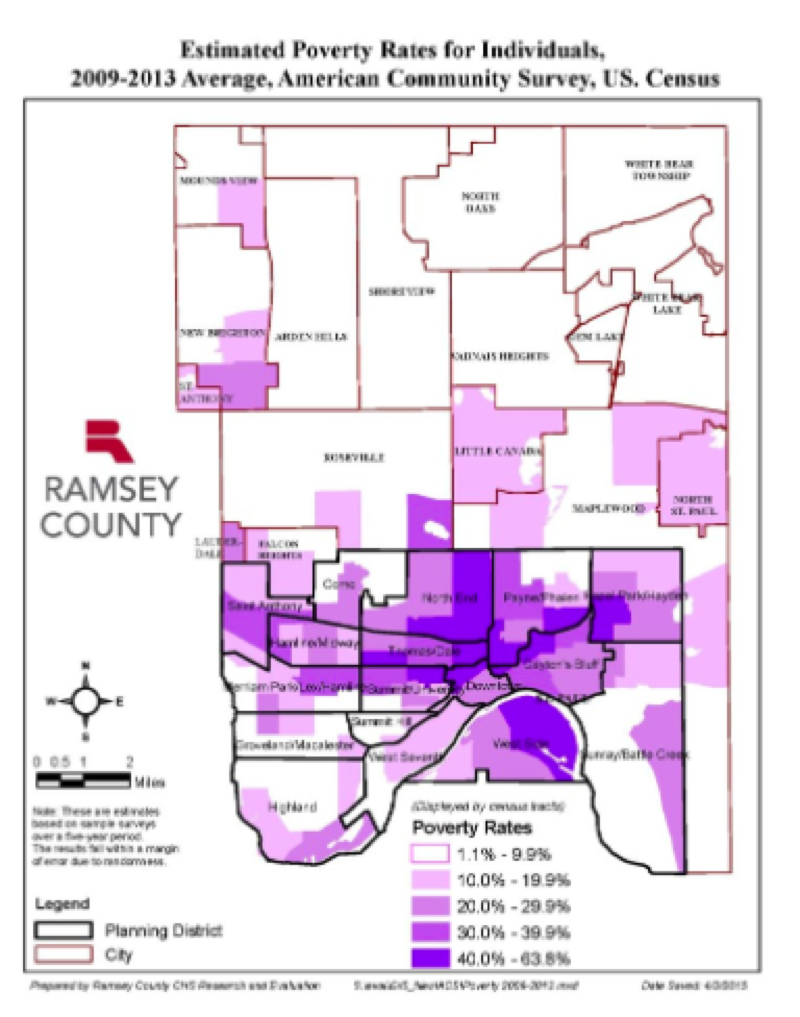
A redesigned Minnesota poverty map. (Stephanie Evergreen)
This raises larger questions about when it is acceptable to represent humans with dots at all, and what reactions a reader might have to seeing other people, or themselves, represented that way. Jacob Harris, then a developer at the New York Times and now at 18F wrote a sobering piece about this conundrum of representing people with dots, and when it may not be such a good idea.
Our Users Are Not Always Who We Imagine They Are
Designers and developers like to talk a lot about the user: user testing, user experience, user interface, etc. But your assumptions about the people you’re designing for can have serious consequences.
Take something as seemingly trivial as intrusive ads on web pages. Of course, everyone thinks banner ads are annoying, but they can make websites actually impossible to use for people who are blind or have low vision, or anyone who depends on a screen reader to navigate the web. Science journalist Rose Eveleth found that these ads often don’t include any text for a screen reader to read or are missing a close button so users with visual impairments are prevented from using the page at all.
Or take the period-tracking app Glow. The opening screen asks you to choose your reason for using the app. A female user’s three choices are: avoiding pregnancy, trying to conceive, or fertility treatments. Male users get their own option.
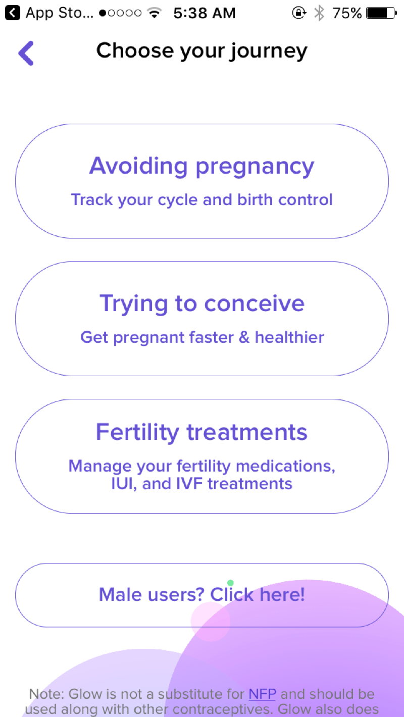
The opening screen of Glow, a period-tracking app. (Glow)
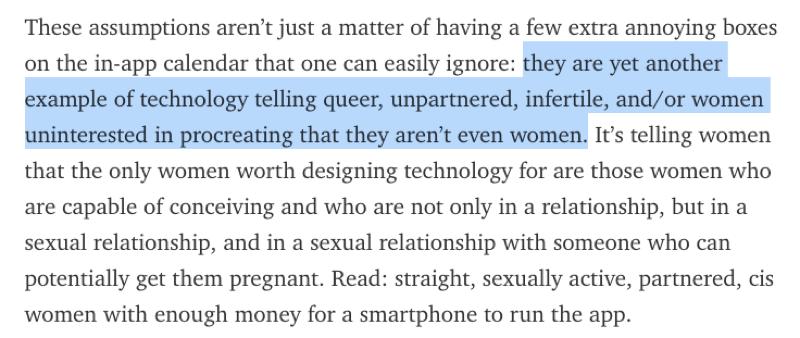
Right away, the design assumes that pregnancy is the only reason someone would want to track their menstrual cycle. But what if you are not fertile, or not having sex, or not with a partner who could get you pregnant? You’d have to lie about your experience just to use the app.
Engineer Maggie Delano, who describes herself as a “queer woman not interested in having children,” wrote about her experience using Glow and other period tracking apps.
“I figured the apps couldn’t be that bad and that I could probably just ignore the pregnancy stuff,” Delano wrote. “But I was wrong… my identity as both a queer person and a woman with irregular periods was completely erased.”
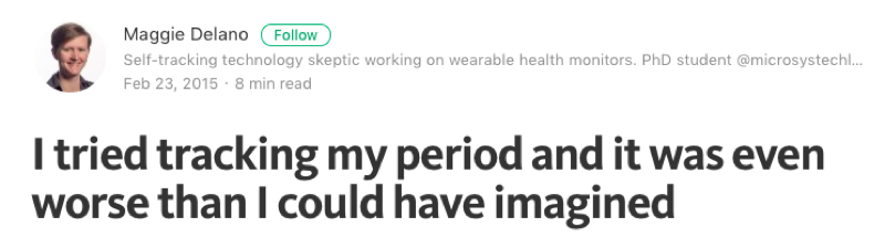
Maggie Delano writes about her experience using period-tracking apps. (Medium)
The design makes assumptions about a “normal” user (sexually active, straight) and leaves no room for anyone else.
According to a spokesperson at Glow, the app’s “main purpose, since its inception, has been to be the best fertility tracker out there… and remains focused on the experience of trying to conceive.” But because the company knows that not every woman is focused on tracking her fertility, in August 2015 they launched a separate app called Eve by Glow, targeted at women who instead want to focus on tracking their cycle and sexual health.
Making assumptions about our users can have other unexpected, unhelpful, and potentially dangerous results. For example, it shouldn’t surprise you to know that if you say to Siri, the virtual assistant built into the iPhone, “I’m having a heart attack,” it responds with list of nearby hospitals along with a link to call emergency services.
But not all emergencies yield such helpful results. Last year, designer and author Sara Wachter-Boettcher tested out Siri’s response to a few other emergencies. She found that Siri seemed to have a surprising lack of knowledge about rape and sexual assault.
Here are three responses it gave on those subjects.
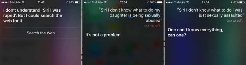
Siri’s response in 2016 to a variety of questions about rape and sexual assault. (Sara Wachter-Boettcher)
Apple is not the only company with these problems. A 2016 study in JAMA Internal Medicine compared four “conversational agent” technologies and found that they dealt with crises inadequately. At the time of the study, none recognized the phrases “I am being abused” or “I was beaten up by my husband.”
After the JAMA study came out, Apple worked with the Rape, Abuse and Incest National Network (RAINN) and researchers at Stanford to revise Siri’s responses. As of March 17, 2016, it now includes helpful resources, such as links to the National Sexual Assault Hotline.
All this comes despite the prevalence of such crises for women. According to some estimates, nearly one in five American women will be raped or sexually assaulted in their lifetime, and one in three women worldwide are victims of physical or sexual abuse. As conversational agents like Siri, Alexa or Google Now become ubiquitous and speech becomes the dominant user interface, making sure this technology is responsive to all users will be even more critical.
Assumptions about what is a “normal” or “default” user come up over and over again. Take facial recognition software. It has had problems recognizing people of color who presumably did not look like the white faces in its practice data sets.
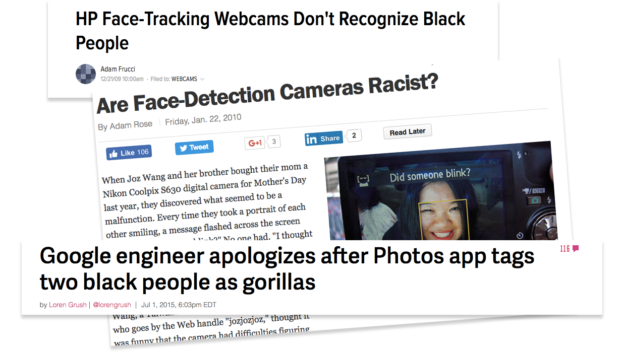
A variety of headlines about the results of bias in facial recognition software (Gizmodo, TIME, The Verge)
This is not a new problem. In the early part of the 20th century, North American photo labs calibrated their color photographs using reference cards picturing white female models—nicknamed “Shirley” cards after the first color test-strip-card model, a Kodak employee named Shirley Page.
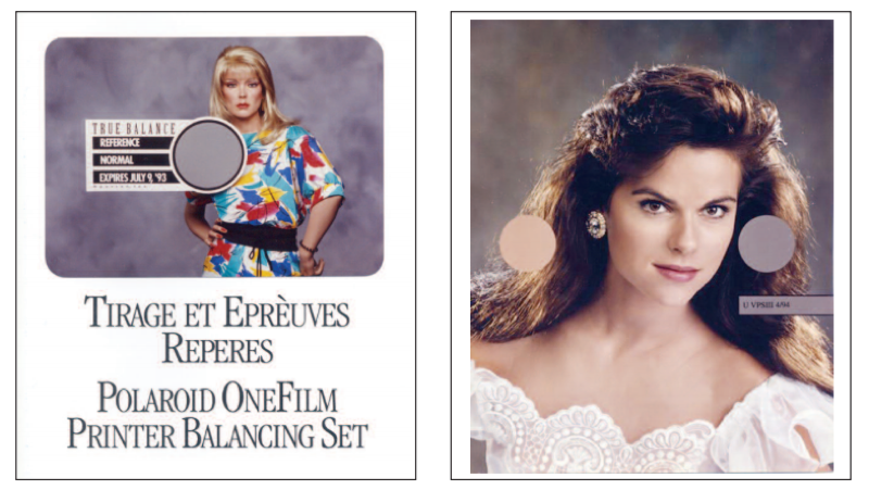
So called “Shirley” cards have long been the standard for calibrating photo equipment. A tradition Shirley card from Polaroid (left) and Kodak (right). (Lorna Roth)
Lorna Roth, a Concordia University communications professor, wrote a fascinating historical overview of the Shirley card. She describes how, from 1959 until today, many versions of Shirley have circulated through photo labs, defining and molding onto photographic equipment a standard of “normality” that was exclusively white.
Working to Fix It
It may be tempting to think that even if we all bring our own assumptions to our work, that they’ll just cancel each other out. The Midwest map roughly captures what we mean by the “Midwest,” doesn’t it?
But it’s worth pausing for a moment to consider who is making most of the decisions in fields of journalism, technology, design. It doesn’t take long to realize that this community skews white, male, straight and able-bodied. So it’s no surprise that the assumptions built into our work skew that way too.
Once we acknowledge that as a community we have imperfect assumptions, we can work to get better. One way to do that is to intentionally design against bias.
Some companies have actively tried to design against bias once it is discovered in their products. The social network Nextdoor is a free web platform that lets members send messages to people who live in their neighborhood. Sometimes this means announcing tag sales or giving tips about plumbers, but the site also has a section dedicated to crime and safety.
A few years ago the East Bay Express wrote about how Nextdoor was being used for racial profiling. Users in Oakland were reporting black folks as “suspicious” just for walking down the street or driving a car. They suggested that a black salesmen and a black mail carrier might be burglars. They reported “suspects” with little more description than “black” or “wearing a hoodie.”
Nextdoor quickly acknowledged this was a problem, and redesigned their interface to discourage it.
Most notably, they required people to give a few specific details about this supposedly “suspicious” person, such as what the person was wearing or the color of their hair. They also added more prominent warning screens about racial profiling and added the ability to report a post as racist.
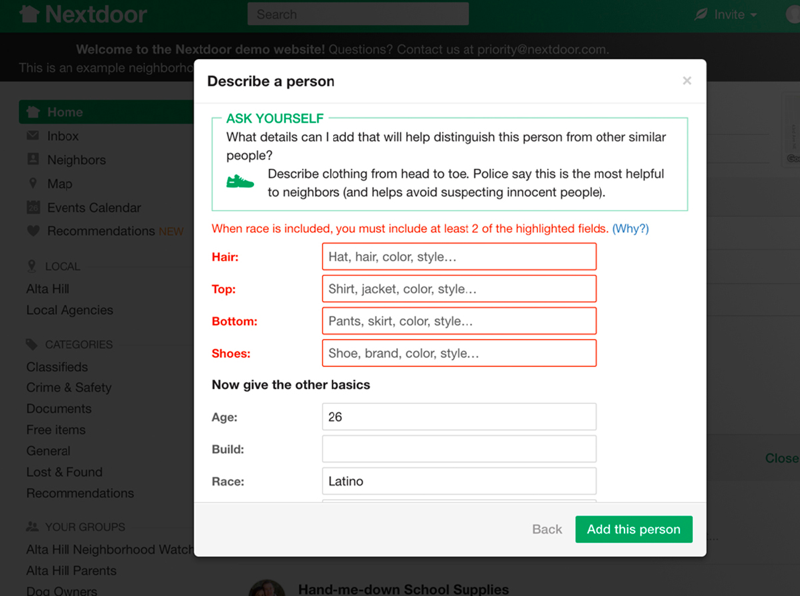
Merely introducing a little friction into the design, by giving people a few hurdles to jump before they reported suspicious activity, cut down posts with racial profiling by 75 percent, according to Nextdoor.
Seek Out New Perspectives
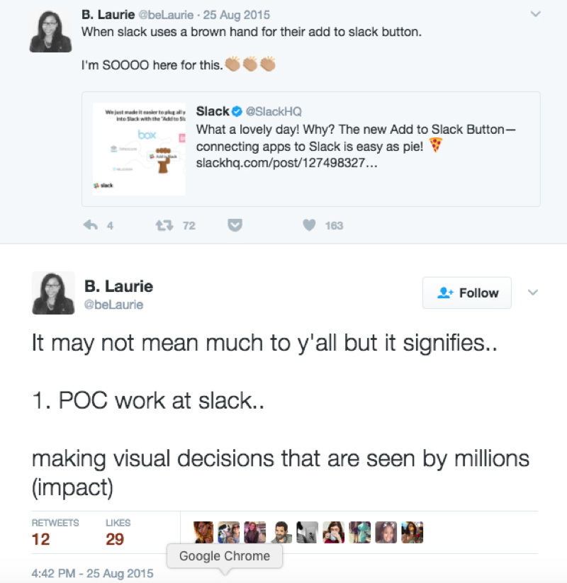
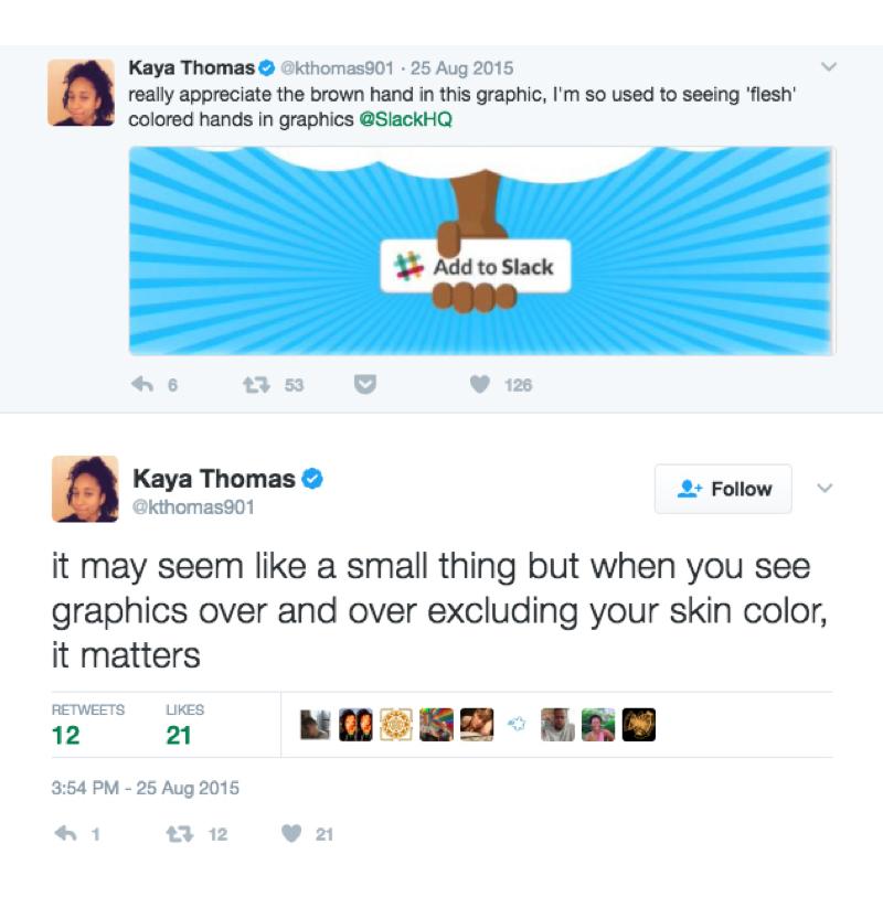
Another way to address systematic assumptions is to expand who’s making these decisions. When Diógenes Brito, a designer at the messaging company Slack, was assigned to create a graphic for the company, he assumed that he could make the hand in the graphic look like his own. So he made it brown.
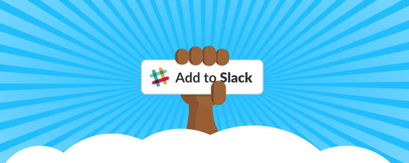
The launch graphic for Slack’s new Add to Slack feature.
And people noticed. They flocked to social media and other channels to express their appreciation at finally being able to see themselves represented in a visual landscape where the “default” skin color is white.
Facebook made a similar small but notable change when one of its designers, Caitlin Winner, changed the default friend icon from a man standing in front of a woman, to a more equal composition.
Facebook’s old friend icon (left), and the redesigned more gender-equal icon (right). (Medium)
Brito from Slack later said that he hopes that designers like him seize opportunities to redesign existing imagery. “Our small choices as creators matter in powerful but sometimes subtle ways,” he wrote in an article about his experience.
The effects may be subtle, but if we pour so much of ourselves into the stories we tell, the data we gather, the visuals we design, the web pages we build, then we should take responsibility for them. And that means not just accepting the limits of our own perspective, but actively seeking out people who can bring in new ones.
Credits
-
 Lena Groeger
Lena Groeger is an investigative journalist and developer at ProPublica, where she makes interactive graphics and other data-driven projects. She also teaches design and data visualization at The New School and CUNY. Before joining ProPublica in 2011, Groeger covered health and science at Scientific American and Wired magazine. She is particularly excited about the intersection of cognitive science and design, as well as creating graphics and news apps in the public interest.


