Features:
The Hamilton Algorithm
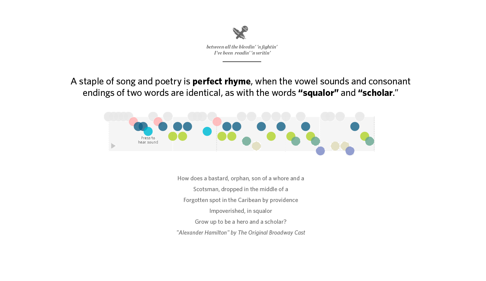
How We Analyzed and Visualized Hamilton’s Rhyming Lyrics for the WSJ

The secret weapon wielded by the Enterprise Visuals team at the Wall Street Journal is collaboration. A lot of it. For our latest project, which dissects the rhyme schemes of the hit musical Hamilton, our team of designers, developers and data journalists worked together to create a new data visualization type that could capture the lyrical complexity of rhyming verse.
From idea to publication, the entire project took about two months. We’ve dug up early mocks, videos, and screencaps which were taken along the way. Here’s how the project unfolded.
The Pitch
After bonding over our mutual love of Hamilton, we—data journalist Joel Eastwood and developer Erik Hinton—pitched the team an idea. What could we learn by analyzing the rhyming patterns in the musical Hamilton?
Could we shed light on the musical’s many influences? We wrote a rough Python program which could match similar phonetic syllables, and mocked up the results in a series of slides.
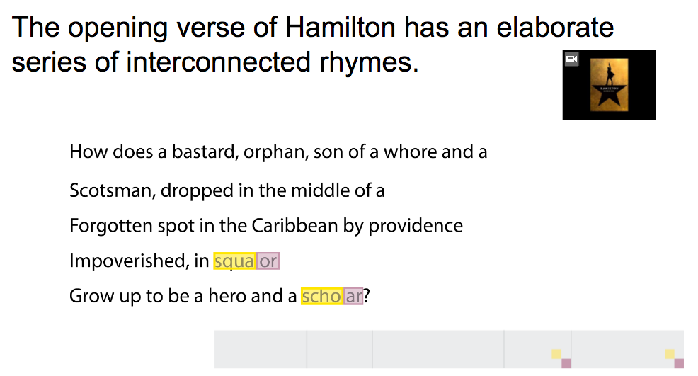
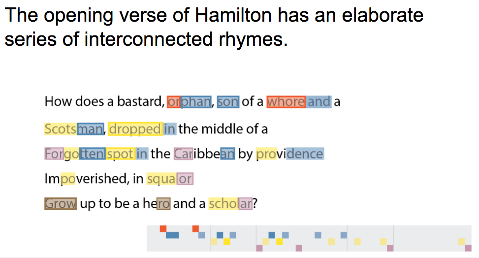

The essential elements of the visualization were here in our first draft: color-coded, annotated song lyrics, accompanied by an abstract, horizontal diagram to display the structure of the rhymes. The basic structure of the script was also present in this early version: introduce the complexity of the musical’s first verse, and then make comparisons between Hamilton and influential rap and musical theater songs.
Erik continued to add to the depth and complexity of the algorithm, adding a command-line visualizer. The algorithm works by breaking every word into its syllables, then translating those into phonetic sounds.
For example, the three syllables of “Ha-mil-ton” break into the sounds “HH-AE,” “M-AH-L” and “TON.” The sounds are then scored against all the other sounds in the passage based on stresses, proximity, and vowel and consonant similarities. The highest scores are considered rhymes, and those syllables are grouped into families. For a full write-up of how the algorithm works, read about our methodology.
The rhyme algorithm was originally written in Python and run through the terminal. This allowed us to test it quickly and make modifications as necessary. Later, we received a lot of feedback that this was a fun part of the visualization—and something we’ve never seen done anywhere else.
That motivated us to recreate it in JavaScript so users could enter their own lyrics and create their own visualizations. It took a bit of work, and some extra designs, but the final product is a robust and fairly reliable generator. We hope this goes on to be one of the more powerful and longest-lasting parts of the project.

The Design
To build the data visualization, we started iterating on ideas using Photoshop, Illustrator and After Effects. We wanted the project to be more of an “experience,” an immersive and awe-inspiring visualization that could stop you in your tracks. It was also important to us that the visualization justified its existence as an interactive, as opposed to an animated video. This meant thinking about how to let the user replay and experiment with the rhymes.
Designer/developer Ana Becker worked with After Effects animations to introduce motion into the visualization. This let us think through how timing and movement could help connect the visualization to the words.

We showed these visualization mock-ups to other people on the team, and their feedback helped us narrow our approach. We found people were confused about what the colors and dots meant because they were shown in isolation, and not tied closely enough to the text, so we turned to visual metaphors to tackle that gap. One design imitated a musical staff, which seemed to help users understand how the dots were positioned and what rhymes were connected. A labelled y-axis helped unite the rhyme families with their dominant sound. But this design introduced another problem: people were taking the musical staff too literally. The visualization isn’t about music or rhythm; it’s about the lyrics and the rhymes.

Iterations on the musical staff design tried to build stronger links between rhyme families, using an x-axis rule to connect the dots, and other similar visual styles. At this point we were still drawing shapes for every syllable, rather than just the rhyming syllables.
Here is a look at just some of the iterations we went through at this stage.

The Code
We felt we were pretty close with the staff variation version, which actually fairly closely resembled the original visualization in the first presentation—try as we might, we just kept coming back to its simplicity.
A few key features that came out of this iteration process were:
- Adding certain words to the visualization itself (e.g. the “General” and “mineral” annotations above)
- The y-axis sounds that helped communicate the core phonetic structure of each rhyme family
Working from this design, we began coding the project and created a working draft that had the music playing alongside the visualization. It was at this point we really started to realize that audio clips opened up a new avenue—time—that could play a crucial role. In earlier static mocks, we didn’t have all the words appearing with the visualization simply because we couldn’t fit them all in without overwhelming the reader. In the browser, the syllables could animate one-by-one as the music played, karaoke-style. We were finally able to properly tie the visualization with the words in a clear way.

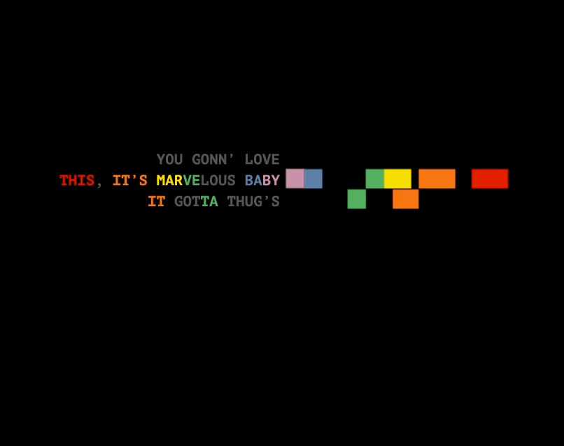
Earlier versions had side-by-side visualizations and used circles to represent the rhyming syllables, which seemed the most flexible unit for screens of different size (they could be resized easily without much fuss). We also experimented with bolding and color-coding the accompanying lyrics and words in the descriptive text, to strengthen the connection between the text and the circles.

As we sought more feedback, a few members of our team separately devised a diamond shape for each rhyme rather than circles. The connection between rhyme pairs seemed clearer, and it was important for readers to actually trace these shapes to understand how they relate to each other.
We refactored the code to include diamonds instead.

At this point the visualization was comprehensible to a first-timer, but we still needed to highlight the specific rhyme patterns the story was describing. A few final touches were needed: we added annotations like the ones below, adjusted the opacity to fade out irrelevant syllables and added color-coded words to the explanatory text.

The Polish
While we refined the visualization itself, we also took some time to craft the opening splash screen. We wanted to make the headline both a subtle nod to the opening verse of Hamilton, as a tip-off to the musical’s hardcore fans, and to have the headline itself rhyme. The goal was to communicate aspects of the visualization from the very start and emphasize we’re talking about the structure of rhymes, not just the stage play. From our earliest versions we had a large font with some kind of rhyme to introduce the project.

We also tried adding the visualization to the splash page, which would animate in. This proved cluttered and unnecessary - the simple image let the power of the headline speak for itself.

Ultimately, the end result looked a lot like what’s above. The headline went through many revisions, to strengthen the rhymes and the framing of the story. Designers Jessia Ma and Laura Holder polished the page and added fun visual elements, such as a hedcut next to each rapper.
Lessons Learned
The project obviously went through a number of iterations, which included feedback from people on the team alongside managers and editors in various sections. (We learned a lot people in the newsroom have a deep passion for Hamilton.)
The first thing this taught us was start with a simple pitch and a clear story. We gave the original presentation to nearly a dozen different stakeholders over the course of the project to get everyone on board with the idea. Rather than including all the complexity of our process, our presentation simply focused on the story we wanted to tell. It was easy to get everyone up to speed with the project because we had a clear starting point with a simple goal in mind. We sometimes strayed from the path, but we’d refer back to the original pitch to get us back on track.
The second thing was, obviously, iterate, iterate, iterate.
Improvement happens one draft at a time. While this process can be slow and sometimes tedious, we feel strongly that working through these ideas visually helps uncover the best visualizations. We abandoned some of the earlier drafts, but kept a few key pieces that made it into the final version. This only worked because everyone working on the project was willing to change course and never got too attached to a single idea.
People
Organizations
Credits
-
Joel Eastwood
Joel Eastwood is a data journalist and graphics reporter on the Wall Street Journal’s Enterprise Visuals team.
-
Erik Hinton
Erik Hinton is a visual journalist on the Wall Street Journal’s Enterprise Visuals team.