Features:
COVID-19 story recipe: Identifying communities at risk from the pandemic and its economic fallout
Where to find the data, how to explore it, and questions to ask to reproduce the story for your community
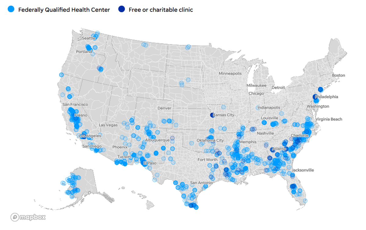
This map by Mitchell Thorson accompanied USA Today’s analysis of U.S. communities both medically underserved and extremely vulnerable to disasters. You can use the same data to see how vulnerable your community is.
During the first weeks of the COVID-19 outbreak, much of the news coverage focused on hospitals. But one in 11 Americans—about 31 million people—depend on smaller clinics and health centers for care because they have no health insurance, live in isolated areas, speak no English, or are experiencing homelessness. There are about 12,000 community-based health centers across the country, and about 1,300 charitable clinics run with donations and volunteers: Are these health centers involved in testing or treatment of mild cases? Where will their low-income patients go for care?
Which counties have residents most vulnerable to a pandemic and its economic fallout?
The story we found
Several datasets provided unique insights for a story that otherwise might have been unsurprising: Poor Americans with limited access to health care are going to have a harder time coping with COVID-19.
Our interviews with health centers and clinics revealed challenges that differed from those being reported at hospitals. Safety-net health centers and clinics were scaling back services or closing their doors, perhaps permanently, in the middle of a national health crisis. They’re critical access points for care to the almost 22 million people living in counties considered by the CDC to be extremely vulnerable to disasters, according to the agency’s Social Vulnerability Index. About 300 of those counties also are deemed medically underserved by the federal Health Resources & Services Administration.
As a result, America’s most vulnerable residents are at risk, not just from the COVID-19 pandemic but because they’re now losing access to care for other pressing medical needs.
How you can analyze the data
My story was based on four datasets that I combined into one Google Sheet, which you are welcome to download or copy. (I did the entire analysis in Excel because I wanted it to be easier to share with our local newsroom partners.) You can also download the original data sources to reproduce the analysis on your own or look at columns I didn’t keep for my streamlined copy.
- CDC Social Vulnerability Index: The CDC scores communities on a scale of 0 to 1, with 1 being the most vulnerable to disasters. Places with overall scores of 0.9 or higher are considered extremely vulnerable. SVI scores are available at county and census-tract levels—we chose to look at the county level because that’s how coronavirus test results were being reported. Shoutout to my colleague Dian Zhang, who downloaded and cleaned this dataset for several USA Today reporters, including me. She also pestered the CDC until they confirmed that scores of 0.9 or higher are “extremely vulnerable.” You’ll find cleaned-up copies of the data and documentation as an open project on BigLocal News (just log in for free with a Google account), or you can download the original data from the CDC, which includes 15 metrics and 4 index subgroups to calculate the overall SVI score. I put this data in the “Counties” tab of my Google sheet.
- Health Resources & Services Administration data on Medically Underserved Areas and IMU scores: An area is considered medically underserved if its IMU score is 62 or lower, or if it is designated by a governor. Some areas with higher IMU scores might still be designated as medically underserved because a particular group in that community is underserved. We focused on areas with scores of 62 or lower for our story, but you might want to change your approach depending on your community. You can download the original data from the HRSA—look for “Medically Underserved Areas/Populations” under “Shortage Areas.” I put this data also in the “Counties” tab of my Google sheet.
- HRSA data on Federally Qualified Health Centers: I downloaded a list of all Federally Qualified Health Centers, which are community-based clinics that receive federal funding to offer primary care to underserved populations. The dataset includes extra information like types of services offered, particular patient groups targeted, address, and contact information. I kept some, but not all, of those descriptive fields in my Google Sheet in the “FQHC_list” tab. You can download the original data from the HRSA under “Health Center Service Delivery and Look–Alike Sites.” I focused on medical providers, but there’s a separate download with information on mental-health providers.
- Data on free and charitable clinics: The National Association of Free and Charitable Clinics provided me with a simple spreadsheet listing their members and addresses. You also can use their website to find clinics in your area. I put this in the “Clinics” tab.
To combine the data, I used VLOOKUP to match the ZIP codes for clinics and centers to corresponding county FIPS codes. I already did it for you in the Google Sheet I shared, but just in case you ever need to match ZIP codes to counties:
The CDC offers a cross reference file that lists the county FIPS code for every ZIP code in the U.S. Because it’s such a large file and you have to combine the state and county code columns, I added a cleaned version to the Google Sheet in the FIPS_ZIPS tab. You’ll notice that I created a new column at the far left where I pasted a copy of the ZIP code column. (For VLOOKUPs, you need the field you’re joining on to be in the far left column.)
NOTE: I also created a “zip_5” column in the Clinics sheet to hold 5-digit versions of the ZIP+4 codes there. Without this step, I would get errors trying to match against the 5-digit codes in our FIPS_ZIPS tab. The formula =LEFT(D2, 5) tells the sheet to return the first 5 characters from cell D2 in our “zip_orig” column, turning entries like “36003-2663” into “36003.”
In my Clinics sheet, I created a new column and used a formula to pull in the matching FIPS codes. It looks something like this:
=VLOOKUP(E2, FIPS_ZIPS!$A$1:$G$53625, 4, FALSE)
Translation:
=VLOOKUP([Find this cell (in our zip_5 column)], [Find it in this sheet ! in this range of cells], [look in column No. 4], [do not return estimates, only exact matches])
(If you add the $ signs to A1:G53625, it will lock those values. That way, you can duplicate the formula and not have them change.)
So here’s an example of what that formula does: The Alabama Free Clinic has a ZIP code of 36507 in cell E2. The formula found “36507” in the first column of my FIPS_ZIPS sheet, and returned the entry from the fourth column in that same row: 01003. Tada! My Clinics sheet now had the FIPS code for the county where the Alabama Free Clinic was located.
I then used a similar process with the FIPS codes to match and combine all the datasets, both at a clinic level and at a county level. There were a handful that couldn’t be matched with the formula so I did manual matches for those. You might notice that some of the columns in the “Clinics” tab include blank fields for charitable clinics. That’s because those characteristics, like urban or rural, were from the HRSA dataset, which only describes Federally Qualified Health Centers. I did not attempt to fill in those fields for charitable clinics.
Now that you know where all the data came from, let’s get to the fun part: zooming in on your state or county. Working from my combined Google Sheet:
Let’s start on the Counties tab and create a filter—we’ll use Arizona as an example. Without selecting any columns or cells, use the Google Sheets menu and choose:
Data>Filter views>Create new filter view. Then click the filter icon next to the “State” column header to start narrowing down our list. All the states are selected right now, so click “clear” to uncheck them as a group, then click “Arizona,” and then “OK.” After filtering, we should see the IMU and SVI scores for all 15 counties in Arizona.NOTE: My original data analysis focused on counties with clinics and centers, those that had already reported COVID-19 cases, and those that were deemed medically underserved or extremely vulnerable. Not all counties fit into one of those categories, and I had to exclude a few. For instance, states like Utah and Alaska sometimes reported case figures for groups of counties instead of individual counties. And some counties did not have a health clinic or a charitable clinic even if they had a vulnerable population. As a result, this tab lists 2,810 of the 3,142 counties and county-equivalents in the U.S. The original SVI data from the CDC will have scores for all counties in the U.S. If you look at HRSA’s original data, you’ll note that not all counties have places designated as Medically Underserved Areas so you might not find IMU scores for all the counties in your state.
- Now, we’ll add some more conditions to our filter. (If you’re working in Excel rather than Google Sheets, this is called a Number Filter.) First, we want to limit IMU scores to 62 or less to focus on counties with medically underserved areas. Click the filter icon next to the “IMU_score” column, choose “Filter by condition,” then “Less than or equal to,” enter “62” and click “OK.” In Arizona, it turns out that all 15 counties have IMU scores of 62 or less.
- Next, we’ll filter SVI scores for results of 0.9 or greater, showing which of those medically underserved counties also are extremely vulnerable to disasters. Click the filter icon next to the “SVI_score” column, “Filter by condition,” then “Greater than or equal to,” enter “0.9” and click “OK.” In Arizona, that’s seven counties.
Copy down the FIPS codes for those counties: 4017, 4027, 4001, 4009, 4023, 4012, and 4003.
NOTE: The FIPS codes are missing leading zeroes. A lovely irritation of working with them in spreadsheets that I didn’t fix because it doesn’t matter for our purposes here. Technically, “4003” should be “04003”; I’m flagging this in case you’re trying to match to a different dataset with complete FIPS codes or aren’t seeing the FIPS codes for your area that you normally work with.
- Now we’ll switch to the “Clinics” tab and use the Google Sheets menu to create a filter here too:
Data>Filter views>Create new filter view. Let’s filter the FIPS column to show clinics in only those seven counties, using the FIPS codes we copied. (After clicking the filter icon next to the “FIPS” column, clicking “Clear” will unselect all the values, and we can use the search box to add just the codes we’re interested in.) - While filtering, we didn’t find FIPS code 4012 in the list, which means there are no Federally Qualified Health Centers or charitable clinics in that county. That’s a place that is both medically underserved and extremely vulnerable without any obvious low-income health providers! Sounds like a story. (Note, however, that the county includes part of the Colorado River Reservation. A quick Google search reveals there is an Indian Health Service facility in Parker, a city on the northern edge of the county. My initial analysis only looked at FQHCs and charitable clinics, but did not include facilities operated by the Indian Health Service or by tribes, which often serve vulnerable, uninsured populations, too.)
- Back to what we did find: In six Arizona counties that are both medically underserved and extremely vulnerable to disasters, we find 63 safety-net health providers. Looking at the “Type” column, I note that all of them are Federally Qualified Health Centers. No charitable clinics. (Again, because this is Arizona and many of these counties include tribal lands, you might want to do an extra search for Indian Health Service and tribal health centers.)
- You can look at columns J through N to see how those clinics describe their work: community health centers, migrant health centers, school-based, public housing-based, or homeless services. For instance, 46 of these 63 centers serve migrants. Although none of them are classified as school-based clinics (which typically means that they focus on serving students), we can see from the “Center Location” column that eight of them are based at schools. With schools closed, are those clinics still serving the broader community or are they closed, too? That could be a story, too.
Bonus: Map this data!
(OR, SKIP THIS SECTION TO GET TO A LIST OF STORY IDEAS.)
With a list of the health centers and clinics in counties extremely vulnerable to disasters _and _medically underserved, we can also make a map to share with other reporters or embed in a story.
- Create a new tab called “Map.” Copy and paste that list of 63 health centers into this tab. I copied all of the descriptive columns, too.
- Drag the “Map” tab over to be the first tab in your spreadsheet. This will save you a headache later.
- In your web browser, go to mymaps.google.com. You’ll need a free Google account, but I’ve found that MyMaps is a quick and easy way to build a map that I can use as a reporting tool or to share info with readers.
- Click “Create a New Map.” A new window will open with a blank map. Click “Untitled Map” in the box at the top left to give your map a name and description. These will be visible to the public if you publish them.

- Now, click the blue “Import” button. A window will pop up asking you to select your spreadsheet from Google Drive or from your desktop. If you don’t see your spreadsheet right away, you can search for it or click through your Google Drive folder structure to get to it.
- Next, several windows will walk you through making your map. First, for “Choose columns to position your markers,” I choose city, state and zip_orig. For “Choose column to title your markers,” I choose “name.” Hit finish and voila! You have a map.
- You might have a yellow notice in your sidebar telling you that 12 rows could not be mapped. If you click on Open Data Table, you can see which those are and click into fields to make changes. For instance, all of the rows with errors here are because Google does not always like ZIP codes with the extra 4 numbers at the end, so changing “85635–2900” to “85635” fixed the error. Sometimes a town is misspelled. Usually the cause of the error is obvious and easy to fix.

- Now, If you click on the paint roll that says “Uniform Style,” you can change how your map pointers look. For instance, I chose to group places by “TYPE_migrant_health_center.” This changes the colors of my markers to match the answer in that column so I can clearly see which clinics report serving migrants. Now, I see health centers serving migrants in one color and those that don’t focus on serving migrants in a different color. (Find more help on how to style points and background with this Google guide here.)

- If you want to share your map, you have two steps. First, click on “Share+” to set sharing settings. You’ll want to make this Public if you plan to publish. You could set it to “Anyone with the link” if you just want to share your map with other folks in your newsroom as a reporting tool.
- Second, click on the menu at the top right of the sidebar, signified by the three dots right next to the title of your map. Choose “Embed on my site” to see the embed code that you can use in many CMS systems to add to your story as an HTML element.

Where to look for your story
Because my task was to do a national story, I focused on broad findings. For instance, more than 300 counties are both extremely vulnerable to disasters and medically underserved. Those places tended to be in the southeast—from coastal Virginia to Louisiana to Southern Texas—but there also were clusters in the rural southwest and through much of California’s core.
My colleagues Josh Salman and Mark Nichols used one of these same datasets for a story focused on testing levels in Florida. They found that testing in some communities lags far behind others, even when patients show symptoms of COVID-19, and that many places with lower levels of testing have predominantly low-income residents vulnerable to disasters.
As happens with good stories, you end up with many, many follow-up questions that could be the seeds for future work. Here are some questions you might try to answer and story ideas that could be rounded out using this data.
- How many counties in your state are extremely vulnerable to disaster and medically underserved? Have those places reported COVID-19 cases yet? How are local and state officials tailoring their response to these communities, if they are at all? What role are FQHCs playing in testing or in caring for people with mild cases? Are they included in the state’s emergency plan for infectious diseases?
- Once you identify vulnerable communities, look at testing rates. Are richer, more-resilient communities being tested at higher rates than poorer, more-vulnerable communities? Why?
- Federally funded health centers are required by the U.S. Centers for Medicare & Medicaid Services to have emergency plans, but those are not required to account for an outbreak of infectious disease. They might focus on hurricanes, tornadoes, or chemical exposures from a prominent industry. What was in the plans for FQHCs in your area? How prepared were they for an outbreak?
- Once you have a list of clinics and centers in vulnerable communities, reach out and ask them how they’re faring. Have they had to cut services or close their doors for now? What do they need to reopen? How are they serving patients who do not have internet service or a phone to do telehealth appointments? Have they had to cancel fundraisers? Are there ways the community can help?
- Medically underserved areas often report higher rates of health conditions, such as diabetes or hypertension, that make people more likely to develop severe COVID-19 symptoms. Other health conditions treated by safety-net clinics might worsen if closures and service reductions effectively end people’s ability to get care. Are clinics and centers in your area still able to help people manage their chronic health conditions? Or are people going without care right now that could lead them to the ER later?
- As millions of people lose their jobs, more of them will qualify for low-cost or free care at FQHCs and charitable clinics. Are those places reporting increased demand? Are they having to turn people away? What advice can they share with newly uninsured people about how to get discounted prescriptions or basic care?
Most states will have an association representing Federally Qualified Health Centers, which could prove helpful when reporting. Many states also have state organizations for charitable clinics. The national groups—the National Association of Community Health Centers and the National Association of Free and Charitable Clinics—are good sources for big-picture commentary and questions, particularly on congressional proposals, best practices, and access to stockpiles.
I expect to use these datasets to bolster several more coronavirus stories. I hope you find it useful, too.
Find more step-by-step COVID-19 data story recipes like this one. If you have questions about a story you’re working on, our free peer data review program is here to help.
Programs like these are part of the OpenNews COVID-19 community care package. If you’re using this story recipe, please let us know — we’d love to promote your work! If you’ve got a story recipe idea, we’d love to hear about it. Drop us a line at source@opennews.org.


